Adding Variants, Sizes, Controls, Styles and Default Arguments to the Story - [My Notes on Storybook]
 Howard
Let's continue with the Button stories we have from the previous article.
If you're new to my blog.
Please check it out to make sure we're on the same page.
Adding Variants
There are a lot of flavors of buttons in the world. For our purposes, we’re going to call these variants.
One of the most common variants that we see out in the wild is the idea of having primary and secondary buttons. In addition, examples include destructive buttons and disabled buttons, etc.
Using a Prop to Set the Variant
The most common way to allow the consumers of your component library to set a variant is to provide them a props
What exactly you choose to call that prop and what values you’re willing to accept is up to you.
The end result might look like this:
<Button variant="primary">Button</Button>
<Button kind="primary">Button</Button>
<Button appearance="primary">Button</Button>
Implementing a Variant Prop
For starters, we'll have the following 3 variants for the button.
primary, secondary, destructive
First, we’ll add our new prop and its accepted values to the ButtonProps type.
type ButtonProps = ComponentProps<'button'> & {
    variant?: 'primary' | 'secondary' | 'destructive';
};
Styling the Button
Create the CSS module file for the Button component.
In the button.module.css
.button {
    align-items: center;
    background-color: #4f46e5;
    border-color: transparent;
    border-radius: 0.25rem;
    border-width: 1px;
    box-shadow: 0 1px 2px 0 rgba(0, 0, 0, 0.05);
    color: white;
    cursor: pointer;
    display: inline-flex;
    font-weight: 600;
    gap: 0.375rem;
    padding: 0.375rem 0.75rem;
    transition: background-color 0.2s;
}

/* Focus visible styles */
.button:focus-visible {
    outline: 2px solid;
    outline-offset: 2px;
}

/* Disabled styles */
.button:disabled {
    opacity: 0.5;
    cursor: not-allowed;
}

.button:hover {
    background-color: #4338ca;
}

.button:active {
    background-color: #3730a3;
}

/* Variant: secondary */
.secondary {
    background-color: white;
    color: #1f2937;
    border-color: #94a3b8;
}

.secondary:hover {
    background-color: #f1f5f9;
}

.secondary:active {
    background-color: #e2e8f0;
}

/* Variant: destructive */
.destructive {
    background-color: #dc2626;
    color: white;
    border-color: transparent;
}

.destructive:hover {
    background-color: #b91c1c;
}

.destructive:active {
    background-color: #991b1b;
}

/* Variant: ghost */
.ghost {
    background-color: transparent;
    color: #4f46e5;
    border-color: transparent;
    box-shadow: none;
}

.ghost:hover {
    background-color: #f1f5f9;
}

.ghost:active {
    background-color: #e2e8f0;
}
We’ll add the style to our component.
import styles from './button.module.css';

export const Button = (props: ButtonProps) => {
    return <button className={styles.button} {...props} />;
};
Now we have a prettier button.
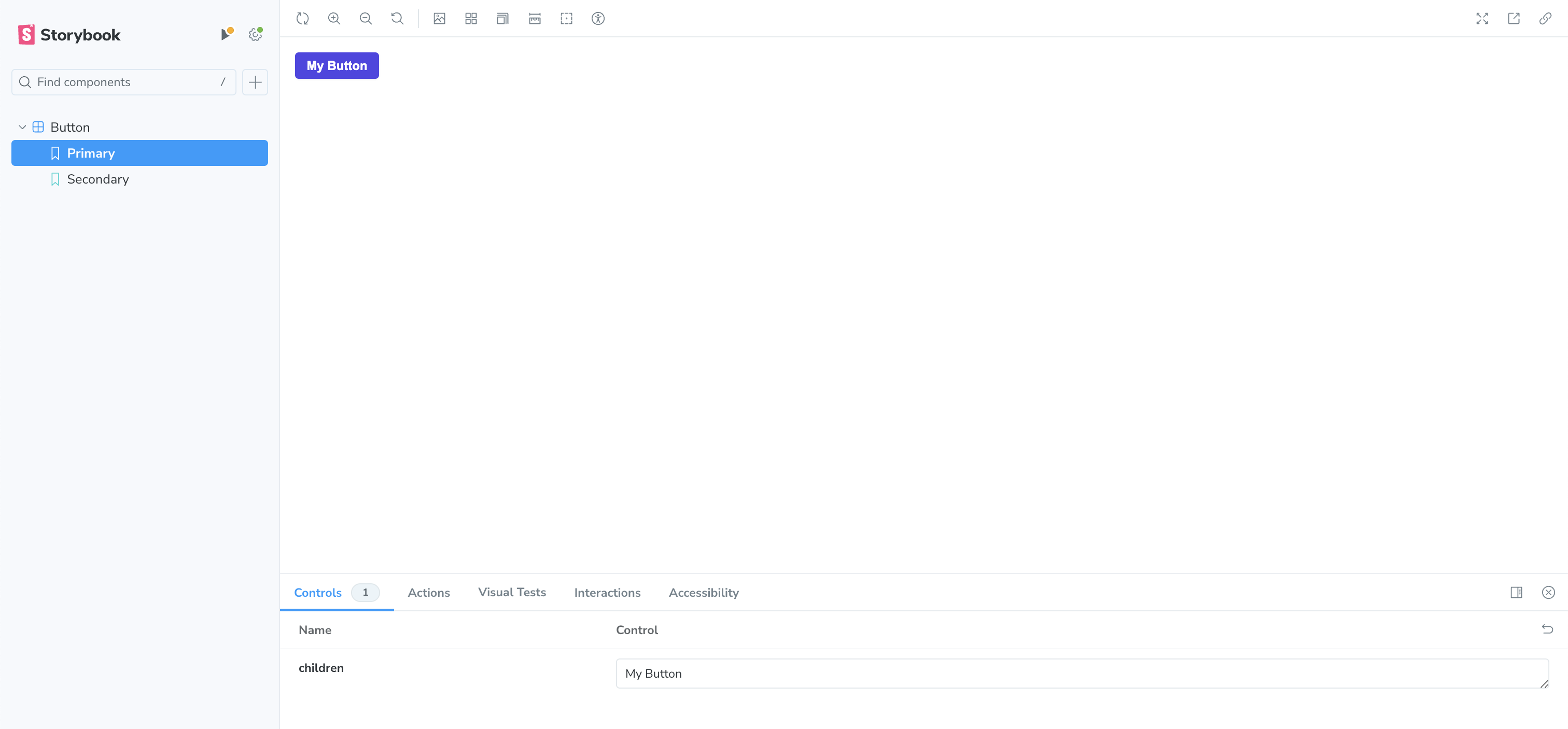
Styling Our Variants
In the button.module.css we already have some styling for our variants.
Now we need to dynamically add them to our our component.
Simple—but tedious—way to do this is to just append them to the className string. This might look something like this:
export const Button = ({ variant = 'primary', ...props }: ButtonProps) => {
    let className = styles.button;
    if (variant === 'secondary') className += ` ${styles.secondary}`;
    if (variant === 'destructive') className += ` ${styles.destructive}`;

    return <button className={className} {...props} />;
};
Adding Stories for Our Variants
Our button.stories.tsx now will look like this:
import type { Meta, StoryObj } from '@storybook/react';

import { Button } from './button';

const meta = {
    title: "Button",
    component: Button,
    args: {
        children: "My Button"
    }
} satisfies Meta;

export default meta;

type Story = StoryObj<typeof Button>;

export const Primary: Story = {
    args: {
        children: 'Button',
        variant: 'primary',
    },
};

export const Secondary: Story = {
    args: {
        children: 'Button',
        variant: 'secondary',
    },
};

export const Destructive: Story = {
    args: {
        children: 'Button',
        variant: 'destructive',
    },
};
Now we can see each variant in our Storybook as well as an additional control for swapping between the variants.
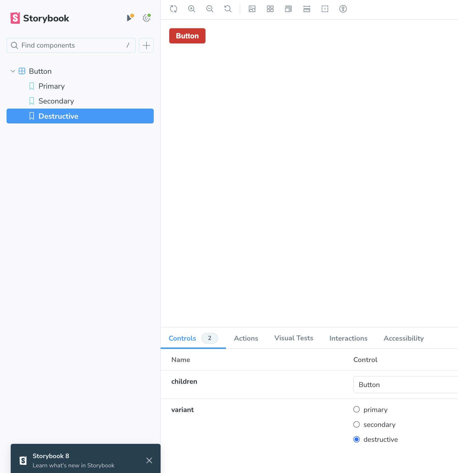
Using clsx to Compose CSS Class Names
Let's install this dependency by npm install clsx or pnpm install clsx
In the above example, we manually append string to compose list of classes based on the variant props, then apply these styles to our button.
BUT it's going to get tedious and hard to read and maintain as the complexity of the button grows.
We can use clsx to Dynamically applying classes, to make our future life easier.
import { ComponentProps } from 'react';
import styles from './button.module.css';
import clsx from 'clsx';

type ButtonProps = ComponentProps<'button'> & {
  variant?: 'primary' | 'secondary' | 'destructive';
};

export const Button = ({ variant = 'primary', ...props }: ButtonProps) => {
  const buttonStyles = clsx(
    styles.button,
    variant == 'secondary' && styles.secondary,
    variant == 'destructive' && styles.destructive,
  )

  return <button className={buttonStyles} {...props} />;
};
OR something like this:
import { ComponentProps } from 'react';
import styles from './button.module.css';
import clsx from 'clsx';

type ButtonProps = ComponentProps<'button'> & {
  variant?: 'primary' | 'secondary' | 'destructive';
};

export const Button = ({ variant = 'primary', ...props }: ButtonProps) => {
  const buttonStyles = clsx(
    styles.button,
    variant && styles[variant]
  )

  return <button className={buttonStyles} {...props} />;
};
Let's flip back to the Storybook UI, and everything still work as expected.
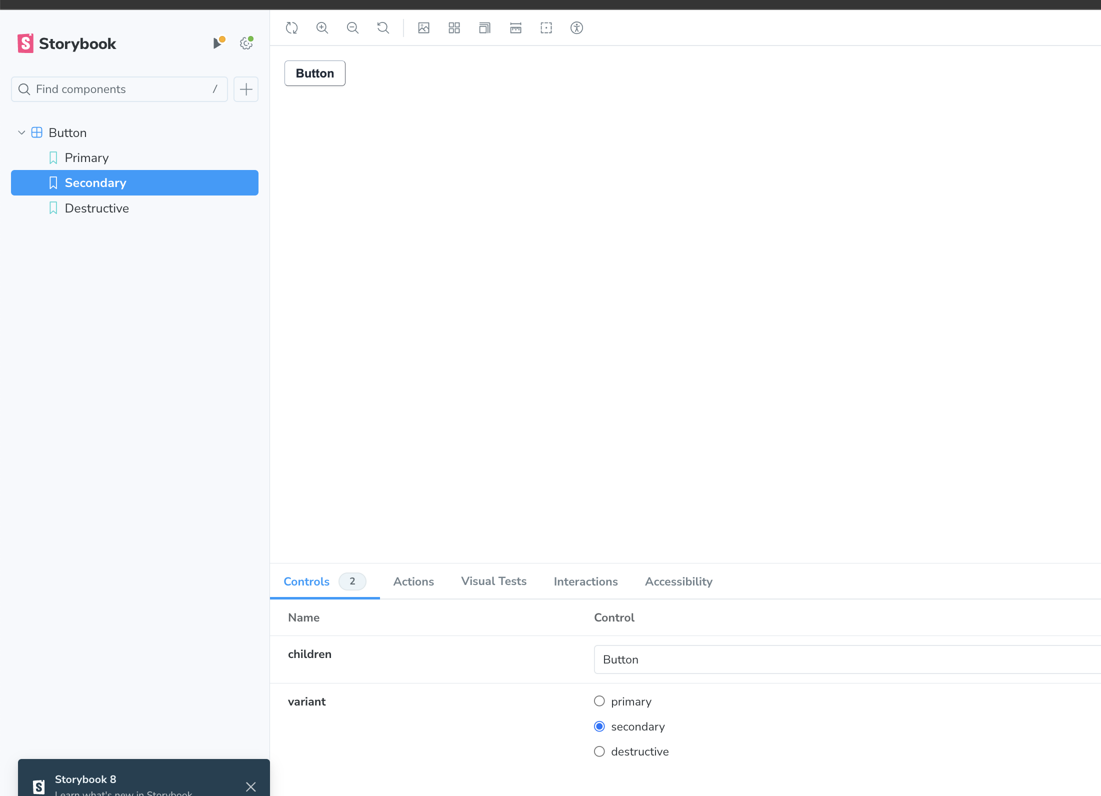
clsx also supports an object notation that you can use if you prefer.
export const Button = ({ variant = 'primary', ...props }: ButtonProps) => {
    return (
        <button
            className={clsx(styles.button, {
                [styles.secondary]: variant === 'secondary',
                [styles.destructive]: variant === 'destructive',
            })}
            {...props}
        />
    );
};
clsx is somewhat helpful in this example, but it becomes a lot more useful when we have even slightly more complicated logic.
Addings Controls
In the button.module.css we already have style for the button when it in the disabled state.
But for now we don't have a particular way to trigger that state in our stories.
We could add additional stories for the disabled state of each of our button variants.
Luckily, Storybook allows us to create custom controls that we can manipulate on our stories.
All that we need to do is add the following to the Meta of our story.
const meta = {
  title: 'Button',
  component: Button,
  args: {
    children: 'My Button',
  },
  argTypes: {
    disabled: {
      control: "boolean",
      description: 'Disables the button',
    }
  }
} satisfies Meta;
Now we have the ability to set the disabled property in our controls.
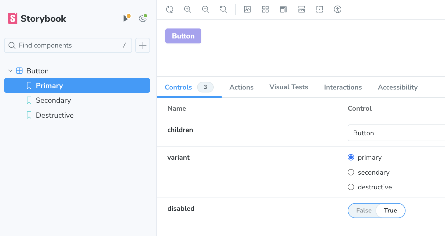
We can click to each story in order to see it.
Next, we can also set the default value of the disabled field on each story.
export const Primary: Story = {
    args: {
        children: 'Button',
        variant: 'primary',
        disabled: false,
    },
};

export const Secondary: Story = {
    args: {
        children: 'Button',
        variant: 'secondary',
        disabled: false,
    },
};

export const Destructive: Story = {
    args: {
        children: 'Button',
        variant: 'destructive',
        disabled: false,
    },
};
By setting the default value, it can save us one extra click. It is totally up to you to decide whether it's worth it or not.
Another example, we can change the control of the variant props as well.
const meta = {
  title: 'Button',
  component: Button,
  args: {
    children: 'My Button',
  },
  argTypes: {
    disabled: {
      control: "boolean",
      description: 'Disables the button',
    },
    variant: {
      control: "select"
    }
  }
} satisfies Meta;
Here's the result:

An Alternative Approach for Setting a Default Value
One of the cool things about Storybook stories is that they’re just ES Modules.
We could use the spread operator if you find yourself needing to make wide-scale changes often.
This is helpful if we want to use aspects of one story in the context of another story.
export const Primary: Story = {
    args: {
        children: 'Button',
        variant: 'primary',
        disabled: false,
    },
};

export const Secondary: Story = {
    args: {
        ...Primary.args,
        variant: 'secondary',
    },
};

export const Destructive: Story = {
    args: {
        ...Primary.args,
        variant: 'destructive',
    },
};
Adding Sizes
Now let's add these styles to your button.module.css
.small {
  font-size: 0.875rem;
  padding: 0.25rem 0.5rem;
}

.medium {
  font-size: 0.875rem;
  padding: 0.375rem 0.625rem;
}

.large {
  font-size: 0.875rem;
  padding: 0.5rem 0.75rem;
}
Flip back to the button.tsx
Adjust the Button Props type to accept the size props.
type ButtonProps = ComponentProps<'button'> & {
  variant?: 'primary' | 'secondary' | 'destructive';
  size?: 'small' | 'medium' | 'large';
};
As a result, the component needs to be changed accordingly to receive new size props as well as the button classes.
import { ComponentProps } from 'react';
import styles from './button.module.css';
import clsx from 'clsx';

type ButtonProps = ComponentProps<'button'> & {
  variant?: 'primary' | 'secondary' | 'destructive';
  size?: 'small' | 'medium' | 'large';
};

export const Button = ({ variant = 'primary', size = 'small', ...props }: ButtonProps) => {
  const buttonStyles = clsx(
                    styles.button,
                    variant && styles[variant],
                    size && styles[size]);

  return <button className={buttonStyles} {...props} />;
};
Now let's change the button.stories.tsx to add a control for the new prop.
const meta = {
  title: 'Button',
  component: Button,
  args: {
    children: 'My Button',
  },
  argTypes: {
    disabled: {
      control: 'boolean',
      description: 'Disables the button',
    },
    variant: {
      control: 'select',
    },
    // ADD THIS !!!
    size: {
      control: 'select'
    }
  },
} satisfies Meta;
You can go ahead and add default props to each story.
export const Primary: Story = {
  args: {
    children: 'Button',
    variant: 'primary',
    disabled: true,
    size: "large"
  },
};

export const Secondary: Story = {
  args: {
    children: 'Button',
    variant: 'secondary',
    disabled: false,
    size: "medium"
  },
};

export const Destructive: Story = {
  args: {
    children: 'Button',
    variant: 'destructive',
    size: "small"
  },
};

Default Arguments
We can set some default arguments that Storybook will fall back to unless we override them in our stories.
This feature can also help us to remove a lot of boilerplate repeated code in all of our stories.
Back to the button.stories.tsx
import type { Meta, StoryObj } from '@storybook/react';

import { Button } from './button';

const meta = {
  title: 'Button',
  component: Button,
  // Set the Default Arguments for each Button Story here!
  args: {
        children: 'Button',
        variant: 'primary',
        size: 'medium',
        disabled: false,
    },
  argTypes: {
    disabled: {
      control: 'boolean',
      description: 'Disables the button',
    },
    variant: {
      control: 'select',
    },
    size: {
      control: 'radio',
    },
  },
} satisfies Meta;

export default meta;

type Story = StoryObj<typeof Button>;

export const Primary: Story = {
  args: {
    variant: 'primary',
    disabled: true,
  },
};

export const Secondary: Story = {
  args: {
    variant: 'secondary',
  },
};

export const Destructive: Story = {
  args: {

    variant: 'destructive',
  },
};
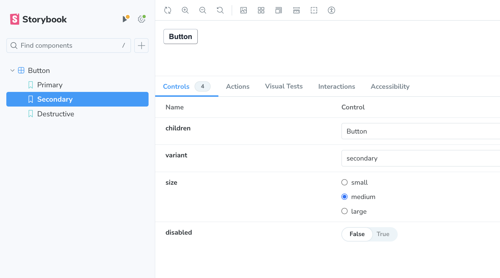
Here is our end result:
_
Reference Source: Steve Kinney
Cover Image from Unsplash
Subscribe to my newsletter
Read articles from Howard directly inside your inbox. Subscribe to the newsletter, and don't miss out.
Written by

Howard
Howard
🙋♂️ I'm a Software Engineer, Voracious Reader, Writer (tech, productivity, mindset), LOVE Fitness, Piano, Running.💻 Started coding professionally in 2020 as a full-time Frontend engineer. ⚗️ I make things in the messy world of JS, Computer Science, and Software Engineering more digestible. Or I would like to say “Distilled” 📹 Documenting my learning journey, and working experience along the way. Share how I learn and build my personal projects.