Using Plotly for Interactive Dice Roll Data Visualization
 Sakib Bin Kamal
In this tutorial, we will learn how to use Plotly to create interactive visualizations. Our project focuses on analyzing the results of rolling dice. When rolling a single six-sided die, any number from 1 to 6 has an equal chance of appearing. However, when you roll multiple dice, some numbers become more likely than others. Our goal is to determine these probabilities by simulating dice rolls and creating a dataset. After that, we will visually represent the results of multiple rolls to show which outcomes are statistically more likely.
What is Plotly?
Plotly is an open-source graphing library that lets users create interactive, web-based visualizations. It supports many chart types, including line plots, scatter plots, bar charts, and more. Plotly is especially useful for creating visualizations that can be embedded in web applications, as it offers interactive features like zooming, panning, and hover information.
Installing Plotly
We'll install Plotly using pip. We also need to install pandas, a library for efficiently working with data, because Plotly Express depends on it.
$ python -m pip install --user plotly
$ python -m pip install --user pandas
Visit the gallery of chart types at Plotly's website to see the different visualizations you can create with Plotly.
Creating the Die Class
First, we'll create the following Die class to simulate the roll of a die. We'll name the file Die.py.
from random import randint

class Die:
    """A class representing a single die."""

    def __init__(self, num_sides = 6):
        """Assume a six-sided die"""
        self.num_sides = num_sides


    def roll(self):
        """Return a random value between 1 and number of sides."""
        return randint(1, self.num_sides)
The __init__ method takes one optional argument. When an instance of Die is created, the number of sides will be six if no argument is provided. If an argument is given, it will set the number of sides on the die.
The roll() method uses the randint() function to return a random number between 1 and the number of sides. This function can return the starting value (1), the ending value (num_sides), or any integer in between. Dice are named according to their number of sides: a six-sided die is called a D6, a ten-sided die is called a D10, and so on.
Rolling the Die
We first import the Plotly Express module using the alias px to avoid typing plotly.express repeatedly. We'll create an instance of a die to simulate rolling two D8 dice. We name this file dice_visual.py.
import plotly.express as px

from die import Die

# Create two D8.
die_1 = Die(8)
die_2 = Die(8)

# Make some rolls, and store results in a list.
results = []
for roll_num in range(500_000):
    result = die_1.roll() + die_2.roll()
    results.append(result)
We created two instances of the Die class, each with eight sides (die_1 and die_2). We then rolled the two dice and calculated the sum of their results for each roll. The results were stored in the list results.
Analyzing the Results
The smallest possible result is the sum of the smallest number on each die (2). The largest possible result is the sum of the largest number on each die (16) which is assigned to max_results. The variable max_result improves the readability of the code for generating poss_results. We could've written range (2,16), but this would work only for two D8 dice. When simulating real-world circumstances, it is best to develop code that can readily handle a wide range of scenarios.
# Analyze the result.
frequencies = []
max_results = die_1.num_sides + die_2.num_sides
poss_results = range(2, max_results + 1)
for value in poss_results:
    frequency = results.count(value)
    frequencies.append(frequency)
Visualizing the results.
We defined the title and assigned it to 'title'. We created a dictionary to specify axis labels. The dictionary's keys represent the labels we want to customize, while the values represent the custom labels we want to use. We name the x-axis as 'Result' and the y-axis as 'Frequency of Result'. To build a bar graph, we use the px.bar() function and pass in the optional variables 'title' and 'labels'.
# Visualize the results.
title = "Results of Rolling Two D8 Dice 500,000 Times"
labels = {'x': 'Result', 'y': 'Frequency of Result'}
fig = px.bar(x = poss_results, y = frequencies, title = title,
 labels = labels)
fig.show()
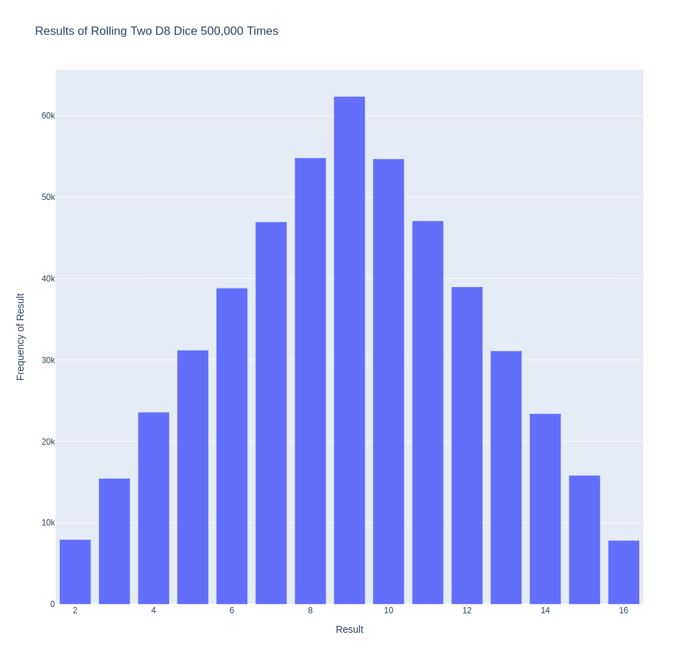
The plot is generated with an appropriate title and labels for each axis, as seen in the picture below.

Further Customizations
There is one issue we need to address with the plot we just created. Because there are 11 bars, the default x-axis layout settings leave some of the bars unlabelled. While the default settings are adequate for most visualizations, this chart would appear better with all of the bars labeled.
Plotly offers an update_layout() method that lets you make various changes to a figure after it has been created. Here's how you can instruct Plotly to give each bar its own label.
# Further customize chart.
fig.update_layout(xaxis_dtick = 1)
fig.show()
#fig.write_html('dice_visual_d6d10.xhtml')
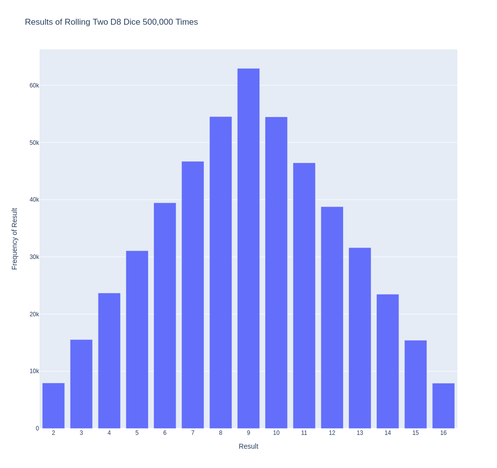
The update_layout() method applies to the fig object, which represents the entire chart. We use the xaxis_dtick option to set the distance between tick marks on the x-axis. We set the spacing to 1 so that each bar is labeled. When you run dice_visual.py again, you should see labels on each bar.

This code can be easily customized to simulate rolling dice of different sizes. To create a D6 and D10, pass the arguments 6 and 10 when creating the two die instances. Change the first loop to the desired number of rolls and change the title of the graph accordingly.
We can get our program to save the chart as an HTML file automatically by replacing the call to fig.show() with a call to fig.write_html().
The write_html() method requires one argument: the name of the file to write to. If you only provide a filename, the file will be saved in the same directory as the .py file. You can also call write_html() with a Path object to save the output file anywhere on your system.
Here is the complete code:
import plotly.express as px

from die import Die

# Create two D8.
die_1 = Die(8)
die_2 = Die(8)

# Make some rolls, and store results in a list.
results = []
for roll_num in range(500_000):
    result = die_1.roll() + die_2.roll()
    results.append(result)

# Analyze the result.
frequencies = []
max_results = die_1.num_sides + die_2.num_sides
poss_results = range(2, max_results + 1)
for value in poss_results:
    frequency = results.count(value)
    frequencies.append(frequency)

# Visualize the results.
title = "Results of Rolling Two D8 Dice 500,000 Times"
labels = {'x': 'Result', 'y': 'Frequency of Result'}
fig = px.bar(x = poss_results, y = frequencies, title = title, labels = labels)

# Further customize chart.
fig.update_layout(xaxis_dtick = 1)
fig.write_html('dice_visual.xhtml')
Refactoring
For clarity, the listings in this section use the long form of for loops. We can refactor the code by using list comprehensions for one or both of the loops. Here is the code using list comprehension:
import plotly.express as px

from die import Die

# Create two D8.
die_1 = Die(8)
die_2 = Die(8)

# Make some rolls, and store results in a list.
results = [die_1.roll() + die_2.roll() for roll_num in range(500_000) ]

# Analyze the result.
max_results = die_1.num_sides + die_2.num_sides
poss_results = range(2, max_results + 1)
frequencies = [results.count(value) for value in poss_results]

# Visualize the results.
title = "Results of Rolling Two D8 Dice 500,000 Times"
labels = {'x': 'Result', 'y': 'Frequency of Result'}
fig = px.bar(x = poss_results, y = frequencies, title = title, labels = labels)

# Further customize chart.
fig.update_layout(xaxis_dtick = 1)

fig.write_html('dice_visual_list_comprehension.xhtml')
Conclusion
In conclusion, analyzing and presenting statistical data becomes powerful and engaging with Plotly for interactive dice roll data visualization. By simulating dice rolls and visualizing the outcomes, we can better understand the probabilities of different results. Plotly's interactive features, such as hover information, panning, and zooming, enhance the user experience and make data more accessible. Additionally, the ability to customize and save visualizations as HTML files makes it easy to share and integrate them into web applications. This article demonstrates how to use Plotly's features to create informative and attractive charts. Plotly is an excellent tool for data analysis and presentation.
Subscribe to my newsletter
Read articles from Sakib Bin Kamal directly inside your inbox. Subscribe to the newsletter, and don't miss out.
Written by

Sakib Bin Kamal
Sakib Bin Kamal
I am a self taught back-end developer, data analyst and technical writer.