How to Implement Custom Theme (Dark & Light Mode) in Flutter using ThemeExtension
 Peter Ewanfo
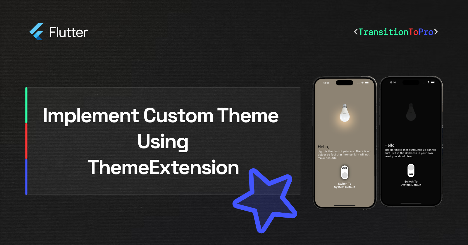
Application theming is now a major practice in mobile and web development. With more users adopting it and major apps integrating these practices, it is important for us as engineers to know how to implement it.
In this article, I will explain how to effectively implement dynamic themes in our application. But first, what does dynamic theme really mean and why is it important?
Dynamic theming allows an application to change its appearance based on the system’s preferred mode or the user’s chosen settings. Usually, an application’s appearance can be in two modes: Dark Mode and Light Mode.
It is widely supported in applications to enhance user comfort and application content readability based on user's lighting conditions or time of day. It works by adjusting the device's theme, which affects all apps, or by modifying the theme within the application settings.
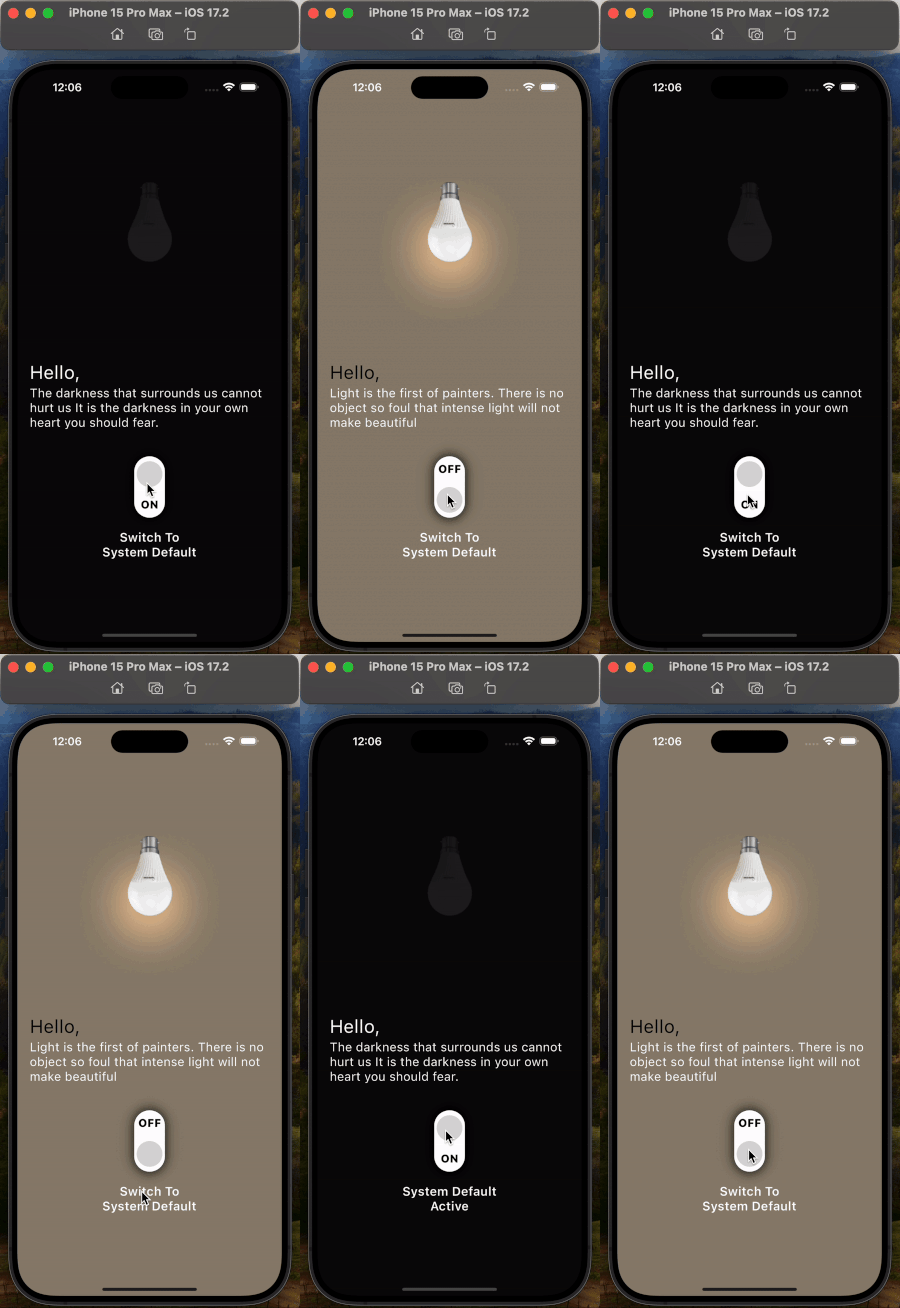
Without further ado, let's build a simple application to help us understand how to implement dynamic theming. We will create an app that can turn a light bulb on and off and change the application theme from light mode to dark mode. The application will function based on the description below.
When a user launches the app for the first time, the default theme will match the device's setting. This means if the user is in dark mode, the app will also use dark mode. If the user is in light mode, the app will use light mode.
A user can decide to change the application's mode, and the change should be saved for the user's next visit.
A user can also decide to return the application to system default theme settings.
Let's see how our application should look when it's finished.
Expo: You can use the link below to clone the repository for this project example.
https://github.com/peterewanfo/switch_lightbulb
Quickly, let's get our hands dirty with code.
Installing Necessary Packages
In your pubspec.yaml file, add the following packages
  hooks_riverpod: ^2.5.1
  shared_preferences: ^2.2.3
  get_it: ^7.7.0
  flutter_svg: ^2.0.10+1
Why do we need these packages?
hooks_riverpodpackage is used to separate logic from UI. We don't want our code scattered everywhere.shared_preferencespackage is used for the persistent storage of theme settings. Our app needs to remember the user's preferred theme and then reuse the same theme the next time the user visits our app.get_itpackage is used as a service locator to store references to class instances and provide them when required.flutter_svgpackage is used to render SVG images in this project. We are using this package specifically for the UI of this example project.
The folder and file structure for this application is as describe below
SWITCH_LIGHTBULB/
   | - android
   | - assets
   | - build
   | - ios
   | - lib
   | - lib/
      | - data
         | - local_cache.dart
      | - presentation/
         | - routes
         | - styles
            | - app_color_extension.dart
            | - custom_colors.dart
         | - viewModel
            | - base_change_notifier.dart
         | - views
            | - component
                | - button_switcher_widget.dart
            | - switch_lightbulb_screen.dart
      | - utils
         | - app_constants.dart
         | - enums.dart
         | - extension.dart
         | - helper.dart
         | - locator.dart
      | - app.dart
      | - main.dart
   | - test
   | - .env
Let's see how we group the colour palette used in our app to support both Light and Dark modes, and how we use this palette to generate ThemeData for both modes.
Below is our Colour Palette:
import 'package:flutter/material.dart';

class CustomColors {
  static Color get lightTextPrimary => const Color(0xFF000000);
  static Color get darkTextPrimary => const Color(0xFFFFFFFF);

  static Color get lightBackground => const Color(0xFF8F8371);
  static Color get darkBackground => const Color(0xFF080808);

  static Color get lightShadowdrop => const Color(0xFFFCCE9C);
  static Color get darkShadowdrop => const Color(0xFF080808);

  static Color get sharedTextPrimary2 => const Color(0xFFFFFFFF);
  static Color get sharedTextPrimary3 => const Color(0xFF000000);

  static Color get sharedBackgroundPrimary => const Color(0xFF000000);
}
NOTE 1: for each color, we have two variations, one for each mode. For example, take TextPrimary. There is lightTextPrimary and darkTextPrimary.
NOTE 2: For components that use the same colors in both light and dark modes, we label the color palette as "shared." For example, sharedBackgroundPrimary.
With this, let's create a custom AppColorExtension class extending ThemeExtension for custom colors
import 'package:flutter/material.dart';

class AppColorExtension extends ThemeExtension<AppColorExtension> {
  final Color textPrimary;
  final Color sharedTextPrimary2;
  final Color sharedTextPrimary3;
  final Color sharedBackgroundPrimary;
  final Color shadowDrop;
  final Color background;
  const AppColorExtension({
    required this.textPrimary,
    required this.sharedTextPrimary2,
    required this.sharedTextPrimary3,
    required this.sharedBackgroundPrimary,
    required this.shadowDrop,
    required this.background,
  });

  @override
  ThemeExtension<AppColorExtension> copyWith({
    Color? textPrimary,
    Color? sharedTextPrimary2,
    Color? sharedTextPrimary3,
    Color? sharedBackgroundPrimary,
    Color? shadowDrop,
    Color? background,
  }) {
    return AppColorExtension(
      textPrimary: textPrimary ?? this.textPrimary,
      sharedTextPrimary2: sharedTextPrimary2 ?? this.sharedTextPrimary2,
      sharedTextPrimary3: sharedTextPrimary3 ?? this.sharedTextPrimary3,
      sharedBackgroundPrimary:
          sharedBackgroundPrimary ?? this.sharedBackgroundPrimary,
      shadowDrop: shadowDrop ?? this.shadowDrop,
      background: background ?? this.background,
    );
  }

  @override
  ThemeExtension<AppColorExtension> lerp(
      covariant ThemeExtension<AppColorExtension>? other, double t) {
    if (other is! AppColorExtension) {
      return this;
    }

    return AppColorExtension(
      textPrimary: Color.lerp(textPrimary, other.textPrimary, t)!,
      sharedTextPrimary2:
          Color.lerp(sharedTextPrimary2, other.sharedTextPrimary2, t)!,
      sharedTextPrimary3:
          Color.lerp(sharedTextPrimary3, other.sharedTextPrimary3, t)!,
      sharedBackgroundPrimary: Color.lerp(
          sharedBackgroundPrimary, other.sharedBackgroundPrimary, t)!,
      shadowDrop: Color.lerp(shadowDrop, other.shadowDrop, t)!,
      background: Color.lerp(background, other.background, t)!,
    );
  }
}
Before we continue, let's create an enum to handle the different themes supported in our application.
enum ProjectTheme {
  lightTheme,
  darkTheme,
  systemDefaultTheme,
}
Let's quickly write a helper function called generateThemeData that takes our project theme as a parameter and returns a ThemeData based on the given theme.
import 'package:flutter/material.dart';
import 'package:flutter/scheduler.dart';
import 'package:switch_lightbulb/utils/app_constants.dart';

import '../presentation/styles/__export__.dart';
import 'enums.dart';

class Helper {
  static ThemeData generateThemeData({
    required ProjectTheme applicationTheme,
  }) {
    ThemeData defaultLightTheme = ThemeData(
      scaffoldBackgroundColor: CustomColors.lightBackground,
      textSelectionTheme: const TextSelectionThemeData(
        cursorColor: Colors.grey,
      ),
      extensions: <ThemeExtension<dynamic>>{
        AppColorExtension(
          textPrimary: CustomColors.lightTextPrimary,
          sharedTextPrimary2: CustomColors.sharedTextPrimary2,
          sharedTextPrimary3: CustomColors.sharedTextPrimary3,
          sharedBackgroundPrimary: CustomColors.sharedBackgroundPrimary,
          shadowDrop: CustomColors.lightShadowdrop,
          background: CustomColors.lightBackground,
        ),
      },
    );

    ThemeData defaultDarkTheme = ThemeData(
      scaffoldBackgroundColor: CustomColors.darkBackground,
      textSelectionTheme: const TextSelectionThemeData(
        cursorColor: Colors.grey,
      ),
      useMaterial3: true,
      extensions: <ThemeExtension<dynamic>>{
        AppColorExtension(
          textPrimary: CustomColors.darkTextPrimary,
          sharedTextPrimary2: CustomColors.sharedTextPrimary2,
          sharedTextPrimary3: CustomColors.sharedTextPrimary3,
          sharedBackgroundPrimary: CustomColors.sharedBackgroundPrimary,
          shadowDrop: CustomColors.darkShadowdrop,
          background: CustomColors.darkBackground,
        ),
      },
      dividerTheme: DividerThemeData(
        color: Colors.grey[300],
        thickness: 0.5,
        space: 0.5,
        indent: 10,
        endIndent: 10,
      ),
    );

    switch (applicationTheme) {
      case ProjectTheme.darkTheme:
        return defaultDarkTheme;
      case ProjectTheme.lightTheme:
        return defaultLightTheme;
      case ProjectTheme.systemDefaultTheme:
        var brightness =
            SchedulerBinding.instance.platformDispatcher.platformBrightness;
        bool isDarkMode = brightness == Brightness.dark;
        if (isDarkMode) {
          return defaultDarkTheme;
        } else {
          return defaultLightTheme;
        }
      default:
        return defaultLightTheme;
    }
  }
}
In the above code snippet, the helper function generateThemeData returns either defaultLightTheme or defaultDarkTheme based on the ProjectTheme parameter supplied. If the supplied ProjectTheme is "systemDefaultTheme," the function detects the platform's brightness using an instance of the SchedulerBinding class. Based on the platform brightness, it returns either the dark theme or the light theme.
Let's review and understand this section of the code snippet again.
switch (applicationTheme) {
    case ProjectTheme.darkTheme:
        return defaultDarkTheme;
    case ProjectTheme.lightTheme:
        return defaultLightTheme;
    case ProjectTheme.systemDefaultTheme:
        var brightness =
            SchedulerBinding.instance.platformDispatcher.platformBrightness;
        bool isDarkMode = brightness == Brightness.dark;
        if (isDarkMode) {
          return defaultDarkTheme;
        } else {
          return defaultLightTheme;
        }
    default:
        return defaultLightTheme;
}
We're already making great progress. Let's gooo!

Quickly remember, we need to save a user's preferred theme so it is used the next time they open the application. We will do this using shared preferences.
Let's create an application constants file to define our various themes and the active theme. Instead of using string variables throughout our app, we will store all string variables in constants and reference them as needed.
Below is our app constants code snippet:
class AppConstants {
  static const String darkTheme = 'darkTheme';
  static const String lightTheme = 'lightTheme';
  static const String systemDefaultTheme = 'systemDefaultTheme';
  static const String activeTheme = 'activeTheme';
}
Let's create the following helper functions
a. convertThemeNameToEnum: Converts a theme name from a string to an enum
b. getThemeModeFromThemeName: Retrieves the theme mode from the application theme constant
c. getDestinationTheme: Helps in theme switching; returns the opposite theme from the current theme parameter provided
  static ProjectTheme convertThemeNameToEnum(String applicationTheme) {
    switch (applicationTheme) {
      case AppConstants.lightThemeKey:
        return ProjectTheme.lightTheme;
      case AppConstants.darkThemeKey:
        return ProjectTheme.darkTheme;
      case AppConstants.systemDefaultThemeKey:
        return ProjectTheme.systemDefaultTheme;
      default:
        return ProjectTheme.systemDefaultTheme;
    }
  }

  static ThemeMode getThemeModeFromThemeName(String applicationTheme) {
    switch (applicationTheme) {
      case AppConstants.lightThemeKey:
        return ThemeMode.light;
      case AppConstants.darkThemeKey:
        return ThemeMode.dark;
      default:
        var brightness =
            SchedulerBinding.instance.platformDispatcher.platformBrightness;
        bool isDarkMode = brightness == Brightness.dark;
        if (isDarkMode) {
          return ThemeMode.dark;
        } else {
          return ThemeMode.light;
        }
    }
  }

  static ProjectTheme getDestinationTheme({
    required String currentTheme,
    bool activateSystemDefault = false,
  }) {
    switch (currentTheme) {
      case AppConstants.lightThemeKey:
        return ProjectTheme.darkTheme;
      case AppConstants.darkThemeKey:
        return ProjectTheme.lightTheme;
      default:
        if (activateSystemDefault) {
          return ProjectTheme.systemDefaultTheme;
        } else {
          var brightness =
              SchedulerBinding.instance.platformDispatcher.platformBrightness;
          bool isDarkMode = brightness == Brightness.dark;
          if (isDarkMode) {
            return ProjectTheme.lightTheme;
          } else {
            return ProjectTheme.darkTheme;
          }
        }
    }
  }
Shared Preferences requires us to save information in key-value pairs. To keep our code uniform, let's create a LocalCache class that handles saving and retrieving data of any datatype from shared preferences. Code snippet below:
import 'dart:convert';
import 'package:shared_preferences/shared_preferences.dart';

class LocalCache {
  SharedPreferences sharedPreferences;

  LocalCache({
    required this.sharedPreferences,
  });

  Object? getFromLocalCache(String key) {
    try {
      return sharedPreferences.get(key);
    } catch (e) {
      /// Print Cached Error
    }
    return null;
  }

  Future<void> removeFromLocalCache(String key) async {
    await sharedPreferences.remove(key);
  }

  Future<void> saveToLocalCache({required String key, required value}) async {
    if (value is String) {
      await sharedPreferences.setString(key, value);
    }
    if (value is bool) {
      await sharedPreferences.setBool(key, value);
    }
    if (value is int) {
      await sharedPreferences.setInt(key, value);
    }
    if (value is double) {
      await sharedPreferences.setDouble(key, value);
    }
    if (value is List<String>) {
      await sharedPreferences.setStringList(key, value);
    }
    if (value is Map) {
      await sharedPreferences.setString(key, json.encode(value));
    }
  }
}
To put it all together, as mentioned earlier, we will use the GetIt package as service locator. Let's quickly register our shared preferences and LocalCache instance using GetIt.
Code Snippet below
import 'package:get_it/get_it.dart';
import 'package:shared_preferences/shared_preferences.dart';

import '../data/local_cache.dart';

GetIt locator = GetIt.instance;

Future<void> setupLocator() async {

  final sharedPreferences = await SharedPreferences.getInstance();
  locator.registerSingleton(sharedPreferences);

  //Register Custom Shared Preference
  locator.registerLazySingleton<LocalCache>(
    () => LocalCache(
      sharedPreferences: locator(),
    ),
  );
}
setupLocator function is called in our main.dart file
import 'package:flutter/material.dart';
import 'package:flutter/services.dart';
import 'package:hooks_riverpod/hooks_riverpod.dart';

import 'app.dart';
import 'utils/__export__.dart';

void main() async {
  WidgetsFlutterBinding.ensureInitialized();

  await setupLocator();

  SystemChrome.setPreferredOrientations(
      [DeviceOrientation.portraitUp, DeviceOrientation.portraitDown]).then(
    (val) {
      runApp(
        const ProviderScope(
          child: App(),
        ),
      );
    },
  );
}
From the main.dart code snippet, we made ProviderScope the root of our widget tree to store the state of providers. The App widget, which is a stateful widget, was made the child of ProviderScope.
Let's create a BaseChangeNotifier class that extends ChangeNotifier. In BaseChangeNotifier, we will expose the activeTheme variable to notify our UI about any changes in theme settings. We will also expose switchTheme, which will be triggered by the user's click event to switch themes, and refreshActiveTheme to simply refresh the active theme. Code snippet below
import 'package:flutter/material.dart';
import 'package:hooks_riverpod/hooks_riverpod.dart';

import '../../data/local_cache.dart';
import '../../utils/__export__.dart';

final baseViewModelRef = ChangeNotifierProvider<BaseChangeNotifier>((ref) {
  return BaseChangeNotifier();
});

class BaseChangeNotifier extends ChangeNotifier {
  late LocalCache localCache;
  BaseChangeNotifier({
    LocalCache? localCache,
  }) {
    this.localCache = localCache ?? locator();
  }

  String _activeTheme = locator<LocalCache>()
      .getFromLocalCache(AppConstants.activeThemeKey)
      .toString();
  String get activeTheme => _activeTheme;
  set activeTheme(String val) {
    _activeTheme = val;
    notifyListeners();
  }

  void refreshActiveTheme(){
    notifyListeners();
  }

  void switchTheme({
    required ProjectTheme destinationTheme,
  }) {
    localCache.saveToLocalCache(
      key: AppConstants.activeThemeKey,
      value: destinationTheme.name,
    );
    activeTheme = destinationTheme.name;
  }
}
Let's remember that our application needs to switch to the system default theme immediately when a user sets it. To achieve this, we will monitor our application lifecycle and call the refreshActiveTheme method onResume. Here's how we achieved this in app.dart:
import 'package:flutter/material.dart';
import 'package:flutter/scheduler.dart';
import 'package:hooks_riverpod/hooks_riverpod.dart';

import 'presentation/viewModel/base_change_notifier.dart';
import 'utils/__export__.dart';
import 'presentation/views/switch_lightbulb_screen.dart';

class App extends StatefulHookConsumerWidget {
  const App({super.key});

  @override
  ConsumerState<App> createState() => _AppState();
}

class _AppState extends ConsumerState<App> with WidgetsBindingObserver {
  @override
  void initState() {
    WidgetsBinding.instance.addObserver(this);
    super.initState();
  }

  @override
  void dispose() {
    WidgetsBinding.instance.removeObserver(this);
    super.dispose();
  }

  @override
  void didChangeAppLifecycleState(AppLifecycleState state) {
    if (state == AppLifecycleState.resumed) {
      if (mounted) {
        WidgetsBinding.instance.addPostFrameCallback((timeStamp) {
          ProviderScope.containerOf(context)
              .read(baseViewModelRef)
              .refreshActiveTheme();
        });
      }
    }
    super.didChangeAppLifecycleState(state);
  }

  @override
  Widget build(BuildContext context) {
    final useBaseViewModelRef = ref.watch(baseViewModelRef);

    var brightness =
        SchedulerBinding.instance.platformDispatcher.platformBrightness;
    bool isDarkMode = brightness == Brightness.dark;

    return MaterialApp(
      debugShowCheckedModeBanner: false,
      title: "Switch  LightBulb",
      theme: Helper.generateThemeData(
        applicationTheme: Helper.convertThemeNameToEnum(
          useBaseViewModelRef.activeTheme,
        ),
      ),
      darkTheme: Helper.generateThemeData(
        applicationTheme: Helper.convertThemeNameToEnum(
          useBaseViewModelRef.activeTheme,
        ),
      ),
      themeMode: isDarkMode ? ThemeMode.dark : ThemeMode.dark,
      builder: (context, wg) {
        return const SwitchLightBulbScreen();
      },
    );
  }
}
All the heavy lifting is done. Now let's see how we use colors in our views.
Instead of using colours directly in our UI, check out the code snippet below:
import 'package:flutter/material.dart';
import 'package:hooks_riverpod/hooks_riverpod.dart';
import '../styles/__export__.dart';
import '../viewModel/base_change_notifier.dart';

class ExampleView extends HookConsumerWidget {
  const ExampleView({super.key});

  @override
  Widget build(BuildContext context, ref) {
    final useBaseViewModelRef = ref.watch(baseViewModelRef);

    AppColorExtension appColorExtension =
        Theme.of(context).extension<AppColorExtension>()!;

    return Scaffold(
      backgroundColor: appColorExtension.background,
      body: Column(
        children: [
          const Text("Hello World"),
          if (Helper.getThemeModeFromThemeName(
                  useBaseViewModelRef.activeTheme) ==
              ThemeMode.light)
            const Text("Only On Light Mode"),
        ],
      ),
    );
  }
}
And that's a wrap!

Congratulations !!!
Here is the source code for the project you just worked on. If you found this article helpful and informative, please hit the like button and share it with your friends.
I am Ewanfo Lucky Peter, and I love building amazing products. To learn more about me and what I do, please connect with me on LinkedIn or X formerly Twitter. Follow me on GitHub for more updates on my repositories.
Subscribe to my newsletter
Read articles from Peter Ewanfo directly inside your inbox. Subscribe to the newsletter, and don't miss out.
Written by

Peter Ewanfo
Peter Ewanfo
Hey, Welcome to my space. I'm a Software Engineer who loves writing code in Dart/Flutter, SwiftUI and Python. Yes, I can play with Python and it won't bite me.