Build your own styleguide with Storybook
 Michał Roman
Why build a styleguide?
A styleguide is a comprehensive document that outlines the visual and functional elements of a web project. It serves as a single source of truth for the design and development teams, detailing everything from typography and color schemes to code conventions and component usage. The primary goal of a styleguide is to ensure consistency and coherence across the entire web project, making it easier to maintain and expand over time.
Key components of a styleguide
Typography: Defines the fonts, sizes, weights, and spacing used throughout the site.
Color Palette: Specifies the primary, secondary, and tertiary colors, along with their usage contexts.
Grid System: Describes the layout grid that helps in structuring the content.
UI Components: Details reusable elements such as buttons, forms, navigation menus, and modals.
Iconography: Provides a set of icons and their intended use cases.
Imagery: Guidelines for images, including aspect ratios, filters, and styling.
Code Conventions: Best practices for writing and organizing code, ensuring readability and maintainability.
Importance of having a styleguide
1. Consistency
A styleguide ensures that all elements of a web project adhere to the same design principles and aesthetic. This consistency is crucial for creating a cohesive user experience, as it helps users understand and navigate the site more intuitively. Consistent design elements also reinforce brand identity, making the site more recognizable.
2. Efficiency
With a styleguide, designers and developers can work more efficiently. They have a clear reference for the project's standards, reducing the time spent on decision-making and revisions. This efficiency accelerates the development process and allows teams to focus on innovation and problem-solving rather than reworking inconsistencies.
3. Scalability
As web projects grow, maintaining consistency becomes increasingly challenging. A styleguide provides a scalable framework that can accommodate new features and pages without sacrificing coherence. It ensures that new additions align with the established design and functionality, making it easier to expand the project over time.
4. Collaboration
A styleguide facilitates better collaboration between team members, especially in larger teams or when involving third-party contributors. Everyone has access to the same guidelines, which helps in aligning their work with the project's standards. This reduces misunderstandings and ensures that all contributors are on the same page.
5. Quality assurance
Having a styleguide helps in maintaining a high standard of quality throughout the project. It acts as a benchmark for design and code reviews, ensuring that all elements meet the specified criteria. This leads to a more polished and professional final product.
6. User experience
A well-defined styleguide enhances the user experience by creating a predictable and harmonious interface. Users can navigate the site with ease, as they encounter familiar patterns and elements. This predictability reduces cognitive load and improves overall satisfaction.
TL;DR
In summary, a styleguide is an essential tool for any web project, providing a blueprint for consistency, efficiency, scalability, collaboration, and quality assurance. By adhering to a well-crafted styleguide, teams can create more cohesive, user-friendly, and maintainable web projects that stand the test of time.
What is Storybook?
Storybook is an open-source tool designed to help developers build and organize UI components in isolation. It provides a dedicated environment for creating, testing, and documenting components, independent of the main application. Storybook supports various JavaScript frameworks, including React, Vue, Angular, and more, making it a versatile choice for modern web development.
Key features of storybook
Component isolation: Allows developers to work on components without the overhead of the entire application.
Interactive playground: Provides a live environment to view and interact with components in various states.
Documentation: Generates comprehensive documentation, including usage notes and code examples.
Add-ons: Offers a rich ecosystem of add-ons for tasks like accessibility checks, performance testing, and design integrations.
Automatic testing: Integrates with tools for snapshot testing, visual regression testing, and unit testing.
How Storybook enhances styleguide development
Component-Driven development Storybook promotes a component-driven development approach, where each UI element is treated as a standalone unit. This aligns perfectly with the principles of a styleguide, which aims to ensure consistency and reusability across the project. By developing components in isolation, developers can focus on their specific behavior and appearance without distractions.
Centralized documentation One of the most significant advantages of using Storybook is its ability to generate and centralize documentation automatically. Each component can have its own "stories" that describe different states and variations. These stories serve as living documentation, providing a clear reference for how components should be used and styled, which is a core aspect of a styleguide.
Visual consistency Storybook’s interactive playground allows developers and designers to see components in action. This visual feedback is invaluable for ensuring that all elements conform to the design specifications outlined in the styleguide. It helps catch inconsistencies early in the development process, maintaining a high level of visual consistency throughout the project.
Improved collaboration Storybook facilitates better collaboration between designers, developers, and other stakeholders. Since components can be viewed and tested in isolation, it’s easier for team members to review and provide feedback. This collaborative environment ensures that everyone is on the same page regarding the component's design and functionality.
Scalability and maintenance As projects grow, maintaining a consistent style becomes increasingly challenging. Storybook helps mitigate this by providing a structured environment for component development and documentation. This structure makes it easier to scale the project, as new components can be developed and documented in the same manner as existing ones. Additionally, any changes or updates to components are automatically reflected in the documentation, ensuring that the styleguide remains up-to-date.
Enhanced testing Storybook integrates seamlessly with various testing tools, enabling developers to conduct thorough tests on their components. This includes snapshot testing, which ensures that components render consistently, and visual regression testing, which detects unintended changes. These testing capabilities are crucial for maintaining the integrity of the styleguide, ensuring that all components adhere to the defined standards.
Let's build our own styleguide
Storybook needs a project to start with, so let's initialize one with "npm init". Next in the project's folder run this command
npx sb@latest init --type html
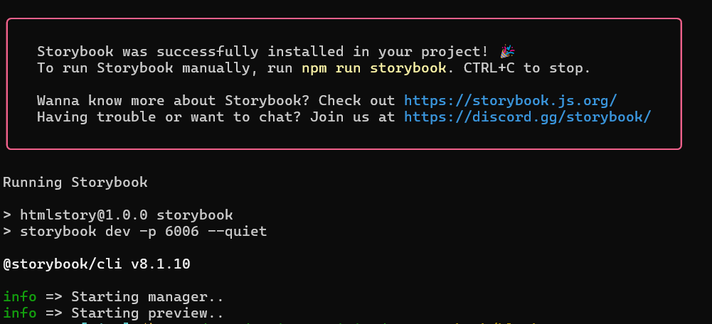
After it successfully finishes, you should see this information in the console:

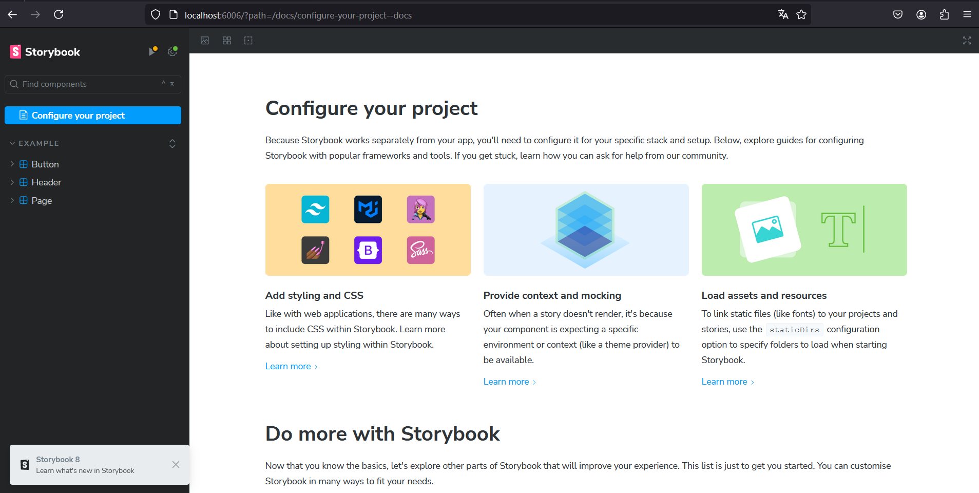
and an actual storybook should open in your browser

That's the starting point. You can see three examples on the left-hand side - a button, a header and a page.
Add a new component
Now we can easily add our own components to the list. For example, let's add an input.
First create an input.js file like this
import './input.css';

export const createInput = ({
    value = '',
    onChange = () => {},
}) => {
    const input = document.createElement('input');
    input.value = value;
    input.classList.add('custom-input');
    input.addEventListener('input', (event) => {
        onChange(event.target.value);
    });
    return input;
}
It's very basic. It creates an input element in the DOM, assigns a value, adds a CSS class, and attaches an event handler.
Since we added a 'custom-input' CSS class, we need to define it. Create an input.css file.
.custom-input {
    border: 1px solid #ccc;
    border-radius: 4px;
    padding: 8px;
    margin-bottom: 8px;
    width: 100%;
    box-sizing: border-box;
}
Now the only thing to make our input visible in the storybook is to create some stories for it, in a file named Input.stories.js, like this
import { createInput } from './Input';

export default {
    title: 'Example/Input',
    tags: ['autodocs'],
    render: (args) => createInput(args),
    argTypes: {
        value: { control: 'text' },
        onChange: { action: 'onChange' },
    },
    args: {
        value: 'Input',
    },
};

export const Input = {
    args: {
        value: 'Input',
    },
}

export const EmptyInput = {
    args: {
        value: '',
    },
}
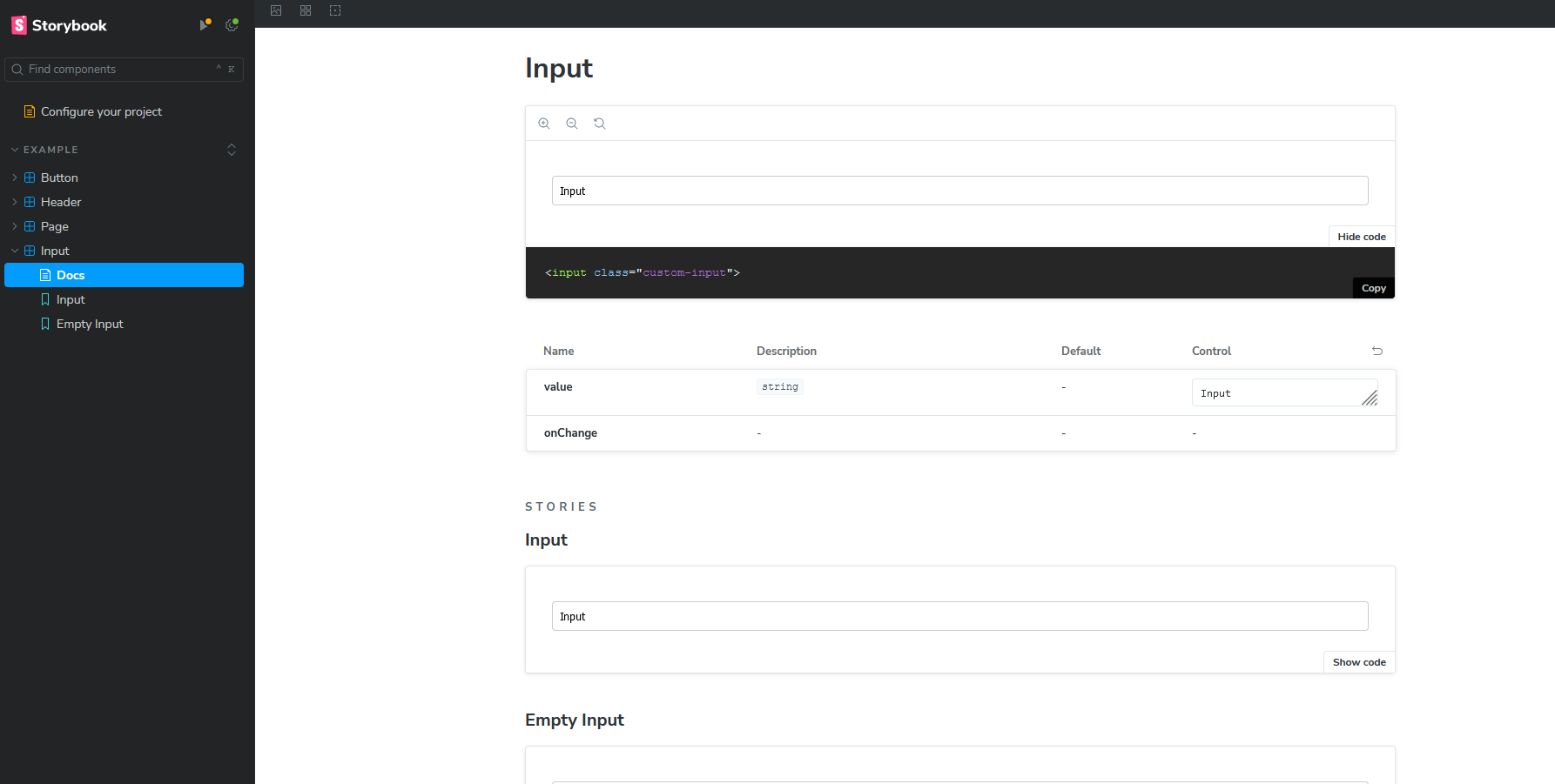
Most of it self-explanatory. We define the title and 'autodocs' generates the documentation page for our component which looks like this

If you notice, "Input" and "Empty Input" at the end come from the stories file. For simplicity, I only created two stories, but we can expand from here and add custom email inputs, inputs with attached buttons, search inputs, and many more. Everything will be described on the docs page and we can easily copy the code.
Conclusion
A styleguide created with Storybook is a powerful asset for both UX and development teams. It fosters consistency, improves communication, enhances collaboration, and streamlines workflows. For UX teams, it ensures a uniform design language and facilitates rapid prototyping. For development teams, it promotes modularity, provides comprehensive documentation, and enforces quality standards. By serving as a single source of truth for the project's UI components, a Storybook styleguide bridges the gap between design and development, ultimately leading to a more cohesive and efficient web development process.
Subscribe to my newsletter
Read articles from Michał Roman directly inside your inbox. Subscribe to the newsletter, and don't miss out.
Written by
