Essential CSS Properties Every Web Developer Should Know!
 Ravi Galhotra
CSS (Cascading Style Sheets) is the backbone of web design, allowing developers to create visually appealing and responsive websites. In this blog post, we'll explore some of the most important CSS properties that every web developer should be familiar with.
Display
The
displayproperty is fundamental in controlling how elements are rendered on a page.
.element {
  display: block | inline | inline-block | flex | grid | none;
}
| Display Value | Description | Visual Analogy |
| block | Starts on a new line, full width | Rectangular box on a new line |
| inline | Sits on the same line, wraps text | Inline box fitting content |
| inline-block | Like inline, but with width/height | Defined size box on the same line |
| none | Hides the element | Empty space |
| flex | Flexible layout container | Container for arranging child elements |
| grid | Grid layout with rows/columns | Table-like structure for positioning |
Position
positiondetermines how an element is positioned in the document flow.
.element {
  position: static | relative | absolute | fixed | sticky;
}
| Positioning Type | Description | Relative To | Stays in Document Flow |
| Static (default) | Element is positioned according to the normal document flow (one below the other). | Containing Block (usually parent element) | Yes |
| Relative | Element stays in the normal flow but can be offset using top, right, bottom, and left properties relative to its original position. | Containing Block (usually parent element) | Yes |
| Absolute | Element is removed from the normal flow and positioned based on its containing block (viewport by default) using top, right, bottom, and left properties. | Containing Block (can be viewport or ancestor with positioning set) | No |
| Fixed | Element is removed from the normal flow and positioned relative to the viewport using top, right, bottom, and left properties. Stays in place even when the page is scrolled. | Viewport | No |
| Sticky | Element behaves like a static element initially but "sticks" to the viewport at a certain scroll position using properties like top or bottom. | Containing Block (usually parent element) | Yes (initially, then relative to viewport) |
Box Model Properties
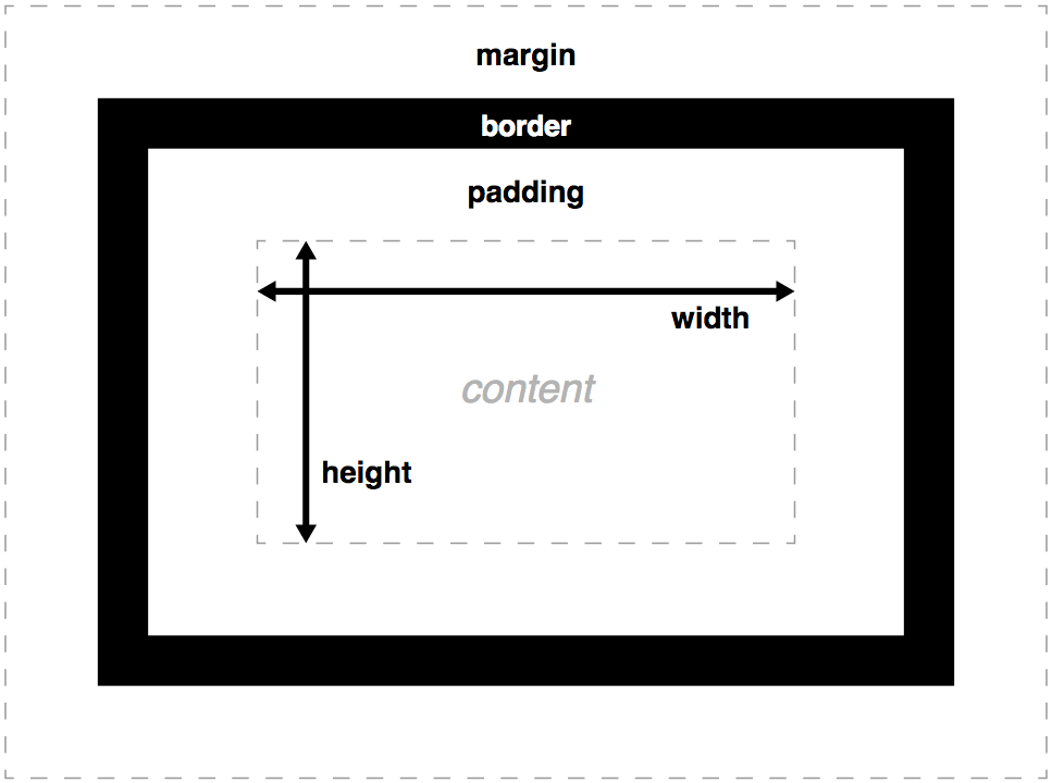
The box model is crucial for layout and spacing. Key properties include:
marginpaddingborderwidthandheight
.box {
  margin: 10px;
  padding: 15px;
  border: 1px solid #000;
  width: 200px;
  height: 100px;
}

Flexbox
Flexbox is a powerful layout system for creating flexible, responsive designs.
.container {
  display: flex;
  justify-content: space-between;
  align-items: center;
}
Grid
CSS Grid is another layout system that allows for complex, two-dimensional layouts.
.grid-container {
  display: grid;
  grid-template-columns: repeat(3, 1fr);
  gap: 10px;
}
Color and Background
These properties control the appearance of elements:
.element {
  color: #333;
  background-color: #f0f0f0;
  background-image: url('background.jpg');
  background-size: cover;
}
Typography
Text styling is essential for readability and design:
.text {
  font-family: Arial, sans-serif;
  font-size: 16px;
  font-weight: bold;
  line-height: 1.5;
  text-align: center;
}
Transitions and Animations
These properties add dynamic effects to your website:
.button {
  transition: background-color 0.3s ease;
}

@keyframes slide-in {
  from { transform: translateX(-100%); }
  to { transform: translateX(0); }
}
Conclusion
Mastering these CSS properties will give you a solid foundation for creating beautiful and functional web designs. Remember, practice and experimentation are key to become proficient in CSS. Happy coding!
Subscribe to my newsletter
Read articles from Ravi Galhotra directly inside your inbox. Subscribe to the newsletter, and don't miss out.
Written by

Ravi Galhotra
Ravi Galhotra
I am a Frontend Developer from India 🇮🇳 , currently pursuing Bachelor's of Computer Applications. Co-founder @ Webic Technologies