Styling React Components with MDBootstrap
 Rajiv theju
Introduction
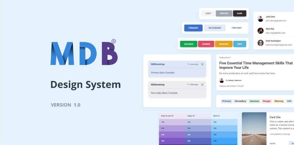
MDBootstrap (Material Design for Bootstrap) is a powerful UI kit that allows you to create responsive and visually appealing web applications. It combines the best of Bootstrap with the material design principles, providing a comprehensive set of UI components and styles. In this tutorial, we'll explore how to style React components using MDBootstrap and how to explore its various components for building a cohesive user interface.
Prerequisites
Before we begin, ensure you have the following installed on your machine:
Node.js: Download from Node.js official website.
npm (Node Package Manager): Bundled with Node.js.
Step 1: Setting Up the Environment
Create a React Application
npx create-react-app mdb-react-appNavigate to Your Project Directory
cd mdb-react-appInstall MDBootstrap for React
npm install mdb-react-ui-kit
Step 2: Integrating MDBootstrap
Import MDBootstrap CSS and JS in
src/index.jsOpensrc/index.jsand import MDBootstrap styles and scripts:import 'mdb-react-ui-kit/dist/css/mdb.min.css'; import 'mdb-react-ui-kit/dist/mdb-react-ui-kit.esm'; import React from 'react'; import ReactDOM from 'react-dom'; import App from './App'; ReactDOM.render(<App />, document.getElementById('root'));Edit
src/App.jsto Include MDBootstrap Componentsimport React from 'react'; import { MDBContainer, MDBNavbar, MDBNavbarBrand, MDBBtn, MDBCard, MDBCardBody, MDBCardTitle, MDBCardText, MDBRow, MDBCol } from 'mdb-react-ui-kit'; function App() { return ( <MDBContainer> <MDBNavbar light bgColor='light'> <MDBContainer fluid> <MDBNavbarBrand href='#'>MDBootstrap React</MDBNavbarBrand> </MDBContainer> </MDBNavbar> <MDBRow className='mt-5'> <MDBCol sm='6'> <MDBCard> <MDBCardBody> <MDBCardTitle>Card Title</MDBCardTitle> <MDBCardText> Some quick example text to build on the card title and make up the bulk of the card's content. </MDBCardText> <MDBBtn href='#'>Go somewhere</MDBBtn> </MDBCardBody> </MDBCard> </MDBCol> <MDBCol sm='6'> <MDBCard> <MDBCardBody> <MDBCardTitle>Card Title</MDBCardTitle> <MDBCardText> Some quick example text to build on the card title and make up the bulk of the card's content. </MDBCardText> <MDBBtn href='#'>Go somewhere</MDBBtn> </MDBCardBody> </MDBCard> </MDBCol> </MDBRow> </MDBContainer> ); } export default App;
Step 3: Exploring MDBootstrap Components
MDBootstrap offers a wide range of components. Here’s how you can explore and use them in your project:
Visit the MDBootstrap Documentation Go to the MDBootstrap React documentation to explore the available components.
Navigating the Documentation
Components: This section lists all the components like buttons, cards, modals, etc. Click on any component to see its usage, properties, and examples.
Getting Started: Offers a quick start guide to set up MDBootstrap in your project.
Utilities: Provides utility classes for common styles and functionalities like spacing, colors, and more.
Using Components in Your Project
Copy the Code Snippet: Each component in the documentation comes with a code snippet. Copy the relevant snippet.
Paste and Modify: Paste the snippet into your React component and modify it as per your requirements.
Example: Using a Modal Component
Let's add a modal to our application.
Import MDBModal Components
 import React, { useState } from 'react';
 import {
   MDBContainer,
   MDBNavbar,
   MDBNavbarBrand,
   MDBBtn,
   MDBCard,
   MDBCardBody,
   MDBCardTitle,
   MDBCardText,
   MDBRow,
   MDBCol,
   MDBModal,
   MDBModalDialog,
   MDBModalContent,
   MDBModalHeader,
   MDBModalTitle,
   MDBModalBody,
   MDBModalFooter
 } from 'mdb-react-ui-kit';
Add State and Modal Logic in
App.jsfunction App() { const [modalOpen, setModalOpen] = useState(false); const toggleModal = () => setModalOpen(!modalOpen); return ( <MDBContainer> <MDBNavbar light bgColor='light'> <MDBContainer fluid> <MDBNavbarBrand href='#'>MDBootstrap React</MDBNavbarBrand> </MDBContainer> </MDBNavbar> <MDBRow className='mt-5'> <MDBCol sm='6'> <MDBCard> <MDBCardBody> <MDBCardTitle>Card Title</MDBCardTitle> <MDBCardText> Some quick example text to build on the card title and make up the bulk of the card's content. </MDBCardText> <MDBBtn onClick={toggleModal}>Open Modal</MDBBtn> </MDBCardBody> </MDBCard> </MDBCol> <MDBCol sm='6'> <MDBCard> <MDBCardBody> <MDBCardTitle>Card Title</MDBCardTitle> <MDBCardText> Some quick example text to build on the card title and make up the bulk of the card's content. </MDBCardText> <MDBBtn href='#'>Go somewhere</MDBBtn> </MDBCardBody> </MDBCard> </MDBCol> </MDBRow> <MDBModal show={modalOpen} setShow={setModalOpen} tabIndex='-1'> <MDBModalDialog> <MDBModalContent> <MDBModalHeader> <MDBModalTitle>Modal title</MDBModalTitle> <MDBBtn className='btn-close' color='none' onClick={toggleModal}></MDBBtn> </MDBModalHeader> <MDBModalBody>...</MDBModalBody> <MDBModalFooter> <MDBBtn color='secondary' onClick={toggleModal}> Close </MDBBtn> <MDBBtn>Save changes</MDBBtn> </MDBModalFooter> </MDBModalContent> </MDBModalDialog> </MDBModal> </MDBContainer> ); } export default App;
Conclusion
Using MDBootstrap with React allows you to create visually appealing and responsive applications quickly. By exploring the MDBootstrap documentation, you can discover a wide range of components to enhance your applications. Experiment with different components, customize them to fit your design needs, and build sophisticated user interfaces with ease. Happy coding!
Subscribe to my newsletter
Read articles from Rajiv theju directly inside your inbox. Subscribe to the newsletter, and don't miss out.
Written by
