Responsive Web Design Techniques with Examples
 Rajiv theju
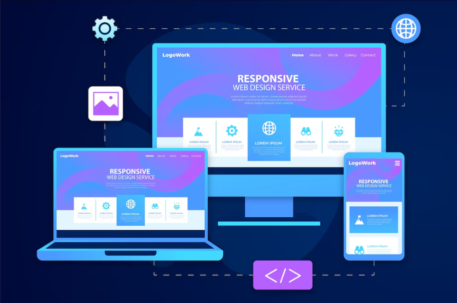
Responsive web design (RWD) is a critical approach to modern web development that ensures websites work well on various devices and screen sizes. Here, we’ll explore several key techniques used in RWD, along with examples to illustrate each concept.
1. Fluid Grids
Fluid grids use relative units like percentages instead of fixed units like pixels, allowing elements to resize proportionally based on the screen size.
Example:
HTML:
<div class="container">
  <div class="box">Box 1</div>
  <div class="box">Box 2</div>
  <div class="box">Box 3</div>
</div>
CSS:
.container {
  display: flex;
  flex-wrap: wrap;
}

.box {
  flex: 1 1 30%;
  margin: 10px;
  background-color: #f4f4f4;
  text-align: center;
  padding: 20px;
}
This CSS ensures that the boxes will take up 30% of the container's width and wrap onto new lines as needed.
2. Flexible Images
Flexible images are scaled in accordance with the containing element to prevent overflow and ensure they remain within the bounds of their container.
Example:
HTML:
<div class="image-container">
  <img src="example.jpg" alt="Example Image">
</div>
CSS:
.image-container img {
  max-width: 100%;
  height: auto;
}
This ensures that the image scales down proportionally while maintaining its aspect ratio.
3. Media Queries
Media queries allow you to apply specific styles based on the device's characteristics, such as its width, height, or orientation.
Example:
HTML:
<div class="content">
  <p>This is some content that will be styled differently based on the screen size.</p>
</div>
CSS:
/* Base styles */
.content {
  font-size: 16px;
  padding: 20px;
}

/* Medium screens (tablets) */
@media (min-width: 768px) {
  .content {
    font-size: 18px;
    padding: 30px;
  }
}

/* Large screens (desktops) */
@media (min-width: 1024px) {
  .content {
    font-size: 20px;
    padding: 40px;
  }
}
This ensures that the content’s font size and padding adapt to different screen sizes.
4. Mobile-First Design
Mobile-first design is a strategy where you start designing for mobile devices first and then progressively enhance the design for larger screens.
Example:
HTML:
<nav class="navigation">
  <ul>
    <li><a href="#">Home</a></li>
    <li><a href="#">About</a></li>
    <li><a href="#">Contact</a></li>
  </ul>
</nav>
CSS:
/* Base mobile styles */
.navigation ul {
  list-style: none;
  padding: 0;
}

.navigation li {
  display: block;
  margin-bottom: 10px;
}

/* Larger screens */
@media (min-width: 768px) {
  .navigation li {
    display: inline;
    margin-right: 20px;
    margin-bottom: 0;
  }
}
This starts with a simple stacked layout for mobile devices and transitions to an inline layout for larger screens.
5. Viewport Meta Tag
The viewport meta tag controls the layout on mobile browsers and ensures your site scales correctly.
Example:
HTML:
<head>
  <meta name="viewport" content="width=device-width, initial-scale=1">
</head>
This tag helps browsers understand how to adjust the page’s dimensions and scaling.
6. Responsive Typography
Responsive typography adjusts text sizes based on the screen size to improve readability.
Example:
HTML:
<h1>Responsive Typography Example</h1>
<p>This paragraph text will adjust its size based on the screen width.</p>
CSS:
/* Base font sizes */
h1 {
  font-size: 2rem;
}

p {
  font-size: 1rem;
}

/* Larger screens */
@media (min-width: 768px) {
  h1 {
    font-size: 2.5rem;
  }

  p {
    font-size: 1.25rem;
  }
}

/* Extra-large screens */
@media (min-width: 1024px) {
  h1 {
    font-size: 3rem;
  }

  p {
    font-size: 1.5rem;
  }
}
This ensures that text remains legible across different devices.
7. CSS Flexbox and Grid Layouts
Flexbox and Grid Layouts are powerful CSS modules that help create complex and responsive layouts.
Flexbox Example:
HTML:
<div class="flex-container">
  <div class="flex-item">Item 1</div>
  <div class="flex-item">Item 2</div>
  <div class="flex-item">Item 3</div>
</div>
CSS:
.flex-container {
  display: flex;
  flex-wrap: wrap;
}

.flex-item {
  flex: 1 1 100%;
  padding: 10px;
  background-color: #f4f4f4;
  margin: 10px;
  text-align: center;
}

@media (min-width: 768px) {
  .flex-item {
    flex: 1 1 45%;
  }
}

@media (min-width: 1024px) {
  .flex-item {
    flex: 1 1 30%;
  }
}
Grid Example:
HTML:
<div class="grid-container">
  <div class="grid-item">Item 1</div>
  <div class="grid-item">Item 2</div>
  <div class="grid-item">Item 3</div>
</div>
CSS:
.grid-container {
  display: grid;
  grid-template-columns: 1fr;
  gap: 10px;
}

.grid-item {
  padding: 20px;
  background-color: #f4f4f4;
  text-align: center;
}

@media (min-width: 768px) {
  .grid-container {
    grid-template-columns: 1fr 1fr;
  }
}

@media (min-width: 1024px) {
  .grid-container {
    grid-template-columns: 1fr 1fr 1fr;
  }
}
Conclusion
Responsive web design ensures that your website looks and functions well across a variety of devices and screen sizes. By using techniques such as fluid grids, flexible images, media queries, and modern CSS modules like Flexbox and Grid, you can create a user-friendly and adaptable web experience. Implementing these techniques and best practices will help you build websites that are accessible, aesthetically pleasing, and functional on any device.
Happy designing!
Subscribe to my newsletter
Read articles from Rajiv theju directly inside your inbox. Subscribe to the newsletter, and don't miss out.
Written by
