Project # 3 - Visualize data with QuickSight
 Namdev Pratap

Project Overview
In the realm of data-driven decision-making, the crucial skill of turning raw data into actionable insights stands out. Amazon QuickSight emerges as a potent business intelligence tool that enables organizations to visualize data, discover trends, and make informed decisions effortlessly.
In this project, we will delve into Amazon QuickSight's capabilities and illustrate how it facilitates the creation of impactful visualizations that contribute to business achievements.
Project Scope
For today's endeavor, we will utilize two AWS services: Amazon S3 and Amazon QuickSight.
Step 1: Retrieving the Data (Preparation of Dataset)
For this project, we will take a sample dataset of a survey of salaries of IT professionals in different roles and industries and aim to create actionable insights.
Once the dataset is ready, let's begin the journey...
Step 2: create a S3 bucket
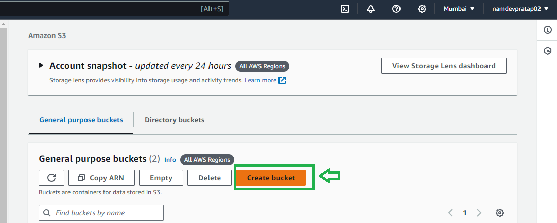
Give a name to the bucket (name should be unique)
And leave all the other settings default and scroll to the bottom of the page
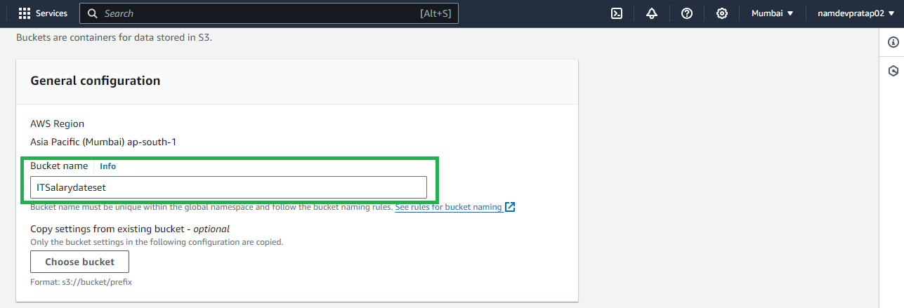
And click on create bucket

Once S3 bucket is created open the bucket

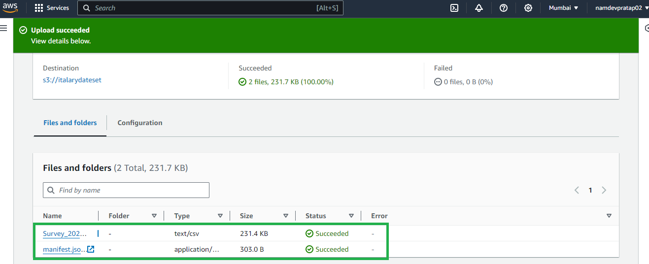
Upload the data set and manifest.json file (we will talk about what this file is in a moment )

After I update these 2 files as shows below
wait before you update the .json file you will have to modify the file
open the .json file in a note pad
Go to the S3 bucket you have created and select the bucket and click on copy S3 URI
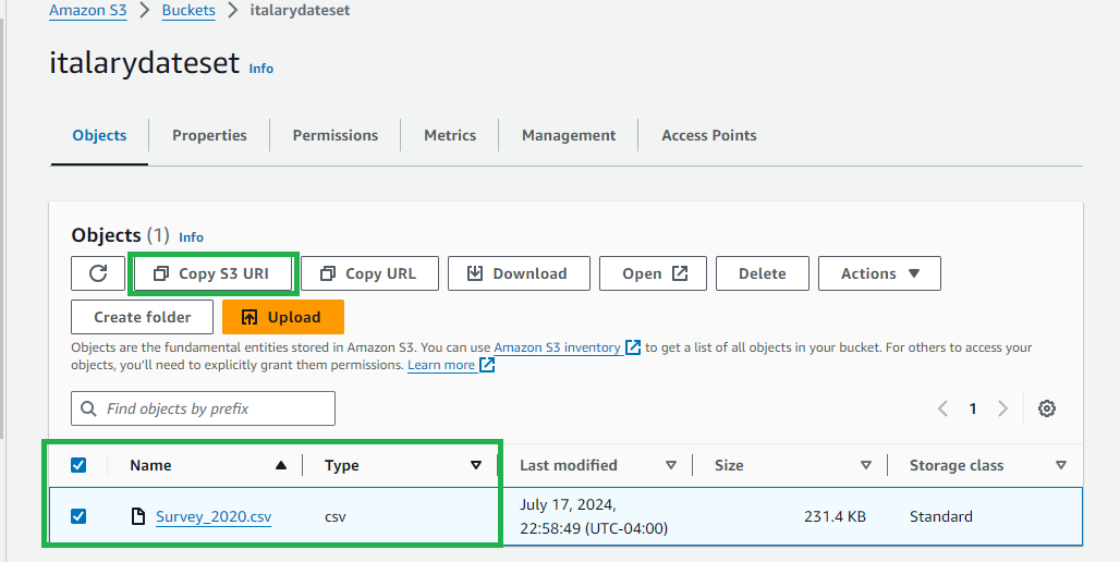
Once copies now Open the jason file from your computer in note pad
Enter the copies URI in the code as shows below and save it
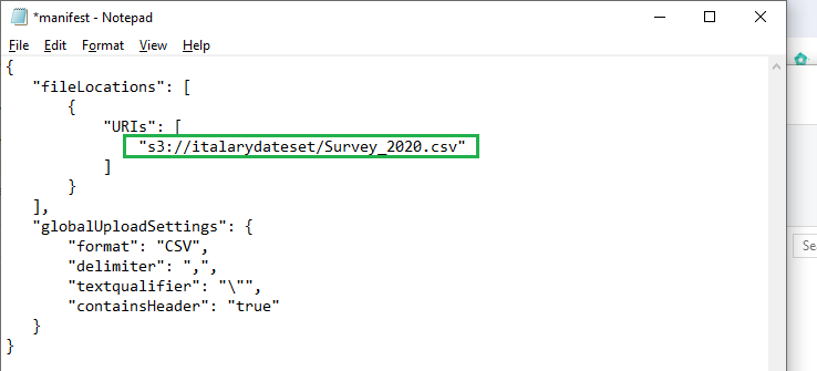
Now upload this file in the same bucket
Now you have the required 2 flies in the bucket you just created
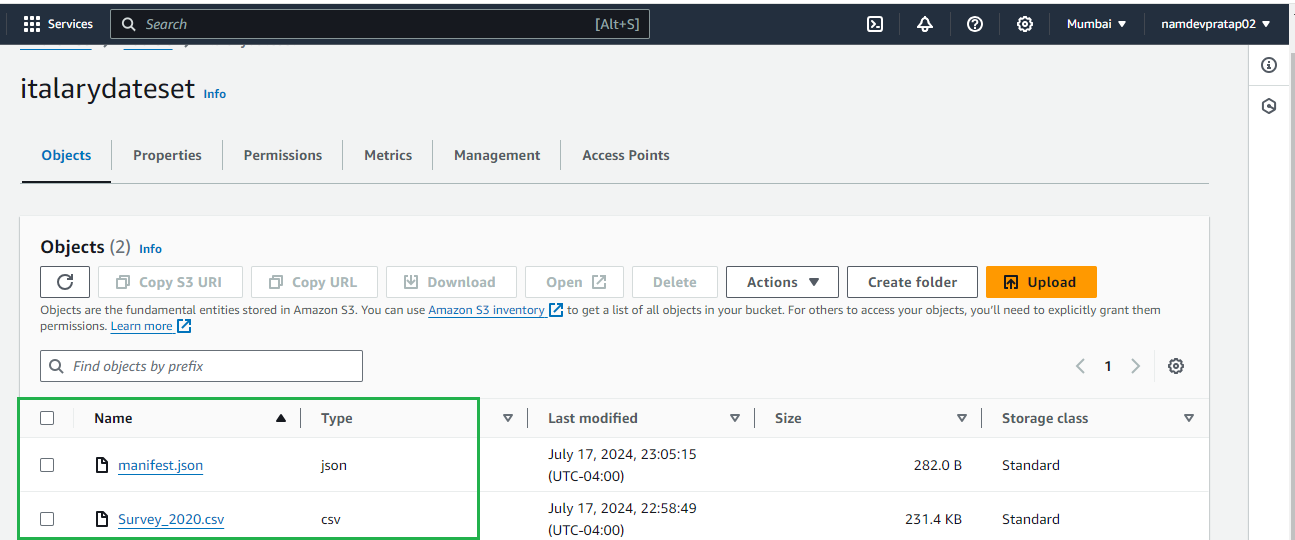
Your S3 part is completed now lets dive in and Sign up for Amazon QuickSight and import the dataset
Go to the console and search for "Amazon QuickSight" and select QuickSight

Sign up for Amazon QuickSight and Ensure you select the S3 bucket you want to link
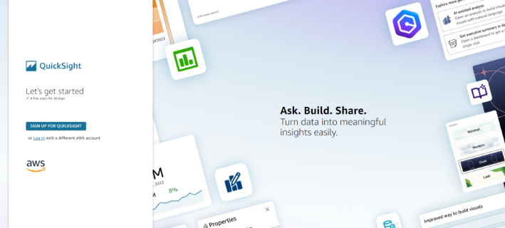
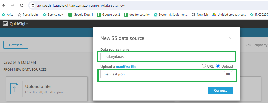
Give name to you data source it can be any name , and then paste the ERL we copies in last step or upload the modified json file you have on your computer that you updated into the S3 bucket and click on connect
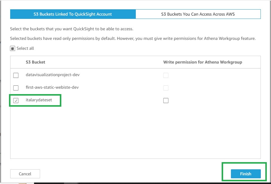
When signing up ensure you select the S3 bucket
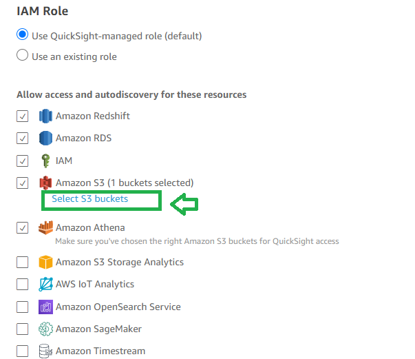
Select your bucket as shows below and click on finish
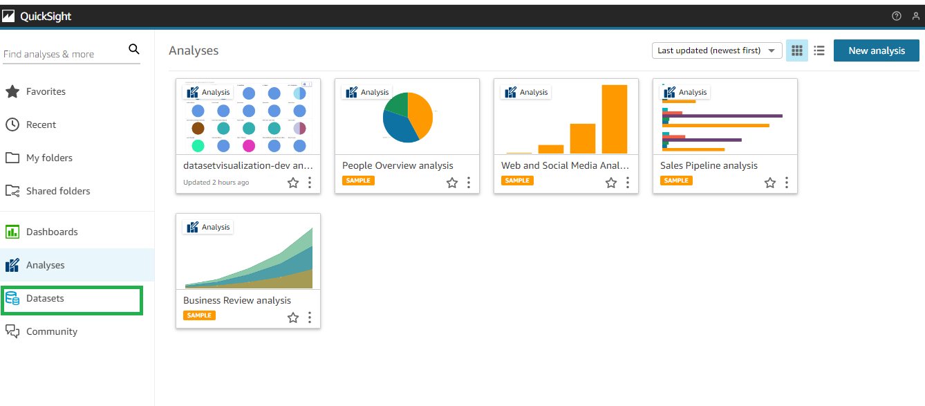
Now this is the dashboard you will see , so first you will have to create a dataset
On the bottom left click on Datasets Icon
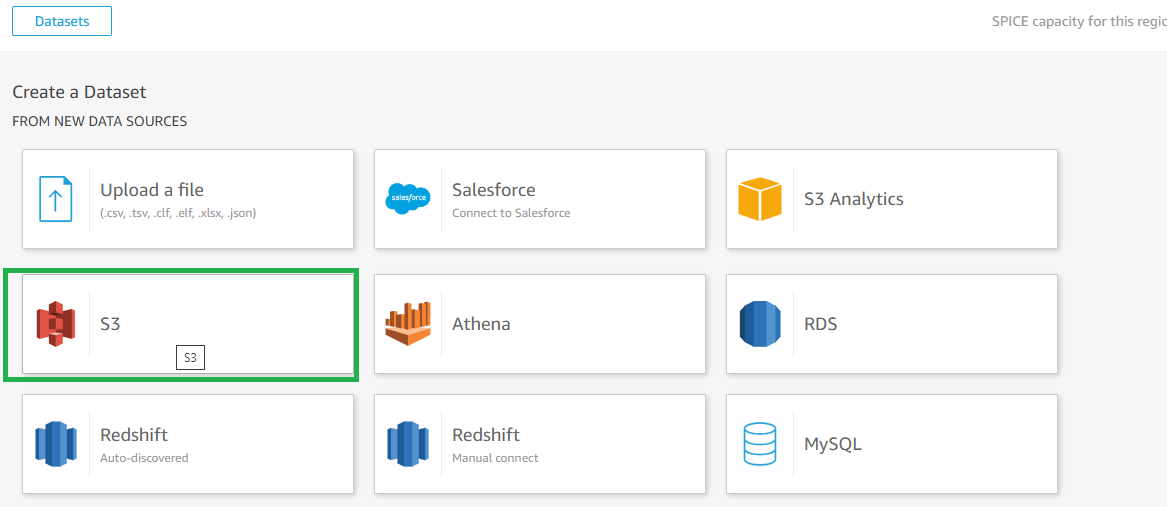
Click on new Dataset

Select S3
Give a dataset name (it can be any thing) then update the Updated Json file from computer or past the URL and click on Connect
Perfect now your dataset is created, click on Visualize
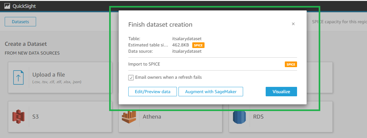
Now you are ready to explore the data visualization magic !
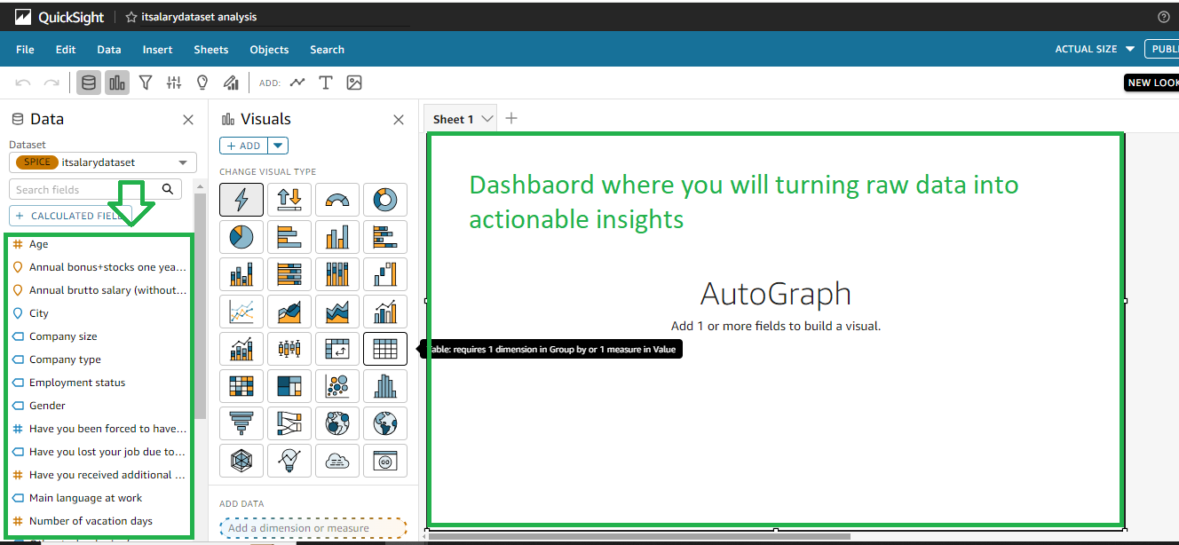
You will notice that the date set files are already imported in the left of the home page
Lets start
what would you do to see a breakdown Salary vs position Select the
Select the desired visuals
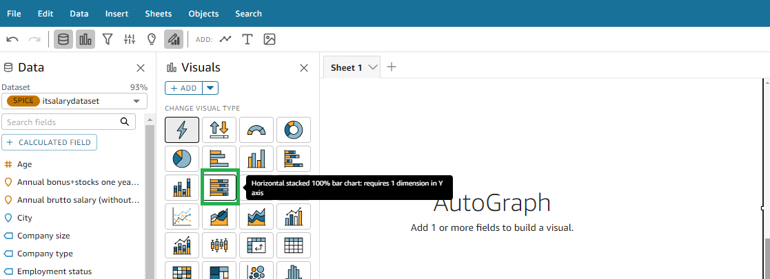
Types of Visual chats we can created !
Using this dataset which we took in example here are several types of visual maps or charts you could create:
Age Distribution Chart: A histogram or bar chart showing the distribution of respondents by age groups.
Gender Distribution Chart: A pie chart or bar chart showing the distribution of respondents by gender.
City Distribution Map: A geographical map showing where respondents are located based on their city.
Experience vs. Salary Scatter Plot: A scatter plot where each respondent is represented by a point, with years of experience on one axis and annual brutto salary on the other.
Technology Usage Chart: A bar chart showing the frequency of different technologies or programming languages used by respondents.
Seniority Level Pie Chart: A pie chart showing the distribution of respondents by seniority levels (e.g., junior, mid-level, senior).
Employment Status Pie Chart: A pie chart showing the distribution of respondents by employment status (e.g., full-time, part-time, freelance).
Company Size Distribution Chart: A bar chart showing the distribution of respondents by company size (e.g., small, medium, large).
Coronavirus Impact Charts: Bar charts or pie charts showing the impact of coronavirus on respondents, such as job loss, reduced working hours (Kurzarbeit), and additional monetary support received.
Salary Change Over Time Chart: A line chart showing how respondents' annual brutto salaries have changed over the past year, if applicable.
Vacation Days Distribution Chart: A histogram or bar chart showing the distribution of respondents by number of vacation days.
Language at Work Pie Chart: A pie chart showing the distribution of respondents by their main language at work.
Each of these visualizations can provide insights into different aspects of the data, helping to understand patterns, distributions, correlations, and impacts related to the respondents' demographic and employment-related information.
Once the Visualization is created you can use the publish button to publish the map| Visualization of data

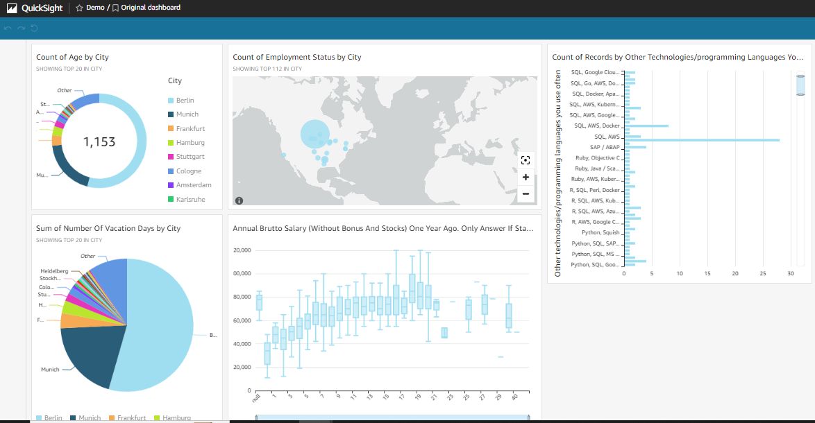
You can also export a copy of your data in pdf or specific format

I hope now you have a brief ideas and concept of how Visualize data with QuickSight !
Follow | share | for more updates and have fun in your learning Journey ....
Subscribe to my newsletter
Read articles from Namdev Pratap directly inside your inbox. Subscribe to the newsletter, and don't miss out.
Written by

Namdev Pratap
Namdev Pratap
Come along with me on a public learning journey into AWS Cloud and DevOps, designed specifically for those without a technical background. I'll be documenting each step in straightforward, easy-to-understand language to help others make a smooth transition into DevOps. Together, we'll delve into continuous integration, deployment, and automation, breaking down complex concepts into manageable, actionable insights.