Easy Steps to Execute EDA on Any Dataset
 Rahul Saini
Let's Dive in!
We are going to build the Ml Model for students’ performance Indicator to be beginner-friendly
The life cycle of Machine learning Project
Understanding the Problem Statement
Data Collection
Data Checks to perform
Exploratory data analysis
Data Pre-Processing
Model Training
Choose the best model
So let’s start understanding our problem statement -
This project aims to analyze how student performance, specifically test scores, is influenced by gender, ethnicity, parental level of education, lunch habits, and participation in test preparation courses.
Data Collection
Dataset Source — https://www.kaggle.com/datasets/spscientist/students-performance-in-exams?datasetId=74977
The data consists of 8 columns and 1000 rows.
EDA —
A preliminary step before undertaking extra formal statistical analyses or modeling
EDA, or Exploratory Data Analysis, refers to analyzing and analyzing information units to uncover styles, pick out relationships, and gain insights.
Let’s start with creating a .ipynb file
notebooks/
├── EDA.ipynb
PS: you can try your dataset this is just an easy example
to see our dataset’s first 5 rows-
df.head()
Dataset information 📅 ℹ
gender: sex of students -> (Male/female)
race/ethnicity: ethnicity of students -> (Group A, B, C, D, E)
parental level of education : parents’ final education ->(bachelor’s degree,some college,master’s degree,associate’s degree,high school)
lunch: having lunch before the test (standard or free/reduced)
test preparation course: complete or not complete before the test
math score
reading score
writing score
Data Checks to perform ✅
- Check Missing values ⭕
df.isna().sum()
gender                         0
race/ethnicity                 0
parental level of education    0
lunch                          0
test preparation course        0
math score                     0
reading score                  0
writing score                  0
dtype: int64
-> There are no missing values in the data set
- Check Duplicates 👨🏻🤝👨🏻
df.duplicated().sum()
0
-> There are no duplicate values in the data set
- Check data type 📝
# Check Null and Dtypes
df.info()
Data columns (total 8 columns):
 #   Column                       Non-Null Count  Dtype
---  ------                       --------------  -----
 0   gender                       1000 non-null   object
 1   race/ethnicity               1000 non-null   object
 2   parental level of education  1000 non-null   object
 3   lunch                        1000 non-null   object
 4   test preparation course      1000 non-null   object
 5   math score                   1000 non-null   int64
 6   reading score                1000 non-null   int64
 7   writing score                1000 non-null   int64
dtypes: int64(3), object(5)
- Check the number of unique values in each column 🌌
df.unique()
gender                          2
race/ethnicity                  5
parental level of education     6
lunch                           2
test preparation course         2
math score                     81
reading score                  72
writing score                  77
- Check the statistics of the data set 📊
df.describe()
math score reading score writing score
count 1000.00000 1000.000000 1000.000000
mean 66.08900 69.169000 68.054000
std 15.16308 14.600192 15.195657
min 0.00000 17.000000 10.000000
25% 57.00000 59.000000 57.750000
50% 66.00000 70.000000 69.000000
75% 77.00000 79.000000 79.000000
max 100.00000 100.000000 100.000000
Insight
From the above description of numerical data, all means are very close to each other — between 66 and 68.05;
All standard deviations are also close — between 14.6 and 15.19;
While there is a minimum score of 0 for math, for writing, the minimum is much higher = 10, and for reading much higher = 17
- Check various categories present in the different categorical column 🔢
Categories in 'gender' variable:      ['female' 'male']
Categories in 'race_ethnicity' variable:   ['group B' 'group C' 'group A' 'group D' 'group E']
Categories in'parental level of education' variable: ["bachelor's degree" 'some college' "master's degree" "associate's degree"
 'high school' 'some high school']
Categories in 'lunch' variable:      ['standard' 'free/reduced']
Categories in 'test preparation course' variable:      ['none' 'completed']
Next — Some Transformation 🐛🦋
We have 3 numerical features : [‘math score’, ‘reading score’, ‘writing score’]
We have 5 categorical features : [‘gender’, ‘race/ethnicity’, ‘parental level of education’, ‘lunch’, ‘test preparation course’
- Adding columns for “Total Score” and “Average” (feature engineering)
In our data set, we have 3 different scores math score, reading score, writing score
so we can combine them in 2 ways Total and average this way we get 2 models to run on
df['total_marks'] = df['math score']+ df['reading score'] + df['writing score']
df['average_marks'] = df['total_marks']/3
df.head()
df['total_marks'] = df['math score']+ df['reading score'] + df['writing score']
df['average_marks'] = df['total_marks']/3
df.head()
#On comparing the marks of different students in different subjects
Number of students who scored full marks in reading:  17
Number of students who scored full marks in writing:  14
Number of students who scored full marks in maths:  7

Number of students who scored less than 20 in reading:  1
Number of students who scored less than 20 in writing:  1
Number of students who scored less than 20 in maths:  3
Insight
From the above values, we get students have performed the worst in Maths, and the Best performance is in the reading section
Exploring Data ( Visualization ) 📊💡
Visualize the average score distribution to draw some conclusions.
Histogram
Kernel Distribution Function (KDE)
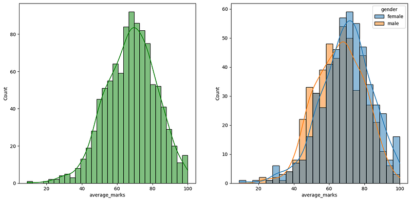
Histogram & KDE — over gender X marks 💯
fig, axs = plt.subplots(1, 2, figsize=(15, 7))
plt.subplot(121)
sns.histplot(data=df,x='average_marks',bins=30,kde=True,color='g')
plt.subplot(122)
sns.histplot(data=df,x='average_marks',kde=True,hue='gender')
plt.show()
Histogram & KDE — over gender X marks 💯
Insight
Female students tend to perform better than male students.
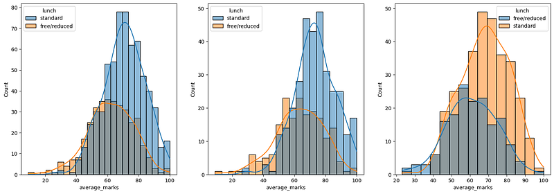
Histogram & KDE — over gender X Lunch 😋
plt.subplots(1,3,figsize=(25,6))
plt.subplot(141)
sns.histplot(data=df,x='average_marks',kde=True,hue='lunch')
plt.subplot(142)
sns.histplot(data=df[df.gender=='female'],x='average_marks',kde=True,hue='lunch')
plt.subplot(143)
sns.histplot(data=df[df.gender=='male'],x='average_marks',kde=True,hue='lunch')
plt.show()
Histogram & KDE — over gender X Lunch 😋
Insights
Standard lunch helps perform well in exams.
Standard lunch helps perform well in exams be it a male or a female.
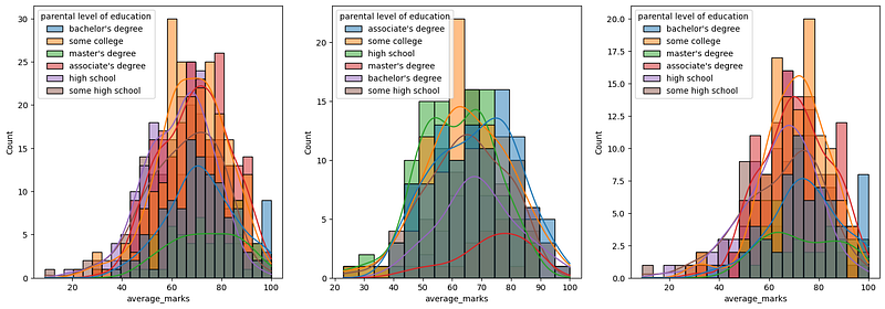
Histogram & KDE — over gender X parents 📊♀️♂️👨👩👧👦
plt.subplots(1,3,figsize=(25,6))
plt.subplot(141)
ax =sns.histplot(data=df,x='average_marks',kde=True,hue='parental level of education')
plt.subplot(142)
ax =sns.histplot(data=df[df.gender=='male'],x='average_marks',kde=True,hue='parental level of education')
plt.subplot(143)
ax =sns.histplot(data=df[df.gender=='female'],x='average_marks',kde=True,hue='parental level of education')
plt.show()
Histogram & KDE — over gender X parents
Insights
In general parent’s education doesn’t help students perform well in exams.
2nd plot shows that parents whose education is of associate’s degree or master’s degree their male child tend to perform well in the exam
3rd plot we can see there is no effect of parent’s education on female students.
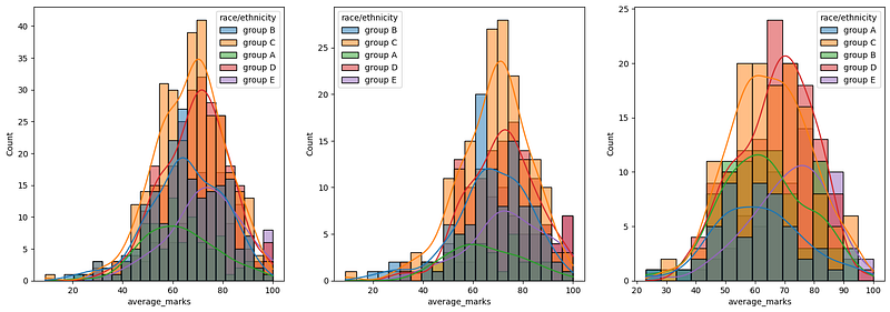
Histogram & KDE — over gender X race 👩🏽🦱👨🏾🦰🧑🏼🦲
plt.subplots(1,3,figsize=(25,6))
plt.subplot(141)
ax =sns.histplot(data=df,x='average_marks',kde=True,hue='race/ethnicity')
plt.subplot(142)
ax =sns.histplot(data=df[df.gender=='female'],x='average_marks',kde=True,hue='race/ethnicity')
plt.subplot(143)
ax =sns.histplot(data=df[df.gender=='male'],x='average_marks',kde=True,hue='race/ethnicity')
plt.show()
Histogram & KDE — over gender X race 👩🏽🦱👨🏾🦰🧑🏼🦲
Insights
Students of group A and group B tend to perform poorly in exams.
Students of group A and group B tend to perform poorly in exams irrespective of whether they are male or female
Maximum score of students in all three subjects
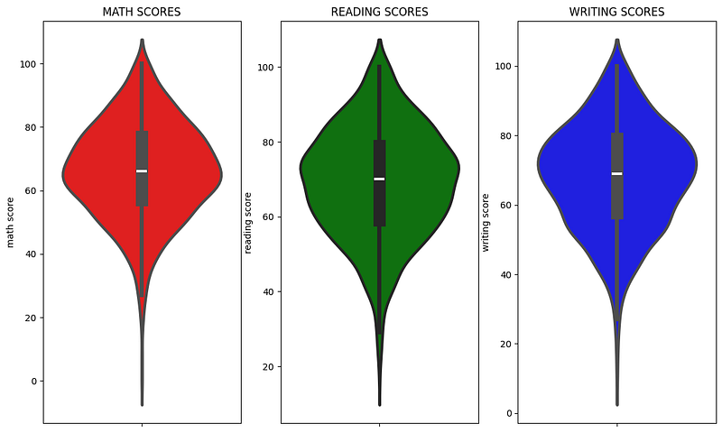
In Extras let’s plot a violin plot to see how students performed in each subject
plt.figure(figsize=(18,8))
plt.subplot(1, 4, 1)
plt.title('MATH SCORES')
sns.violinplot(y='math score',data=df,color='red',linewidth=3)
plt.subplot(1, 4, 2)
plt.title('READING SCORES')
sns.violinplot(y='reading score',data=df,color='green',linewidth=3)
plt.subplot(1, 4, 3)
plt.title('WRITING SCORES')
sns.violinplot(y='writing score',data=df,color='blue',linewidth=3)
plt.show()
violin plot to see how students performed in each subject
Insights
From the above three plots, it's visible that most of the students score between 60–80 in Maths whereas in reading and writing most of them score from 50–80
Exploratory Data Analysis
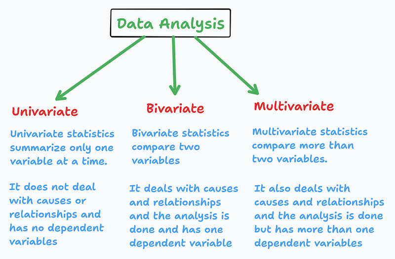
Univariate, bivariate, and multivariate analysis are types of exploratory data analysis. They are based on the number of variables being analyzed
Univariate, bivariate, and multivariate analysis
Multivariate analysis using pieplot
plt.rcParams['figure.figsize'] = (30, 12)
plt.subplot(1, 5, 1)
size = df['gender'].value_counts()
labels = 'Female', 'Male'
color = ['red','green']

plt.pie(size, colors = color, labels = labels,autopct = '.%2f%%')
plt.title('Gender', fontsize = 20)
plt.axis('off')

plt.subplot(1, 5, 2)
size = df['race/ethnicity'].value_counts()
labels = 'Group C', 'Group D','Group B','Group E','Group A'
color = ['red', 'green', 'blue', 'cyan','orange']


plt.pie(size, colors = color,labels = labels,autopct = '.%2f%%')
plt.title('Race/Ethnicity', fontsize = 20)
plt.axis('off')

plt.subplot(1, 5, 3)
size = df['lunch'].value_counts()
labels = 'Standard', 'Free'
color = ['red','green']

plt.pie(size, colors = color,labels = labels,autopct = '.%2f%%')
plt.title('Lunch', fontsize = 20)
plt.axis('off')

plt.subplot(1, 5, 4)
size = df['test preparation course'].value_counts()
labels = 'None', 'Completed'
color = ['red','green']

plt.pie(size, colors = color,labels = labels,autopct = '.%2f%%')
plt.title('Test Course', fontsize = 20)
plt.axis('off')

plt.subplot(1, 5, 5)
size = df['parental level of education'].value_counts()
labels = 'Some College', "Associate's Degree",'High School','Some High School',"Bachelor's Degree","Master's Degree"
color = ['red', 'green', 'blue', 'cyan','orange','grey']

plt.pie(size, colors = color,labels = labels,autopct = '.%2f%%')
plt.title('Parental Education', fontsize = 20)
plt.axis('off')

plt.tight_layout()
plt.grid()

plt.show()
Multivariate analysis using pieplot
Insights
The number of Male and Female students is almost equal
The number of students is greatest in Group C
The number of students who have standard lunch is greater
Number of students who have not enrolled in any test preparation course is greater
The number of students whose parental education is “Some College” is greater followed closely by “Associate’s Degree”
Feature Wise Visualization
GENDER COLUMN
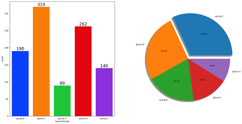
How is the distribution of Gender?
Does gender have any impact on student performance?
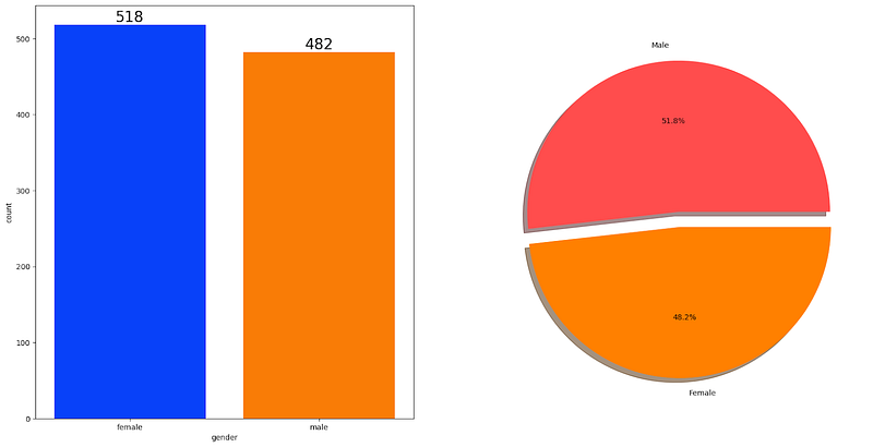
UNIVARIATE ANALYSIS ( How is distribution of Gender ? )
f,ax=plt.subplots(1,2,figsize=(20,10))
sns.countplot(x=df['gender'],data=df,palette ='bright',ax=ax[0],saturation=0.95)
for container in ax[0].containers:
    ax[0].bar_label(container,color='black',size=20)

plt.pie(x=df['gender'].value_counts(),labels=['Male','Female'],explode=[0,0.1],autopct='%1.1f%%',shadow=True,colors=['#ff4d4d','#ff8000'])
plt.show()
Insights
Gender has balanced data with female students are 518 (48%) and male students are 482 (52%)
BIVARIATE ANALYSIS ( Is gender has any impact on student’s performance ? )
# Identify numeric columns in the DataFrame
numeric_cols = df.select_dtypes(include=['number']).columns


# Group the DataFrame by 'gender' and calculate mean only for numeric columns
gender_group = df.groupby('gender')[numeric_cols].mean()


# Display the result
gender_group
 gender math score reading score writing score total_marks average_marks

female 63.633205 72.608108 72.467181 208.708494 69.569498
male 68.728216 65.473029 63.311203 197.512448 65.837483
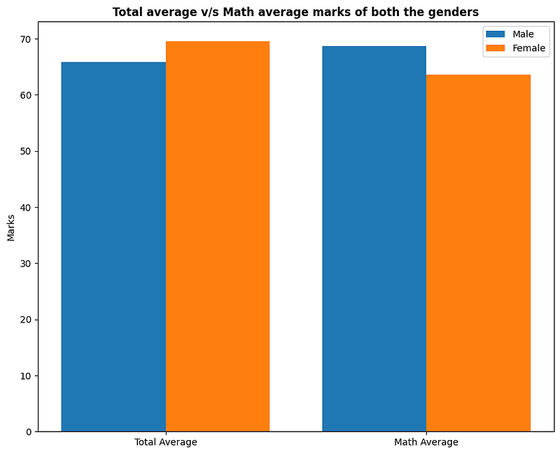
Is gender have any impact on student performance?
Insights
On an average females have a better overall score than men.
whereas males have scored higher in Maths.
RACE/ETHNICITY COLUMN
How is Group-wise distribution?
Does race/ethnicity have any impact on student performance?
UNIVARIATE ANALYSIS ( How is Group-wise distribution ?)
f,ax=plt.subplots(1,2,figsize=(20,10))
sns.countplot(x=df['race/ethnicity'],data=df,palette = 'bright',ax=ax[0],saturation=0.95)
for container in ax[0].containers:
    ax[0].bar_label(container,color='black',size=20)

plt.pie(x = df['race/ethnicity'].value_counts(),labels=df['race/ethnicity'].value_counts().index,explode=[0.1,0,0,0,0],autopct='%1.1f%%',shadow=True)
plt.show()
UNIVARIATE ANALYSIS ( How is Group-wise distribution ?)
Insights
Most of the students belonged to Group C /Group D.
The lowest number of students belong to a group.
BIVARIATE ANALYSIS (Does race/Ethnicity have any impact on a student’s performance?
Group_data2=df.groupby('race/ethnicity')
f,ax=plt.subplots(1,3,figsize=(20,8))
sns.barplot(x=Group_data2['math score'].mean().index,y=Group_data2['math score'].mean().values,palette = 'mako',ax=ax[0])
ax[0].set_title('Math score',color='#005ce6',size=20)


for container in ax[0].containers:
    ax[0].bar_label(container,color='black',size=15)


sns.barplot(x=Group_data2['reading score'].mean().index,y=Group_data2['reading score'].mean().values,palette = 'flare',ax=ax[1])
ax[1].set_title('Reading score',color='#005ce6',size=20)


for container in ax[1].containers:
    ax[1].bar_label(container,color='black',size=15)


sns.barplot(x=Group_data2['writing score'].mean().index,y=Group_data2['writing score'].mean().values,palette = 'coolwarm',ax=ax[2])
ax[2].set_title('Writing score',color='#005ce6',size=20)


for container in ax[2].containers:
    ax[2].bar_label(container,color='black',size=15)
Insights
Group E students have scored the highest marks.
Group A students have scored the lowest marks.
Students from a lower Socioeconomic status have a lower avg in all course subjects
Parental Level Of Education Column
What is the educational background of the student’s parent?
Is parental education has any impact on student’s performance ?
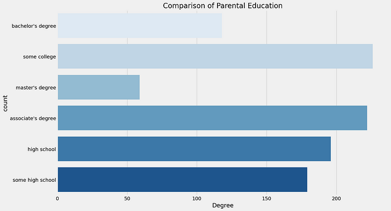
UNIVARIATE ANALYSIS ( What is the educational background of the student’s parent ? )
plt.rcParams['figure.figsize'] = (15, 9)
plt.style.use('fivethirtyeight')
sns.countplot(df['parental level of education'], palette = 'Blues')
plt.title('Comparison of Parental Education', fontweight = 30, fontsize = 20)
plt.xlabel('Degree')
plt.ylabel('count')
plt.show()
What is the educational background of the student’s parent?
Insights
- The largest number of parents are from some college.
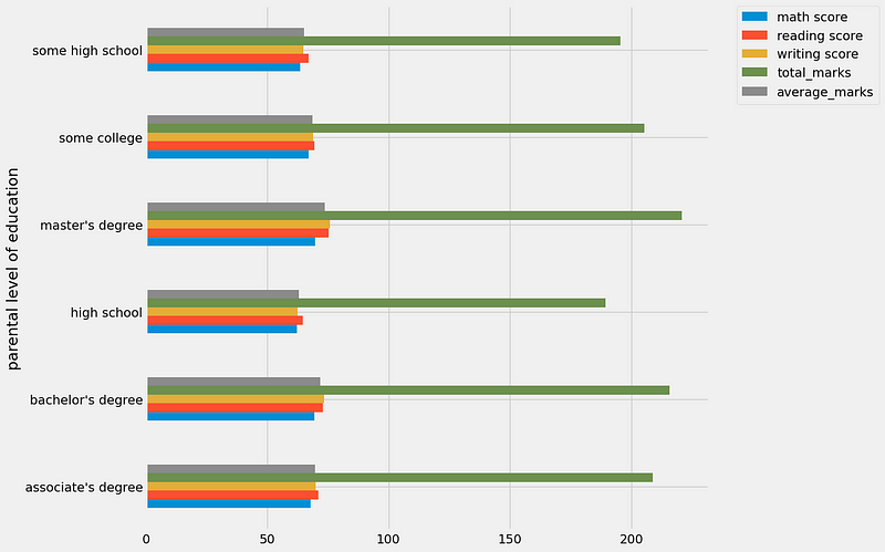
BIVARIATE ANALYSIS (Does parental education have any impact on student performance ? )
# Select only numeric columns for aggregation
numeric_cols = df.select_dtypes(include=['number'])

# Group by 'parental level of education', calculate mean for numeric columns, and plot
numeric_cols.groupby(df['parental level of education']).mean().plot(kind='barh', figsize=(10, 10))
plt.legend(bbox_to_anchor=(1.05, 1), loc=2, borderaxespad=0.)
plt.show()
Insights
- The scores of students whose parents possess master's and bachelor's level education are higher than others.
LUNCH COLUMN
Which type of lunch is most common among students?
What is the effect of lunch type on test results?
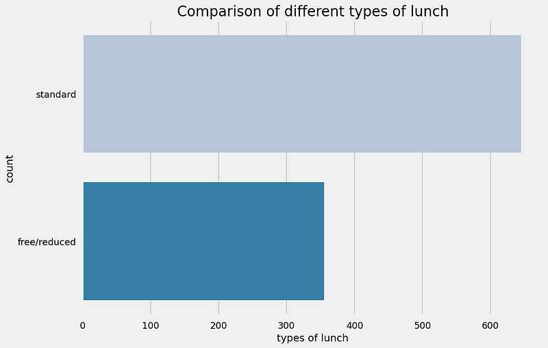
UNIVARIATE ANALYSIS ( Which type of lunch is most common among students ? )
plt.rcParams['figure.figsize'] = (15, 9)
plt.style.use('seaborn-talk')
sns.countplot(df['lunch'], palette = 'PuBu')
plt.title('Comparison of different types of lunch', fontweight = 30, fontsize = 20)
plt.xlabel('types of lunch')
plt.ylabel('count')
plt.show()
UNIVARIATE ANALYSIS ( Which type of lunch is most common among students ? )
Insights
- Students being served Standard lunch was more than free lunch
BIVARIATE ANALYSIS (Does lunch type intake have any impact on student’s performance ? )
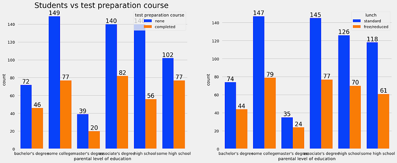
f,ax=plt.subplots(1,2,figsize=(20,8))
sns.countplot(x=df['parental level of education'],data=df,palette = 'bright',hue='test preparation course',saturation=0.95,ax=ax[0])
ax[0].set_title('Students vs test preparation course ',color='black',size=25)
for container in ax[0].containers:
    ax[0].bar_label(container,color='black',size=20)

sns.countplot(x=df['parental level of education'],data=df,palette = 'bright',hue='lunch',saturation=0.95,ax=ax[1])
for container in ax[1].containers:
    ax[1].bar_label(container,color='black',size=20)
BIVARIATE ANALYSIS (Does lunch type intake have any impact on student’s performance ? )
Insights
- Students who get Standard Lunch tend to perform better than students who get free/reduced lunch
TEST PREPARATION COURSE COLUMN
Which type of lunch is most common among students?
Is a Test prepration course have any impact on a student’s performance?
BIVARIATE ANALYSIS ( Is Test prepration course have any impact on student’s performance ? )
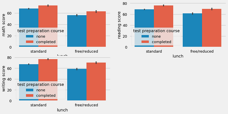
plt.figure(figsize=(12,6))
plt.subplot(2,2,1)
sns.barplot (x=df['lunch'], y=df['math score'], hue=df['test preparation course'])
plt.subplot(2,2,2)
sns.barplot (x=df['lunch'], y=df['reading score'], hue=df['test preparation course'])
plt.subplot(2,2,3)
sns.barplot (x=df['lunch'], y=df['writing score'], hue=df['test preparation course'])
<Axes: xlabel='lunch', ylabel='writing score'>
Insights
- Students who have completed the Test Prepration Course have scores higher in all three categories than those who haven’t taken the course
CHECKING OUTLIERS
plt.subplots(1,4,figsize=(16,5))
plt.subplot(141)
sns.boxplot(df['math score'],color='skyblue')
plt.subplot(142)
sns.boxplot(df['reading score'],color='hotpink')
plt.subplot(143)
sns.boxplot(df['writing score'],color='yellow')
plt.subplot(144)
sns.boxplot(df['average_marks'],color='lightgreen')
plt.show()
CHECKING OUTLIERS
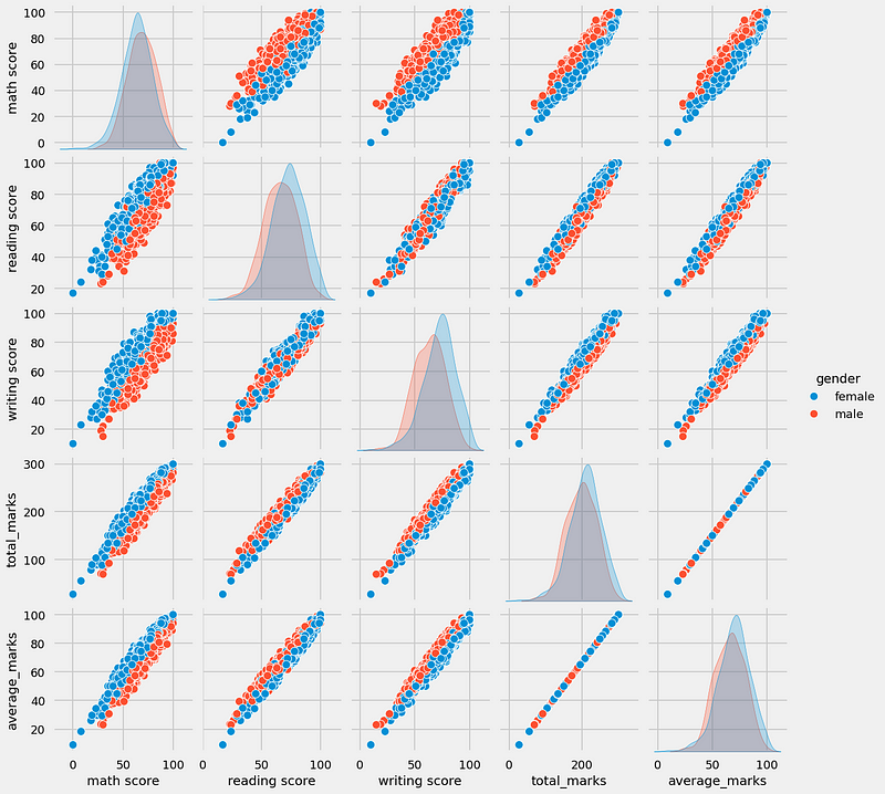
MULTIVARIATE ANALYSIS USING PAIRPLOT
sns.pairplot(df,hue = 'gender')
plt.show()
Insights
- From the above plot, it is clear that all the scores increase linearly.
Conclusions
Student’s Performance is related to lunch, race, parental level education
Females lead in pass percentage and also are top-scorers
Student Performance is not much related to the test preparation course
Finishing the preparation course is beneficial.
Subscribe to my newsletter
Read articles from Rahul Saini directly inside your inbox. Subscribe to the newsletter, and don't miss out.
Written by

