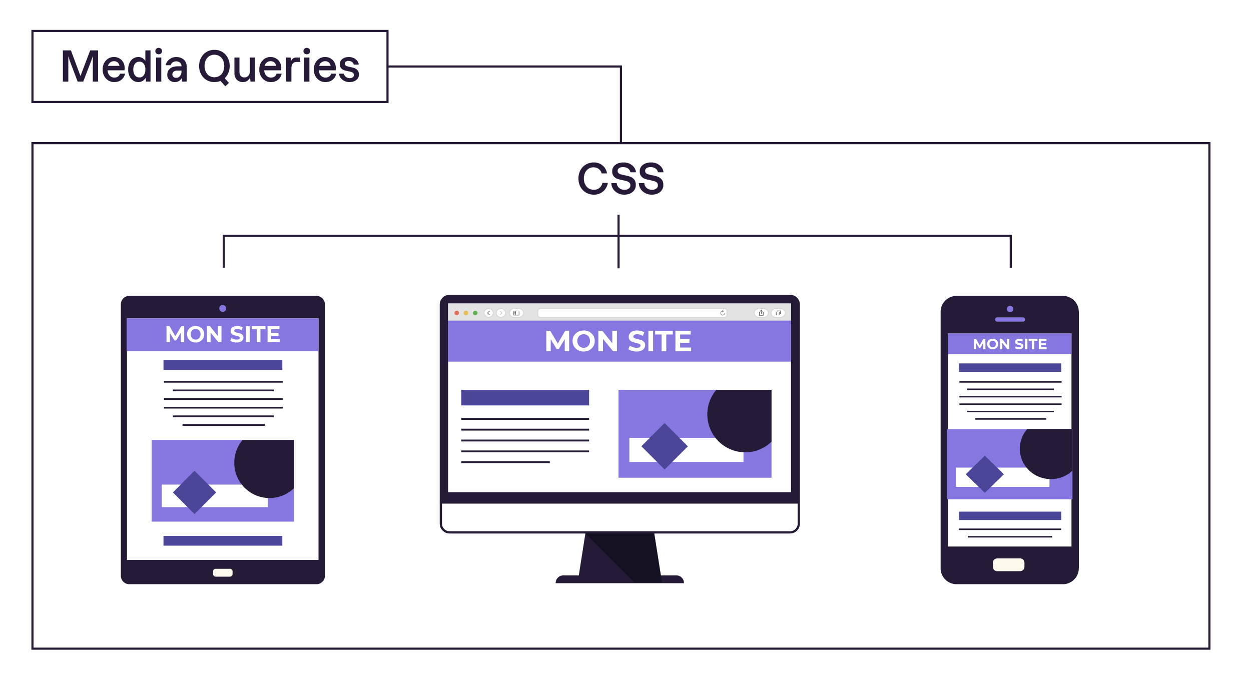
Responsive Design Made Simple with SCSS Breakpoints Mixins.
 Ibrahim Nagnur
In modern web development, ensuring your designs look great across different devices is crucial. With SCSS (Sassy CSS), managing responsive breakpoints becomes easier using mixins. Let's walk through how to effectively use SCSS mixins to handle breakpoints for responsive web design.
Defining Screen Sizes
Firstly, we need to define our breakpoints—these are the points at which our design adapts to different screen widths. Here's an example based on the Twitter Bootstrap grid system:
$breakpoints: (
  sm: 576px,
  md: 768px,
  lg: 992px,
  xl: 1200px
);
This sets up named breakpoints from small to extra-large screens, aligning with common design practices.
Creating Mixins
Next, we create mixins that generate media queries based on these breakpoints. These mixins allow us to encapsulate responsive behavior cleanly:
@mixin media-breakpoint-up($size) {
  @media (min-width: map-get($breakpoints, $size)) {
    @content;
  }
}

@mixin media-breakpoint-down($size) {
  @media (max-width: map-get($breakpoints, $size) - 1px) {
    @content;
  }
}

@mixin rwd($screen) {
  @media #{$screen} {
    @content;
  }
}
These mixins media-breakpoint-up and media-breakpoint-down generate media queries for screens at and above, or below, a specified breakpoint size. The rwd mixin allows us to define custom responsive styles beyond predefined breakpoints.
Using Mixins in SCSS
Now, let's apply these mixins in our SCSS code. Here’s an example where we style a basic component, ensuring it adapts responsively:
.card {
  padding: 20px;
  background-color: #fff;

  @include media-breakpoint-up(md) {
    padding: 30px;
    font-size: 16px;
  }

  @include rwd('orientation: landscape') {
    font-size: 18px;
  }
}
In this example, .card will have different padding and font sizes based on screen sizes. The media-breakpoint-up mixin adjusts styles for medium-sized screens and larger, while rwd applies styles based on the device orientation.
Conclusion
By using SCSS mixins for breakpoints, we streamline the process of creating responsive designs. This approach not only enhances maintainability but also ensures that our designs look great across various devices without duplicating CSS code. Experiment with these mixins in your projects to achieve responsive web design efficiently.
Subscribe to my newsletter
Read articles from Ibrahim Nagnur directly inside your inbox. Subscribe to the newsletter, and don't miss out.
Written by

Ibrahim Nagnur
Ibrahim Nagnur
Software developer specializing in HTML, CSS, and JavaScript frameworks such as AngularJS, Vue.js, and ReactJS. With a robust background in both Indian and Irish markets, I've contributed to diverse projects like the Green India Portal and Qrencia.com, where I excel in crafting captivating user interfaces and optimizing backend, enhancing performance, and scalability. My experience extends to collaborating effectively within remote Agile teams, ensuring streamlined project management and delivering successful outcomes.