Introduction to Data Analysis using Microsoft Excel
 Jogleen Calipon
Ever stared at a spreadsheet, feeling lost in a sea of numbers? Don't worry, you're not alone! Excel can be overwhelming, especially for beginners. But fear not! This guide will transform you from a spreadsheet novice to a data-driven decision-maker.
We will do a walkthrough of the entire data analysis process, from organizing your data to uncovering potential hidden trends. By the end of this article, you'll be confident in using Excel to extract valuable insights and make informed choices."
Excel is a very powerful tool and can handle small to medium datasets efficiently.
Before we start, we need to know the framework for how to do the data analysis in Excel, and those are:
Preparing your data: Import or enter your data into Excel. Ensure that the data is clean and organized in a table format with consistent column headings.
Cleaning and preprocessing your data: Use Excel's tools to clean and preprocess your data, such as removing duplicates, handling errors, and dealing with missing values.
Exploring your data: Use Excel's features to explore your data, such as sorting, filtering, and pivot tables. This will help you understand the basic structure and distribution of your data.
Analyzing your data: Use Excel's functions and formulas to analyze your data, such as descriptive statistics, ANOVA, and regression analysis. This will help you uncover trends, patterns, and relationships in your data.
Visualizing your data: Use Excel's charts and graphs to visualize your data, making it easier to understand and communicate your findings.
Interpreting your results: Analyze and interpret your results, drawing conclusions and making recommendations based on your findings.
Communicating your findings: Use Excel's features to communicate your findings, such as creating reports, dashboards, or presentations.
Iterating and refining your analysis: Continuously refine your analysis as you gain new insights and receive feedback.
Prepare the data
To start with, we will need our dataset. You can download the dataset on Kaggle
(You can use your Google account to create one if you don't have a Kaggle account.)
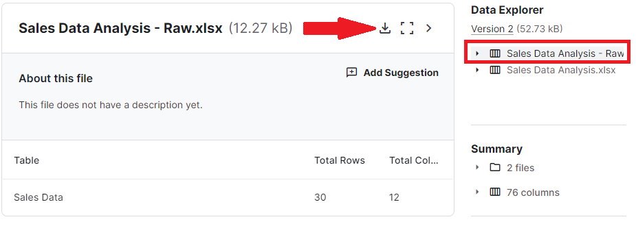
Once you download the dataset, it should look like this:
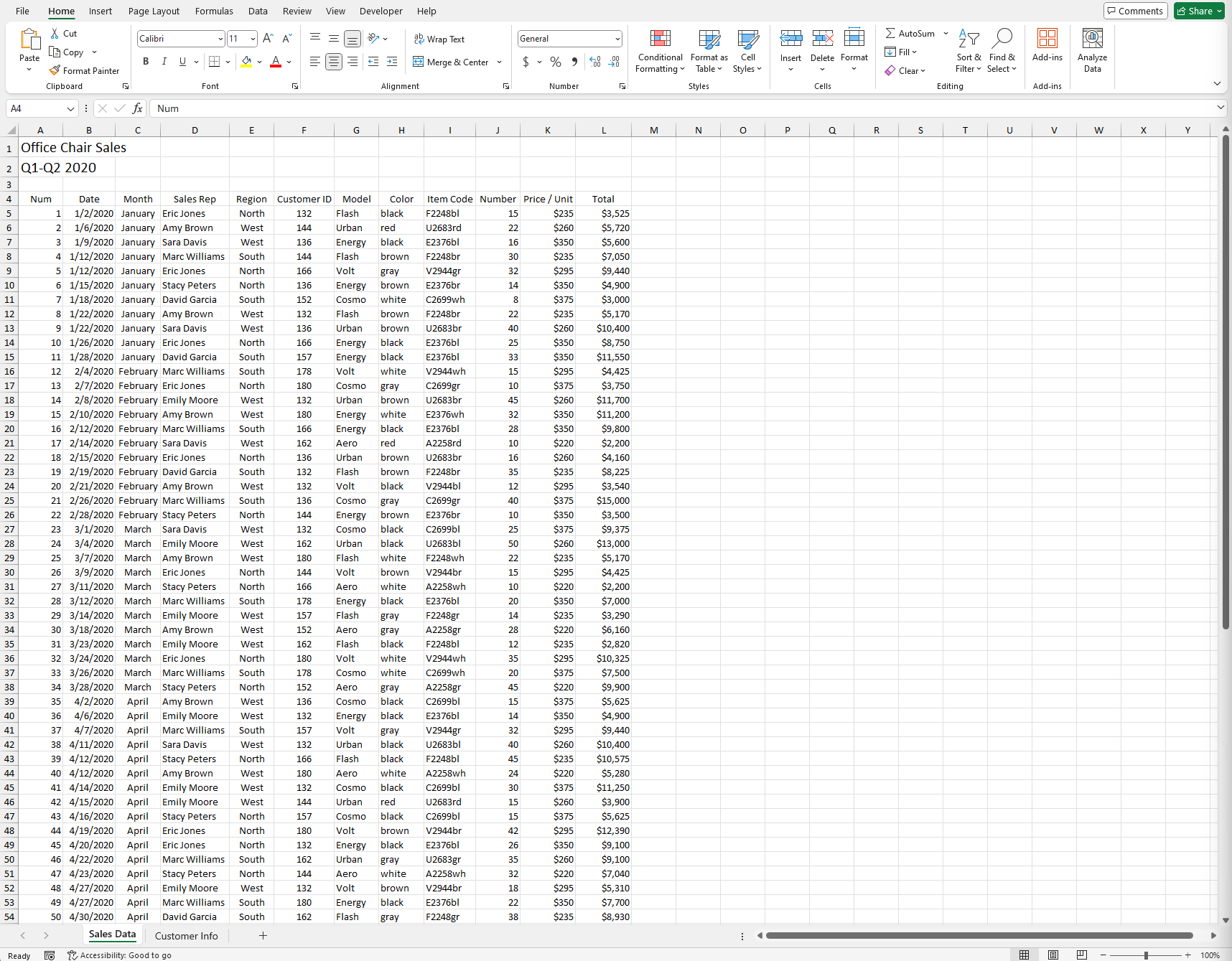
Clean and preprocess the data
Before we start working on our data, my first tip is to always create a copy of the data you are working on. This will serve as a backup file (you can hide it if you don't want to see it in the background). If you accidentally mess up the data, you'll still have something to go back to, and it will also serve as your reference.
On our "Sales Data" tab, we can see that we have data from columns A–L and rows 1-84. Now we will need to make sure that our data is clean before we start exploring it. You will notice something is off in the "Sales Rep" (column D). Yes, you guessed it right; the format of the sales representative's name is not in the proper format. We will need to fix that. There are a lot of ways to do this, but let's do the basic one: We can see that the format of the names has some spaces in between them, and the last names seem to be in the uppercase except for the last characters. To fix this, we will need to do it one step at a time. Since there are spaces between the first name and the last name, let's separate the last name first. To do this, we will use Excel's built-in tool, which is Text to Column. However, we will be facing some issues with this because there is no unique identifier to separate the characters in the cell. But don't fret yet; there's actually a workaround for this kind of scenario. Stay with me. First, highlight column E, right-click on your mouse, and click insert
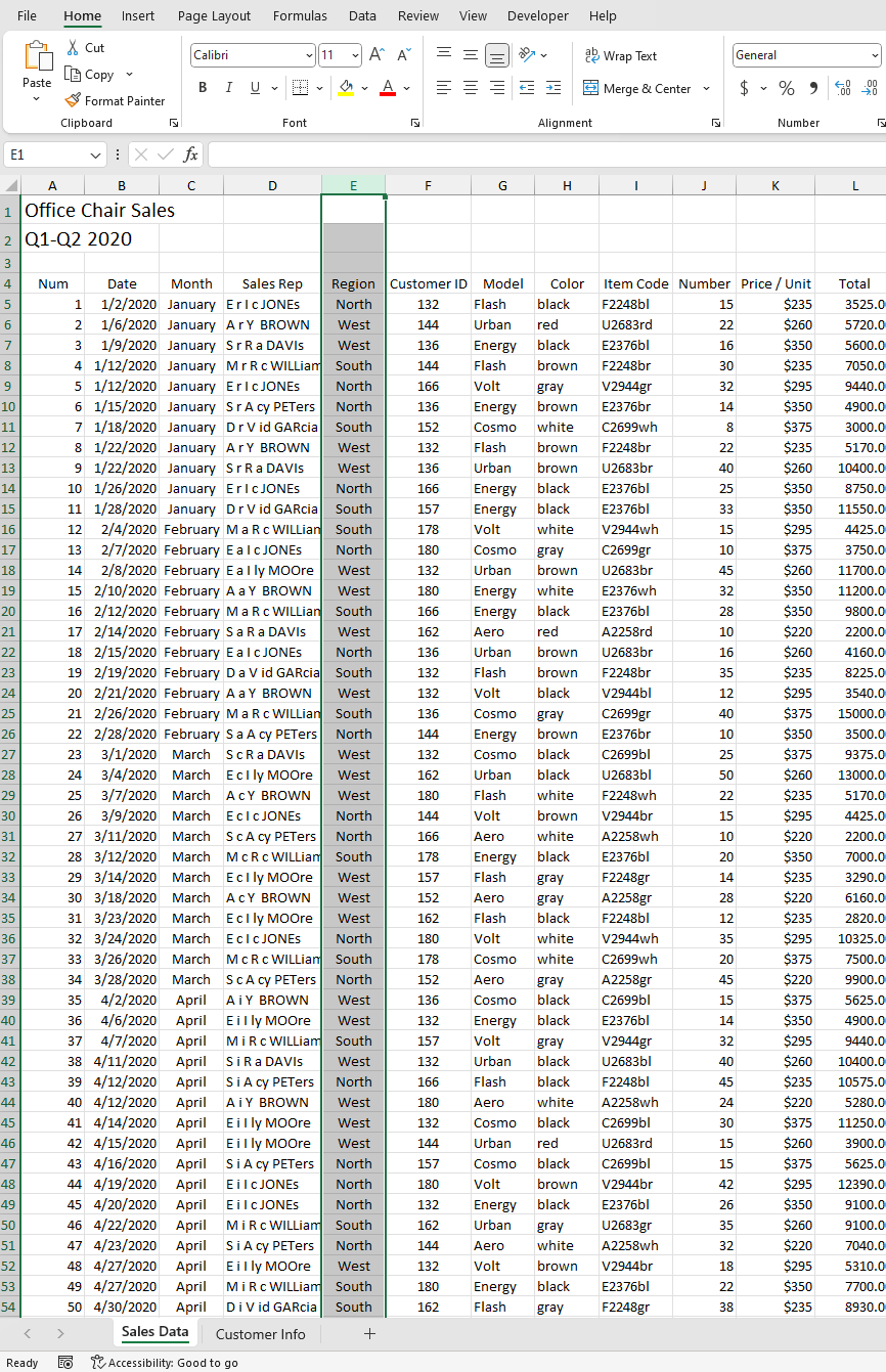
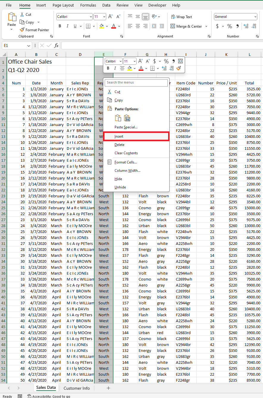
Type in the sales name manually to prompt the flash-fill option later on, but this time you will need to add a hyphen and type in at least two names. Now highlight the two names you typed manually, and then hold the left-click while you drag them downward. By now, you will probably see just the two names we typed in manually, and that's normal. For us to reflect the same name based on the "Sales Rep" tab, we will need to choose the flash-fill option.
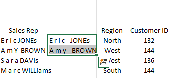

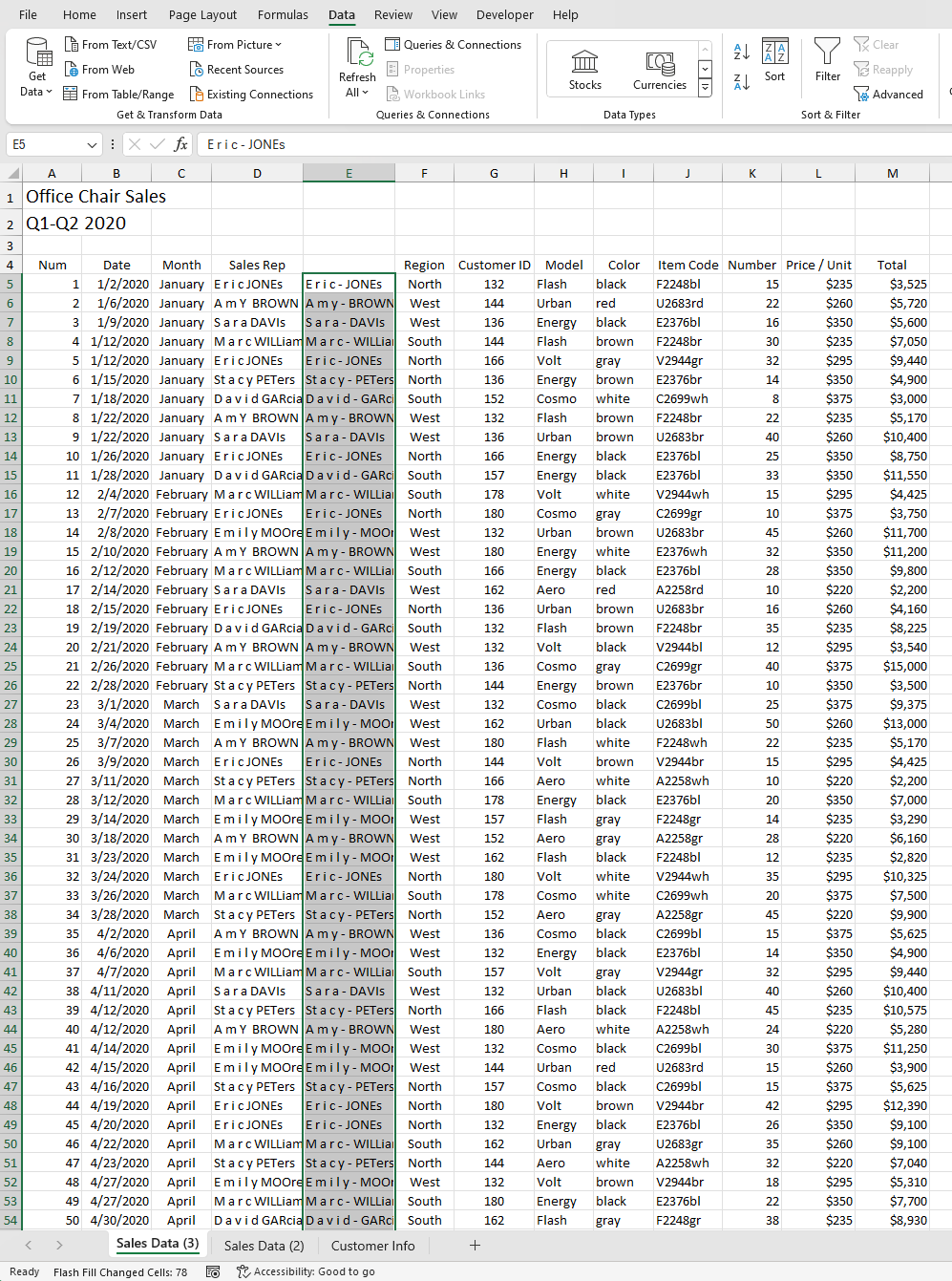
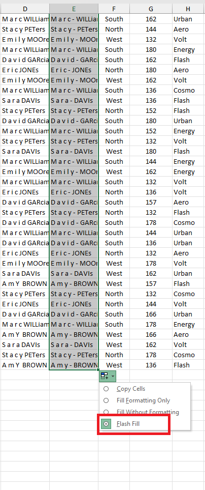
Now let's proceed with separating the last name. To do that, we will use another built-in tool in Excel, which is Text to Columns. Go to the Data tab and look for Text to Columns. Choose Delimited and click Next

On the Delimiters option, choose Others and input the hyphen, then click Next
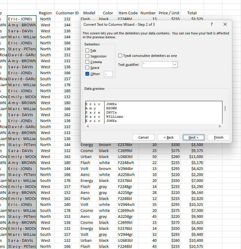
On the next dialogue box, Excel will ask for the destination. Click N5 and click Finish
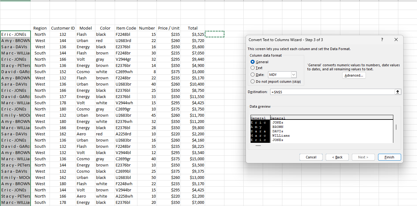
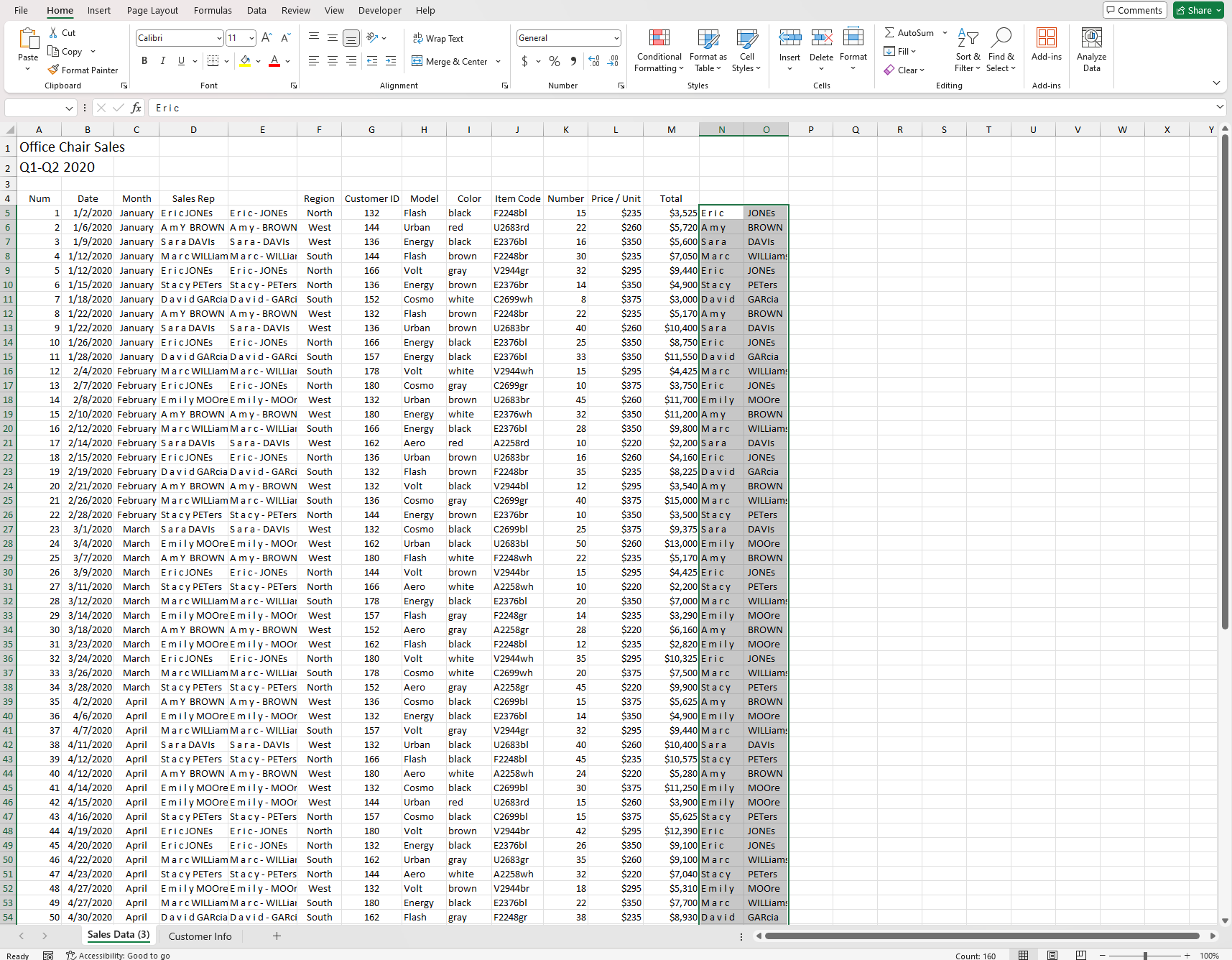
Now since we already have everything to start fixing our first problem, click column N6 hold shift, and ctrl plus arrow-down keys to highlight the first names
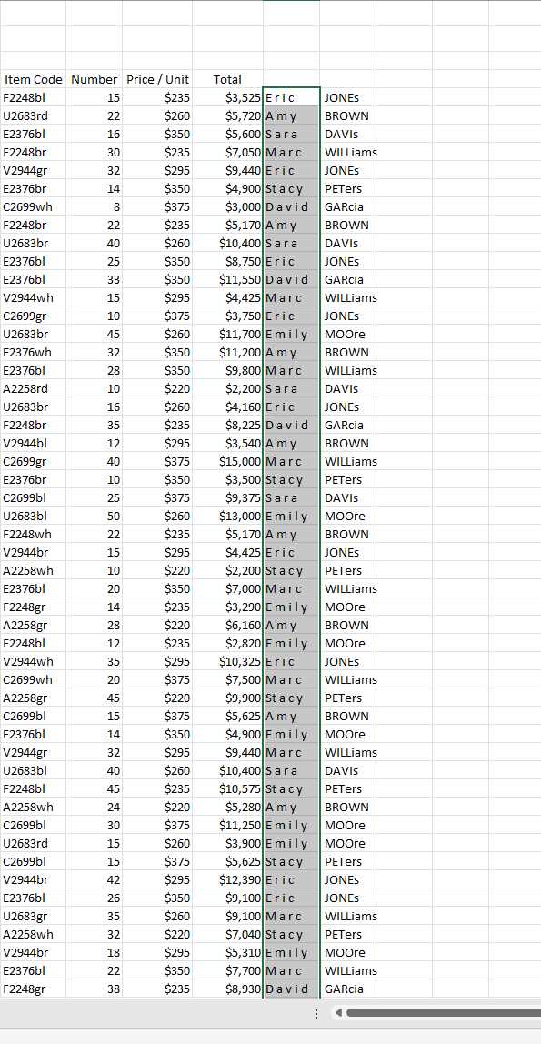
Now let me introduce one of the built-in tools of Excel, which is the Find and Replace
To use it, you can use the shortcut keys by pressing Ctrl + F under the dialogue box, and you will see two options. Click the Replace button under the Find What section, type in a space, and click Replace All
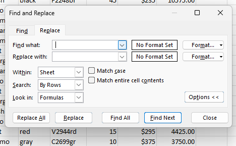
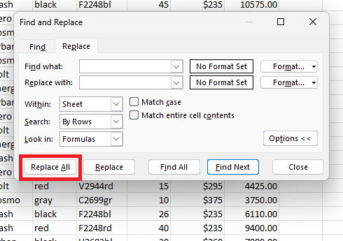
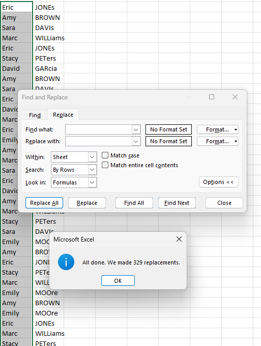
Voila! Those extra spaces between the first names have been eliminated. Now we will move on to the last name. We can see that the last name is not in proper formatting. To fix this, we need to use an Excel function, and yes, you guessed it right. Let me do the honor of introducing the proper function. To use this function, you can click P5 and press the = sign, or you can click the Insert Function button, type in "proper," and press Tab. What the Proper function does is convert a text string to the proper case: the first letter in each word will be uppercase, and the rest will be in lowercase.

Next, the function will ask you in which cell you want the code to run. For this, you can click O5 and end the query by typing the close parenthesis sign and pressing Enter.

You will see that on P5, the last name has been formatted properly. All we have to do is apply it to all other last names. To do this, we do have two options: we can either double-click the fill handle to activate the flash fill or we can drag it down until the very bottom of the data. The results will be the same.
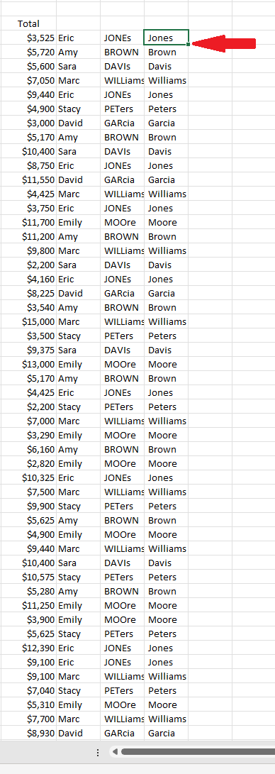
For our next step, we will need to copy and paste the formatted name into column O, but instead of doing a plain copy and paste, we will do it differently, and I will explain why. Even though we have successfully corrected the format of the last names, if you click on P5, you can see the function =PROPER(O5), which is clearly not text. In order for us to manipulate the names, we will need to convert those last names into a string (text). Highlight the last name in the P5 column and copy it, but before you paste it in O5, right-click, look for "Paste Special," and click "Values."
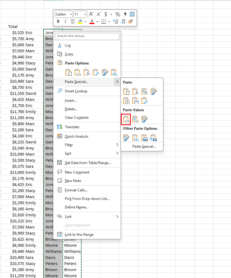
Now you can see that the first and last names are in the proper format. We can delete column P since we will not need it anymore. Now we just need to combine the first and last names. For this scenario, Excel has a perfect function called CONCAT. To do this, follow the same process as earlier: click on P5, type the = sign, and then type CONCAT. What CONCAT does is join two different cells into one cell, which is perfect for our case. The result will be Eric Jones. Double-click for flash fill, or we can drag it down. Finally, copy it and paste it using the paste special value to convert it to text. Now we can delete columns E, N, O, and P by holding control while clicking those mentioned columns and pressing delete.


Explore the data
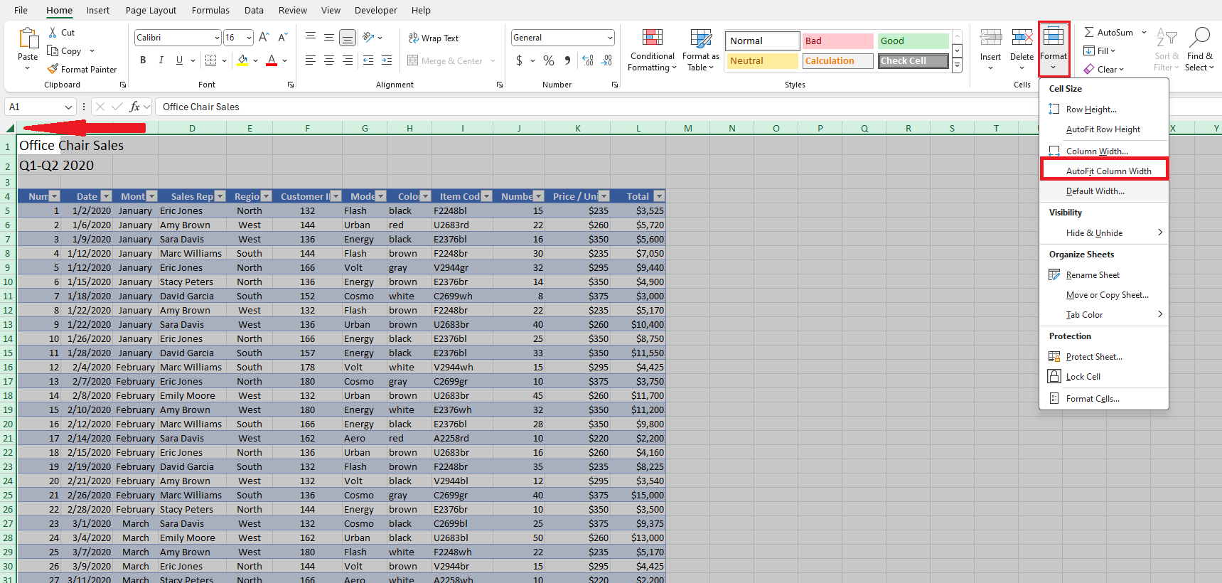
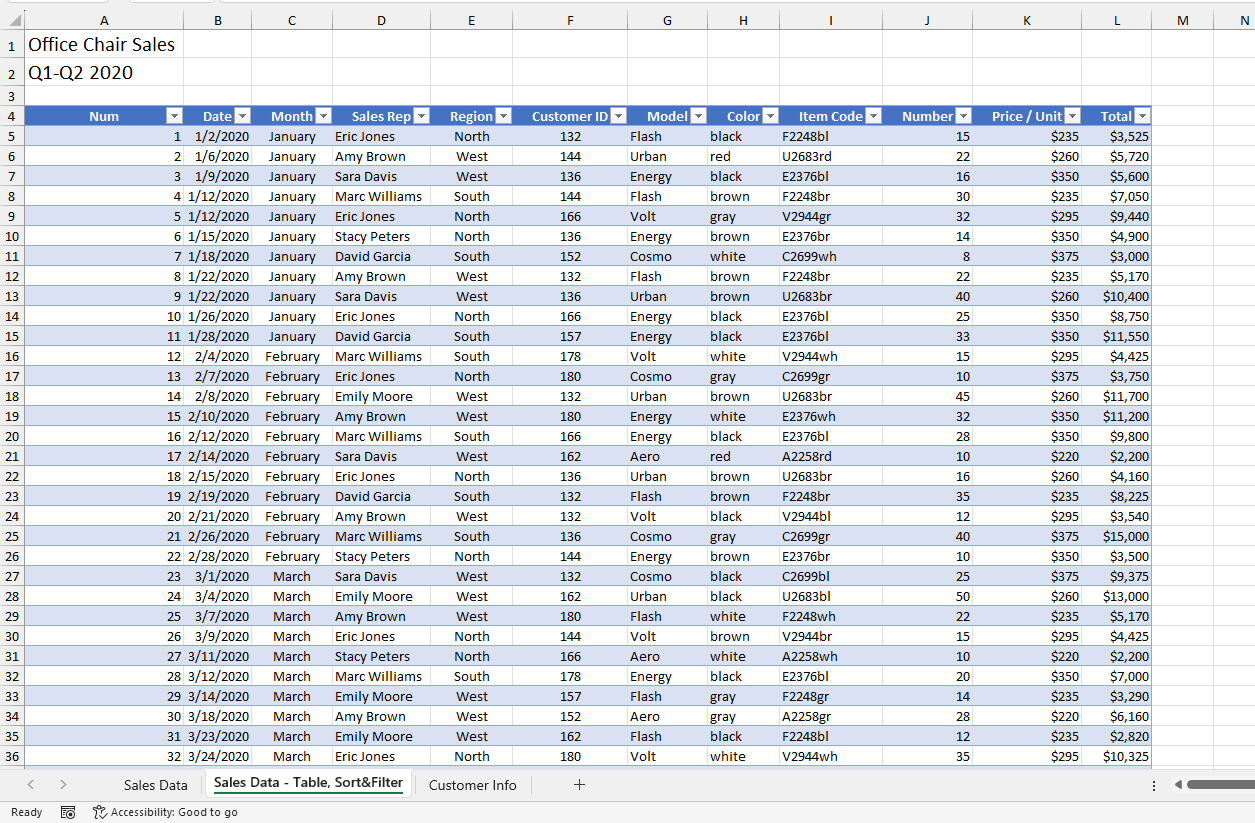
Now we are ready for the next step, which is to explore our data. First, we need to create a table so we can easily work with the data. Use a shortcut by clicking on a cell in our data set, like A5, then pressing ctrl + a to highlight all the data, and then ctrl + t to create the table. By default, the table should have banded rows enabled, but if not, you can enable it by going to the Table Design tab and, in the Table Style Options, checking the Banded Rows to activate it. You might notice some headers are not fully readable. To fix this, use the Select All button and the Format tool. Click on the drop-down menu and choose AutoFit Column Width.


Analyzing the data
Since this is a sales dataset, we need to follow some requirements, and one of those is as follows:
| Requirements: |
| There will be a wholesale 5% Discount for more than 20 orders (Column J) |
| This means those orders with more than 20 will have a discounted price |
Let's start by adding a new column, which we can name Discount. To identify if an order is subject to a discount, we can use one of the Excel functions, the IF function, in cell M5, typed as =IF([@Number]>=20,"Y","N") or =IF(J5>=20,"Y","N"). Either one is correct. The IF function checks whether a condition is met and returns one value if true and another value if false. We can drag the formula down or use flash fill to apply it to the entire column.
Next, we can identify which order has the discounted price by relying on the Discount column; however, we still don't have the exact amount. Now, we need to know the final price. We will create another header on our table and name it Final Price. We will still use the same function above. We will type in cell N5 =IF([@Number]>=20,0.95*[@Total],[@Total]) or =IF(J5>=20,0.95*L5,L5). Either one is correct. We can drag the formula down or use flash fill to apply it to the entire column.
The breakdown of the formula is this: basically, we instruct Excel that if the order is greater than (>) or equal to (=) 20, it will show as "Y" or "N" if the requirements have not been met. The same procedure applies to the Final Price column, where we multiply 0.95 (100%–5%) in decimal form by the Number column to get the output for the discounted price, but it will have the same Total price if the requirements aren't met.

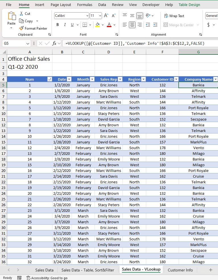
Now our data still lacks some information, especially the details of the company that placed the order. We can get this information from the other worksheet, Customer Info. We could manually enter the information into our workbook based on the Customer ID, but this would take a lot of time and be prone to human error. In this situation, VLOOKUP shines the most. We can create a new column after Customer ID and name it Company Name.
Go to cell G5, then type in =VLOOKUP([@[Customer ID]],'Customer Info'!$A$3:$C$12,2,FALSE) or =VLOOKUP(F5,'Customer Information'!$A$4:$C$12,2,FALSE). Either one is correct. We can drag the formula down or use flash fill to apply it to the entire column.
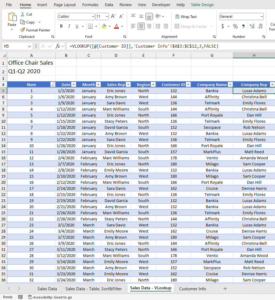
Right now, we can see the name of the company corresponding to the Customer ID column; however, we still don't know the representative from that company. We can find their names by creating a new tab and using the same function as above. Create a new column and name it Company Rep. Insert this formula =VLOOKUP([@[Customer ID]],'Customer Info'!$A$3:$C$12,3,FALSE) or =VLOOKUP(F5,'Customer Information'!$A$4:$C$12,3,FALSE). Either one is correct. We can drag the formula down or use flash fill to apply it to the entire column.
Now, if we break down the VLOOKUP function and it is your first time using it, it can be very confusing. You don't have to worry if you can't get it the first time you use it. I will guide you through.
If you can go to the insert function button and search for VLOOKUP, it will give us a brief description of what the function does
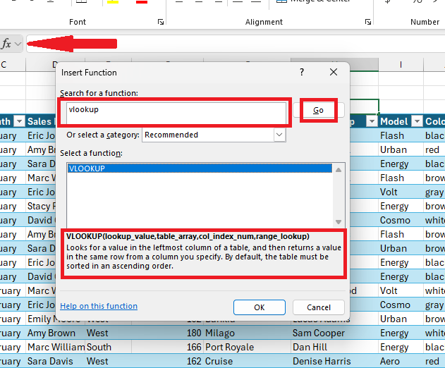
VLOOKUP(lookup_value.table_array,col_index_num,range_lookup) Looks for a value in the leftmost column of a table, and then returns a value in the same row from a column you specify. default, the table must be sorted in an ascending order.
lookup_value = Customer ID 132
table_array = 'Customer Info'! A3:C12(by default) we need to make this as an absolute reference $A$3:$C$12 so it will only search within our table
col_index_num = 2
range_lookup = FALSE (VLOOKUP will only find an exact match)
Visualizing the data
In this part, I will introduce the pivot table. This will be the main tool we will use to visualize our data. To start, highlight all our data (ctrl + a), then go to the Insert tab, look for the Tables menu, click the PivotTable button, and leave everything as is. Finally, click OK.
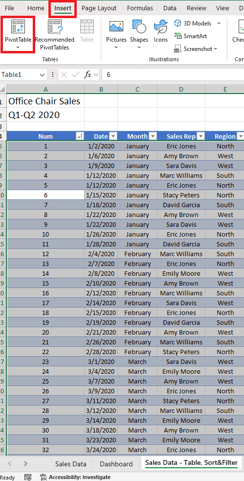
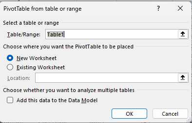
The first thing we can visualize is the monthly sales. Rename the new sheet to Sales by Month and on the PivotTable Fields, since we are trying to visualize the Monthly sales, we can drag the Final Price to Values and drag the Month to either Rows or Columns (I prefer Rows)
Before we do our visualization, let's have a quick touch on Rule for Using Recommended Charts
While the "Recommended Charts" feature in Excel is a helpful starting point, it's crucial to remember that it's not infallible. The tool analyzes your data and suggests potential chart types, but it doesn't necessarily provide the best visualization for your specific needs. Always critically evaluate the recommended charts before finalizing your choice.
The rule of thumb is to choose a chart type that effectively communicates the story your data tells.
Best Scenarios for Different Chart Types
Here's a breakdown of common chart types and when to use them:
Column and Bar Charts
Best for: Comparing values across categories, showing changes over time, and visualizing parts of a whole.
Example: Comparing sales figures for different products, tracking website traffic over months, or showing market share.
Line Charts
Best for: Displaying trends over time, showing relationships between two variables, and visualizing data points that change continuously.
Example: Tracking stock prices, analyzing temperature changes over a year, or plotting sales growth.
Pie Charts
Best for: Showing the proportion of different categories within a whole.
Caution: Avoid using too many slices, as it can become difficult to read.
Example: Illustrating the distribution of age groups in a population, or showing the breakdown of expenses.
Area Charts
Best for: Emphasizing the magnitude of change over time and visualizing cumulative effects.
Caution: Overlapping areas can make the chart difficult to read.
Example: Tracking website traffic over time, showing total sales by region.
Scatter Charts
Best for: Showing the relationship between two variables and identifying trends or patterns.
Example: Correlating product price with sales, analyzing the relationship between advertising spend and revenue.
Bubble Charts
Best for: Showing the relationship between three variables, where the size of the bubbles represents a third variable.
Example: Comparing sales, profit, and market share for different products.
Histogram
Best for: Displaying the distribution of numerical data.
Example: Analyzing the distribution of customer ages, income levels, or product ratings.
Box and Whisker Plot
Best for: Showing the distribution of data, including outliers, quartiles, and median.
Example: Comparing the performance of different groups or products.
Remember:
Clarity is key: Choose a chart that is easy to understand and interpret.
Less is more: Avoid cluttering your chart with too much information.
Context is important: Provide clear labels and titles to explain the data.
Experiment: Try different chart types to find the best visualization for your data.
By following these guidelines and carefully considering your data, you can create effective and informative charts that effectively communicate your message.
Now that we have discussed the rules for visualization, I will walk you through on how to create the monthly sales visual and I will let you do the rest. You can experiment and you can share with me your work if you want to.
Click on any cells on the pivot table. Go to the Insert tab and click the Recommended Charts. For this scenario, based on the rules, we can use the line chart and I prefer the one with markers
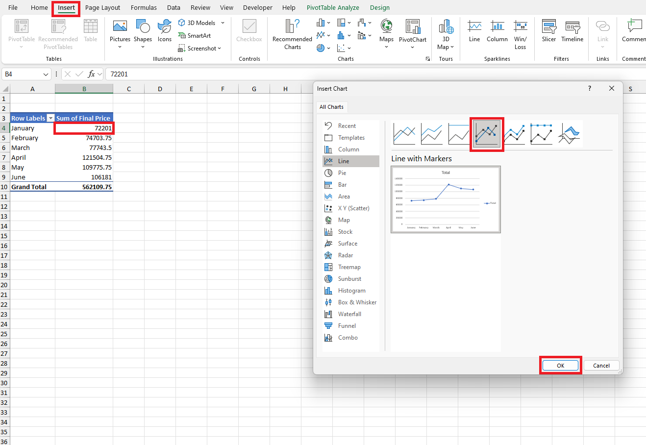
Now we can format the chart the way we like it by going into these options
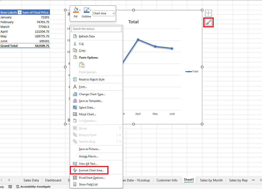
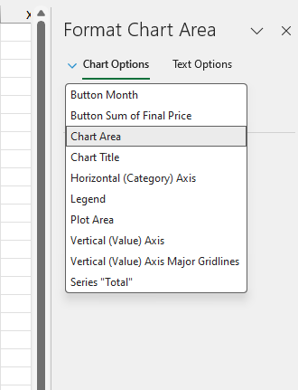
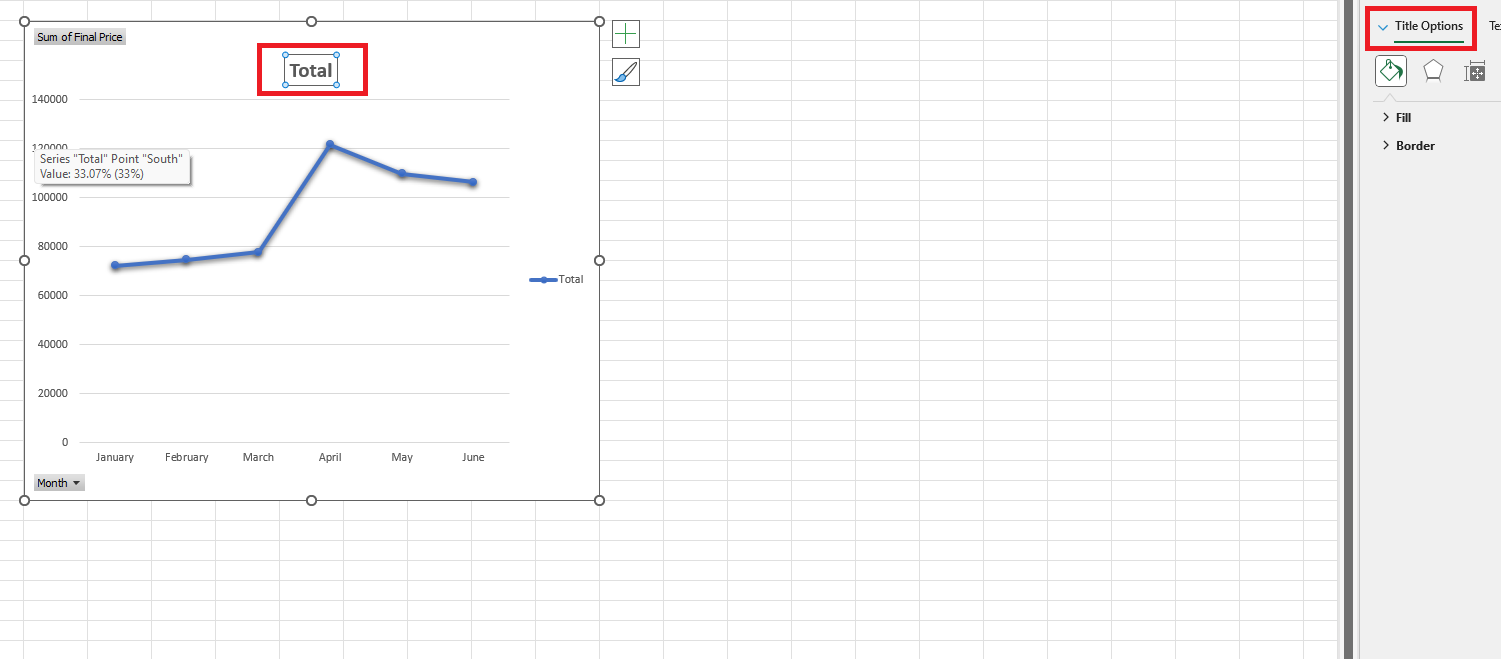
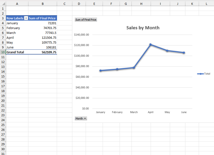
For instance, if we choose the drop-down and choose the Chart Title, we will notice that the cursor automatically goes to the title (Total). We can rename it as Sales by Month
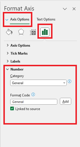
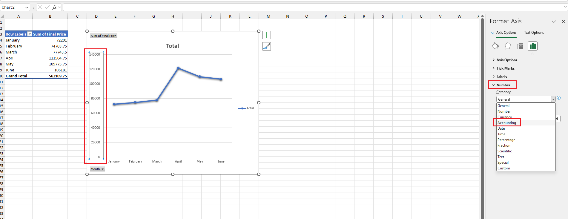
Next, we can format the chart area where we can see the number to a currency format for a much better visual. To do this, we can click the drop-down and click on Vertical (Value) Axis. We can see under Number that the Format is in General; we need to change it to Accounting to reflect the currency ($)
the final output should look like this
Now it's your turn. You can try to visualize sales by each rep, model, and region by following the rules above.
Interpreting your results
In this stage, we will consolidate all of our visualizations into the dashboard. This varies in every organization; some require a detailed report, while others just want the dashboard shown and explained in the meeting.
Now let's create a new worksheet and name it Dashboard. You might have different visualizations, and that's perfectly fine. I made a total of four visuals based on sales by month, rep, item sold, and sales by region.
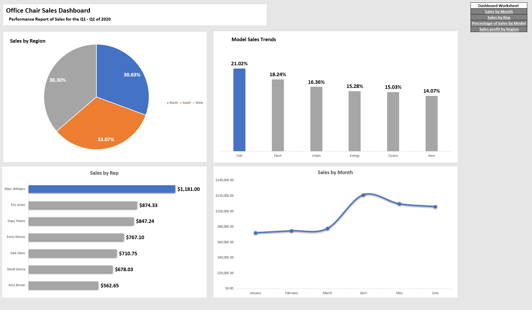
By effectively visualizing your data, you can confidently share insights with stakeholders and make data-driven decisions. Remember, interpreting results and communicating findings are crucial steps that often require collaboration within an organization.
Continuously refining your analysis through iteration (Iterating and refining your analysis) and feedback will help you uncover deeper insights over time.
I hope this guide has given you the essential tools to start your Excel data analysis journey.
If you want more content like this, subscribe to my newsletter. Feel free to leave a comment if you have any questions!
Subscribe to my newsletter
Read articles from Jogleen Calipon directly inside your inbox. Subscribe to the newsletter, and don't miss out.
Written by

Jogleen Calipon
Jogleen Calipon
👋 Welcome to My Profile! I'm a Data Analyst with over four years of experience turning data into meaningful insights that drive smart business decisions. Whether it's building automated reports, uncovering operational inefficiencies, or creating interactive dashboards that tell a clear story—I'm passionate about using data to solve real-world problems. 💡 What I Do Best Data Preparation: Cleaning, shaping, and enriching messy datasets Data Analysis: Extracting insights to inform decisions Automation: Streamlining recurring reports and building data entry forms Business Reporting: Creating reports tailored to decision-makers Visualization: Designing dashboards that make data easy to understand Collaboration: Translating technical findings for non-technical audiences 🛠️ Tools & Technologies Spreadsheets & Data Processing Microsoft Excel: Power Query, Power Pivot, DAX, advanced lookup functions, custom automation workflows Business Intelligence Power BI: Interactive dashboards and visual storytelling Databases & SQL Foundational knowledge of MS SQL Server, MySQL, BigQuery, and MS Access Experience writing basic to intermediate SQL queries Programming Python: Foundational experience with Pandas, NumPy, SciPy, Seaborn, and Matplotlib for data analysis and visualization R: Working knowledge of data wrangling, ggplot2, and statistical modeling 🚀 Let's Connect I'm currently open to short-term projects and part-time roles where I can contribute to: Optimizing processes Unlocking insights hidden in data Building scalable, automated solutions Thanks for visiting my profile! Feel free to explore my projects and reach out for collaboration or just to connect. 😊