Visualizing airtable data in powerBI
 Nabil Muhammad Sani
I was given a task by a friend to extract data from his Airtable workspace and visualize it. He wanted to be able to visualize the amount of work he did over a period of time. The data was a collection of previous works done by the client. It contained information such as payment, and date received, amongst other things. I used powerBI for visualization because I'm most familiar with it. This is meant to serve as a simple guide for anyone interested in doing something similar.
STEPS
The first step I undertook was creating an airtable account so I could access his data.
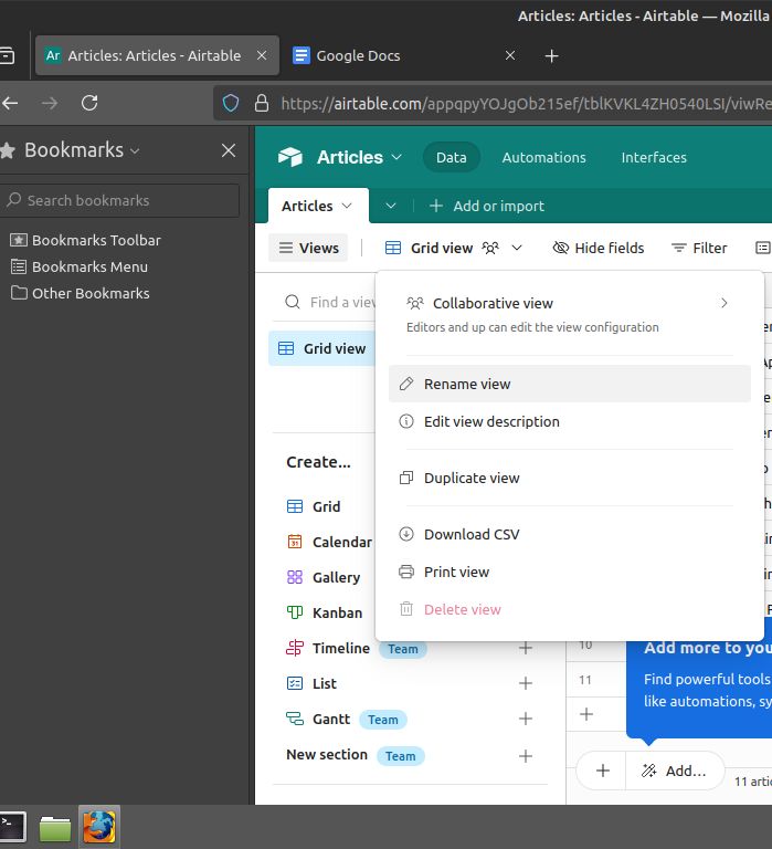
After creating the account, I used the “grid view” slide down menu on the top left corner to access the “Download CSV” button and then I converted the data into a CSV file.

I then loaded the data into PowerBI for visualization.
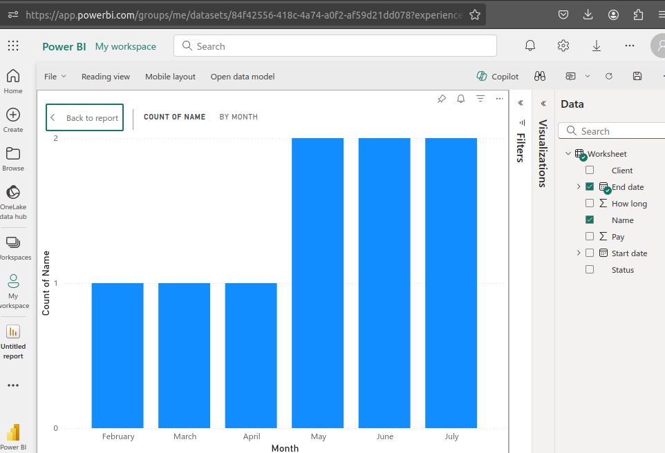
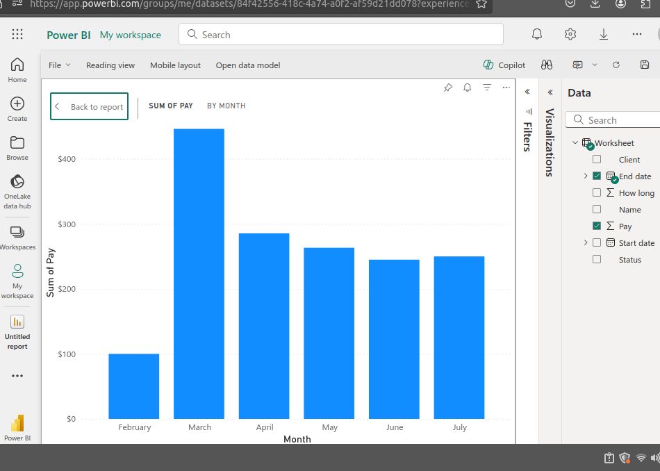
I used powerBI’s “clustered bar chart” tool on the “pay”, “Name” and “enddate” columns in the dataset. I created the charts to show the number of articles he had done per month and the amount he got paid per month.


Subscribe to my newsletter
Read articles from Nabil Muhammad Sani directly inside your inbox. Subscribe to the newsletter, and don't miss out.
Written by

Nabil Muhammad Sani
Nabil Muhammad Sani
I'm an upcoming data analyst and data scientist. I have a background in biochemistry and finance. I love studying history, writing poetry, and weird passion for the macabre.