Learning Power BI
 Amey Pote
Table of contents

Introduction
Recently, I had the opportunity to dive deep into Power BI, a powerful business analytics tool that has transformed my understanding of data visualization and analysis. This comprehensive learning experience has equipped me with the essential skills needed to harness the power of Power BI for data analysis and visualization. In this blog, I will walk you through the key lessons I learned, providing informative insights into each topic I covered during my journey.
Exploring Power BI
My journey began with understanding what Power BI is and how it can revolutionize the way we interact with data. Power BI connects to hundreds of data sources, simplifies data prep, and drives ad hoc analysis. It provides a cohesive view of data, enabling users to create interactive reports and dashboards that offer valuable insights at a glance.
Discovering Power BI Features
Power BI comes packed with features that make data analysis intuitive and insightful. From data connectivity and transformation to interactive dashboards and advanced visualizations, each feature is designed to enhance the user experience. I was particularly impressed by Power BI's AI capabilities, such as Q&A and insights, which uncover hidden trends and patterns in data, making it easier to derive meaningful insights.
Understanding Power BI Components
Understanding the different components of Power BI is crucial for effectively utilizing the tool. I explored Power BI Desktop, Power BI Service, and Power BI Mobile, learning how each component plays a unique role in the data analysis process. Power BI Desktop is where the magic begins with data preparation and modelling, Power BI Service allows for sharing and collaboration, and Power BI Mobile ensures data access on-the-go.
Navigating Power BI Service
Power BI Service is the online platform where users can publish, share, and collaborate on their Power BI reports and dashboards. I learned how to navigate the Power BI Service interface, publish reports from Power BI Desktop, and share insights with colleagues. The service also offers features like workspaces, apps, and dataflows, which enhance collaboration and data management.
Creating Charts and Graphs
Visualizations are at the heart of Power BI, and I spent a significant amount of time learning how to create various types of charts and graphs. From bar charts and line graphs to more advanced visualizations like tree maps and scatter plots, I discovered how to effectively represent data to convey clear and compelling stories. The drag-and-drop interface of Power BI Desktop made it easy to customize and refine visualizations to suit specific analytical needs.
Building Data Models
Data modelling is a crucial step in preparing data for analysis. I learned how to create data models by defining relationships between different data sources. Establishing proper relationships and using DAX (Data Analysis Expressions) functions to create calculated columns and measures enhanced the analytical capabilities of my data model.
Mastering DAX Functions
DAX functions are powerful formulas that allow users to perform complex calculations on their data. I explored the basics of DAX, including functions like SUM, AVERAGE, and DATEDIFF, as well as more advanced functions for time intelligence and conditional calculations. Understanding DAX is essential for creating dynamic and insightful reports.
Enhancing Data Modelling Skills
Building on my initial data modelling knowledge, I delved deeper into data modelling techniques. Using Power BI's modelling tools, I created relationships, managed tables, and optimized data models for performance. Proper data modelling ensures that reports and dashboards are accurate, responsive, and easy to maintain.
Crafting Power BI Dashboards
Power BI Dashboards provide a consolidated view of the most important metrics and KPIs, all in one place. I learned how to create and customize dashboards, add visualizations, and configure interactivity to make dashboards more engaging. Dashboards are a powerful way to monitor business performance and share insights with stakeholders.
My Sales Dashboard Project
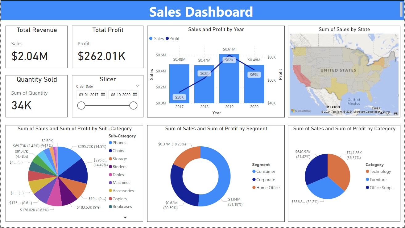
One of the most exciting parts of my journey was creating a sales dashboard using Power BI. This dashboard utilizes sales data from a superstore and includes various insightful charts and graphs:
Total Revenue: Shows the overall revenue generated.
Total Profit: Displays the total profit earned.
Sales and Profit by Year: Tracks sales and profit trends over different years.
Sum of Sales by State: Highlights sales distribution across different states.
Sum of Sales and Sum of Profit by Sub-Category: Breaks down sales and profit by product sub-categories.
Sum of Sales and Sum of Profit by Segment: Analyse sales and profit across different customer segments.
Sum of Sales and Sum of Profit by Category: Categorizes sales and profit by product categories.
Creating this dashboard allowed me to apply the concepts I learned and gain hands-on experience with Power BI. The interactive elements and dynamic visualizations in the dashboard provide a comprehensive overview of the superstore's sales performance, enabling better data-driven decision-making.

Conclusion
Completing this journey through Power BI has been an enriching experience. I now have a strong foundation in Power BI, from basic concepts to advanced data modelling and visualization techniques. I am excited to leverage these skills in my future projects and continue exploring the vast potential of Power BI in the field of data analytics.
Subscribe to my newsletter
Read articles from Amey Pote directly inside your inbox. Subscribe to the newsletter, and don't miss out.
Written by
