AuraUI Component Library - Crafting Seamless Frontend Experiences
 Kishor Kunal
In the fast-paced world of web development, creating visually stunning and high-performance websites is more important than ever. Developers need tools that not only streamline their workflow but also ensure a seamless user experience. Enter AuraUI, a component library designed to provide stunning website components and content for quick and high-performance React websites.
These components help developers build React-based websites quickly and easily, ensuring a smooth development process and a great user experience.
The Vision Behind AuraUI
AuraUI aims to be a go-to resource for developers looking to create stunning, high-performance websites. It offers a wide range of components that can be easily integrated into any project, saving developers time and effort. Whether you're a seasoned developer or just starting out, AuraUI provides the tools you need to create beautiful and functional websites.
By leveraging AuraUI, developers can focus on building unique features and functionalities, rather than reinventing the wheel for common UI elements. So basically all you have to do is to copy and paste the provided code for the UI that you want to have in your project. it's way easier then you think. You can ship your sites within hour.
Seamless Integration with Next.js

This component library provide codes with high optimisation because AuraUI is designed with modern web development practices in mind. One of the key frameworks supported by AuraUI is Next.js, a popular React framework known for its server-side rendering and static site generation capabilities. AuraUI components integrate seamlessly with Next.js, allowing developers to create dynamic and high-performing websites effortlessly, let's walkthrough.
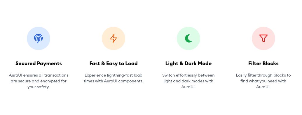
Let's Look at an example of the component they provide. let's see how optimised code they provide by examining a feature section component

And here is the code for the component:
import React from "react";
import { FaFingerprint, FaMoon } from "react-icons/fa6";
import { FiFilter } from "react-icons/fi";
import { RxLightningBolt } from "react-icons/rx";

const SmallFeatureSection = () => {
  const containerStyles = "py-10 bg-white sm:py-16 lg:py-24";
  const innerContainerStyles = "px-4 mx-auto max-w-7xl sm:px-6 lg:px-8";
  const gridStyles =
    "grid grid-cols-1 text-center sm:grid-cols-2 gap-y-8 lg:grid-cols-4 sm:gap-12";
  const itemStyles = "flex flex-col items-center";

  return (
    <section className={containerStyles}>
      <div className={innerContainerStyles}>
        <div className={gridStyles}>
          <div className={itemStyles}>
            <div className="h-20 w-20 bg-blue-100 flex items-center justify-center rounded-full">
              <FaFingerprint className="flex items-center justify-center w-8 h-8 mx-auto text-blue-600" />
            </div>

            <h3 className="mt-8 text-lg font-semibold text-black">
              Secured Payments
            </h3>
            <p className="mt-4 text-sm text-gray-600">
              AuraUI ensures all transactions are secure and encrypted for your
              safety.
            </p>
          </div>
          <div className={itemStyles}>
            <div className="h-20 w-20 bg-orange-100 flex items-center justify-center rounded-full">
              {" "}
              <RxLightningBolt className="flex items-center justify-center w-8 h-8 mx-auto text-orange-600" />
            </div>
            <h3 className="mt-8 text-lg font-semibold text-black">
              Fast & Easy to Load
            </h3>
            <p className="mt-4 text-sm text-gray-600">
              Experience lightning-fast load times with AuraUI components.
            </p>
          </div>
          <div className={itemStyles}>
            <div className="h-20 w-20 bg-green-100 flex items-center justify-center rounded-full">
              <FaMoon className="flex items-center justify-center w-8 h-8 mx-auto text-green-600" />
            </div>
            <h3 className="mt-8 text-lg font-semibold text-black">
              Light & Dark Mode
            </h3>
            <p className="mt-4 text-sm text-gray-600">
              Switch effortlessly between light and dark modes with AuraUI.
            </p>
          </div>

          <div className={itemStyles}>
            <div className="h-20 w-20 bg-red-100 flex items-center justify-center rounded-full">
              <FiFilter className="flex items-center justify-center w-8 h-8 mx-auto text-red-600" />
            </div>
            <h3 className="mt-8 text-lg font-semibold text-black">
              Filter Blocks
            </h3>
            <p className="mt-4 text-sm text-gray-600">
              Easily filter through blocks to find what you need with AuraUI.
            </p>
          </div>
        </div>
      </div>
    </section>
  );
};

export default SmallFeatureSection;
This code defines a SmallFeatureSection component in React, utilizing Tailwind CSS for styling and react-icons for iconography. It arranges feature items in a responsive grid layout, each item showcasing a different feature with an icon, title, and description. The component is designed for easy readability and maintainability, making it simple to integrate and customize within a React application.
This integration demonstrates how AuraUI components can be easily used within a Next.js project to create a responsive and modern UI. The reusable styles and components simplify the development process, allowing developers to focus on building unique features while maintaining a consistent design language.
Open Source and Community-Driven
AuraUI is an open-source project, meaning anyone can contribute to its development. This community-driven approach ensures that the library is constantly evolving and improving, with input from developers around the world. By contributing to AuraUI, you can help shape its future and make it an even more valuable resource for the web development community. Check out the GitHub repository to get involved and start contributing.
Key features of AuraUI
Stunning Design:
AuraUI components are meticulously crafted with a focus on aesthetics and usability. Each component is designed to provide a visually appealing interface that not only looks good but also enhances the overall user experience. The attention to detail in design ensures that your website stands out with a polished and professional appearance, making a lasting impression on your users.
Performance Optimization:
In the digital age, performance is key. AuraUI components are lightweight and optimized for fast loading times, ensuring that your website runs smoothly and efficiently. By minimizing load times, AuraUI helps improve user retention and satisfaction, as visitors are more likely to stay on a site that loads quickly. The components are built with best practices in mind, leveraging modern web technologies to deliver optimal performance.
Easy to Use:
AuraUI is designed with developers in mind. The components come with intuitive APIs and comprehensive documentation, making it easy for developers of all skill levels to get started quickly. Whether you’re a beginner or an experienced developer, AuraUI simplifies the development process, allowing you to integrate and use components with minimal effort. The clear and concise documentation provides step-by-step guides, examples, and usage instructions to help you make the most of the library.
Customizable:
One size does not fit all, and AuraUI recognizes that. The components are highly customizable, allowing you to tailor them to match your brand’s unique style and requirements. You can easily adjust colors, sizes, and other properties to align with your brand’s identity. This flexibility ensures that your website not only functions well but also maintains a consistent and cohesive look that resonates with your audience.
Responsive:
In today’s multi-device world, responsiveness is crucial. All AuraUI components are built to be responsive, ensuring that your website looks great and functions seamlessly on any device, whether it’s a desktop, tablet, or mobile phone. The responsive design principles embedded in AuraUI components ensure that your website adapts to different screen sizes and orientations, providing a consistent and user-friendly experience across all devices.
Getting Started with AuraUI
Getting started with AuraUI is simple. The documentation provides step-by-step guides and examples to help you integrate the components into your projects. Whether you're building a new website from scratch or enhancing an existing one, AuraUI has the tools you need to create a seamless frontend experience.
Join the AuraUI Community
I encourage you to join the AuraUI community and contribute to its growth. Share your feedback, suggest new features, or even contribute code to the project. Together, we can create a library that benefits developers around the world.
AuraUI is more than just a component library; it's a resource designed to empower developers to create stunning, high-performance websites with ease. By leveraging the power of AuraUI, you can focus on what truly matters – crafting unique and engaging user experiences. Start exploring AuraUI today and see how it can transform your web development workflow.
Future Enhancements
AuraUI will continue to grow with more advanced components, improved performance, and additional customization options. We're also planning integrations with other popular tools to make AuraUI even more versatile and user-friendly.
Thank You ❤️
Thank you for choosing AuraUI for your web development projects. We appreciate your support and contributions to the community. Together, we can continue to build and improve AuraUI, making it an indispensable resource for developers everywhere.
Ready to dive in? Check out the documentation and GitHub repository to get started. Join the conversation on LinkedIn and share your experiences with AuraUI. We look forward to seeing what you create!
Subscribe to my newsletter
Read articles from Kishor Kunal directly inside your inbox. Subscribe to the newsletter, and don't miss out.
Written by

Kishor Kunal
Kishor Kunal
Developer from India with a love for coding and books. 📚💻 Passionate about crafting code and diving into captivating stories.