Groovy Updates at SkyTrade!
 Victoria Zd.
SkyTrade is delighted to reveal a variety of fresh changes that will enhance your experience! As we evolve and grow, our priority is to deliver remarkable value to our customers. From our modern new logo that reflects our innovative spirit to improved services designed for your convenience, these updates highlight our dedication to excellence.!
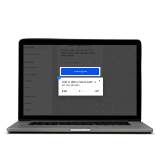
1.- Adding a tour for new users
Your ultimate guide to navigating our platform! As a new user, you'll enjoy a step-by-step journey through all the essential features. Our tour is packed with interactive elements and visual cues to keep things fun and engaging. Plus, you'll see your progress along the way! You can skip or replay the tour anytime, making it super flexible to fit your pace by making your onboarding a breeze, boost your confidence, and get you interacting with our platform in no time.
2. Feature: Updating Skytrade's Logo
Skytrade is getting a fresh new look! We're updating our logo to reflect our growth and keep up with modern design trends. This isn't just a cosmetic change; it's part of our strategy to attract a wider audience, stay relevant in the market and connect better with our customers. We have a detailed launch plan to ensure a smooth transition across all our branding materials.
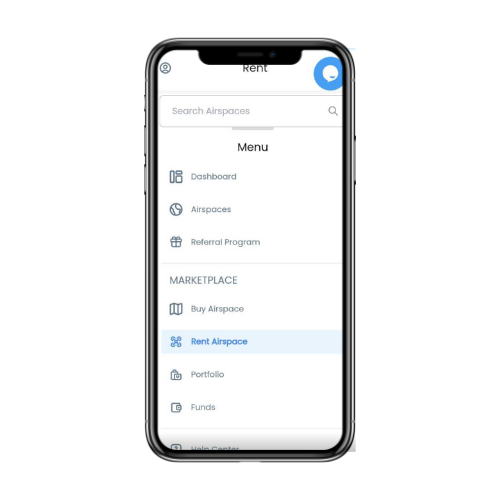
3. Enhancing the Mobile Menu with a Scrollbar
Navigating our mobile menu just got easier! We've added a scrollbar to the navbar, making it a breeze to access longer lists of menu items. This enhancement ensures you can quickly find what you're looking for, making your mobile experience smoother and more intuitive.
We’re committed to creating a user-friendly environment, and this update is a testament to that.
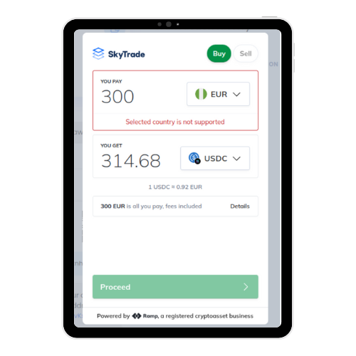
4. Integrating On-Ramp Feature
With this update, we're optimising functionality and enhancing the user interface, ensuring you have a seamless experience on our platform.
5. Showing Transaction History on the Fund Page
Keeping track of your transactions just got easier! We’ve added a feature that displays the transaction history for a specific address right on the fund page. The new design is clear and user-friendly, so you can quickly review past transactions with ease.
This enhancement shows our commitment to providing valuable information in an accessible format. Now, all your important transaction data is just a click away!
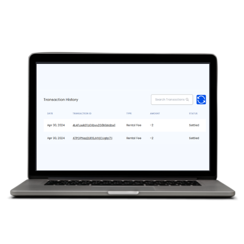
6. Displaying Transaction History on the Fund Page
We've introduced a sleek new feature to showcase transaction history for specific addresses on the fund page. With an updated design for better clarity, you can effortlessly review your past transactions.
This change is all about delivering valuable insights in an easy-to-navigate format, ensuring you always have the information you need at your fingertips.
7. Fixed Auto Transaction History Reload
Now, the screen only refreshes when you click the reload icon. This update puts you in control, allowing for smoother and more efficient navigation.
No more constant reloading—just a seamless, user-friendly experience. Enjoy the improved functionality and take charge of your transaction data!
Subscribe to my newsletter
Read articles from Victoria Zd. directly inside your inbox. Subscribe to the newsletter, and don't miss out.
Written by
