How I Designed and Created the Jubilee Water Landing Page
 CHUKWUEMEKA ONYENWUZOR
Creating a landing page for Jubilee Water was an exciting project that involved meticulous planning, creative design, and thoughtful execution. In this blog, I'll walk you through the steps I took to bring this project to life, from initial planning to the final launch on Netlify.
Step 1: Planning and Documentation
The first step in any web development project is to plan and document the requirements. For the Jubilee Water landing page, I started by identifying the key elements and functionalities needed.
Project Overview:
Objective: Create a modern, responsive landing page for Jubilee Water that showcases products and services, and provides easy contact options.
Key Requirements:
- Color Theme: Primary colors (blue and purple) and secondary colors (shades of blue and gray).
- Sections: Home, Features, Gallery, Testimonials, About Us, Contact Us.
- Contact Details: Email and phone options.
- Functionality: Fully responsive design, hamburger menu for small screens, responsive image gallery, and 3D carousel for testimonials.
- Hosting Platform: Netlify.
Step 2: Design
With the requirements in hand, I moved on to the design phase. I created wireframes and mockups for each section of the landing page.
Home Section:
The home section features a hero image with a brief introduction to Jubilee Water. I chose a clean, high-quality image that reflects the brand's essence.
Features Section:
This section highlights the nature of the job and practices at Jubilee Water, focusing on their commitment to quality and customer satisfaction. It provides an overview of their operations, the processes they follow, and their dedication to delivering pure, high-quality water products.
Gallery Section:
The gallery section showcases images of the products and company activities. I designed this as a responsive image slider to enhance user engagement.
Testimonials Section:
To build trust, the testimonials section includes a 3D carousel with customer testimonials. This dynamic element adds visual interest and credibility.
About Us Section:
This section provides information about the company, and its mission, vision and values, helping users connect with the brand.
Contact Us Section:
I added a Contact Us button in the navigation bar that leads to the footer where the company’s contact details are displayed.
Step 3: Development
With the designs finalized, I began the development phase using HTML, CSS, and JavaScript.
Setting Up the Project:
I set up the project on GitHub and linked it to Netlify for seamless deployment and hosting.
Building the Sections:
I developed each section based on the wireframes, ensuring a cohesive and responsive design.
- Home Section: Implemented the hero image and introduction text.
- Features Section: Created a layout that highlights Jubilee Water' operations and practices.
- Gallery Section: Developed a responsive image slider using JavaScript.
- Testimonials Section: Implemented a 3D carousel using CSS and JavaScript.
- About Us Section: Added content about the company’s history and mission.
- Contact Us Section: Created a Contact Us button that scrolls to the footer with contact details.
Responsive Design:
Ensuring the site is fully responsive was crucial. I used media queries and flexible grid layouts to make sure the site looks great on all devices.
Hamburger Menu:
For small screens, I implemented a hamburger menu that slides down from the top, providing a clean and accessible navigation experience.
Step 4: Testing
Before launching, thorough testing is essential.
Device Testing:
I tested the site on various devices and screen sizes to ensure responsiveness and functionality.
Functionality Testing:
I tested the image gallery slider, testimonial carousel, and Contact Us button to make sure they work smoothly.
Step 5: Launch
After finalizing the content and ensuring everything was working perfectly, I deployed the site on Netlify.
Review and Final Touches:
I reviewed the site for any final adjustments and tweaks before the official launch.
Deployment:
With everything in place, I deployed the site, making it live for users to access.
Conclusion
Creating the Jubilee Water landing page was a rewarding experience. By following a structured approach to planning, design, development, testing, and launch, I was able to deliver a modern, responsive, and engaging website. Whether you're building a landing page for a brand or any other web project, thorough planning and attention to detail are key to success.
I hope this walk-through inspires you in your web development journey. If you have any questions or need further insights, feel free to reach out.
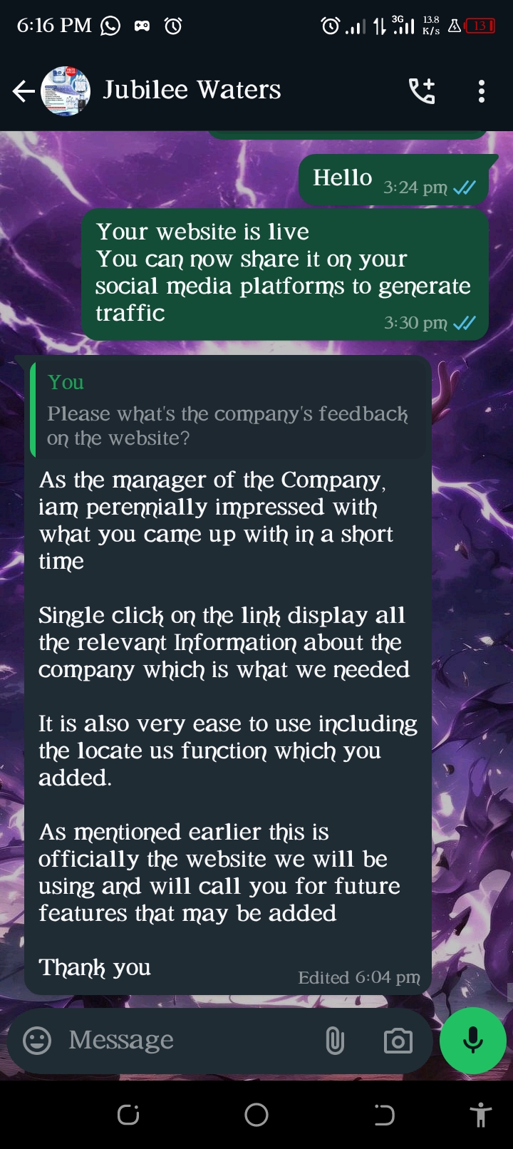
JUBILEE WATER REVIEW ON THEIR NEW WEBSITE

LINKS
If you enjoyed this blog,
like 👍🏽, comment📝 and follow . Thank you 😊
Subscribe to my newsletter
Read articles from CHUKWUEMEKA ONYENWUZOR directly inside your inbox. Subscribe to the newsletter, and don't miss out.
Written by
