Implementing Selection and bookmark features for advanced analysis in powerBi desktop
 Halimah Teniola Jamiu

The selection and bookmark pane in your powerBi desktop allows reporting interactivity. This Logic allows for two views— to display a list of objects and specify its visibility. Although the features are best used for internal reporting.
Selection
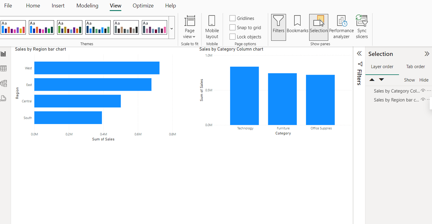
The Selection view manages the visibility in your report page. You can find your selection pane on the view tab and then select. Make sure you have one or two visuals displaying on your canvas.
The selection pain lists all the visual elements on the current report page and allows you to hide or unhide it. it’s often used through bookmark. It Use the "eye" icon next to each element to toggle its visibility on and off. This is useful for layering visuals and focusing on specific parts of your report during design.

To implement it, you drag and drop the elements in the selection pane to layer order. When this is done, it helps to overlap visuals that needs to be managed. Rename each of this visuals to help keep track especially in a complex report.
Bookmarks
A bookmark save the current page of your report page. Allowing you to capture and manage different views of your report. When bookmark is selected via the view menu babe, it provides options on what to do, ADD, VIEW, RENAME, DISPLAY DELETE e.t.c which all works for the varieties of tasks you want to perform.

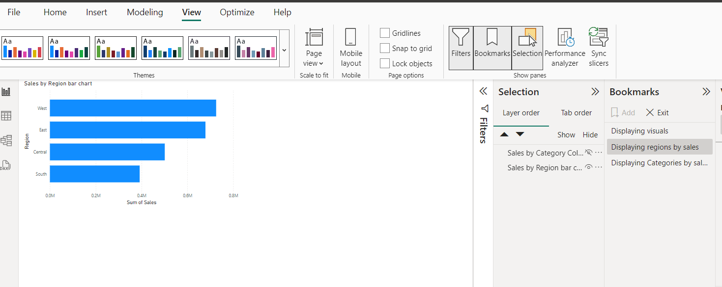
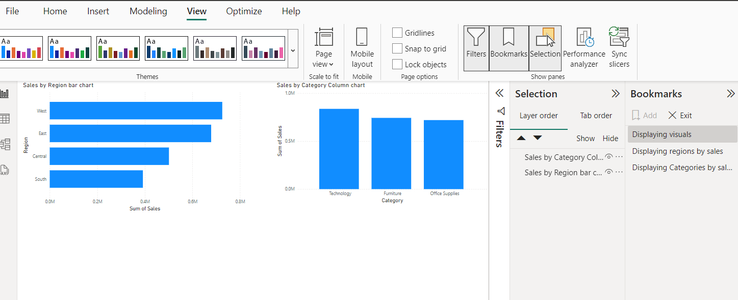
Bookmark is often used in connection with buttons to enhance response of interactivity on a report. Which is the goal for this article. This button is added on your dashboard, with another exact button overlapped. To do this, go to insert in the menu bar, click on button and place it where you intend to put it. Copy and paste to get as much needed and edit it to your satisfaction.

These buttons are made active in your formatting pane where you turn the ‘Action’ toggle on. Select the type and select desired bookmark depending on the names you give each.
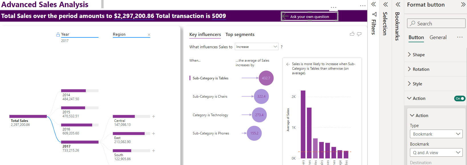
So when you click on one it takes to another, making both alive on a single page but different display.
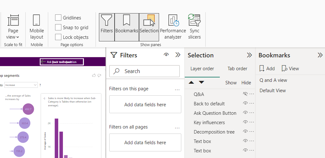
The image above also shows two buttons named Q and A and Back to default, both also been added to the bookmark with one of it hidden in the selection pane. The unhidden one stays visible on our visual while the second stays active but hidden until shown on another page.
Combining selection and bookmark allows users to navigate through the interactive storytelling showing different perspectives. It allows for dynamic views of the same report page with the use of bottoms based on the users selection and the creators manipulation.
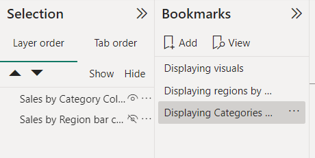
These Panes allows one to create interactive and user friendly reports on powerBi desktop.
Subscribe to my newsletter
Read articles from Halimah Teniola Jamiu directly inside your inbox. Subscribe to the newsletter, and don't miss out.
Written by
Halimah Teniola Jamiu
Halimah Teniola Jamiu
I am a Data Analyst from Nigeria.