Mastering Bento Grids: Enhance Your Web Design with Japanese Precision
 Chirag Tyagi
You may have noticed the trend of websites that are neatly organized like Japanese bento boxes. These 'Bento Grids' have quickly gained popularity because they provide an aesthetically pleasing and structurally cohesive way to present online content.
In this article, we'll explore the origins, rise, and practical implementation of the bento grid trend, examining how it merges aesthetics with functionality in modern web design.
Prerequisites
Fundamentals of HTML and CSS (CSS Grid)
Basics of Web Design
Bento Lunch Box
The Concept and Significance of Bento Grids
The idea of bento grids comes from the Japanese tradition of using bento boxes, which are containers divided into sections to hold different types of food. This way of serving food not only makes sure the meal is balanced but also looks nice and organized.
In web design, bento grids work similarly: different types of content are divided into clear sections, making it easy to access and visually appealing.
The philosophy behind bento grids focuses on compartmentalization and organization. This approach creates a predictable layout that users can easily navigate, reducing mental effort and improving the overall user experience. The design's symmetry and order provide a sense of calm and control, satisfying users' need for simplicity and structure in the often-chaotic online environment.
The Growing Popularity of Bento Grids
While grids have been used in design for a long time, the bento grid trend gained popularity as designers focused on creating more organized and mobile-friendly layouts. Bento grids provide a structured, adaptable way to present content clearly across various devices.
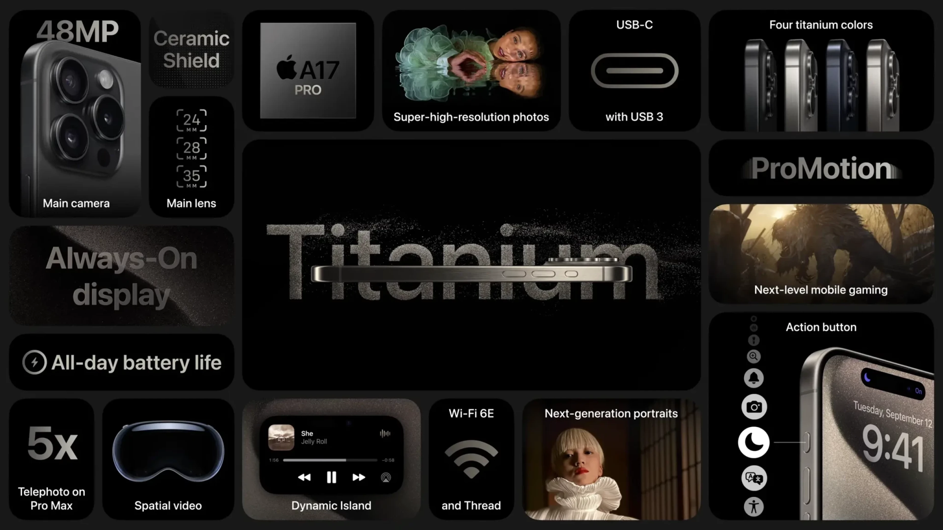
Apple mac promotional infographic
The rise in the use of bento grids can be seen in how major companies, like Apple, have adopted this design approach. By using bento grids, these companies create organized, visually appealing interfaces that are easy to navigate on various devices. This trend reflects a broader shift towards more structured and adaptable web and app designs, responding to the need for clarity and efficiency in a digital landscape.
Pros of Using Bento Grids
Organized Presentation: Bento grids neatly divide content into clear sections, making it easier for users to navigate and understand the information.
Aesthetic Appeal: The structured layout of bento grids creates a visually balanced and attractive design, enhancing the overall look and feel of the site or app.
Enhanced Usability: By breaking content into manageable parts, bento grids reduce cognitive overload, helping users focus on specific sections without feeling overwhelmed.
Responsive Design: Bento grids work well across different screen sizes, ensuring a consistent and accessible layout on desktops, tablets, and smartphones.
Consistency: The predictable structure of bento grids helps provide a uniform user experience, making it easier for users to interact with the site or app.
Efficient Design Process: The grid framework simplifies the design process, leading to more efficient and effective development.
Flexible Content Display: The modular nature of bento grids allows for easy updates and rearrangements, accommodating new content without disrupting the overall layout.
Cons of Using Bento Grids
Design Limitations: The fixed structure may limit creative options, making it challenging to use unconventional design elements or layouts.
Potential for Repetition: If not used thoughtfully, bento grids can lead to similar-looking designs across different sites or apps, reducing uniqueness.
Maintenance Effort: Keeping the grid layout balanced and aligned can require ongoing attention, particularly if content is updated frequently.
Example of Bento Grid Design


Best Practices for Designing with Bento Grids
When using bento grids, consider the following rules to ensure an effective and aesthetically pleasing design
1. Maintain Consistent Spacing
Grid Gaps: Ensure uniform spacing between grid items to keep the layout clean and balanced.
Padding and Margins: Use consistent padding inside grid items and margins outside to maintain visual harmony.
2. Follow a Logical Structure
Organize Content: Group related content together and ensure the grid layout aligns with the content hierarchy and flow.
Predictable Layout: Keep the layout predictable to help users navigate easily.
3. Ensure Responsiveness
Media Queries: Use media queries to adjust the grid layout for different screen sizes, ensuring a good user experience on desktops, tablets, and smartphones.
Flexible Units: Utilize relative units like percentages or
frin CSS Grid to create a flexible and adaptive layout.
4. Balance and Alignment
Symmetry: Aim for symmetry in your grid design to create a visually balanced layout.
Alignment: Align grid items consistently to maintain order and avoid visual clutter.
5. Limit the Number of Sections
- Avoid Overcomplication: Don’t overcrowd the grid with too many sections or elements. Aim for simplicity to avoid overwhelming users.
6. Design for Accessibility
Contrast and Readability: Ensure sufficient contrast between text and background for readability.
Keyboard Navigation: Make sure interactive elements are accessible via keyboard navigation.
7. Consider Visual Hierarchy
- Highlight Key Elements: Use size, color, and placement to emphasize important content and guide users’ attention.
8. Use Clear Labels and Headings
- Descriptive Labels: Provide clear and descriptive labels or headings for each grid section to improve usability.
9. Test Across Devices
- Cross-Device Testing: Test the grid layout on various devices and browsers to ensure it functions correctly and looks good everywhere.
10. Maintain Flexibility
- Adapt to Content: Be ready to adjust the grid based on the type and amount of content to maintain visual appeal and functionality.
By following these rules, you can create a bento grid layout that is organized, visually appealing, and user-friendly.
Learn more about bento grids using other sources
Conclusion
Bento grids have become a standout trend in modern web design, providing a perfect balance between visual appeal and functional organization. By segmenting content into clear, manageable sections, they enhance both the aesthetic and usability of web layouts.
This approach emphasizes the importance of neatness and clarity, helping users navigate websites with ease. As web design evolves, the principles behind bento grids will continue to influence best practices, encouraging designers to create experiences that are not only visually engaging but also intuitive and user-friendly. The ongoing popularity of bento grids highlights their effectiveness in delivering well-structured and aesthetically pleasing web interfaces.
Contact Information
Want to connect or contact me? Feel free to hit me up on the following:
Twitter / X: @I_am_Chirag28
LinkedIn: Chiragtyagi (link)
Email: chiragtyagiofficial@gmail.com
Subscribe to my newsletter
Read articles from Chirag Tyagi directly inside your inbox. Subscribe to the newsletter, and don't miss out.
Written by
Chirag Tyagi
Chirag Tyagi
Profile Bio I’m currently pursuing B.Tech in Computer Science and Engineering at Roorkee Institute of Technology, where I am deeply engaged in learning full-stack development with the MERN stack. My passion for technology drives me to explore and stay updated with the latest advancements in the field. Eager to apply and expand my skills, I am committed to continuous learning and growth in the ever-evolving tech landscape.