Sky High Content: A UX Writer’s Guide to Problem Solving
 Salma Sabry
Every writer dreads publishing a post only to find a typo. For UX writers, this struggle extends further: releasing in-app content and discovering that an error message fails to clearly explain the issue or offer a solution.
This not only frustrates the user but also you, the UX writer, especially when the fix has to wait for the next app update.
Over-the-Air and Quick Fixes
In our previous blog, we discussed how using Phrase Strings—our localization tool—enabled us to efficiently introduce Klivvr's Arabic version. Phrase helps us manage content in both English and Arabic seamlessly.
While this made managing content easier, it still didn’t solve the need to create a new release for every content modification. Here comes in the real star: over-the-air (OTA). OTA was a win-win: it allowed me to make quick fixes, and introduce new translations with little to no reliance on developers, which freed them from content-related tasks.
How it Works
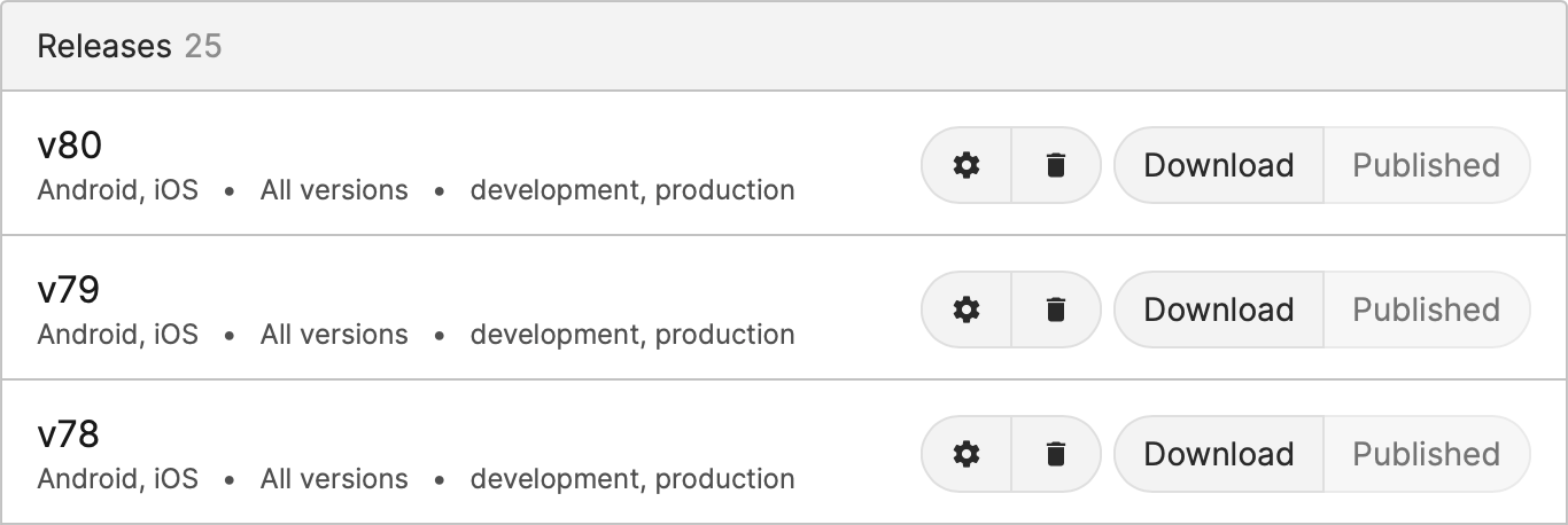
To implement OTA, we linked our app project file on Phrase to a distribution where our developers included the SDK into their projects. After this was setup, we simply look up existing keys and change their content or add translations. With every change, a new OTA release is made, that reflects instantly, as opposed to an app release. This saved us time, and allowed us to skip the store’s approval.
Here’s what Mohamed Hisham, our iOS lead had to say:
Before Phrase over-the-air, fixing even a single string error meant a full build release—often over the weekend. My keyboard saw more spilled spaghetti than I'd care to admit. But implementing Phrase was a breeze; all I had to do was include the SDK in my project, and we were good to go. Now, we fix those pesky typos without a new release, and my keyboard stays clean. It's a win-win! Plus, our localization process is faster and more efficient than ever, making our whole team happy.

Creating a release allows us to filter our changes by tags, and specify the app versions using these changes apply to.
Real-World Example: Improving Error Messages
Following up on the pickle we found ourselves into at the start of the article, in one of our older screens our users received a generic error message when they were not connected to the internet. The message read:
Heading: "Something went wrong"
Description: "We could not process your request. Try again later."
This message was confusing and did not help users understand the actual issue. Using OTA updates, we quickly improved this by changing the values of the existing keys to:
Heading: "No Internet Connection"
Description: "Make sure you're connected to the internet and try again."
This change was implemented instantly without needing a full app update, enhancing user experience and reducing frustration.
Stay Informed & Inspired
The ability to make quick, efficient updates using OTA has transformed our approach to UX writing. By utilizing this technology, we can always ensure that app updates are reserved for design, and technical changes, while also allowing our users to have a smoother, more intuitive experience.
Subscribe to my newsletter
Read articles from Salma Sabry directly inside your inbox. Subscribe to the newsletter, and don't miss out.
Written by

Salma Sabry
Salma Sabry
I write copy for fun (and living)