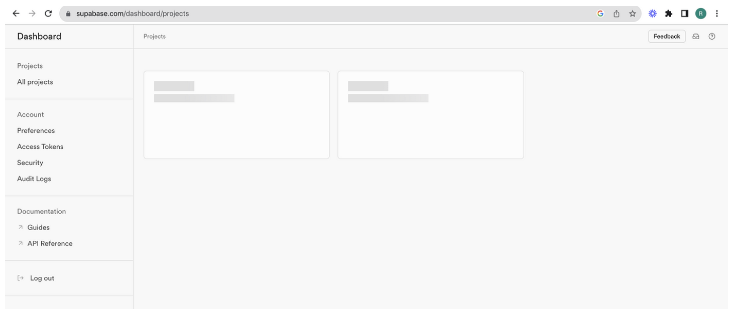
Shimmer effect in Card when you load Supabase dashboard.
 Ramu Narasinga
When loading a dashboard, especially one as feature-rich as Supabase’s, it’s essential to provide visual feedback to users indicating that content is being loaded. A popular and visually appealing way to achieve this is by using a shimmer effect. This effect simulates a loading state and keeps users engaged while the actual content is being fetched.
Let’s explore how Supabase implements a shimmer effect in their dashboard using the animate property and some creative CSS.
Shimmer Effect Using the Animate Property
The ShimmeringCard component in Supabase's source code showcases how to create a shimmering loading effect using a combination of React and CSS animations.
Here’s the implementation of the ShimmeringCard component:
// Pulled from
// https://github.com/supabase/supabase/blob/master/apps/studio/components/interfaces/Home/ProjectList/ShimmeringCard.tsx#L3
import CardButton from 'components/ui/CardButton'

const ShimmeringCard = () => {
  return (
    <CardButton
      className="h-44 !px-0 pt-5 pb-0"
      title={
        <div className="w-full justify-between space-y-1.5 px-5">
          <p className="flex-shrink truncate text-sm pr-4 shimmering-loader h-5 w-20" />
          <p className="text-sm lowercase text-foreground-light h-4 w-40 shimmering-loader" />
        </div>
      }
    />
  )
}
export default ShimmeringCard
In this component, CardButton is used to create the card structure, and the shimmer effect is applied to the text elements within the card using the shimmering-loader class.
The shimmering-loader CSS Class
The shimmering-loader class is defined in the main.scss file and leverages the animate property to create the shimmer effect:
.shimmering-loader {
  animation: shimmer 2s infinite linear;
  background: linear-gradient(
    to right,
    hsl(var(--border-default)) 4%,
    hsl(var(--background-surface-200)) 25%,
    hsl(var(--border-default)) 36%
  );
  background-size: 1000px 100%;
}
How It Works
Animation Definition: The shimmer keyframes animation moves the background gradient from left to right.
Gradient Background: The background is a linear gradient that creates the shimmer effect. The colors transition smoothly to give the appearance of a light moving across the surface.
Animation Application: The shimmering-loader class applies this animation to any element, making it shimmer.
Want to learn how to build shadcn-ui/ui from scratch? Check out build-from-scratch
About me:
Website: https://ramunarasinga.com/
Linkedin: https://www.linkedin.com/in/ramu-narasinga-189361128/
Github: https://github.com/Ramu-Narasinga
Email: ramu.narasinga@gmail.com
Build shadcn-ui/ui from scratch
References:
Subscribe to my newsletter
Read articles from Ramu Narasinga directly inside your inbox. Subscribe to the newsletter, and don't miss out.
Written by

