😕The Sorry State of Network Device UIs | A Journey Through Time⏳
 Ronald Bartels
Early Beginnings | NetWare & the Dawn of Network Devices
My first foray into the world of networking was with a NetWare server running MultiProtocol Router (MPR). At the time, Debid relied on this setup for their WAN. The hardware consisted of Compaq Proliant servers equipped with Eicon adapters connected to Diginet. At the headquarters, these servers interfaced with an AS/400 system using Systems Network Architecture (SNA) via the same software. Workstations ran Attachmate for 5250 sessions and Da Vinci email over a Message Handling System (MHS) backend using IPX. That was 1992. The interface, though basic, was decent and usable—crisp, clear, and to the point.
The Abomination of Wellfleet Routers
My next encounter was with a Wellfleet router. The experience was nothing short of an abomination. The user interface was convoluted and unintuitive, a stark contrast to the relatively straightforward NetWare setup. This was a sign of things to come.
The Forgivable CLI of Cisco
Following the Wellfleet experience, Cisco's command-line interface (CLI) felt like a breath of fresh air. While it was far from beautiful, it was workable. Network engineers could navigate it with relative ease, and its consistent syntax made it a reliable tool. However, the CLI's steep learning curve and text-based nature still left much to be desired in terms of user-friendliness.
Cisco did introduce a GUI for some of their solutions that used Java. It was as slow as a donkey moving through treacle.
The Pinnacle | Madge's Trueview
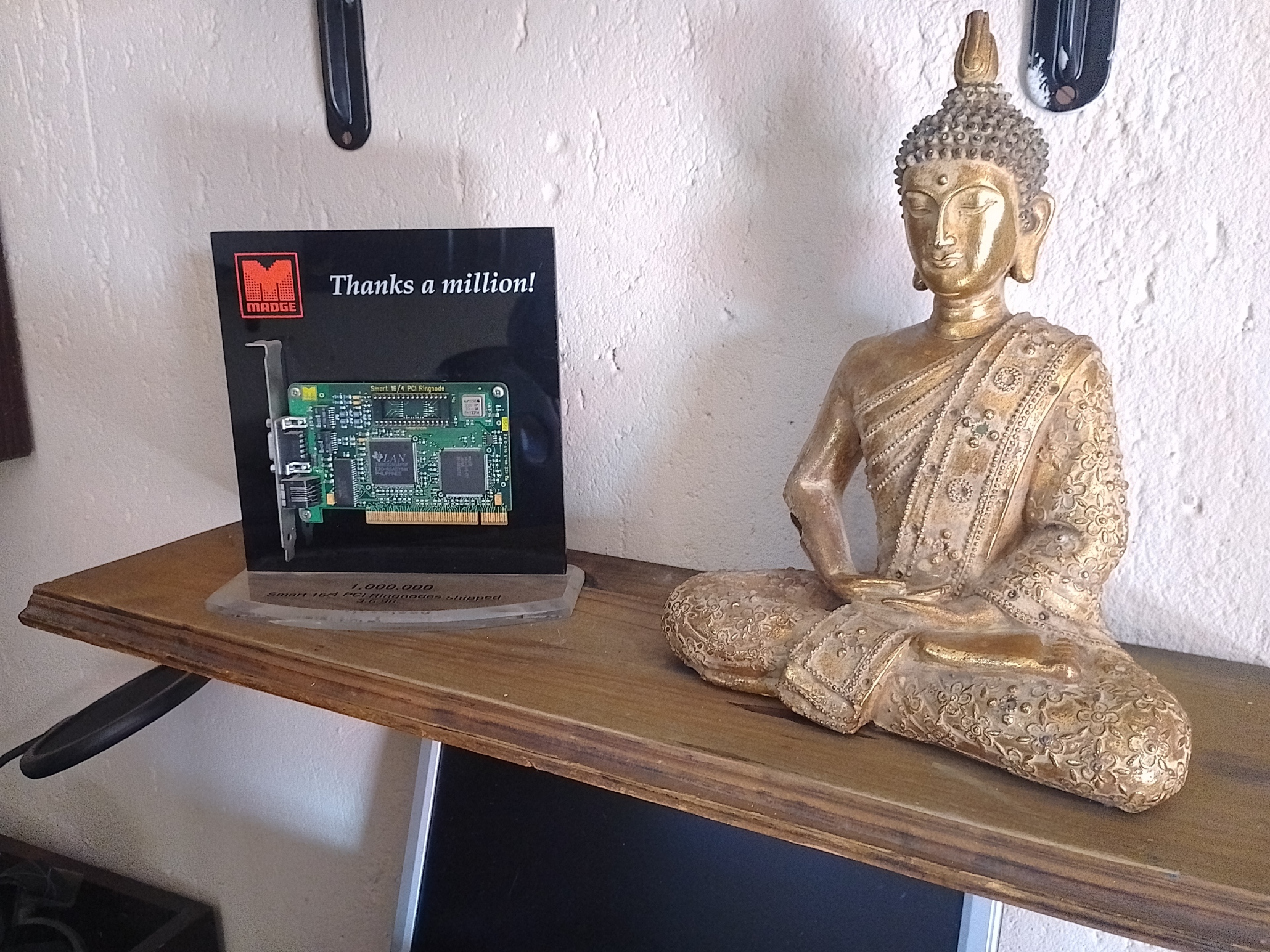
The best user interface for network devices I've ever encountered was Madge's Trueview. This Windows application provided an exact representation of the networking device, including paddle switches. It was point-and-click and easy to use, making it a joy to configure and manage network settings. Trueview set a high bar for what network device UIs could be—intuitive, graphical, and efficient. However, it was only a flash in the pan.
The Plight of Modern UIs
Unfortunately, the network community has had a rough run with user interfaces since then. Take Fortinet's UI, for example. It is complex, confusing, and looks like it was built for the Netscape browser era. This complexity often leads to configuration errors and security breaches, as even seasoned network professionals struggle to navigate the maze of menus and settings.
A Glimmer of Hope | Fusion's Antares Platform
In the realm of Software-Defined Wide Area Networking (SD-WAN), there is a beacon of hope—Fusion's Anatres platform. Anatres offers a slick and useful tool for configuring SD-WAN, standing out as a modern UI done right. It combines the ease of point-and-click interfaces with the power and flexibility needed for complex network configurations.
Wrap
The journey through network device user interfaces has been a bumpy one. From the simplicity and usability of early NetWare systems to the nightmare of Wellfleet routers and the workable but uninspired CLI of Cisco, the industry has seen its fair share of poorly designed UIs. While there have been bright spots, like Madge's Trueview, many modern UIs, such as Fortinet's, continue to disappoint.
However, solutions like Fusion's Antares platform show that it is possible to create user-friendly, powerful, and intuitive UIs for network devices. As the industry continues to evolve, we can only hope that more vendors will follow Fusion's lead and prioritize the user experience in their designs. After all, a well-designed UI is not just a convenience—it is a crucial component of network security and efficiency.
Ronald Bartels ensures that Internet inhabiting things are connected reliably online at Fusion Broadband South Africa - the leading specialized SD-WAN provider in South Africa. Learn more about the best SD-WAN provider in the world! 👉 Contact Fusion
Subscribe to my newsletter
Read articles from Ronald Bartels directly inside your inbox. Subscribe to the newsletter, and don't miss out.
Written by

Ronald Bartels
Ronald Bartels
Driving SD-WAN Adoption in South Africa