Understanding HTML Input Types and Their Uses
 Joctan
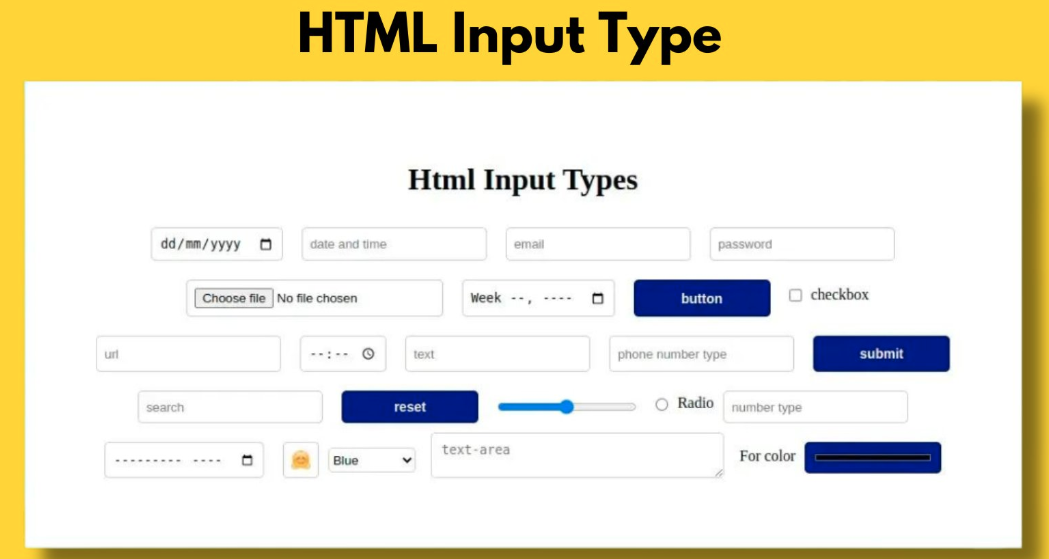
HTML forms are a fundamental part of web development, allowing users to interact with web applications by submitting data. The <input> element is pivotal in forms, and HTML offers a variety of input types to handle different kinds of data. Understanding these input types helps in creating more user-friendly and efficient web forms. In this article, we’ll explore various HTML input types and their uses in detail.
1. Text Input Types
1.1. text
The text input type is the most basic form of input. It allows users to enter a single line of text. It’s suitable for fields like names, usernames, or search queries. The text input does not have built-in validation or formatting.
<input type="text" name="username" placeholder="Enter your username">
Attributes:
placeholder: Shows a hint in the input field (e.g., "Enter your username").maxlength: Limits the number of characters the user can enter.
1.2. password
The password input type hides the characters entered by the user, making it ideal for sensitive information like passwords. This ensures that the password is not visible to others who might be looking over the user's shoulder.
<input type="password" name="password" placeholder="Enter your password">
Attributes:
maxlength: Limits the number of characters in the password field.
1.3. email
The email input type ensures that the entered text follows the format of an email address. This includes the presence of an "@" symbol and a domain. Most modern browsers will validate the format of the email address before form submission.
<input type="email" name="email" placeholder="Enter your email address">
Attributes:
multiple: Allows the user to enter multiple email addresses separated by commas.
1.4. tel
The tel input type is used for entering telephone numbers. It does not enforce any format but may bring up a numeric keypad on mobile devices to simplify entry.
<input type="tel" name="phone" placeholder="Enter your phone number">
Attributes:
pattern: Allows you to specify a regular expression for validating the phone number format.
2. Date and Time Inputs
2.1. date
The date input type provides a date picker that allows users to select a date from a calendar. This is useful for date-related fields like birthdays or event dates.
<input type="date" name="birthday" placeholder="Select your birthday">
With this input users can enter month, date and year in a specified format.

Attributes:
min: Specifies the earliest date that can be selected.max: Specifies the latest date that can be selected.
2.2. time
The time input type allows users to input a time of day. It usually provides a time picker interface.
<input type="time" name="appointment-time" placeholder="Select a time">
Time, Allows user to set their specific time as the input not like the date or datetime-local

Attributes:
min: Sets the earliest time that can be selected.max: Sets the latest time that can be selected.
2.3. datetime-local
The datetime-local input type combines both date and time into a single control. This is useful for specifying a precise moment in time, such as an appointment or deadline.
<input type="datetime-local" name="meeting-time" placeholder="Select date and time">
Example: With this input type you can allow users to choose month, date and year. Imagine a date of birth, end of program or when end of semester exam.

Attributes:
minandmax: Define the allowable date and time range.
3. Numeric Inputs
3.1. number
The number input type allows users to enter numeric values. It provides controls for increasing or decreasing the number, and it can validate that the value is a number within specified limits.
<input type="number" name="quantity" min="1" max="10" step="1">
Attributes:
min: Defines the minimum value allowed.max: Defines the maximum value allowed.step: Specifies the interval between valid values.
3.2. range
The range input type presents a slider that users can drag to select a value within a specified range. It’s commonly used for selecting quantities or adjusting settings.
<input type="range" name="volume" min="0" max="100" step="1">

Attributes:
minandmax: Define the range of values.step: Defines the granularity of the slider.
4. Specialized Inputs
4.1. url
The url input type ensures that the entered text is a valid URL. This is useful for fields where users need to provide a website address.
<input type="url" name="website" placeholder="Enter your website URL">
Attributes:
pattern: Allows you to specify a regular expression for validating the URL format.
4.2. color
The color input type provides a color picker that allows users to select a color from a palette. This is useful for fields where users need to choose colors.
Example: Imagine you are developing a social media platform where users can customize their profile appearance. One of the features allows users to choose a color for their profile background. Using the <input type="color">, you can provide a color picker that lets users select their preferred background color easily.
<input type="color" name="favorite-color">
Attributes:
- No additional attributes; the input displays a color picker interface.
5. File Inputs
5.1. file
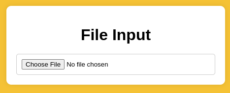
The file input type allows users to select files from their device to upload. It can be configured to accept specific types of files and to allow multiple file selections.
<input type="file" name="profile-picture">

Attributes:
accept: Specifies the types of files that can be selected (e.g.,image/*for image files).multiple: Allows multiple files to be selected.
6. Button Inputs
6.1. button
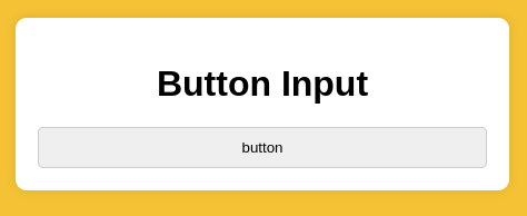
The button input type creates a clickable button that can trigger JavaScript functions or perform actions. It does not submit the form by default. Can be used to Triggering custom JavaScript actions or Performing actions that do not involve form submission.
- When you need a button that performs an action like opening a modal or changing content without submitting a form.
<input type="button" value="Click Me" onclick="alert('Button clicked!')">
It'll look like this:

Attributes:
onclick: Specifies JavaScript code to execute when the button is clicked.
6.2. submit
The submit input type submits the form data to the server. It is typically used at the end of a form to send the collected data.
<input type="submit" value="Submit">
Attributes:
- No additional attributes; triggers form submission.
6.3. reset
The reset input type clears all the fields in the form, resetting them to their default values.
<input type="reset" value="Reset">
Attributes:
- No additional attributes; resets the form inputs.
other inputs:
Checkbox
suppose you want to ask your friends to list how many programming languages they know, using checkboxes will allow the to list or choose more that one options in your html form, or if you want to select your favorite music. So checkbox are used when users need to select multiple options from a set.
Selecting multiple items or options.
Choosing from a list of features or preferences.
Example:

Conclusion
Understanding and using the correct HTML input types is crucial for creating effective and user-friendly web forms. Each input type has its own specific use case and functionality, and leveraging these can enhance the user experience by providing appropriate controls and validation.
Feel free to experiment with different input types and attributes to find what works best for your web applications. Happy coding!
Subscribe to my newsletter
Read articles from Joctan directly inside your inbox. Subscribe to the newsletter, and don't miss out.
Written by

Joctan
Joctan
👋 Hello, I'm Joctan! Pythonista. Java 🌐✨ I like cats and comics.