Learn like a baby - Bokeh for Visuals - 1
 raja mani
Table of contents

```
#install bokeh
pip3 install bokeh==0.13.0
```
1 - Getting the look and feel
lets do something for quick visualization and get the look and feel
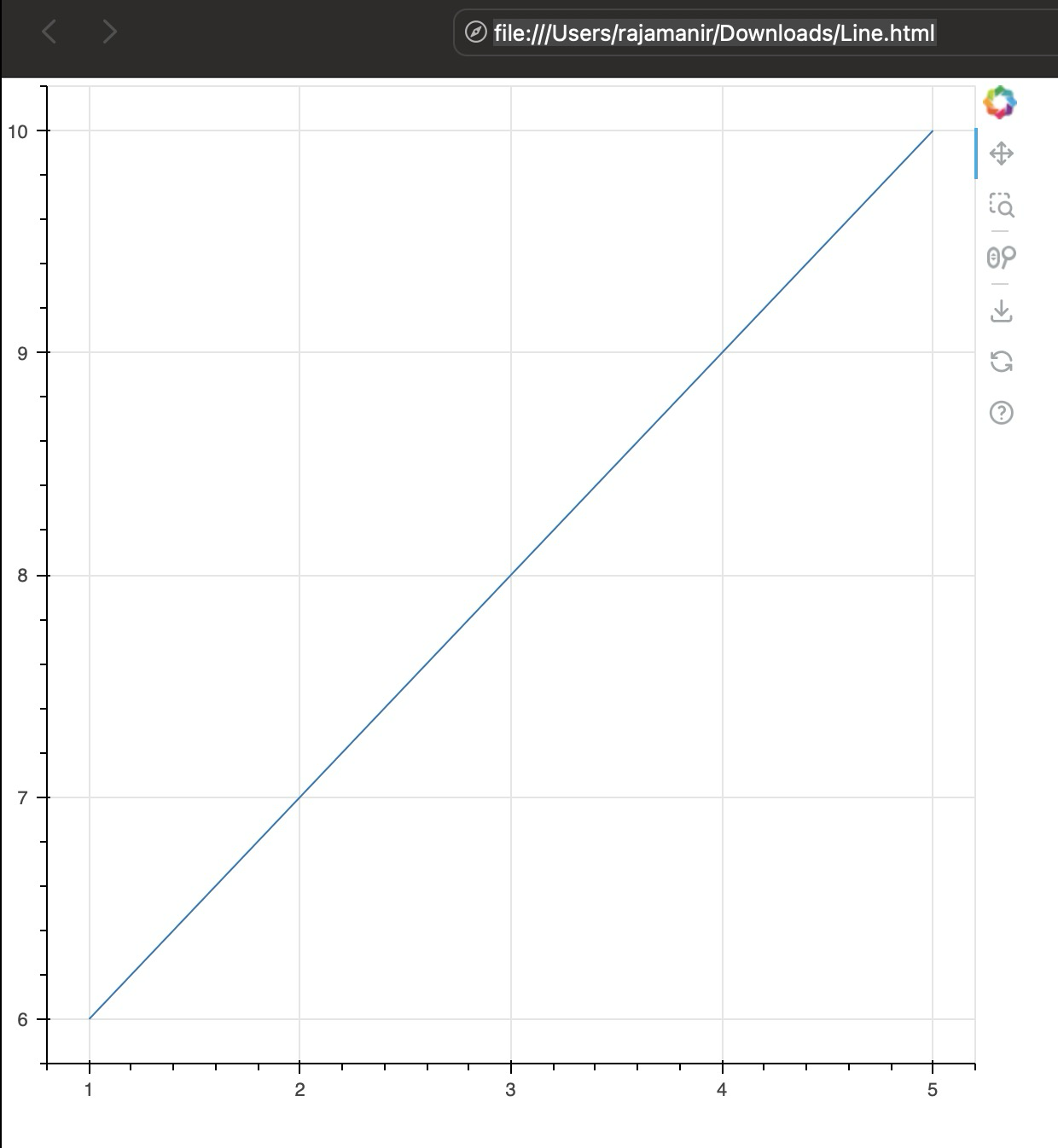
#Making a basic Bokeh line graph

#importing Bokeh
import bokeh
#prepare some data
x = [1,2,3,4,5]
y = [6,7,8,9,10]

#prepare the output file
output_file("Line.html")

#create a figure object
f = figure()

#create line plot
f.line(x,y)

#write the plot in the figure object
show(f)
Ok ! we have started! an interactive plot

we need some kind of data to play with! i choose sport and cricket to play with!
A kaggle project on cricket click here
now lets read them in pandas
matches=pd.read_csv('matches.csv')
delivery=pd.read_csv('deliveries.csv')
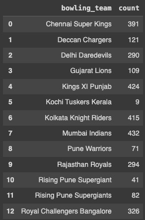
lets do some stats on a batsman vs bowlers
dhawan_runs = delivery[delivery['batsman'] == 'S Dhawan']
display1 = dhawan_runs.groupby(['bowling_team']).size().reset_index(name='count')
Lets use the same template to see how to build a line plot with the 4 steps
Prepare data
have a data frame suitable for bar chart which we have done already

Create a figure
x_range array has to be declared for xaxis, xrange =
have a title, title =
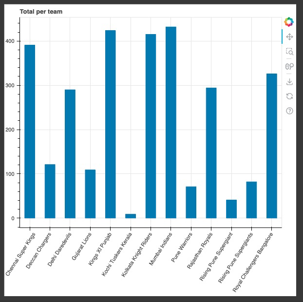
f = figure( x_range=display1['bowling_team'],title="Total per team")
Create a bar plot
vbar method is used in bar chart
whats your source DF has be in source =
top should y Axis field name for bar, top =
x axis should be called as, x=
width of the bars , width =
f.vbar(x='bowling_team', top='count', width=0.5, source=display1)use this customization always for legibility in x axis
f.xaxis.major_label_orientation = 1
print
show(f)
total code
from bokeh.plotting import figure, show
from bokeh.io import output_notebook
from bokeh.models import HoverTool

output_notebook()

#source

delivery=pd.read_csv('deliveries.csv')

# prepare data
dhawan_runs = delivery[delivery['batsman'] == 'S Dhawan']
display1 = dhawan_runs.groupby(['bowling_team']).size().reset_index(name='count')


#create a figure
f = figure( x_range=display1['bowling_team'],title="Total balls per team")
f.vbar(x='bowling_team', top='count', width=0.5, source=display1)

# Customize
f.xaxis.major_label_orientation = 1

#write the plot in the figure object
show(f)

Lets do some thing in line chart with cricket data
what do we need ?
source dataframe
GayleOverStats = CGayle.groupby('over')['total_runs'].sum().reset_index(name='runs')
Create a figure
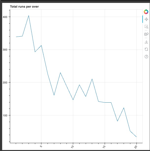
f = figure(title="Total runs per over")
Create a plot by selecting input df , x axis and y axis
  f.line(source=GayleOverStats,x='over',y='runs')
  f.xaxis.major_label_orientation = 1
print
show(f)
Full code
GayleOverStats = CGayle.groupby('over')['total_runs'].sum().reset_index(name='runs')
#Create a Figure
f = figure(title="Total runs per over")

#Create a line plot
f.line(source=GayleOverStats,x='over',y='runs')

# Customize
f.xaxis.major_label_orientation = 1

#write the plot in the figure object
show(f)
yes! gayle is an opener and runs are more in the early overs

now practice ! thanks
Subscribe to my newsletter
Read articles from raja mani directly inside your inbox. Subscribe to the newsletter, and don't miss out.
Written by

raja mani
raja mani
✨🌟💫Threat Hunter 💫🌟✨