🌟 Top 7 Laws of UX Design: Simplified and Explained 🌟
 Prasanna Pushspa Kumara
User experience (UX) design is all about creating products that provide meaningful and relevant experiences to users. To achieve this, designers follow various principles and laws. Here are seven essential laws of UX design, explained in a simple and understandable way, along with examples.
1. Von Restorff Effect 🌟
The Von Restorff Effect, also known as the Isolation Effect, states that an item that stands out is more likely to be remembered than other items.
Example: Imagine you have a list of product features on your website. By highlighting one key feature in a different color or with a bold font, it will stand out and be more memorable to users.

2. Hick's Law 🕒
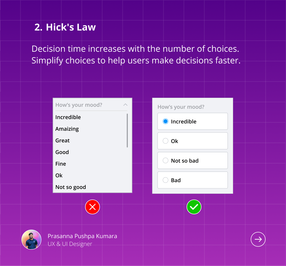
Hick's Law states that the time it takes for a person to make a decision increases with the number and complexity of choices.
In a navigation menu, offering fewer, well-categorized options helps users find what they are looking for faster. Instead of overwhelming users with numerous links, group related items under broader categories.
3. Fitts's Law 🎯
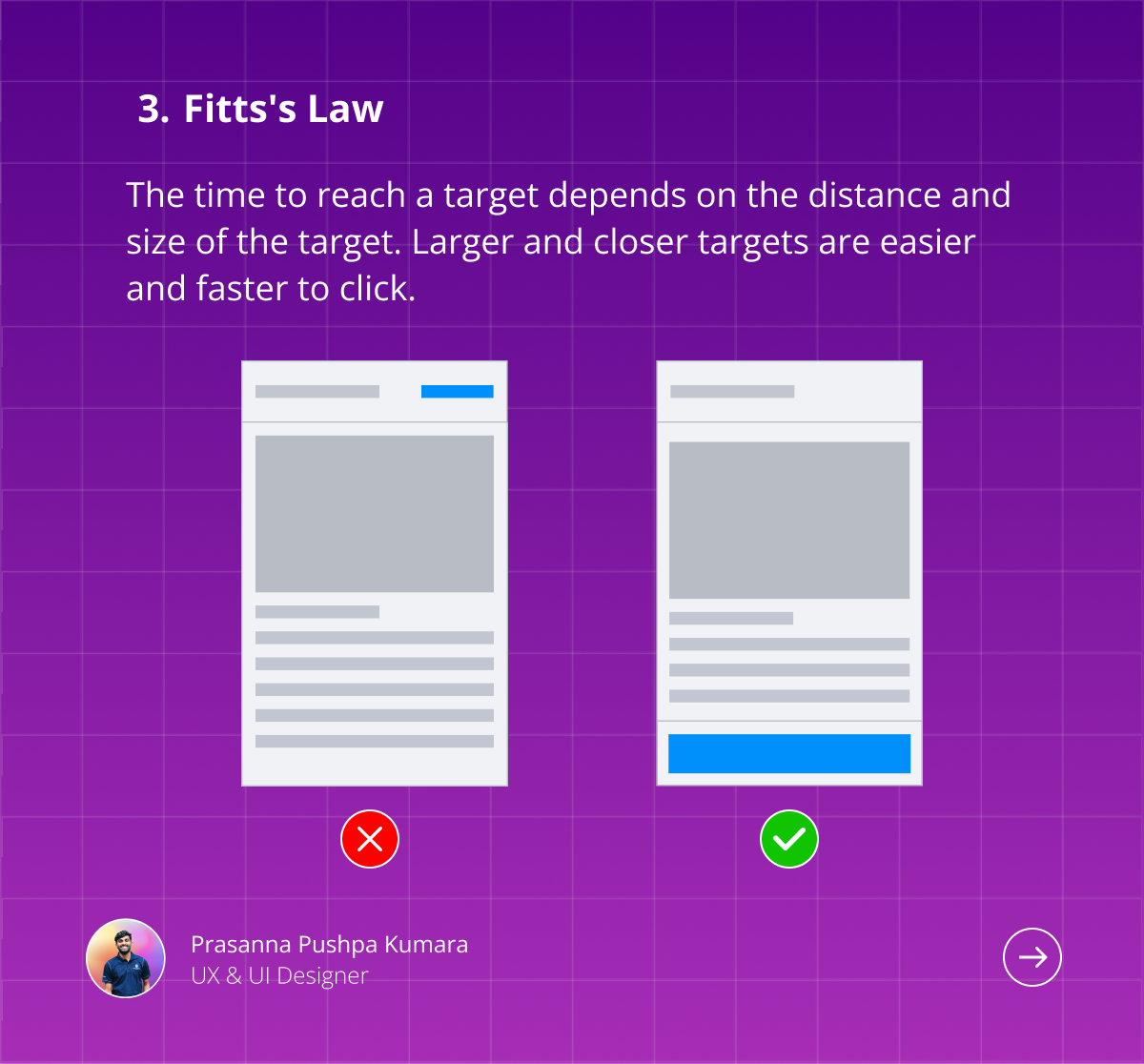
Fitts's Law predicts that the time required to move to a target area is a function of the distance to the target and the size of the target.
Example: In a mobile app, making touch targets (like buttons) large enough and placing them within easy reach of the user’s thumb can improve usability. This is why "tap targets" should be adequately sized and spaced out.
4. Zeigarnik Effect 📝
The Zeigarnik Effect states that people remember uncompleted or interrupted tasks better than completed tasks.
Example: In task management apps, showing incomplete tasks prominently can motivate users to complete them. For instance, a progress bar showing incomplete steps can encourage users to finish setting up their profiles.

5. Serial Position Effect 📋
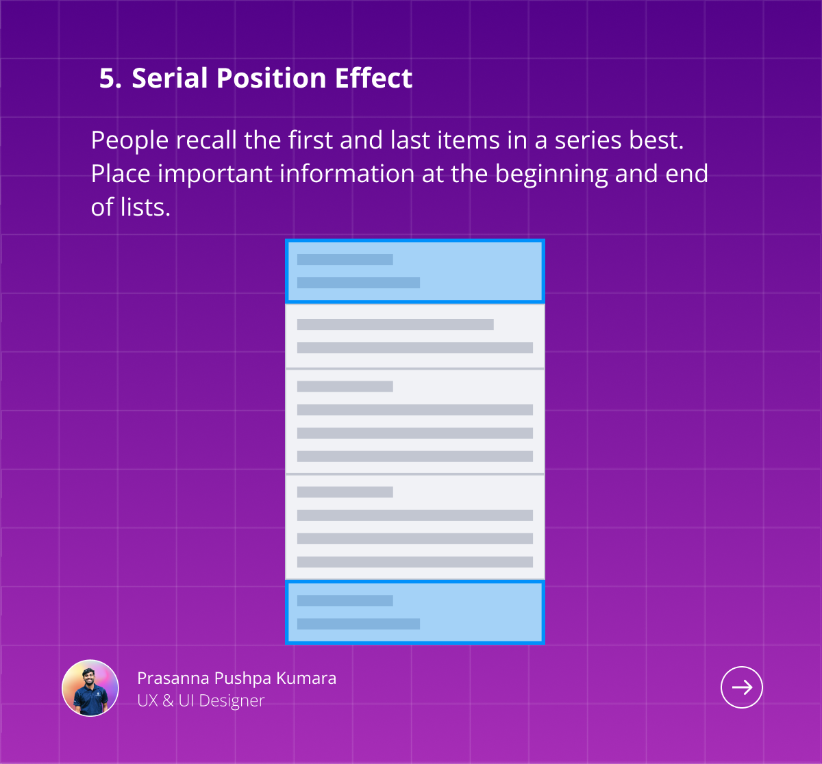
The Serial Position Effect is the tendency of a person to recall the first and last items in a series best, and the middle items worst.
Example: On a website's homepage, placing important information or calls to action at the beginning (top) and end (bottom) of the page ensures they are more likely to be remembered by users.
6. Law of Common Region 📦
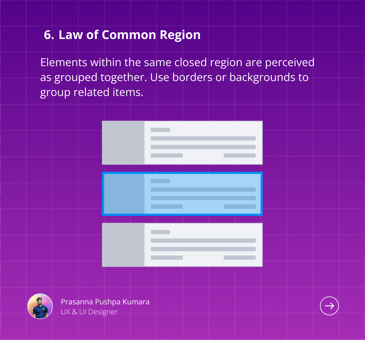
The Law of Common Region suggests that elements tend to be perceived as grouped together if they are located within the same closed region.
Example: Grouping related form fields within a bordered box helps users understand that these fields are related and should be completed together, enhancing the form's usability.
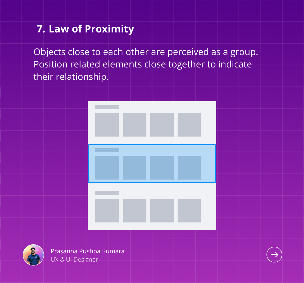
7. Law of Proximity 📍
The Law of Proximity states that objects that are close to each other are perceived as a group.
Example: In a product listing, placing the product image, title, and price close together makes it clear that these pieces of information are related to the same product. This helps users quickly scan and comprehend the listings.
Conclusion 🎨
Understanding and applying these laws of UX design can significantly improve the usability and effectiveness of your digital products. By making thoughtful design choices, you can create more intuitive and enjoyable experiences for your users. Remember these laws as you design, and watch your users benefit from a more seamless interaction with your product.
Subscribe to my newsletter
Read articles from Prasanna Pushspa Kumara directly inside your inbox. Subscribe to the newsletter, and don't miss out.
Written by

Prasanna Pushspa Kumara
Prasanna Pushspa Kumara
I am a Front-End Developer and passionate UX & UI Designer who loves creating intuitive and engaging user experiences, currently studying at Sabaragamuwa University of Sri Lanka