13 Ways To Ensure Easier Accessibility on Your Website
 Harish Rajora
Many websites do not comply with WCAG accessibility guidelines, forcing people with disabilities to rely on assistive gadgets, which often lack full functionality. It can lead to significant monetary losses due to legal consequences and a negative user experience.
Easier accessibility benefits all users, including those without impairments, as it enhances the overall user experience. Therefore, it is crucial to dedicate time and resources to focus on website accessibility and ensure compliance with WCAG guidelines.
What Is Website Accessibility?
Website accessibility ensures that a site is usable by everyone, including those with disabilities. It involves considering various needs such as visual, auditory, motor, and cognitive impairments. Addressing accessibility from the beginning prevents the need for costly and time-consuming redevelopment later on.
Individuals with impairments or disabilities represent a substantial portion of the global population. According to the CDC reports, 27% of adults, or about one in four, have a disability. As a result, brands with inaccessible websites neglect a significant segment of the population. Additionally, the number of individuals with disabilities is projected to rise in the coming decades.
Therefore, it is imperative to ensure that your website and web applications are accessible to all users. Adhering to web accessibility checklists and best practices allows developers and testers to create inclusive websites efficiently. Integrating accessibility practices early, you comply with legal standards and contribute to a more inclusive and equitable web.
Best Practices to Ensure Easier Accessibility
Tim Berners-Lee, the founder of the World Wide Web, emphasized that “The power of the web is in its universality. Access by everyone regardless of disability is an essential aspect.” This principle reflects the web’s original intent, but many websites fail to meet accessibility standards. Often, this occurs because speed in development is prioritized over inclusive design.
With this learning from Tim Berners-Lee, we have listed some best practices to address and resolve accessibility issues efficiently. With this list of best practices, you will find methods to achieve easier accessibility, focusing on user-centric approaches and effective testing methodologies. You can also ensure a more inclusive and seamless experience for all users.
Conduct Surveys and Research
The first step to making website accessibility easier is to conduct surveys and gather input from a diverse group. Surveys provide exact insights into what people with impairments expect from a website, which is difficult to brainstorm in a room with only non-impaired individuals. These insights will provide a real-life, personalized experience, assuming the survey questions are carefully crafted to target each aspect of the application.
Besides surveys, independent research will highlight recent problems and their solutions regarding website accessibility. This research can be based on users’ experiences and feedback or backed by research papers and new advancements documented in journals. It is important to understand that, like technology, web accessibility implementation styles change over time, and developers should be aware of such changes to ensure easier accessibility.
This step should be taken before starting the planning and implementation phase of the website.
Accessibility Starts From Day 0
The easiest way to achieve easier accessibility is to include it in the planning phase of the sprint or the product. With this approach, it becomes a part of the coding culture and not a separate entity that requires dedicated resources for inspection and maintenance. Including web accessibility in planning also helps shape the product correctly. If this is not the case, the product may evolve in a way that becomes irreversible and not as accessible as it should be for everyone.
Provide Feedback Options
Implementing accessibility comprehensively can be challenging, and developers may inadvertently overlook specific aspects crucial to users with disabilities. To enhance easier accessibility, offering users a feedback channel is crucial. This enables them to highlight gaps in accessibility and helps improve the experience for all users, ensuring a more inclusive digital environment. While legal actions for inaccessible websites are a last resort, providing feedback options empowers users to contribute early in the development process, fostering continual improvement towards easier accessibility.
In implementing a feedback option, developers should:
Keep forms concise to prevent user frustration and abandonment. Divide longer forms into smaller panels if necessary.
Provide contact options such as callbacks or emails to facilitate detailed, personalized feedback.
Consider offering incentives to motivate user participation, as 33% of respondents seek rewards.
If feasible, consider hiring a survey agency experienced in crafting effective questions for diverse user needs.
After getting the feedback, the next step is implementing the solutions to make the website more accessible to a larger audience. As a moral responsibility, it is important to prioritize easier accessibility over assessing each disability based on business revenue.
Use Structure on a Web Page
People with disabilities face challenges while reading an unstructured web page. This is true even with assistive technologies because they rely on how things have been organized and can understand a structured page better. To achieve an easier accessibility, make sure the following rules are followed on a web page:
Create Regions: Identify and mark up regions on the page.
Label Regions: Label the regions so that they are distinguishable and understandable by the user.
Structure Headings: Structure the page into multiple nested headings based on their relationship with the parent heading.
Use Correct HTML Elements: HTML contains tags that portray a specific meaning on the web page. Use specific tags as they help the assistive devices understand the meaning of that region and navigate across the page easily.
Structured web pages improve navigation for keyboard users and those using assistive technologies like screen readers, leading to easier accessibility across diverse user needs.
Use Descriptive Links
A web page has many links that target internal pages or external third-party websites. Visually impaired people use assistive technologies like screen readers to read out links and texts on which these links are embedded. If the developer has used descriptive links like this:
Ambiguous version: Read More Long URL: https://www.lambdatest.com/accessibility-devtools
Users cannot figure out the context of these links and may never be able to navigate them. Instead, use texts and URLs such that they describe the page they are referring to. For instance, in the above case, it will become:
<a href="https://www.lambdatest.com/accessibility-devtools">Accessibility DevTools</a>
Something similar in the lines can be embedded in the URL as well.
Use Text Instead of Images With Text
To achieve easier accessibility, it’s vital to ensure compatibility with assistive technologies like screen readers, which often struggle with embedded text images. Despite their convenience in quickly designing UI elements, these images pose significant accessibility challenges.
Assistive technologies perceive the embedded text as inseparable from the image itself, rendering it inaccessible to visually impaired users and depriving them of crucial contextual information, especially on landing pages where such text communicates key business objectives.
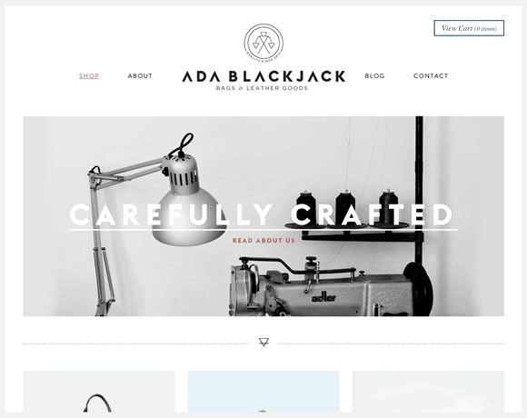
Choosing text over images with embedded text requires more effort but greatly enhances accessibility. It ensures all users can access and understand content effectively regardless of impairments. This approach fosters a more inclusive user experience and supports the broader goal of accessibility in digital design.
Use Tables Wisely
The tag in HTML serves dual purposes: constructing data tables and designing custom elements on web pages. When used for data tables, tags provide essential structure and help prevent cross-browser issues, particularly concerning responsiveness adjustments.
However, when overused or misapplied, tables can complicate navigation and readability for all users, including those relying on assistive technologies like screen readers. Therefore, using tables judiciously is essential for ensuring easier accessibility across different devices and improving overall user experience.
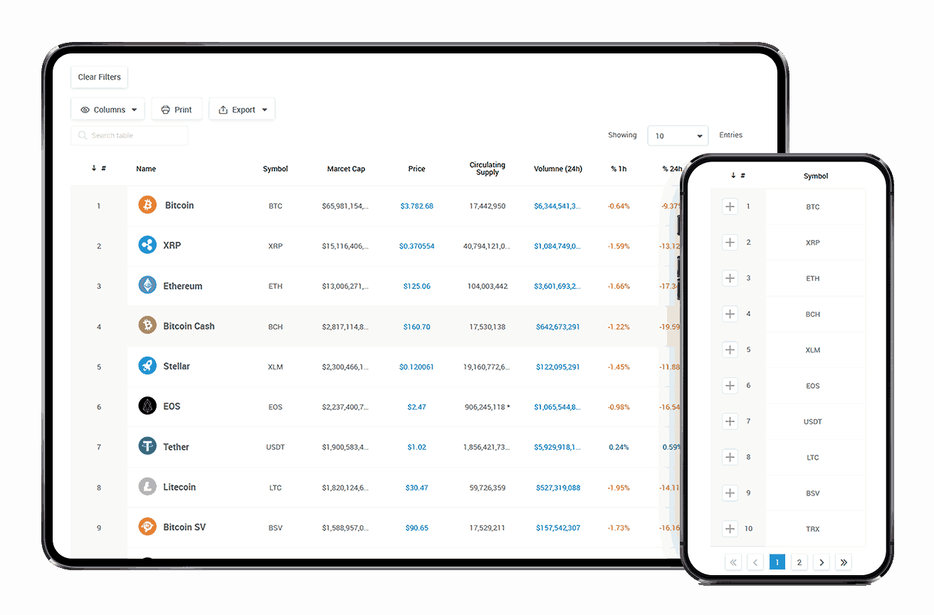
However, the same structure will hurt the website’s accessibility when the table is too complex and big to be understood by a screen reader. For instance, this is a big and complex table from accessibility and web responsiveness point of view:
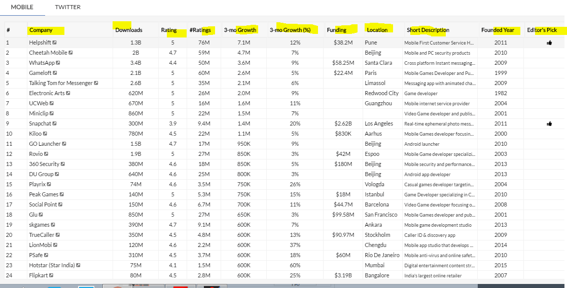
When screen readers encounter a <table>, they announce the rows and columns along with their headings, aiding users in navigating the data. However, for large tables, users may find it challenging to retain all the column information, potentially diminishing their experience and causing them to overlook valuable table data.
The tag is sometimes misused to structure elements that do not contain tabular data, such as graphical elements or layouts mimicking CSS Grid. This misuse can confuse screen reader users, as these elements are not intended to be read sequentially like traditional tables. It’s best practice to reserve the tag strictly for presenting tabular data in a textual format that is easier for people with impaired vision to interpret and navigate.
This revision clarifies the implications of using tags in both scenarios, emphasizing the importance of proper usage for enhancing accessibility.
Do Not Ignore Media Elements
When discussing website accessibility, the focus often leans towards textual content, but media elements such as audio, video, and images are equally crucial, if not more so. Media accessibility not only addresses disabilities and motor control issues but also temporary impairments, such as those recovering from injuries like broken bones. Therefore, it’s essential to prioritize media elements in website accessibility design to ensure easier accessibility for all users.
Two significant issues with media accessibility include the lack of keyboard-friendly native controls on video players, where not all browsers seamlessly switch between controls using the “tab” key. Additionally, differences in how browsers interpret native controls due to various browser engines lead to cross-browser compatibility issues in web accessibility.
To address these challenges, consider moving away from native APIs and focusing on strict JavaScript and HTML coding practices. Browsers universally understand these technologies, ensuring consistent results to achieve easier accessibility across different platforms and assistive technologies.
Make the Website Keyboard-Friendly
Assuming that most users use a mouse to navigate, the website often overlooks those relying solely on a keyboard. For example, blind users often use braille keyboards, and people with limb impairments may rely on keyboards instead of mice. Navigating a website with just a keyboard can be tricky, especially when tabbing through options and making selections.
Developing and testing websites for keyboard friendliness enhances accessibility, benefiting both typical users and those who require or prefer using a keyboard due to accessibility needs. This approach ensures easier accessibility for all users, regardless of their input method.
Incorporate Assistive Technology in Testing
Assistive technology refers to devices that help people with disabilities understand web pages. The specific type of assistive technology used depends on the individual’s disability; for example, those with visual impairments may use screen readers, while individuals with hearing issues may rely on text-to-speech software.
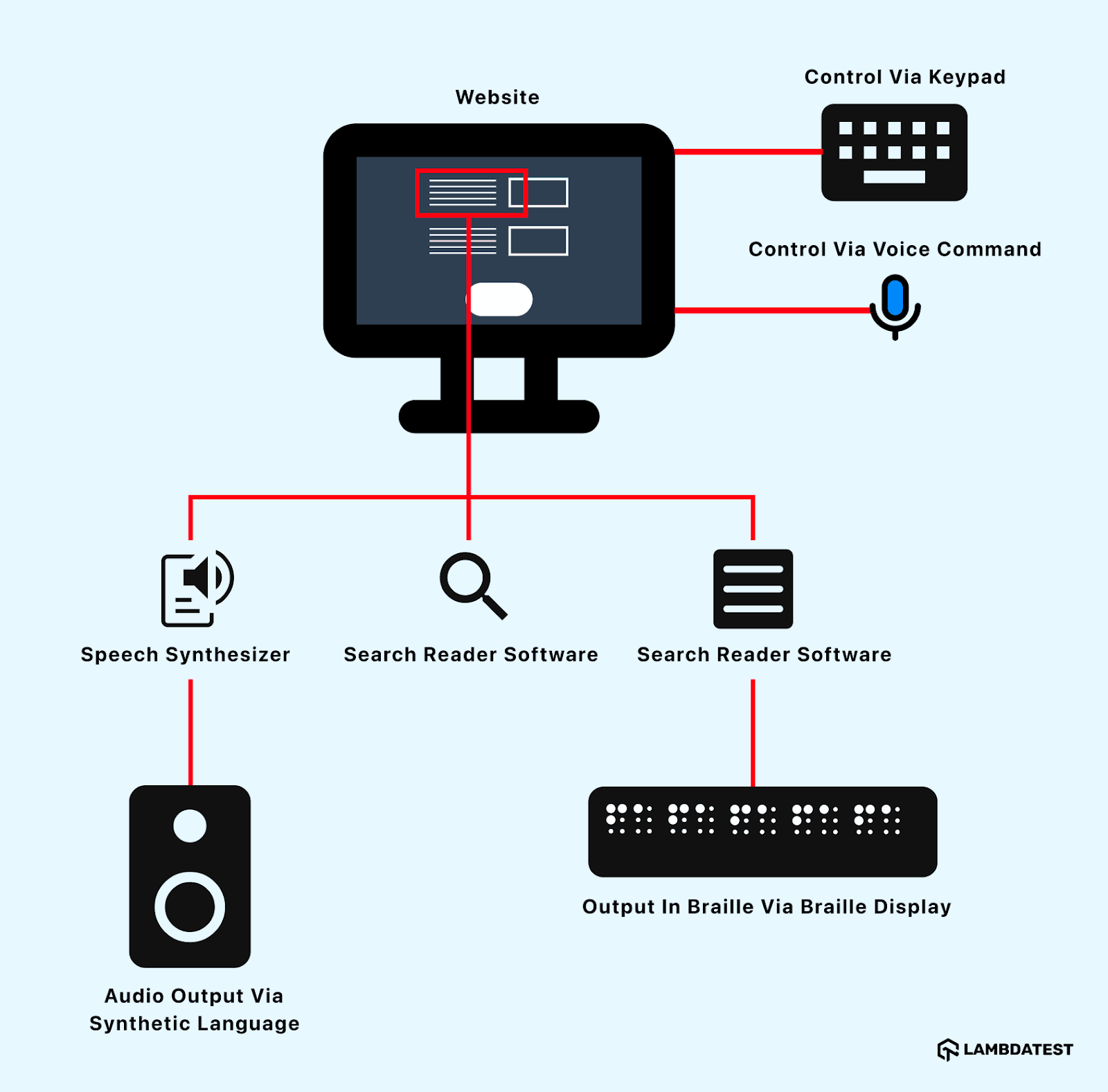
Leaving out assistive technology during testing poses risks for users who depend on these tools to navigate websites effectively. This oversight can lead to negative feedback and the eventual adoption of assistive technologies, underscoring the importance of integrating them from the outset for easier website accessibility.
Do Not Completely Rely on Automated Tests
Automation tests are a preferred method for verifying the correctness of new code and its impact on existing stable code. Once written, these tests can be used repeatedly until there are changes to the core functionality. However, automated tests should not be the only testing methodology used in certain domains. For instance, UI testing should be done manually because automated tests cannot identify all UI anomalies as efficiently as manual testers.
Website accessibility testing requires both manual inspection and automation testing. Testers should use automation testing for scenarios that are compatible with it. For example, contrast can be checked through automation since colors are embedded in the CSS styling code or by using a separate sheet of colors for quick analysis. Checking the alt text of images is also suitable for automation.
However, it is not recommended to use automation to test keyboard navigation or captions on videos. Writing automation scripts for these tests is challenging and can lead to false positives or negatives.
Therefore, do not rely solely on automation tests. Instead, segregate scenarios into two categories: those suitable for automation and those requiring manual testing. Keep the manual testing category robust, as web accessibility is more reliable when verified manually.
Perform Accessibility Testing or Install an Accessibility Browser Extensions
Often, developers may struggle to identify elements on their web pages that don’t comply with WCAG guidelines, which encompass numerous parameters, making full compliance challenging. Conducting accessibility testing is crucial to pinpointing these issues efficiently, allowing developers to address them in line with WCAG standards.
Accessibility testing tools ensure web pages meet WCAG guidelines by detecting and resolving accessibility issues. Additionally, utilizing accessibility browser extensions, such as those offered by platforms like LambdaTest, can significantly help in making websites and web applications accessible to all users. It is an AI-powered test execution platform that allows you to run manual and automated accessibility tests at scale with over 3000+ browsers and OS combinations.
As an accessibility browser extension, you can make use of LambdaTest Accessibility DevTools Chrome extension that allows you to easily test, manage, and report accessibility issues with features like partial scans, full scans, multi-page scans, and workflow scans that focus on continuous accessibility scanning by capturing dynamic interactions and page changes.
The most interesting part of this extension is that it can classify the issues and suggest solutions for each issue, making web accessibility easier for manifolds. {% gist %}
Beta Test or Usability Test With Impaired People
Once developers and testers have followed all the guidelines and methods to create an accessible website, it is beneficial to have it tested by impaired people. This helps prevent negative feedback and the need to rebuild certain parts of the application after release.
Creating a team of diverse individuals representing various impairments is advisable to get comprehensive feedback before the application reaches millions of users. The team can choose either beta testing or usability testing for this step, as both approaches will yield similar results in terms of outputs and efficiency.
Conclusion
Integrating accessibility is crucial for creating an inclusive and user-friendly website. Conducting surveys and research to gather insights from diverse users ensures your website meets real-world needs. Incorporating accessibility into the planning phase makes it an integral part of the development process, promoting easier accessibility rather than treating it as an afterthought. Feedback options are vital for identifying and addressing accessibility gaps and should be easily accessible to users.
Combining automated testing with manual inspection thoroughly evaluates easier accessibility. Tools like LambdaTest Accessibility DevTools are valuable for ongoing monitoring and issue resolution.
These best practices underscore the importance of considering all users, regardless of their abilities, to achieve easier accessibility and create a more inclusive digital environment.
Subscribe to my newsletter
Read articles from Harish Rajora directly inside your inbox. Subscribe to the newsletter, and don't miss out.
Written by
