Responsive Profile Cards using HTML & CSS
 Aditya Gadhave
How do you make a profile card?
After reading and watching the following article and tutorial, you will able to create to responsive profile card or page as you can see on the web page.Hello readers, today in this blog I’m going to create Responsive Profile Cards by using HTML & CSS only. In my previous blog, I have shared a Profile Card with Sliding Animation, and this time to create a profile card.
What is Profile Card?
Shortly profile card means a card where is a small photo of a particular person and his some details like name, job, some other minor details. A profile card is used as an identity of a specific person.
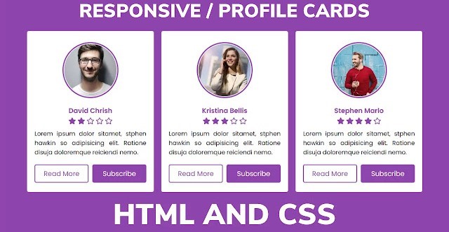
As you can see on the given images there are three profile cards of a different person. At the top, there are different images for specific people in the circular form. Under the images, there is a different name for all and some ratings and some limes of dummy text.
At the bottom of this card we can see two buttons one is with text Readmore and another is as a subscribed. When we hover on that button background is changed smoothly. These all cards are responsive, all cards are seen perfectly on all sizes of screen.
As you have seen, there are three profile cards for all people, I have given them the small image in a circular form, under the image there is a person’s name, job, and some rating. At the bottom there are two buttons one is named by Readmore and another is named by subscribing.
Did you notice when that is hovered their background smoothly changed? To make these cards responsive I have used the @media query. Media query helps to fit these cards on different screens.
If you are familiar with HTML & CSS then you can easily make create this program. Those friends who are feeling difficulty creating this program, don’t worry I have provided all source code files below. This is free and you use this program for your purposes.
Responsive Profile Cards | Free Source Codes]
To paste the given codes of Responsive Profile Card Design, first of all, you need to create two files one is an HTML file and another is a CSS file, after creating these two files then you can copy-paste the given codes in your files. You can also download all source codes and file from the given “Download Button” directly.
<!DOCTYPE html>
<!-- Created By CodingLab - www.codinglabweb.com -->
<html lang="en" dir="ltr">
  <head>
    <meta charset="UTF-8">
    <meta name="viewport" content="width=device-width, initial-scale=1.0">
  <title>Responsive Profile Cards | CodingLab</title>
    <link rel="stylesheet" href="style.css">
    <link rel="stylesheet" href="https://cdnjs.cloudflare.com/ajax/libs/font-awesome/5.15.2/css/all.min.css"/>
  </head>
  <body>
    <div class="container">
      <div class="box">
      <div class="image">
        <img src="img1.jpeg">
        </div>
        <div class="name_job">David Chrish</div>
        <div class="rating">
          <i class="fas fa-star"></i>
          <i class="fas fa-star"></i>
          <i class="far fa-star"></i>
          <i class="far fa-star"></i>
          <i class="far fa-star"></i>
        </div>
        <p> Lorem ipsum dolor sitamet, stphen hawkin so adipisicing elit. Ratione disuja doloremque reiciendi nemo.</p>
        <div class="btns">
          <button>Read More</button>
          <button>Subscribe</button>
        </div>
      </div>
      <div class="box">
        <div class="image">
        <img src="img2.jpeg" alt="">
        </div>
        <div class="name_job">Kristina Bellis</div>
        <div class="rating">
          <i class="fas fa-star"></i>
          <i class="fas fa-star"></i>
          <i class="fas fa-star"></i>
          <i class="far fa-star"></i>
          <i class="far fa-star"></i>
        </div>
        <p> Lorem ipsum dolor sitamet, stphen hawkin so adipisicing elit. Ratione disuja doloremque reiciendi nemo.</p>
        <div class="btns">
          <button>Read More </button>
          <button>Subscribe</button>
        </div>
      </div>
      <div class="box">
        <div class="image">
         <<img src="img3.jpeg" alt="">
        </div>
        <div class="name_job">Stephen Marlo</div>
          <div class="rating">
          <i class="fas fa-star"></i>
          <i class="fas fa-star"></i>
          <i class="fas fa-star"></i>
          <i class="fas fa-star"></i>
          <i class="far fa-star"></i>
        </div>
        <p> Lorem ipsum dolor sitamet, stphen hawkin so adipisicing elit. Ratione disuja doloremque reiciendi nemo.</p>
        <div class="btns">
          <button>Read More</button>
          <button>Subscribe</button>
        </div>
      </div>
    </div>
      </body>
</html>
CSS Code:
@import url('https://fonts.googleapis.com/css2?family=Poppins:wght@200;300;400;500;600;700&display=swap');
*{
  margin: 0px;
  padding: 0px;
  box-sizing: border-box;
  font-family: 'Poppins', sans-serif;
}
::selection{
  background: #8e44ad;
  color: #fff;
}
html,body{
  display: grid;
  height: 100%;
  place-items: center;
  background: #8e44ad;
}
.container{
  max-width: 1100px;
  display: flex;
  justify-content: space-between;
  align-items: center;
  flex-wrap: wrap;
  padding: 20px;
}
.container .box{
  width: calc(33% - 10px);
  background: #fff;
  display: flex;
  flex-direction: column;
  justify-content: center;
  align-items: center;
  padding: 20px 30px;
  border-radius: 5px;
}
.box .quote i{
margin-top: 10px;
font-size: 45px;
color: #17c0eb
}
.container .box .image{
  margin: 10px 0;
  height: 150px;
  width: 150px;
  background: #8e44ad;
  padding: 3px;
  border-radius: 50%;
}
.box .image img{
  height: 100%;
  width: 100%;
  border-radius: 50%;
  object-fit: cover;
  border: 2px solid #fff;
}
.box p{
  text-align: justify;
  margin-top: 8px;
  font-size: 16px;
  font-weight: 400;
}
.box .name_job{
  margin: 10px 0 3px 0;
  color: #8e44ad;
  font-size: 18px;
  font-weight: 600;
}
.rating i{
  font-size: 18px;
  color: #8e44ad;
  margin-bottom: 5px;
}
.btns{
  margin-top: 20px;
  margin-bottom: 5px;
  display: flex;
  justify-content: space-between;
  width: 100%;
}
.btns button{
  background: #8e44ad;
  width: 100%;
  padding: 9px 0px;
  outline: none;
  border: 2px solid #8e44ad;
  border-radius: 5px;
  cursor: pointer;
  font-size: 18px;
  font-weight: 400;
  color: #8e44ad;
  transition: all 0.3s linear;
}
.btns button:first-child{
  background: none;
  margin-right: 5px;
}
.btns button:last-child{
  color: #fff;
  margin-left: 5px;
}
.btns button:first-child:hover{
  background: #8e44ad;
  color: #fff;
}
.btns button:hover{
  color: #fff;
}
@media (max-width:1045px){
  .container .box{
    width: calc(50% - 10px);
    margin-bottom: 20px;
  }
}
@media (max-width:710px){
  .container .box{
    width: 100%;
  }
}
Subscribe to my newsletter
Read articles from Aditya Gadhave directly inside your inbox. Subscribe to the newsletter, and don't miss out.
Written by

Aditya Gadhave
Aditya Gadhave
👋 Hello! I'm Aditya Gadhave, an enthusiastic Computer Engineering Undergraduate Student. My passion for technology has led me on an exciting journey where I'm honing my skills and making meaningful contributions.