Drawing Awesome Shapes with Elliptical Border Radius in CSS
 Ayomikun Osota
1 min read

Most are familiar with the basic usage of border-radius to create circular or rounded shapes but many are unaware of its potential for creating more complex and interesting shapes using elliptical border-radius.
Understanding Border-Radius
By setting a uniform value, you can achieve simple rounded corners or circles.
<!-- Simple rounded corners -->
.circle {
    width: 100px;
    height: 100px;
    background-color: #3498db;
    border-radius: 50%; /* Creates a circle */
}
Elliptical Border-Radius
To create an elliptical border-radius, you can use two values separated by a slash (/):
.elliptical {
    width: 200px;
    height: 100px;
    background-color: #e74c3c;
    border-radius: 50% / 25%;
}
Examples
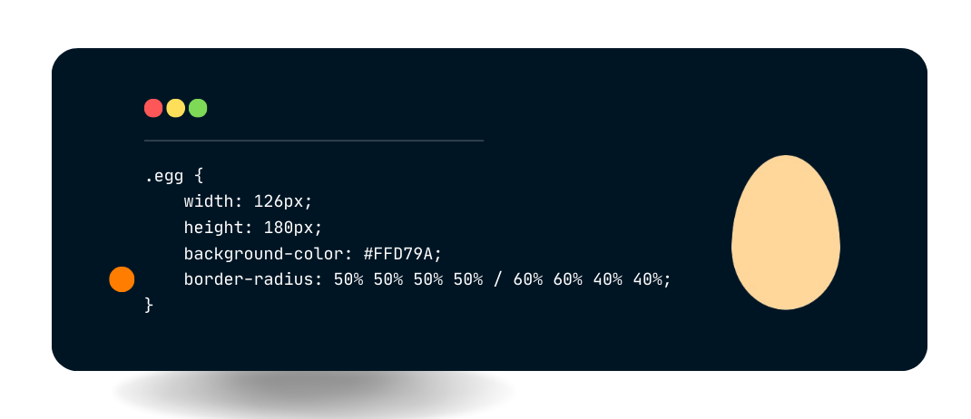
By adjusting the values of the elliptical border-radius, you can create a variety of unique shapes. Here are a few examples:
0
Subscribe to my newsletter
Read articles from Ayomikun Osota directly inside your inbox. Subscribe to the newsletter, and don't miss out.
Written by
