Haixu Case Study #1 - Glowing Life - a visual guide
 Anand (RC)
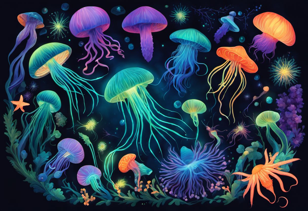
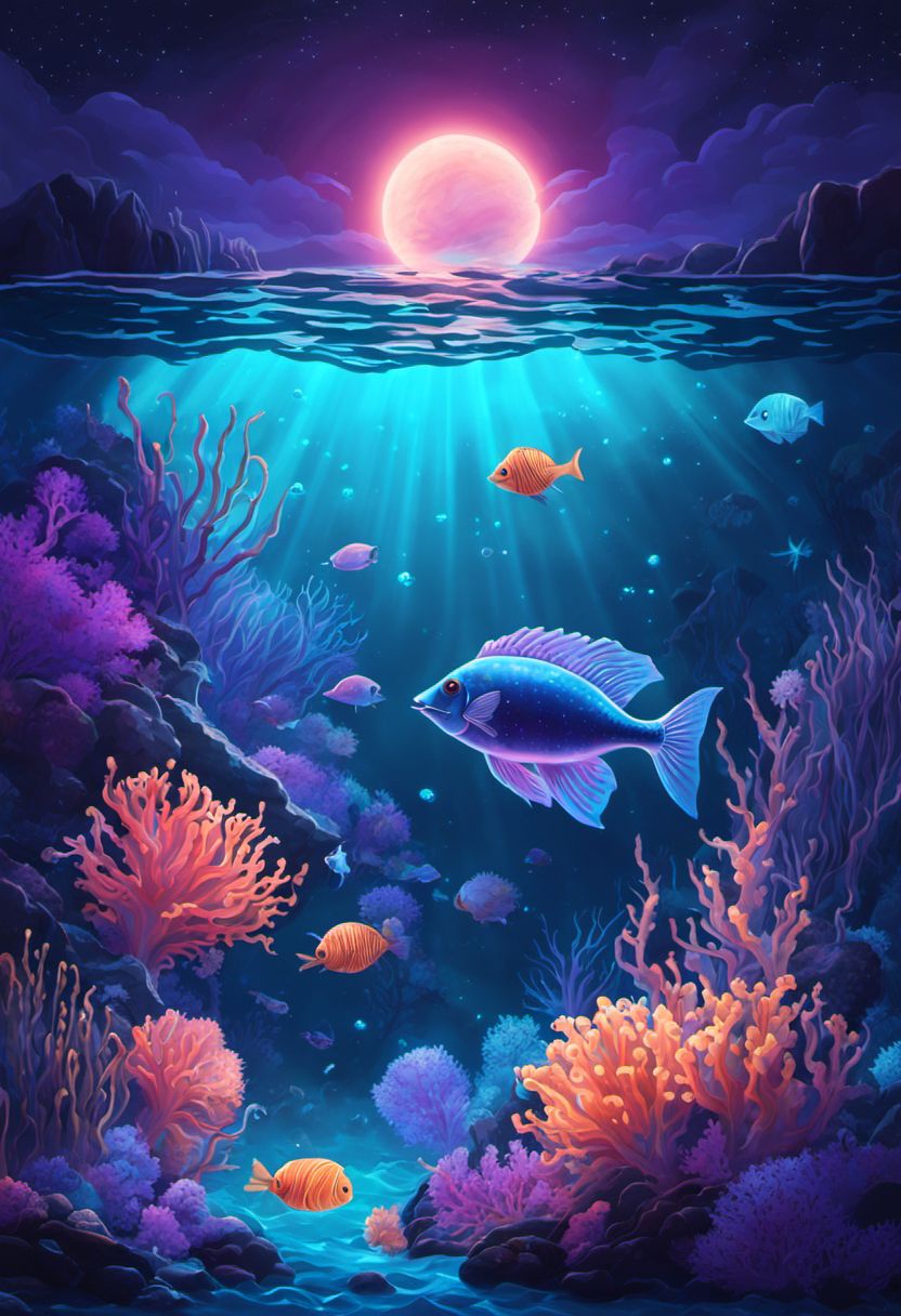
This article explains the unique experience of a haixu visual guide through an example: Glowing Life - a visual guide about Bioluminescence - the phenomenon of production and emission of light by living organisms.
After a brief overview of haixu visual guides, I will dig deeper with images from within the visual guide. I will critique the visual guide and explain what is good and what is bad. Whether you want to know what to expect in this visual guide, or want to understand how I made this visual guide, this article is for you.
What is haixu?
haixu is my project of Human AI collaboration to combine science/technology/math/objective (X, for the universal unknown in math) with art/visual/subjective (U, for curves). It is pronounced to rhyme with haiku, with the choice of how to pronounce the 'x' left to your preference. I tend to pronounce it as hai-gzoo or haikshoo or sometimes just as haiku.
Haixu visual guides
The first output of this project is a series of AI generated educational visual guides, each based entirely on a single Wikipedia Article.
In the current set of haixu visual guides, all the content you see - text and images - is generated by a team of AIs. The human (me) adds code and prompts to coordinate and guide the AI team to create the best possible visual guide.
In this initial set of haixu visual guides, I do not edit any image or text that is produced by AI. We (the AI team and I) generate visual guides, we both review them for any serious errors, reject any visual guide with even a single serious error, also reject visual guides with too many milder errors, and publish the rest.
The current quality of this system can be made concrete by the metric that more than a third of the generated visual guides were published (~59 published out of 145 ). Most rejections were due to a single panel having a serious error, or a couple of panels that looked too bad to let the visual guide through. A handful of visual guides were also rejected due to unsuitability for a younger audience:
for example, a beautiful visual guide about Geishas was rejected in spite of content being beautiful and mostly family friendly. It was rejected because the topic itself is inappropriate, and there were just two text phrases that referenced the adult aspects of the Geisha trade.
some visual guides on medical topics, disasters and wars were rejected since they naturally involved images which may be disturbing for younger audiences.
This metric of 59/145 is pretty good, subjectively compared to anything else out there.
Some serious errors may have slipped our review. If you find any, please report them here. Thank you!
AI generated content can also contain factual errors - check the facts before using them.
Glowing Life
The visual guide in this case study, titled Glowing Life, is entirely based on the Wikipedia page for Bioluminescence.
Title and Cover
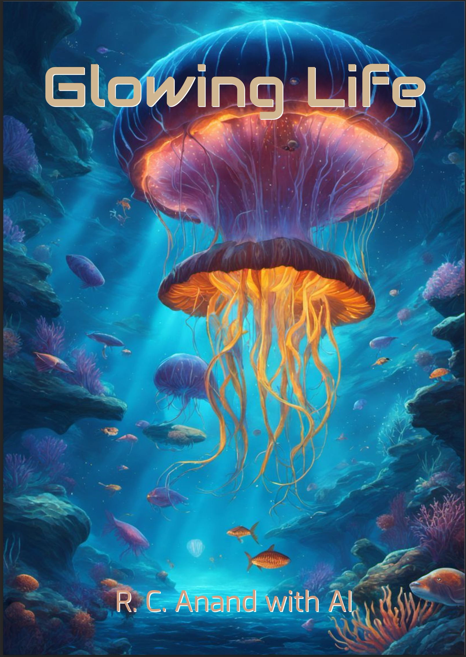
Since Bioluminescence may sound complex to some readers, it is titled Glowing Life, which accurately captures the phenomenon of Bioluminescence in simple terms.
The visual guide is written by me (R. C. Anand) with AI.
AI generated images
All images are generated by AI. Different people have different emotional reactions to images (and art in general). I will share my take on this cover image:
The image is beautiful: it captures the theme of Bioluminescence well via the depiction of its main representative - the jellyfish. The central two jellyfish glow to emphasize their light emitting nature.
The image is not perfect: AI generated images are generally not perfect. A human artist would compose this cover image much better. They might for instance separate the two jellyfish with some space, or have a single central jellyfish, which makes for a better composition than the overlap in this image. One possible reason for the image being imperfect is that the cover image needed to be a certain aspect ratio (width to height ratio), and image generation AI tends to repeat elements along longer dimensions - so even if we asked for a single central jellyfish, you might get two.
Table of Contents
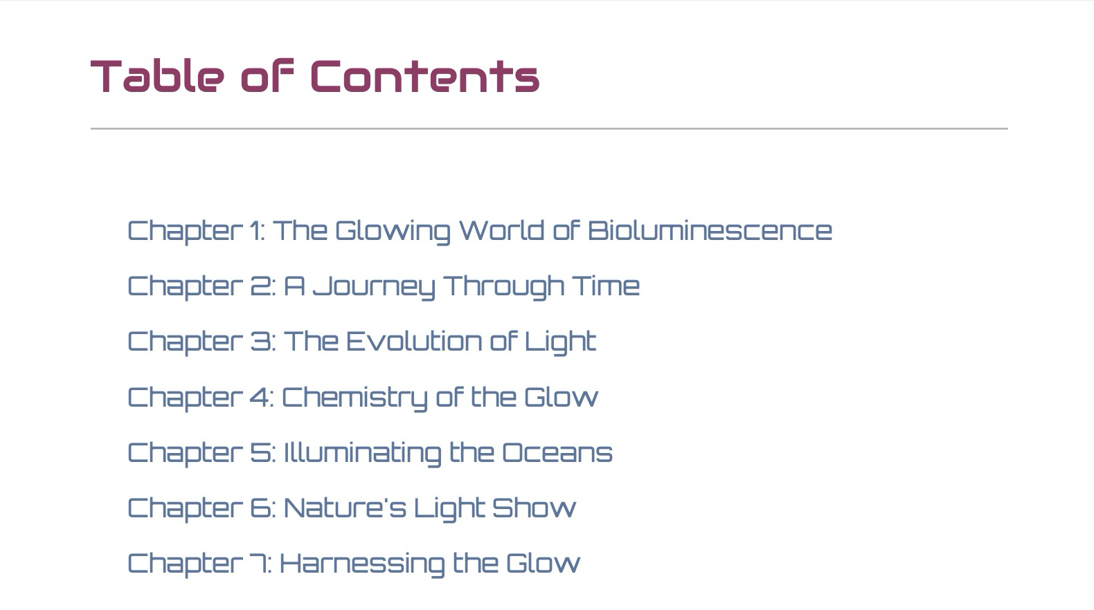
The haixu visual guide covers a balanced set of topics and content based on the source wikipedia page. The topics are chosen to suit a first reading of the subject by young readers and to fit the comic medium. Some topics in the wikipedia page may not be covered, and some topics will be introduced to suit the visual guide.
The table of contents also shows that the chapters are given creative names, and do not map directly to the sections of the wikipedia page and its more encyclopedic section titles.
I like the coverage by the contents - it has an overview chapter 1, a history in chapters 2 and 3, the chemistry in chapter 3, the beauty of bioluminescence in chapters 5 and 6, and applications of bioluminescence in various fields in chapter 7.
Issue: Chapter Overlap
In an educational visual guide of this kind, there is some expected overlap of content across chapters. However, some chapters involve a large amount of overlap between their content (like 2 and 3, 5 and 6 in this visual guide). A friend (Venky) found this issue while reviewing a visual guide. In some cases the content generated is different enough to justify keeping them. In some, the overlap may be too much and should be removed. Future versions of these visual guides and newer ones will be engineered to reduce or eliminate this issue.
Visual guide versions
It is possible to regenerate any number of visual guides for the same topic, and each one will be different from the others.
I have provided two different visual guide versions for some of the topics (Coral reef, Tutankhamun's Tomb, Photosynthesis, Sydney Opera House, Renewable Energy, etc.).
Request us (email) for more versions of existing visual guides or visual guides on other topics if you want, and I will regenerate and publish them based on interest.
By the way, I intend to fix issues (like chapter overlap above) using better end to end engineering (and in the future, maybe manual curation). If a new version is mostly fixes of issues in previous versions, the new version will be provided free of cost to previous buyers.
Summary as first chapter
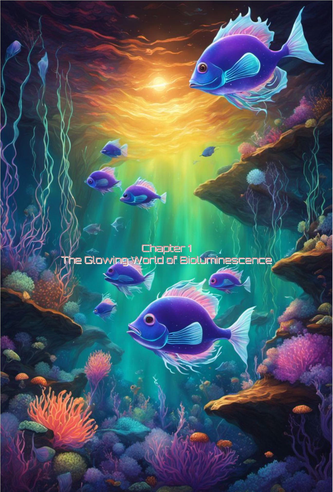
This visual guide's first chapter is a summary of the entire topic. Sometimes, the AI generates a summary as the first chapter, and sometimes it chooses to begin with something else (usually a history). I think a summary in the beginning makes sense for some topics. I have had feedback requesting summaries for all topics, but am not sure if that is the right approach, even only for educational topics. Let me know in the comments what you think.
The first content page
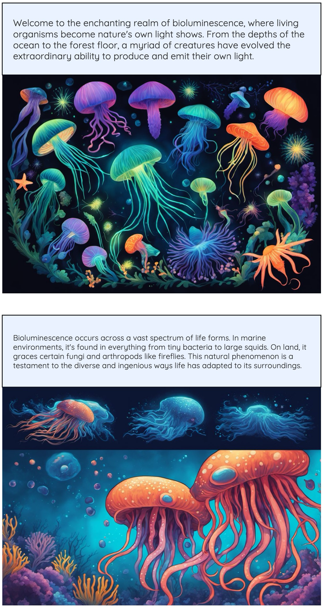
This (above) is the first content page of the first chapter in our visual guide.
The text in both panels shows very useful content befitting an introduction to the topic.
The top panel image is beautiful and depicts the panel image text well.
The bottom panel image is not that great. It has a weird split view with no clear contrast or relation between the top and the bottom. I am not sure what the orange creature in the lower part is, or if such a creature actually exists. Also, the image does not represent the text well. This is another challenge with AI image generators. If we ask for a lot of different things in the image, it will often miss some or repeat a few of them or worse (which is what I think happened here in the lower panel) combine many of them into one thing.
Technical aside: AI image generators
To fix the above problem, we want to feed the panel text directly as natural language to the image generator AI. Till about a year ago, most AI image generators required to be prompted in very specific ways to get the desired image. We provide a sequence of keywords separated by commas. Some AI image generators accept natural language requests, but the results are not as good for a variety of content and styles. Others do well but cannot be called programmatically. Some do not accept natural language prompts for complex images, and require prompting in a special way, but they do well in terms of handling variety and flexibility of content and style. This presents a challenge today, but as these systems get better at handling natural language and providing programmatic access and allowing flexibility in content and style, it will be possible to use the panel text directly to get much better alignment.
Another challenge is that all AI image generators are trained on some set of images and text - then, we specify the style and content we want from them in the text prompt. If the training data has good number of images in the style and content specified, we may get good results. However, if the style specified does not have enough images of the content we ask for, then the content will get changed from the original. This may be what is happening in the above case of the orange creatures.
The second content page
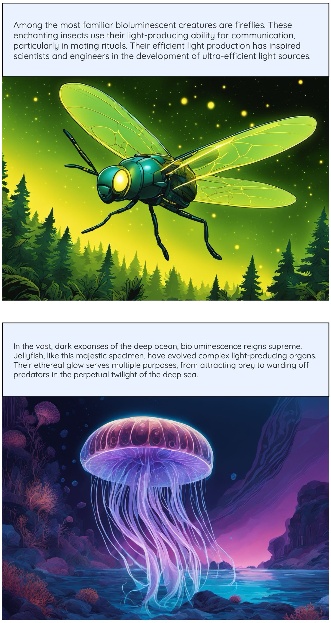
I like this second page better. The text and the images are informatively aligned in both panels. And both panels look beautiful.
Conclusion
My goal has been to give a full picture of what to expect from haixu AI generated visual guides. Both the good and the ugly. I have released these visual guides because I think the issues are far overshadowed by the overall aesthetic and informative experience of these visual guides. I have rejected the visual guides where the issues outweighed the value. I will fix what can be done on my end as I continue to work on this, will release more visual guides and better variants of existing visual guides over time. Also, as AI systems get better, we can expect that they will generate better and better content, and make the problems go away.
I will be publishing more such case studies that illustrate more details around how I built haixu. Stay tuned by subscribing to this blog.
Get this visual guide at Glowing Life.
Thanks!
Subscribe to my newsletter
Read articles from Anand (RC) directly inside your inbox. Subscribe to the newsletter, and don't miss out.
Written by

Anand (RC)
Anand (RC)
I am currently working on generative AI, currently text+image experiences, educational AI generated visual guides in various mediums (comic, video, etc.). Before that, I was building llm apps with chat models, evaluating GPTs and Assistants API. Before that worked in conversational AI. Prior to that, have worked on many things product, software, AI, ML.