What is Figma? A Design Crash Course
 Adrian Twarog

Figma is a powerful design tool that helps you to create anything: websites, applications, logos, and much more.
By learning to use Figma, you'll take your first steps into User Interface Design and and User Experience Design. These skills are essential for building a great portfolio for yourself and potentially for your own company.
In this Figma Crash Course, I will use a real project website from Frontend Mentor which we will recreate in Figma. Learning by building a project is a great way to solidify your knowledge, so I recommend downloading the assets and following along.
I'll break this crash course into a bunch of parts as we explore different features of Figma including:
Account setup
Design file
Design assets
How to get started – the basics
Frames
Grid columns and rows
Shapes
Import images
Labelling and grouping
Text
Navigation bar
Button design
Header title and scaling
Additional text settings
Hero section and Figma layers
Groups and sections
Fonts and Figma colors
Text line height and spacing
Alignment and snapping
Masking with shapes and images
Copying groups and sections
Updating sections
Color picker and copying sections continued
Color selecting and picking correct hue
Testimonial section
Autolayout
Autolayout options
Autolayout alignment
Autolayout content
Gallery images
Resizing images
Footer
SVG color and overlay edits
Auto layout menu footer
Layers toolbar, hide and lock
Prototype viewer
Frames and pages
Prototype interactions
Prototype interaction navigation to page
Share test and preview prototypes
Export pages
Export groups or sections
In this article, I'll give you a brief overview of some of the main parts of the course so you can get started designing in Figma.
Introduction
Let's begin by creating an account on the Figma Website. You can do this here: Figma.com.
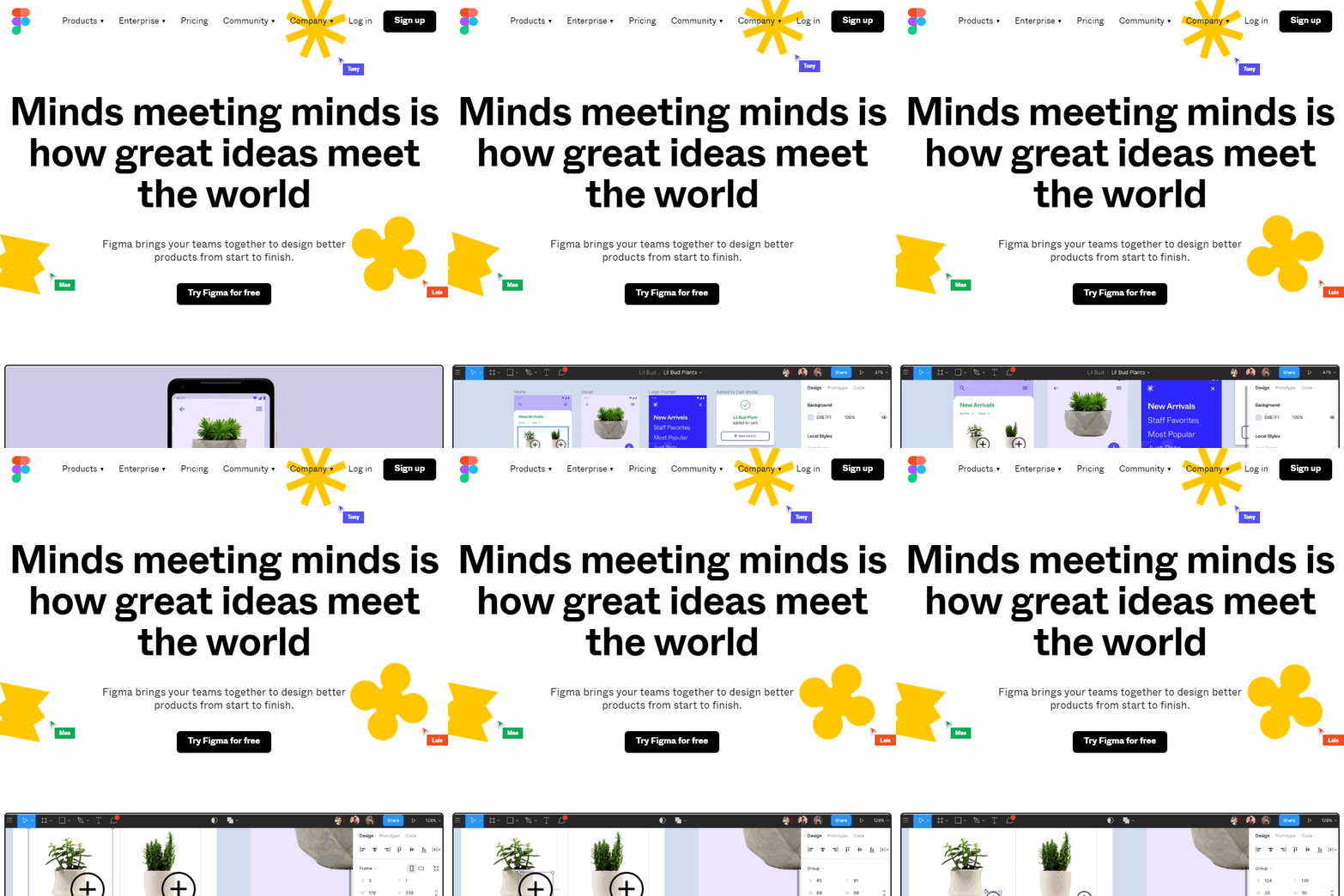
Just sign up with a new account (email or Google sign in) – it's completely free
Next we need to get the design assets to use for this project, which we'll grab from Frontend Mentor. You can download them here:
We are going to build our first draft page. Take a look at the default design layout we will be working with below. Select the + sign, or on the right hand side create a new design page.
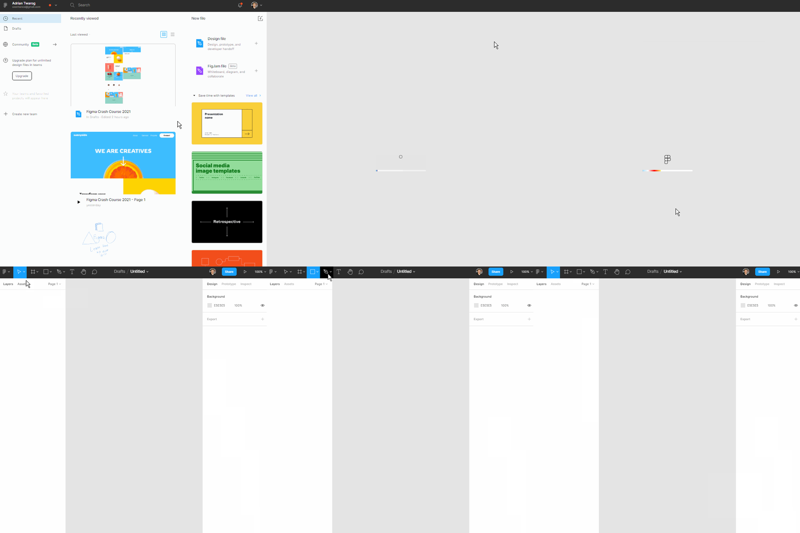
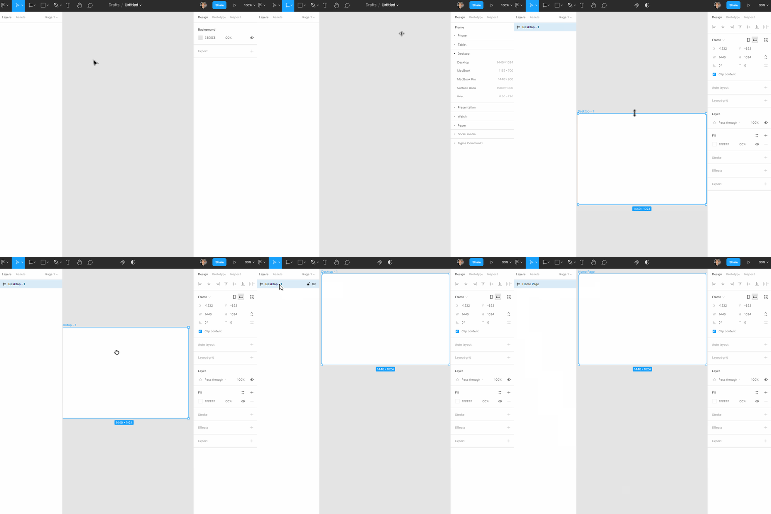
How to Make a Frame in Figma
First we will create a frame. This is the same as a page, and it's where our design will live. You can size a frame however you want depending on your requirements.
This example will be a website, so we will select the Desktop Frame – but you can also create mobile application frames, or even custom frames.
Select the Frame tool from the top menu
Select the Frame size on the right panel
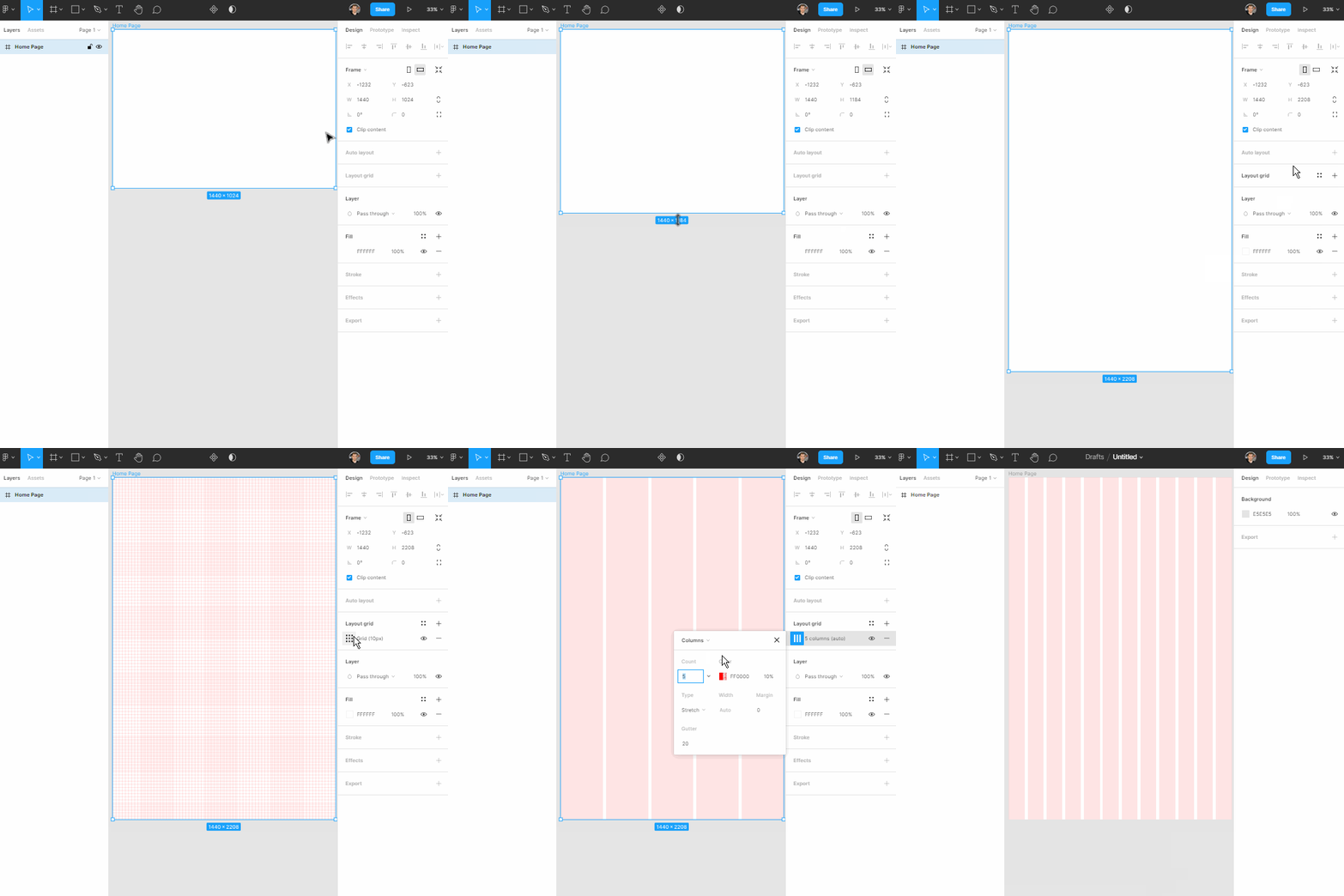
How to Add Grids and Columns in Figma
Before we start with the design, you will want to add grids that help you keep the alignment of content for your page consistent.
You can add grids to a frame and customise them. For example, I often prefer 12 grids as this is the default for website development.
Select the frame you wish to grid
Select Layout Grid on the right panel
Select Columns and 12 units
How to Use Shapes in Figma
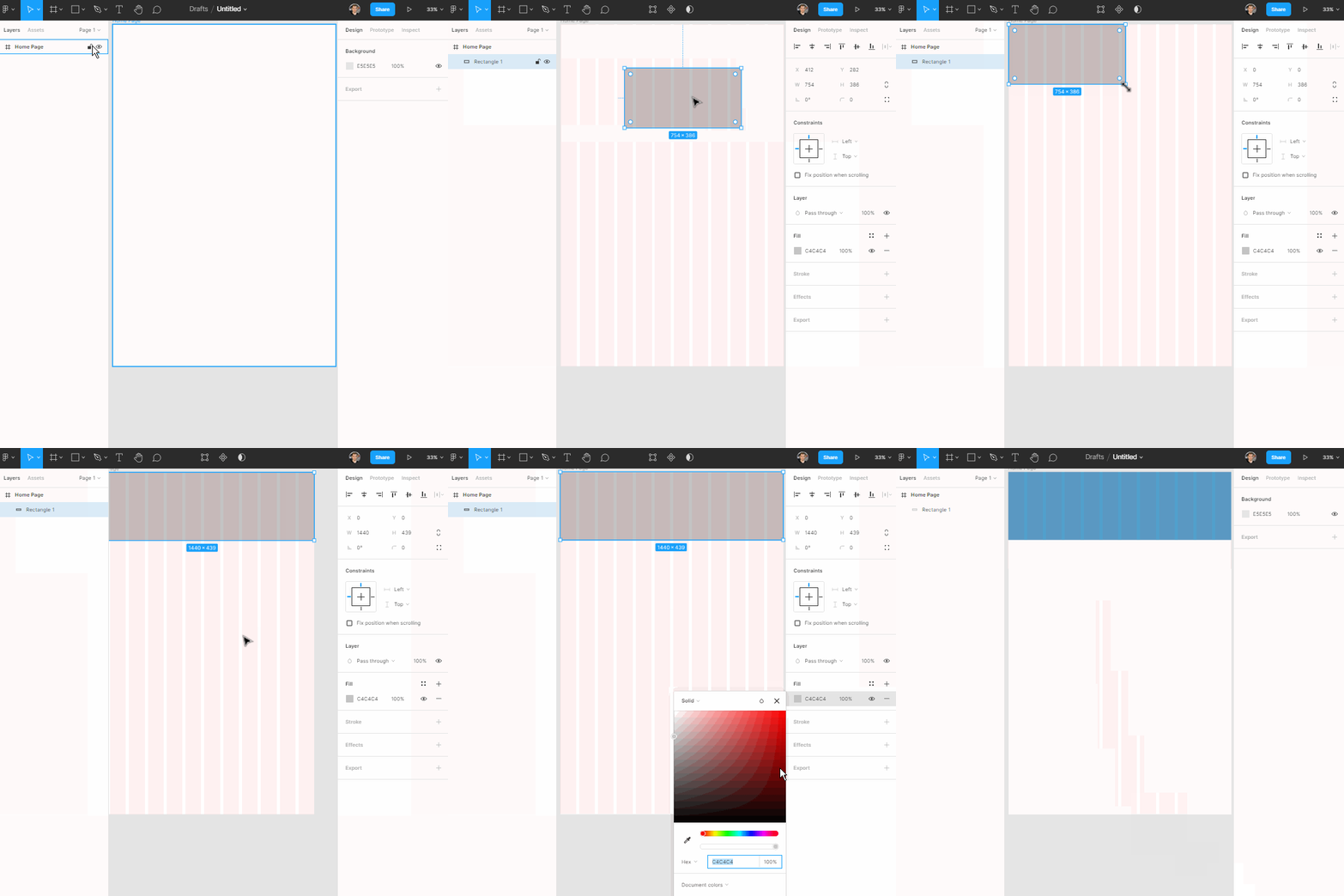
Use the shapes and elements in Figma to create squares, circles, lines, and more. These are the fundamentals for creating a design on a page.
I'll start with a simple rectangle which we will use to create our hero navigation section for the top part of this home page.
Select Square Shape tool
Create a square
Begin to shape and size it
How to Add Images in Figma
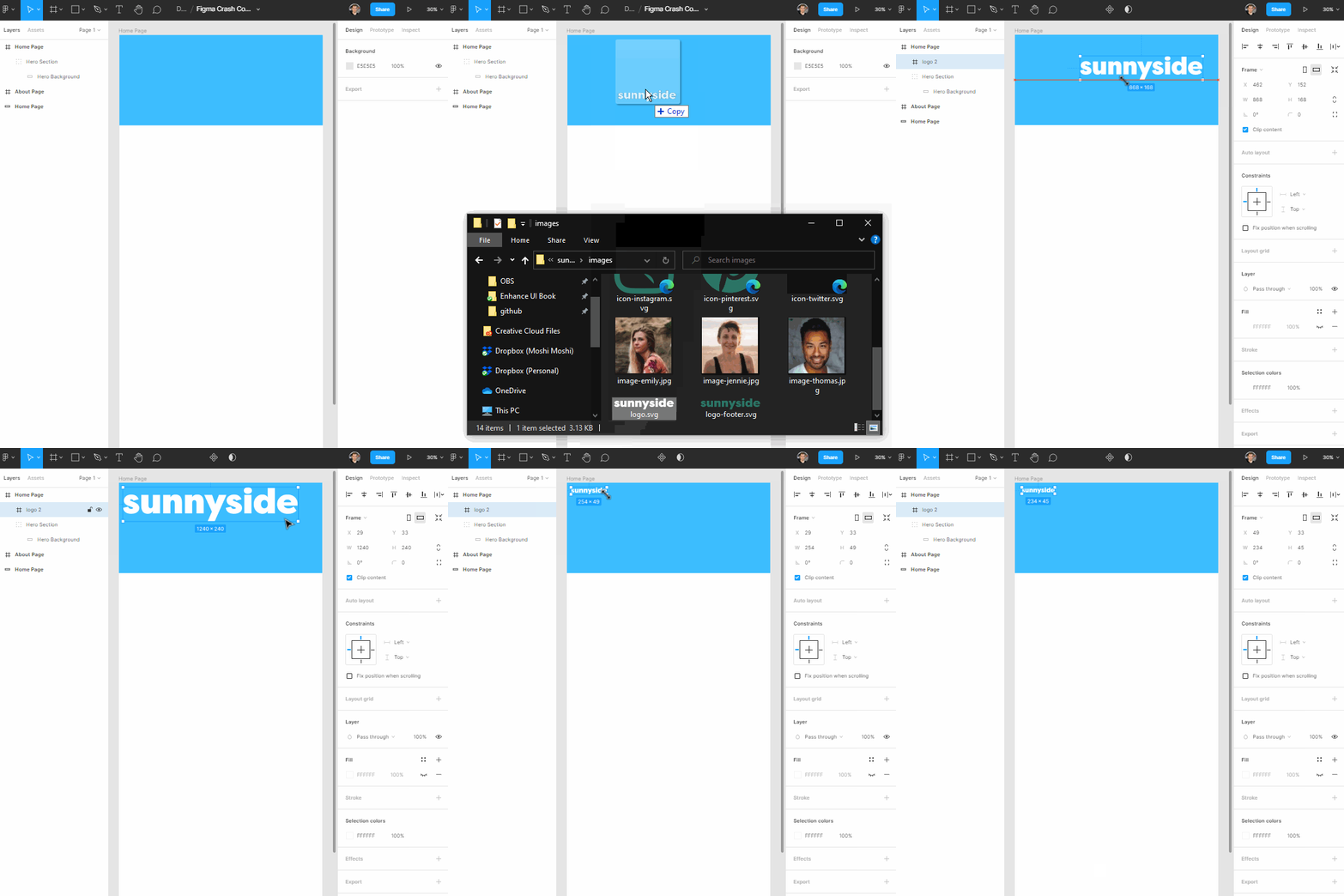
You can add images from an online source or locally to your page. Images are an important part of designing a website, especially for the hero section.
Let's add a logo as our first image which we will add to the top left of the screen.
Drag and drop an image from you local computer
Import an image from the shapes image upload option
Resize and place the image on the design
How to Add Text to a Design in Figma
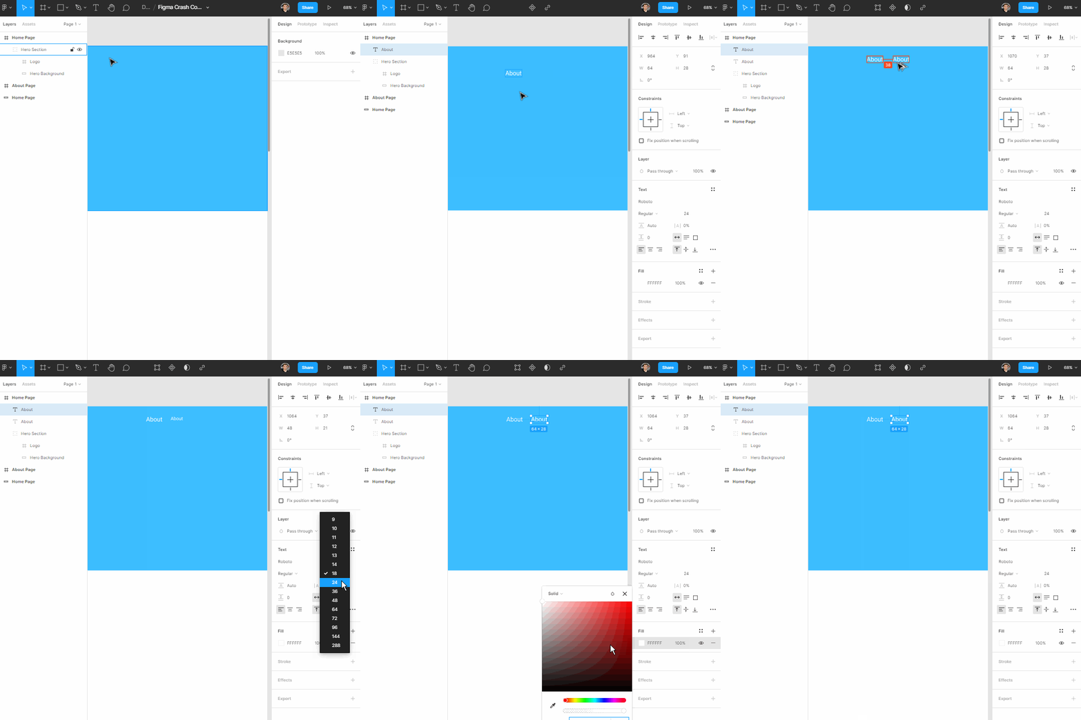
To add text to a design, select the text tool and place it on the page. The font will default to Roboto, but you can change the font family, size, and color at any stage.
In this example we will use right panel to change the color and size of the font, and later the font family as well.
Select the Text tool
Add "About" text as the start of the navigation
Ensure the size and color are 24 and white
How to Label Elements and Create Groups in Figma
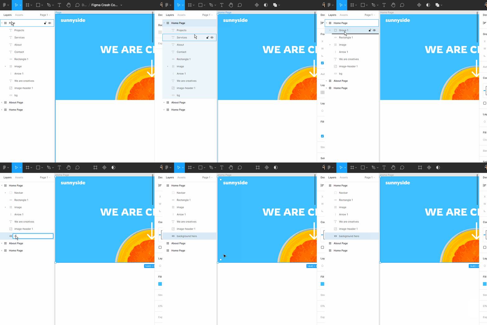
Working with lots of layers in Figma can get confusing, so label all your elements as soon as you create them. Even better is to group different sections and shapes with labels such as "Hero Background" or "Navbar".
Select your element/s and right click to group or press Ctrl + G
Name your group
Places groups inside groups for each section of your page to improve readability once your page gets large
Conclusion
Figma is simple to start using, but there's a lot to learn to use it to its full potential. With the basics of shapes, images, and text, you can easily get started prototyping a website, designing a mobile application, and much more.
If you want to take a deeper dive into these basics, I would recommend watching and following along the whole video crash course which looks at each aspect in more depth.
You can view the full results of the design below:
This whole process is part of what I am trying to teach on my own channel and also part of a course/book I am writing on design called Enhance UI. The goal is to help developers understand the fundamentals of design. Check out my Enhance UI Book below:
I hope you enjoyed this article. If you don't know who I am, I'm Adrian from Australia. I have a tiny channel on Twitter and YouTube, so if you want to know more about me or enjoy my content, check them out sometime. 😉

YouTube: https://youtube.com/adriantwarog
Twitter: https://twitter.com/adrian_twarog
Subscribe to my newsletter
Read articles from Adrian Twarog directly inside your inbox. Subscribe to the newsletter, and don't miss out.
Written by
