Let's Create a Stepper Using Material UI in React!
 Shubham Kumar Singh
Table of contents

Hi everyone,
Welcome to my blog. Today, I'm thrilled to show you how to create a Stepper component in React using Material-UI. It's ideal for displaying progress through a series of steps!
Code Available on GitHub: Link
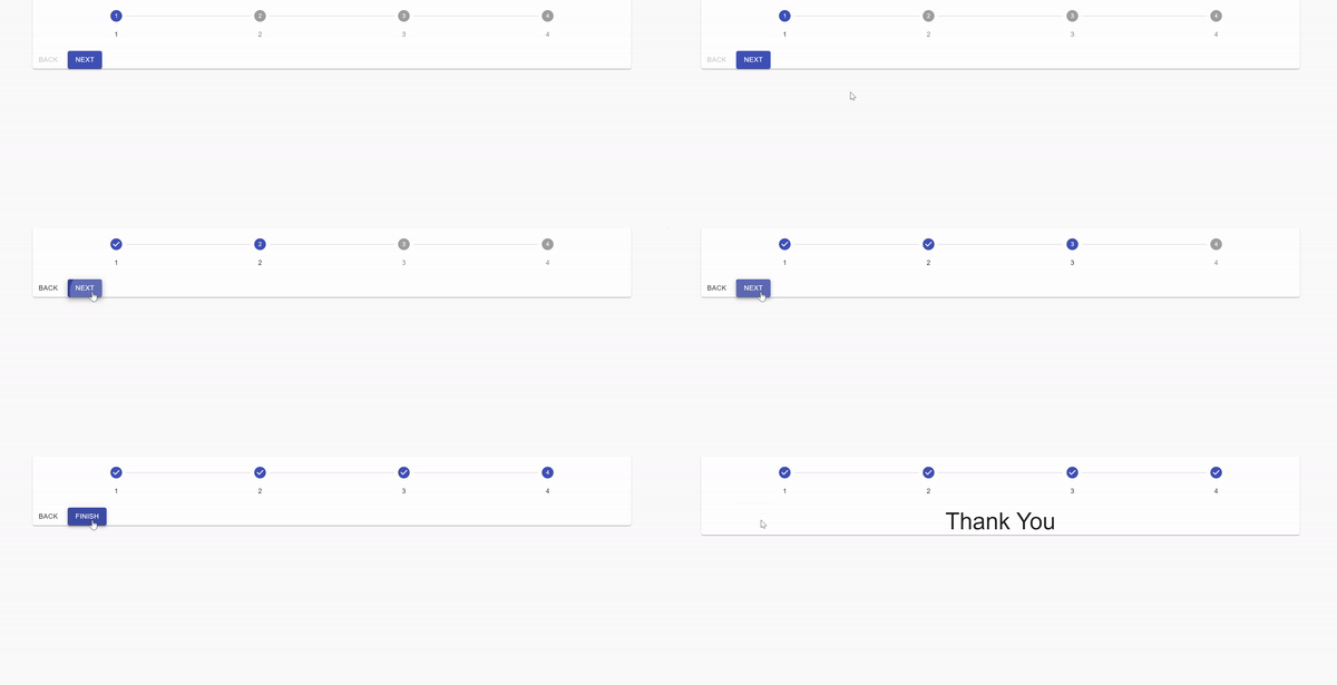
What is a Stepper?
The Stepper component displays progress through a sequence of logical and numbered steps. It's great for multi-step forms, onboarding flows, or any process that requires users to move through a series of steps.
Let's Start working on projects
In this guide, I'll show you how I built a simple, dynamic Stepper component:
Step 1: Setting Up the React Project
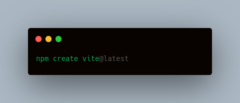
I used Vite as the bundler for its speed and simplicity.
Run the following command to create the project:
Step 2: Installing Material-UI
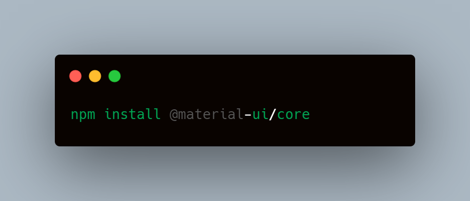
- To integrate Material-UI, I installed it using npm install @material-ui/core.
Step 3: Cleaning Up the Initial Code
- After setting up, I removed the default code provided by Vite and start fresh
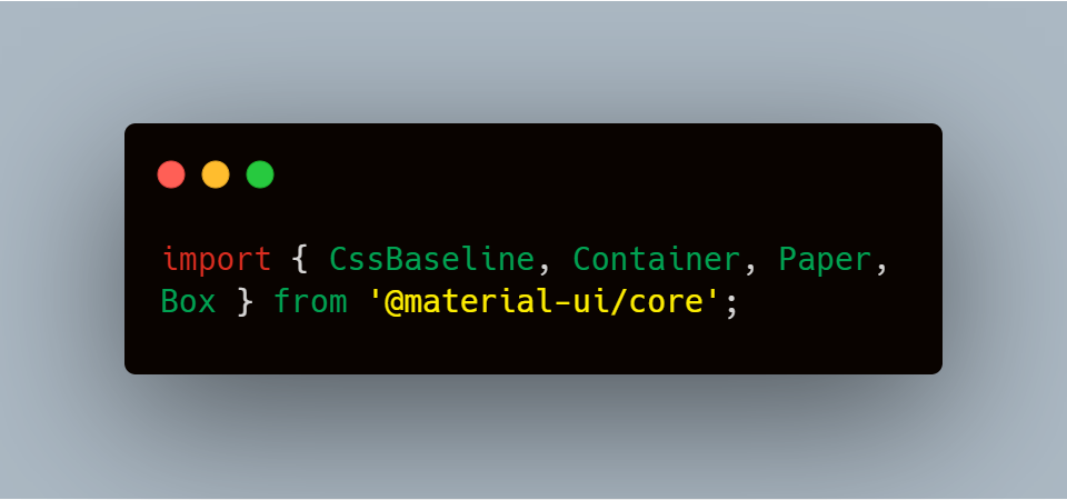
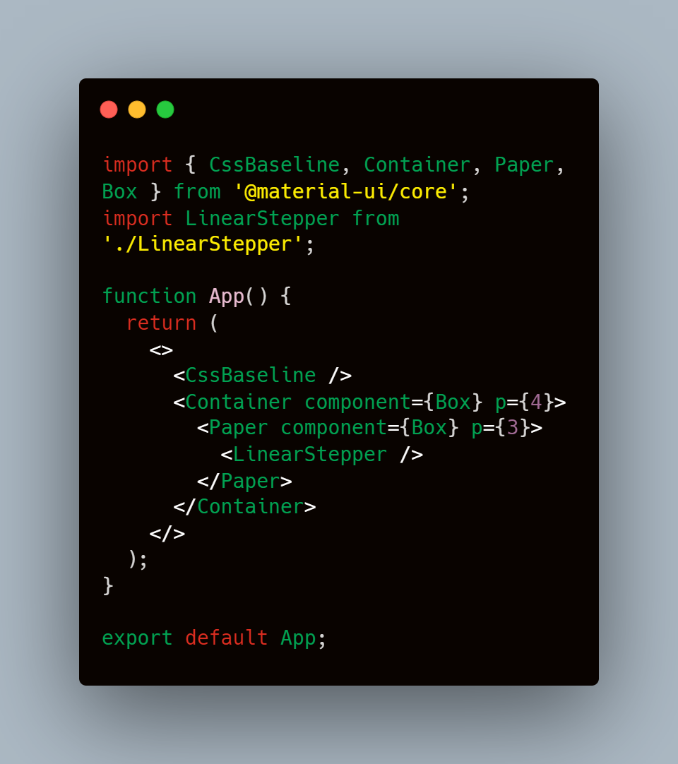
Step 4: Importing Essential Components In the App.js file, I imported the following components from Material-UI:
Why These Components?
CssBaseline: Similar to normalize.css, it ensures cross-browser consistency in styling.
Container: It centers and contains content with padding.
Box: A utility component that allows flexible styling using the sx prop or standard CSS.
Paper: Provides an elevated look with shadows, simulating a material design "paper" effect.
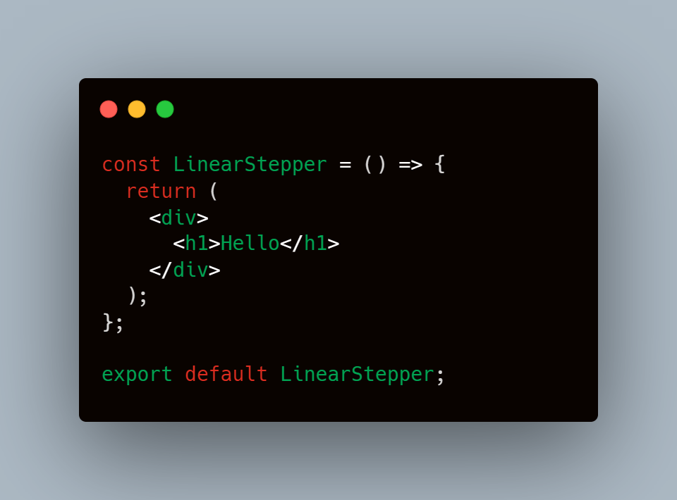
Step 5: Creating the LinearStepper Component
I started by setting up a simple LinearStepper component with a placeholder.
Later, I integrated the Material-UI Stepper component to create the stepper structure.
Step 6: Setting Up the App Component
- After setting up the LinearStepper, I integrated it into the App.js file:
- Here, the Container and Paper components are rendered as Box components, allowing for easy styling and layout control.
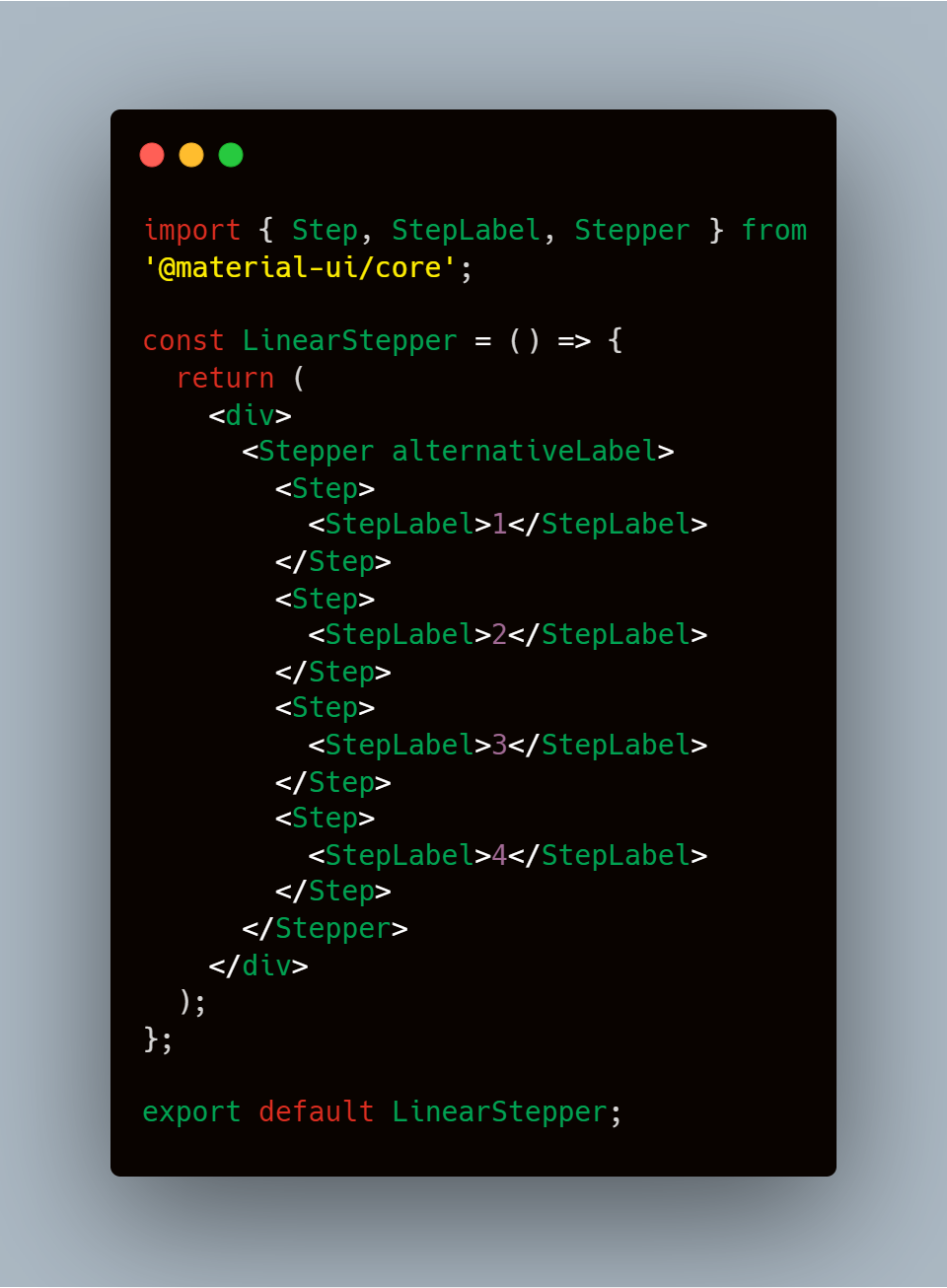
Step 7: Adding Steps to the Stepper
Using the Step, StepLabel, and Stepper components from Material-UI, I defined four steps
Why Use the
alternativeLabelProp?- The
alternativeLabelprop places labels below the step icons, improving clarity and usability. Without it, the labels would appear parallel to the step icons.
- The
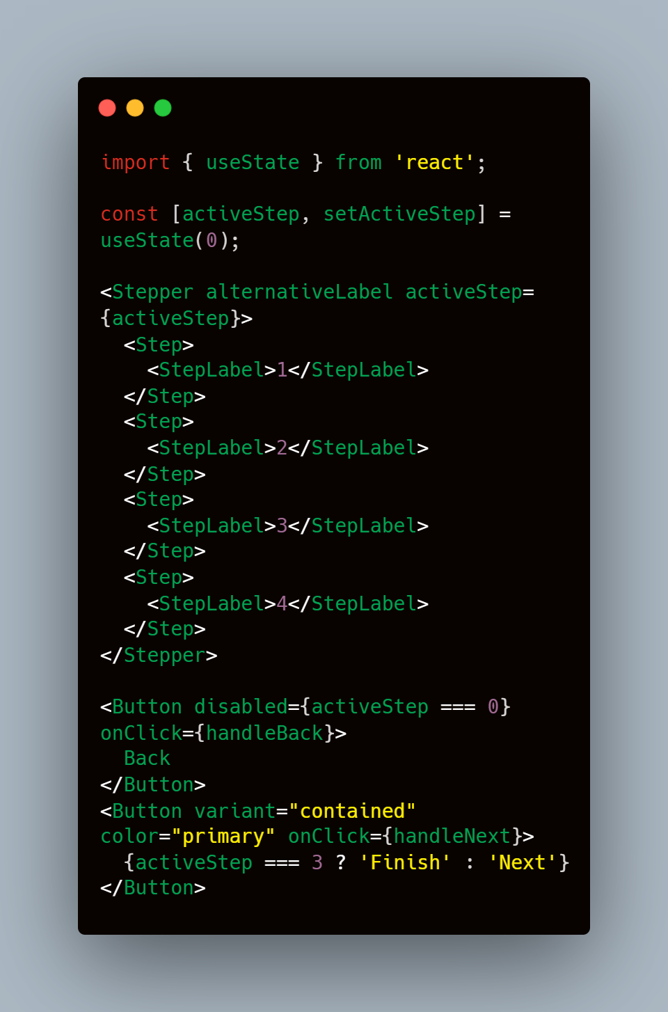
Step 8: Making the Stepper Dynamic
To make the Stepper interactive, I used React's useState to manage the active step:
The buttons allow users to navigate between steps, with the "Next" button changing to "Finish" on the last step.
Now, go ahead and try it out in your browser! This is just Part 1 of my exploration—stay tuned for more parts where I'll dive into advanced customizations and additional features.
Code Available on GitHub: Link
Subscribe to my newsletter
Read articles from Shubham Kumar Singh directly inside your inbox. Subscribe to the newsletter, and don't miss out.
Written by

Shubham Kumar Singh
Shubham Kumar Singh
I'm Shubham (@shubhamsinghbundela), I'm a Software Engineer, a Full-stack developer, a tech enthusiast, and a technical writer here on @Hashnode. I have a strong zeal to share my acquired knowledge and I am also willing to learn from others.