How I Designed My First App
 freeCodeCamp
By Daniel Novykov
This is a story about building a product, what went wrong, and how it changed my career into Design.
For the past ten years, I’ve built many personal side projects. Some were small daily gigs, but there was one that took awhile to accomplish.
This story is about an iPhone app I was working on back in 2015–2016. The automotive startup should save drivers money on gas, reduce greenhouse gases, and make autonomous vehicles a little smarter.
After many brainstorm and research sessions, I assembled a team of developers to help me build an MVP (Minimum Viable Product). We chose to design the iOS app first due to a better audience fit.
During the mid-stage development, a landing page and social channels were launched. This accumulated the first 1,000 people for the wait list and future beta test.
Although we had some challenges down the road, the project was developing well. Frequent user tests confirmed we were working in the right direction.
Nonetheless, only days before releasing the MVP for a beta test, I decided to put the development on hold.
There were a few reasons why I made that decision, including personal things and funding. I still want to share the design process I went through, what lessons I learned, and how it reflected on my career.
It all started with a Personal Need
A few years ago I bought my first car and became obsessed with driving. The comfort, joy, and freedom overcame the cheapness of public transportation and traffic mess. But there were costs that came with owning a car — parking tickets, insurance, maintenance, and gas.
One thing that bothered me the most was the fuel price fluctuation on a daily basis. It could rise in the morning and drop at night. It could be a 10% difference around the corner, and you would know that right after leaving the pump.
So I started digging the web and found a brilliant ( I thought at that time) solution for my needs — GasBuddy. It’s an app that shows up-to-date fuel prices at the local gas stations. I was on heaven that day imagining saving hundreds per month on gas.

The next several years I spent using GasBuddy, I was thankful for the treasure they’ve built but frustrated with the app’s interface that drove me crazy. A confused interface and limited features are among those things I couldn’t handle any longer.
That’s why, in June 2015, I started my side project. I called it Fuelhunt.
The initial idea was to get GasBuddy’s data and to build a better user experience around it. But they are a large corporation and didn’t want to share any of their data even for a reasonable, startup price.
I tried hard to find another data provider, which turned out to be Waze. But they couldn’t help me either. Besides, the accuracy of their data even today is quite terrible.

So I thought, well, I can do everything myself. Why not. And the journey of sleepless nights begun.
But first, let’s find out why it all matters.
What’s the deal?
1. People want to pay less for gas
I bet you’ve noticed that gas prices differ from station to station, from one brand to another, or from one area to the other. The reason can be a real estate or brand issue, or any other condition that influences the oil market, like politics or hurricanes.
Many of us don’t consider the price difference as savings. But it can run up to $100–200 of savings per year or more, depending on what, how and where you drive. You may argue — that’s not big money. But you can invest the savings on dining, shopping or even more gas.
The are three main components of any gas station:
- Convenience
Close to work or home, has a corner store, or other convenience. - Pricing
Gas cost, store deals, or other saving. - Quality
Fuel or overall service.
If you know places that satisfy you with fuel, price, and location — that’s great. If you do not care and will purchase gas whenever you need it — well, that’s also fine.
Meanwhile, there are lots of people who are not aware of the gem locations, but want to use a convenient spot with lower prices.
However, saving a few bucks might not be the smartest idea. The bad gas is not a myth. The fuel itself can come from the same refinery in a region, but still be different at various retail points.
Some factors may include fuel filters that are not maintained properly, unusual additives, “old gas” on some stations, unfair employees who can mix it with oil or other stuff to make more profit, and so forth. All this may lead to expensive car repairs.
We use Yelp, Google Maps, local magazines and ask our friends for recommendations when looking for the right places to eat. So why don’t we care as much for our cars? A well-treated vehicle can run longer without unexpected maintenance.
2. Climate change is real and we need to be more concerned about it.
This is another area in which I wanted to make an impact.
In 2014 there were over 1.2 billion vehicles in the world, and this number is growing rapidly. They all produce an enormous amount of greenhouse pollution that causes:
- Rising temperatures as greenhouse gases trap more heat.
Hello global warming! - Melting of the polar ice caps that can lead to a rise in sea levels.
Hello destructive flooding! - Depletion of our ozone layer which causes harmful UV rays to enter the Earth. Hello skin cancer!
The question is — can we do something about it?
Well, we can’t cut the production of new vehicles as there is a growing demand for them. And we can’t recycle the existing cars as they usually get reused in third world countries. Can we switch to electric? Kind of.
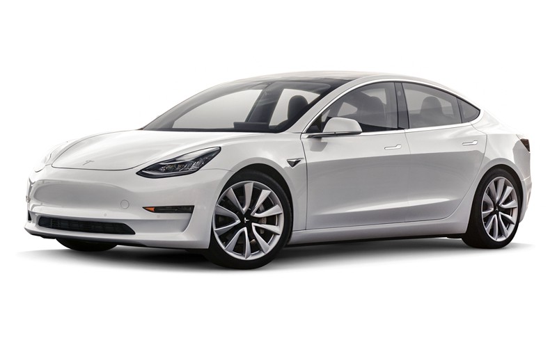
Electric cars are the future. They are quiet, quick, and cheap to operate. They are more reliable with fewer parts to break. And most important, they don’t emit carbon dioxide.
But this is the future that many of us cannot afford today. Some cars are too high priced, where others can’t provide a proper value yet.
Everything might change with Tesla’s Model 3 (along with other manufacturers’ entry-level propositions), more extensive government support for EV’s, and other benefits. But we are not quite there yet.
So how can we make an impact on the environment with everything we have today — with all these vehicles with the internal combustion engines heating up the world we live in?
Am I the only one who cares?
The first questions I had were “How many people share the same problem and vision as I do?” and “Are there enough potential users that it’s worth building a product?”
I ran some surveys and talked to friends who also happen to be drivers. I wanted to figure out the needs and wants of a target audience.
Here are some insights:
- The target audience includes most vehicle owners — casual drivers, regular commuters, taxi drivers, truckers.
When choosing a gas station,
- Most critical factors are convenience and lower fuel prices for drivers in the North American market. The fuel quality adds up in some Eastern European countries.
- The brand loyalty program doesn’t seem like a factor at all among respondents in the North American market. It’s a significant factor in the Eastern European market.
- Other things like a convenience store, car wash, and 24 hours operation don’t matter much among all respondents.
- People are willing to share either good or bad experiences at the pump.
They want to encourage or redirect other drivers to fill up at the particular place if there is one. - Most drivers don’t track their gas expenses, because it’s time-consuming or they’re not aware of easy tools to do so. The majority are willing to track the costs and mileage in some “automatic” way.
- Almost a half of respondents said they do care about the environment in some way, like garbage sorting and recycling. They’re interested in progressing with the reduction of the carbon footprint.
I also wanted to know what people do while they fill up their cars.
I wanted to know if I can fit a product into this 5-minute activity and make this time more entertaining.
Among some activities were:
- Watching the gas counter
- Staring at the nozzle
- Observing the neighbors
- Looking for new scratches and dents on the car
What options do drivers have today?
Apart from personal awareness of gas stations and word of mouth, there are many players on this field to find a gas pump. In reality, none of the solutions matched the product my target users and myself would enjoy using.
I’ll start with the minor competition first, then move along to the more major.
1. Built-in infotainment systems
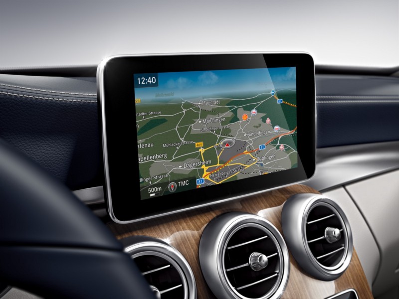
Today, even the low-end vehicles come with pre-installed infotainment systems. Drivers can get most of the information they need while driving. They can consume media content, see vehicle’s stats, navigate through the city and more. Unfortunately, this cannot be said about real-time gas prices. There are only a few systems that provide it.
In theory, infotainment systems should be safer than peering at a mobile device while driving. But due to a poor design, most of them are actually very distracting and dangerous. You cannot replace the car’s head unit and you cannot switch the OS. Besides, modern smartphones provide a better navigation experience.
2. Apple Maps
Apple Maps is a first navigation option for millions of users on iPhone. Yet it’s limited in many features and provides only basic information such as contacts and directions.
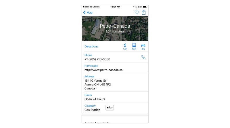
Also, it doesn’t show gas prices and has a weak map coverage for many areas of the world. These two components are critical for the driver.
3. Google Maps
Google has more experience in building maps than Apple. This is by far the best global cartography mobile app on any platform.
Along with the basic info, it has consumer reviews, user images, street view and they started to pull fuel data from Waze in December 2015!
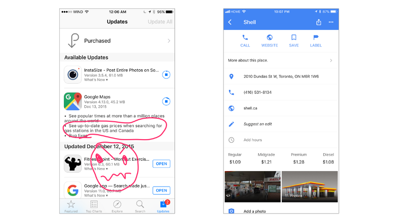
When you’re building a startup, such an update from a market leader feels like a knockout! But, it only proved to me that this feature is in demand, or at least Google’s engineers think so. Which is, apparently, true.
They kept this feature simple. There was no filtering, user contributions, or other social engagements.
4. Venue discovery apps
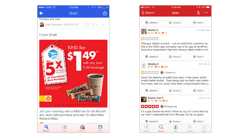
The venue discovery apps include Foursquare, Yelp, and Yellow Pages. They provide a variety of details like reviews and deals. Yet the surveyed drivers responded that this is not their go-to solution to find a gas pump.
5. Gas station locators
Here is an exciting thing — almost every country has a source to get fuel prices. Certain countries have a single price for the gas because it is government controlled. But in general — it’s all different by brand, place, and time.
I won’t go deep into the analysis here, but in short:
- Some websites are only for desktop use and are not responsive to the mobile world. They also tend to have a terrible UX.
- The vast majority of apps are not global. They may cover one or sometimes two countries for the bigger “local market,” like the United States and Canada.
- Some apps are not informative enough. Additional apps need to be installed to complement the “driver’s experience.”
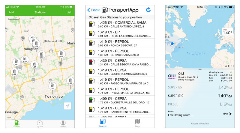
- There are cases when apps are not localized to other languages and territories. Why do you need another account to download an app?
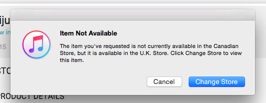
- In the end, having a bunch of apps for various locations is not a solution.
They all will have a different UI, multiple accounts, and take storage on the device.
6. Big Oil branded apps
At first, I thought that Top Tier brands can invest a ton of money to develop their own apps and make them great. Nope.
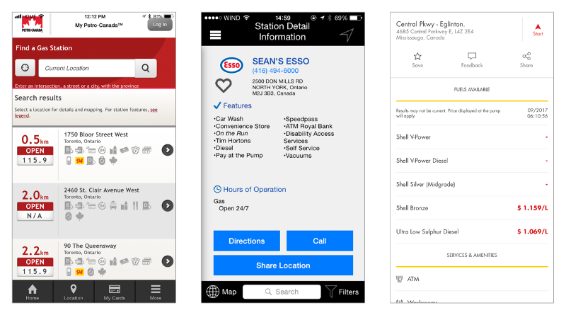
Some took an approach of squeezing a mobile website into the app. Others thought that tiny buttons with unreadable text are good options for drivers.
But, most of them contain gas pricing info and it’s very accurate where it’s applied.
7. Waze
Waze, which is owned by Google today, is my favorite navigation tool. It’s a crowdsourcing network of 90 million of drivers worldwide. It shows traffic, road conditions, accidents, and police traps.
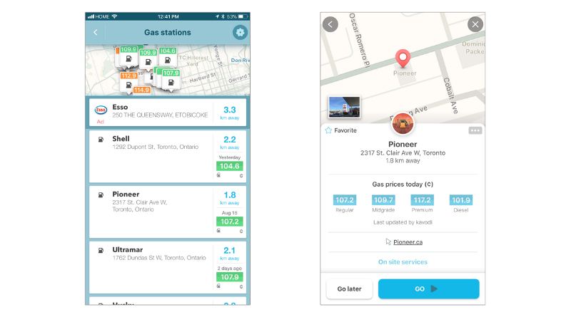
Waze also provides fuel prices for many locations. Unlike its excellent navigation experience, the fuel data is quite inaccurate.
I did a quick investigation to find out why drivers don’t use this feature. The assumptions are:
- The element to find a gas station is hidden deep in the menu and is not intuitive to use.
- Waze displays the label when the fuel price was last updated. It’s good to know. Yet, when you see “updated a few days ago” on any location — it’s almost certainly a signal of weak community contribution. If people don’t contribute enough to make it usable, why one would trust and use it?
8. GasBuddy
Here is a big one — GasBuddy. It was founded in 2000 and currently has 65 million users. It operates in the United States and Canada. It was recently launched in Australia.
When talking about the United States and Canadian markets, their data is quite phenomenal — especially since it’s gathered from a crowdsourcing community and other sources. Yet their app failed on usability and performance.
While conducting research and observing people performing usability tasks, I found out that:
- Many users, who were unfamiliar with the app, couldn’t complete a simple thing such as setting directions to a location. It required seven taps to accomplish that task.
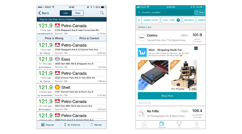
- The majority of drivers didn’t use the default list view and immediately switched over to a map view. The problem is that information on the list view is not that clear. It’s hard to understand in which direction the gas station is located. It can be close in distance, but may take longer to drive due to traffic, difficult intersections, U-turns, or a dozen stop signs.
- Overall, the UI is quite confusing and distracting. The information architecture lacks logic in some places. Annoying ads consume cellular data and screen real estate. Elements unreadable from a distance and tiny buttons make it hard to perform a task without giving too much attention to the smartphone.

- GasBuddy, as well as many other competitors, state that drivers can save money with their app — and it’s true. But it’s not clear how much the person saves at the pump, as there is no savings indicator.
The app displays locations with lower prices but doesn’t show the value of using the app over a period of time. - Users can win $100 of gas daily by exchanging in-app points earned for price submissions into the entries to win. Yet the chances to win are roughly 65 millions to 1.
Nonetheless, it looks like it works for user engagement and retention.
9. Savings Trackers
There are many apps to gather vehicle’s stats and track various expenses. The majority of them require a significant effort to enter the data, whether it’s a manual operation with dozens of fields or scanning receipts with unreliable text and field recognition. The visual part of these apps is unpleasant and “scary” — as most drivers responded.

On the other hand, there are solutions for car monitoring, like Automatic. They carry their pros and cons, but the biggest issue with them is that a special adapter is required for their operation, which is an additional investment.
At that point, after the research and user testing sessions I’ve done, the picture was clear — there was a niche on the market and I could fill it with a new product.
Designing Fuelhunt
I wanted to create a product which embraces best practices in usability. At the same time it eliminates the pain points that users have with other apps in this segment.
I didn’t want to create “yet another app to find a gas station.” I wanted a product that will have a more significant impact on our lives in the future.
I’ll skip over the dozens of iterations, sketches, and wireframes right to the final MVP build that was successfully tested with potential users.
Here are some key improvements upon the competition:
1. A single app to cover global fuel prices
I’m talking a post-MVP phase. But the database architecture had to be developed beforehand for an easy expansion.
At first, it didn’t seem like a challenge.
I needed to solve the problem of any social network: no content=no users, no users=no content.
In this case, the content was pump locations with fuel types, current gas prices, and user reviews. To get that content fast, we collected everything we could find on the market and built — as we called it — a dirty database.
Even though there were lots of open data out there, it was all a complete mess. Some sources provided clear API’s, others only had Excel spreadsheets. Then we needed to find a way to pull the data and make it usable.
Another issue was a difference in brand lists and octane levels in various regions. North America and Europe calculate the octane rating in different ways. North America’s 87 is like Europe’s 95, where NA’s 91 is more like E’s 98, and so forth.
To be honest, it took a while to bring everything under one roof.
Finally we had the data, but it was inaccurate. Fortunately, fuel prices are changing so fast, that it actually didn’t matter if the price is a day old or a week old — it was still wrong. So, we were pretty close to Waze and Google Maps accuracy.
2. Clear UI and simple app navigation
It doesn’t matter how unsafe it is to use a smartphone in the car or how high the tickets are for the handheld devices. People still use their phones while driving. They are either holding them or the phone is mounted on the dashboard.
Our job as designers is to build well organized and easy-to-use features and to think through all possible ways of using our product. We have to make sure that ergonomics minimize distraction and don’t harm the end user.
Large text, bigger touch points, clear screen flow, smart notifications, no ads. These are only a few of the criteria I kept in mind.
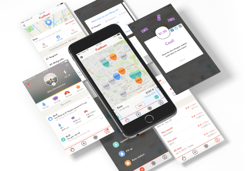
Speaking of navigation, the Fuelhunt app consists of 4 screens:
- Main screen
to find gas stations - Add screen
to add content - Activity
to see user’s and friend’s public activities - Profile
to see all user’s activities and stats
3. Super fast pump search
The primary app’s role is to find an optimal gas station and set directions for that station. The flow was optimized to complete this task under 10 seconds.
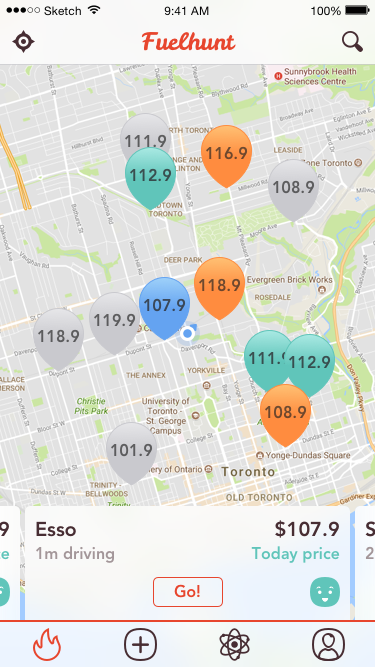
Upon launching the app, it displays the map view with pump locations and — using a combination of distance, user’s moving direction, price, and review score, it preselects the best option to fill up. No intermediate screens or additional taps needed.
The bottom banners contain all info the driver needs at the moment: brand, gas price, an indication how “current” that price is, and the rating emoji.
Instead of showing the distance to the location, the time of driving is provided. Traffic and road conditions may play a bigger role.
The button to get directions is always visible, making it faster to set the route. This decreased GasBuddy’s seven taps to one.
All location pins are color-coded by the time relevancy:
- Green if they were updated today — It’s the most accurate.
- Orange if they were updated yesterday — It’s somewhat relevant.
- Grey if they were estimated — Everything that’s older and everything collected from 3rd party sources.
In case of inaccurate pricing data, this approach is more effective. It focuses the user on data accuracy.
Waze marks locations by a pricing scale, with green for low and red for high. This green-cheap gas station may have the old price and may be more expensive than a red, but has a currently updated price.
Choosing Google Maps as a map provider instead of native Apple Maps adds a better world coverage and one finger zoom. This is quite handy in the car.
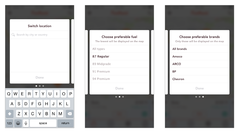
Filters are a rarely used but useful feature. They are hidden under the search functions. This not only makes the overall UI cleaner, but gives the user the power to create a personalized map, and display the brands and fuel types the user needs.
4. Bad locations avoidance
The research demonstrated that almost no one reads a review upfront when heading to the pump. This is something we do spontaneously. We drive, feel the need, see a gas station and fill up.
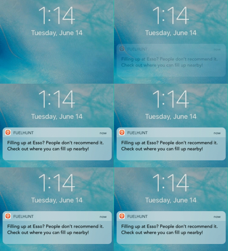
People still keep writing reviews. Many drivers share their negative feedback if something is wrong. In this scenario, the driver won’t know anything beforehand, but he may feel consequences of bad fuel the next day or in a month.
To solve this problem, a notification system was designed to alert the driver if there is a problem at the location.
5. Easy content submission for user contribution
There is a button to make it easy for drivers to make a new submission. They can provide a price update, fill up data or a new review. It’s always visible on the tab bar no matter which screen the user is on.
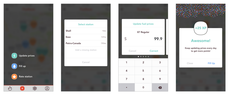
It the fuel price was updated, the app asks the driver to enter the fill up data. In the same way, it asks for a price update after the fill up data had been added.
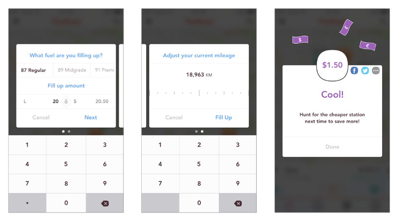
Unlike competitors that only say that users save with their app, Fuelhunt demonstrates right away the amount saved at the pump. After each fill-up, Fuelhunt instantly calculates the price difference between local stations and provides clear value to the user.
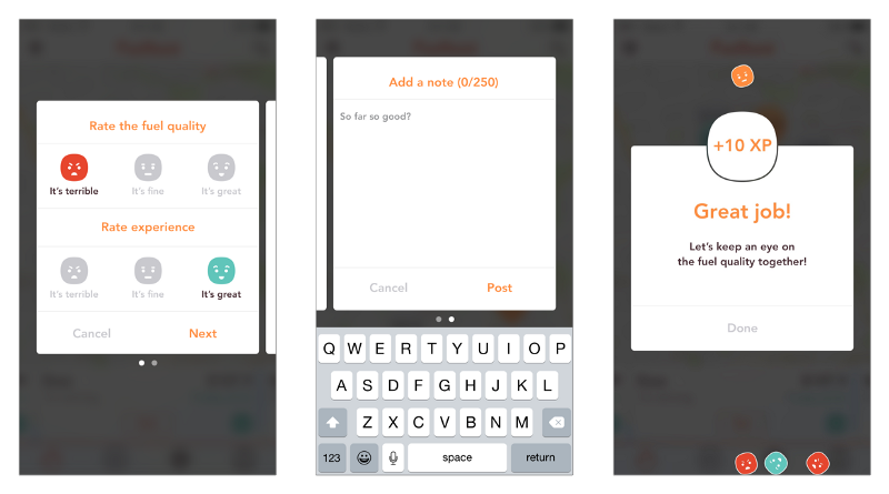
Sometimes it takes a lot of effort for the user to submit a review. I made it simple with a fuel quality and overall experience evaluation along with an optional description.
6. Activity and stats tracker
The Activity screen displays user’s and friends’ public activities, like points earned, money saved and reviews written.
After testing, we debated whether to include this feature in the app. Nonetheless, I wanted to see how the audience would react to it. I also wanted to make Fuelhunt a little more social. So it made it to the MVP build.
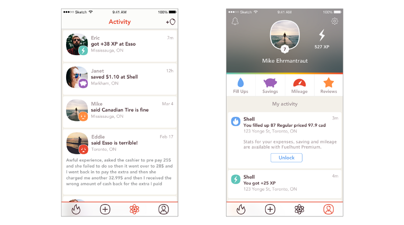
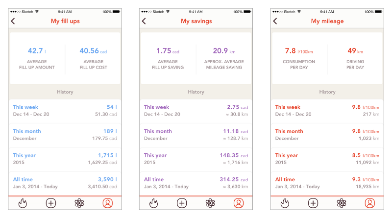
The Profile screen contains a user’s content only. The user can see various stats broken down into time periods:
- Money spent on gas and the amount of fuel burnt
- Money saved with its equivalent of mileage saved
- Vehicle’s mileage itself and fuel consumption
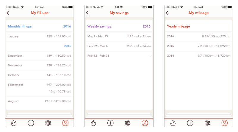
This tracker can serve many purposes from knowing the state of your car and wallet to easing the calculation of business trips and filling tax forms. But the main idea has been kept for future releases.
7. Gamification mechanics for user engagement and monetization
Gamification is used in many products, but sometimes it’s not done right. Often, it benefits the top users where beginners struggle to get on top, no matter how good they are. Top users usually get more attention, likes, and benefits.
Fuelhunt’s gamification was designed to eliminate the barrier for new users and make everyone equal to compete.
For every price report and written review, the user earns points. Those who are active for a certain number of consequent days earn enough points to redeem premium features for free. Once they become inactive users, they lose that benefit and need to start over.
8. Post-MVP growth
Enough about what’s been done. The app’s roadmap looked pretty interesting at that time with a number of cool features, but I would identify two large milestones:
First, Global expansion — it is a key element to build a big data company. Why is that important?
I had the vision that someday, with such data, self-driving cars would be able to drive from point A to point B and be smart enough to make decisions for themselves.
They could set the most optimal route and take into account traffic, road conditions, fuel level, and where to fill up most efficiently. That is the future.
And second, I started all this to try to decrease the carbon footprint with technologies we have today. Without the need for drivers of extra investments and extra gadgets to install.
To do that, I wanted to extend Fuelhunt’s database with all vehicle models released to date and their city, highway, and combined fuel consumption. Then compare it with real data from my users to determine the driving inefficiency. And if more gas is burnt than it needs to be, update the user with suggestions to improve their driving habits.
The outcome
What went wrong?
- The team is everything
It’s vital to have the right partners and team members involved. But it’s also important to have developers as a core team in the same room to being able to iterate and execute fast.
I ended up building this project with developers overseas, which brought many obstacles to the whole process. Before I realized some team members were not a good fit in the culture, it was too late and the price we had to pay to replace them was too high already. - The issue of adding value
Despite all the research and user validation that showed there is a product and market fit, I still had doubts.
I spent too much time trying to perfect the experience from day one instead of releasing MVP, getting the feedback, and moving on to iteration. - I ran out of cash
From the beginning, I didn’t want to use crowdfunding or any other investment opportunity to raise funds. I wanted to stick to my own cash to feel more responsibility for the project. Like, if I fail I’ll lose my own money.
And I did. Would I do something different next time? Definitely yes. - Personal issues
Sometimes that happens, when you need to choose a personal life or a business. I tried to balance both.
I lost focus on the project and let distractions to get control over me. It was too late when I realized it.
What did I learn?
Startups are considered intense experiences that result in rapid learning. I gained a lot of experience designing Fuelhunt, filling more roles than I could possibly fill as a full-time employee.
The exciting part was getting the knowledge that helped me roll into a Product Design career from my previous Marketing background. This is an experience that I can look back on to build something more meaningful.
Closing a startup is often seen as a bad and sad thing. For me, it’s only a chapter before the next adventure.
I’m currently open for career opportunities in Toronto to contribute as a UX/Product Designer. Feel free to contact me.
Subscribe to my newsletter
Read articles from freeCodeCamp directly inside your inbox. Subscribe to the newsletter, and don't miss out.
Written by

freeCodeCamp
freeCodeCamp
Learn to code. Build projects. Earn certifications—All for free.
