How to use wireframes with design systems
 freeCodeCamp
By Leon Barnard
In my 10+ years as a UX designer, one of the most frequent questions I’m asked about wireframes is how much visual detail to put into them.
There’s an attractive elegance to a simple black and white sketch, but it can sometimes lead to gaps in the shared understanding of what the final product will really look like.
Wireframes shine during the early phases of product development when ideation and rapid iteration are most valued. But what makes them ideal for this phase also hinders them in the next phase, when pixel precision and visual details are called upon for implementation.
As a result, many people (I’ve been guilty of this) try to incorporate fine-grained and aesthetic details into their wireframes by tuning fonts, adding colors, and using other visual effects.
This can often lead to confusion when these proto-high-fidelity wireframes are used as implementation specifications and sent “over the wall” to the development team. Most wireframing tools are not optimized for creating artifacts that look and feel like a finished product. Yet creating polished renditions of every screen or a high-fidelity prototype is time consuming and may not translate well to the final product anyway.
But, is there another way?
There sure is! A way where you can keep your wireframes low fidelity, yet achieve that powerful shared understanding of the implemented look and feel.
Design Systems to the Rescue
An alternative to pushing wireframes beyond their limits is to keep them low fidelity and let another tool do the work of specifying the look and feel.
In this article, I’ll explain why, for web applications and sites at least, an excellent tool for this job is a design system.
Before diving in, let’s define what a design system is.
Like their precursor, style guides, design systems define the application’s look and feel. They go one step further though, in that they often define behavior as well and are backed by working code.
Large companies have been using design systems for a long time. Until recently, they were too labor intensive for smaller companies, as they often required dedicated designers and developers working outside of the primary product teams.
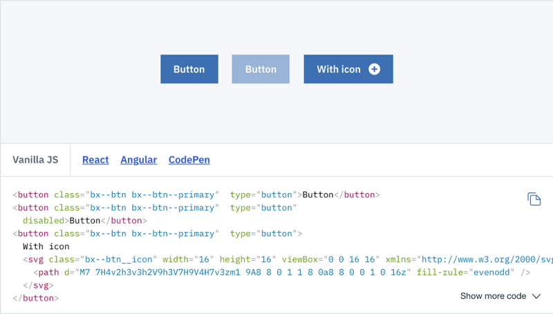
Here is an example, from the IBM Carbon Design System, showing appearance and code for buttons.
The design system landscape changed after the Bootstrap framework was released in 2011. It is a free starter kit for web development that provides compliant, robust HTML templates and generally good-looking CSS styles that can be customized to your brand.
It comes with its own grid and typography definitions as well as styles for buttons, forms, and more. In short, it takes a lot of the hard work out of starting a web project and making sure that it works across browsers.
Bootstrap and other frameworks like it have been used as a foundation for design systems for smaller companies that don’t have the resources to build their own.
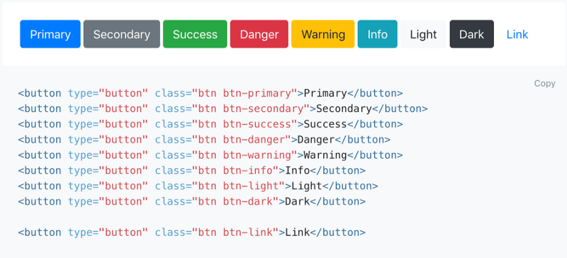
As you can see below, Bootstrap is very similar to corporate design systems like the one shown above.
Design Systems + Wireframes in Practice
The main advantage of pairing a design system with a wireframing tool is that it can free you from worrying about look, feel, and behavior when wireframing. Yet, they provide pixel-perfect renditions of the final product components.
When you already know what a button (or tab, menu, etc.) is going to look like and what its state transitions will be when you click it, then you don’t have to style it in your wireframe. Black and white and Balsamiq Sans is just fine.
Having a design system to refer to can allow you to jump straight from wireframes to code without leaving the final vision undefined.
Here’s how you can pair them together. You’ll find that they get along quite well together!
If you already have a design system, great. If not, you can start with a customized download of Bootstrap or Foundation. The next step is to create a mapping between it and the controls in your wireframing tool.
A mapping basically means developing a shared agreement of “this means that”. You can do this by creating a document showing these mappings or by just having a meeting with the design and development teams around a screen to work it out.
Here’s an example of how you might map some Balsamiq controls to Bootstrap components (you could also start with the Bootstrap Wireframes To Go library).
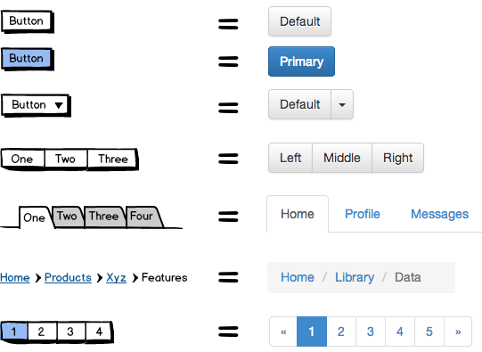
Note: It’s ok to use some color, but it should only be used as much as necessary to indicate states and selections, for example.
Having this kind of mapping means that developers no longer have to wonder whether the colors in the wireframe are supposed to be used in their code. They can just translate in their head that a blue button in the wireframe actually means a green button in the UI (if that’s the color you use), and that breadcrumbs separated by the > character should actually be separated by the / character in the app, for example.
You can also extend your design system by creating your own Balsamiq controls as Symbols to map to other components in your library, like this:
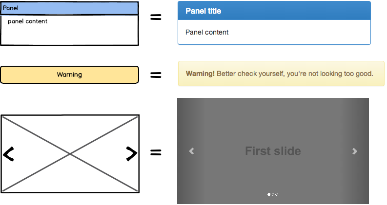
This mapping can evolve and grow over time as needs and design language change in your organization.
Here’s a simple example showing what a completed wireframe could look like when built in conjunction with a design system.
Note: Blue in the wireframe doesn’t have to mean blue in the finished product.
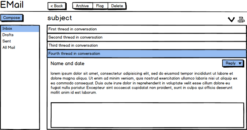
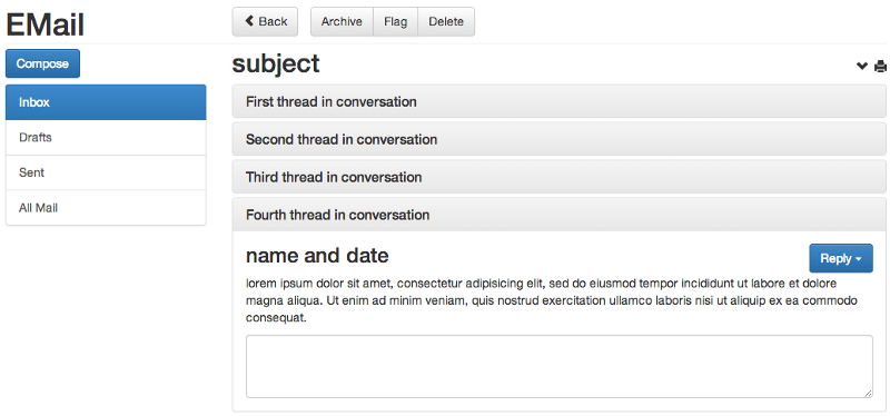
Wireframe to working code with no additional design artifacts in between!
Having a design system also means that you’re reusing the same code across all parts of your application so that different developers produce the same UI which leads to better standards and consistency. And if the design system gets updated, the wireframes don’t have to change.
Finally, designers can rely more on the stock controls inside the tool rather than spending hours trying to replicate the look on their own, so both the design and development cycles are shortened.
Summary
Nothing works for everyone, of course. This approach isn’t guaranteed to work for all projects or organizations. For example, it is better suited to in-house teams.
Clients outside your organization are more likely to want to see a high-fidelity mockup. Also, most of the starter design systems are for web-based products. Desktop and mobile application design system templates and examples are less common.
Lastly, and perhaps most importantly, you should have good communication between design and development teams for this approach to work.
Much of the shared understanding of the connection between wireframes and design systems is created by having a conversation about it. Announcing it over email or simply posting it on your intranet alone probably won’t work. Waterfall and distant remote teams trying this might not fare as well.
That said, it does offer lots of advantages for many teams, such as:
- Saves time when wireframing
- No mismatch between wireframe and reality
- Good for Lean/Agile methodologies where deliverables don’t need to be so formal
- Good for small teams and startups without many resources (especially when using frameworks)
- Different skillsets can be applied to different design areas (e.g., visual designers and developers for the design system, interaction designers or PMs for the wireframes)
- Design processes (wireframes vs. design system creation) can be done independently, resulting in fewer bottlenecks
- More UI consistency across the product
More Design System Resources
Subscribe to my newsletter
Read articles from freeCodeCamp directly inside your inbox. Subscribe to the newsletter, and don't miss out.
Written by

freeCodeCamp
freeCodeCamp
Learn to code. Build projects. Earn certifications—All for free.