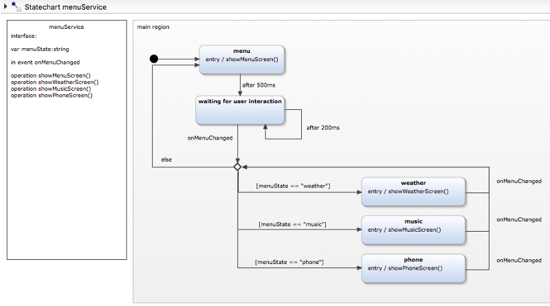
How to visually design state in JavaScript
 freeCodeCamp
By Shawn McKay
A roadmap for developing applications with state machines & statecharts

Why does state management seem particularly tricky in JavaScript? Is it the inherent complexity of modern apps, or just the tools? How do other fields of engineering develop reliable and predictable systems? Is it possible to draw a system and transform it into code, and vice versa?
Let’s explore a paradigm shift in state management towards visually designing systems with state machines & statecharts.
Concepts > Libs
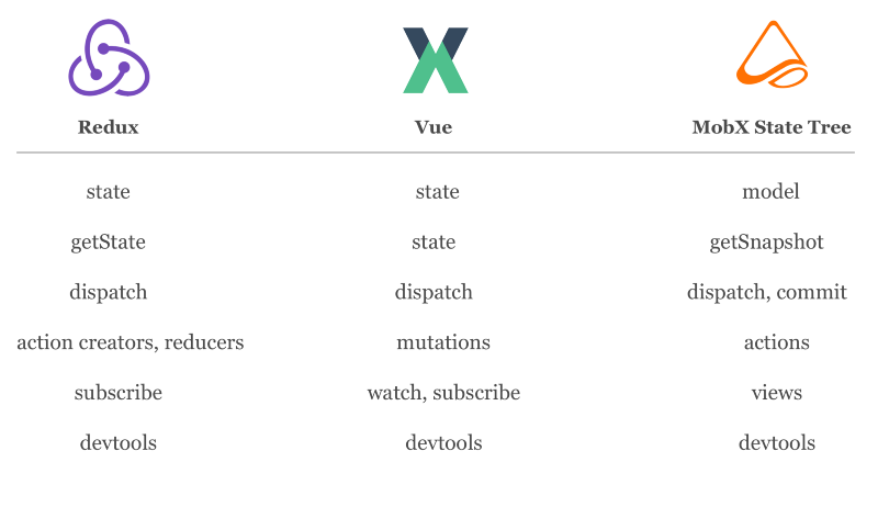
State management has been on my mind for a while now. I’ve experimented with various state management libraries: Flux, Reflux, Redux, Dva, Vuex, Mobx, and also my own.
There’s no point arguing which is the 10x solution. State libs are different flavors with the same ingredients. They are a piece of the puzzle—they make it easier to sync and connect data.
The solutions that require our focus next concern the bigger picture:
We need to get better at planning & designing systems.
Break All The Things
Think of a user interface that you would consider elegant. Something built to withstand a barrage of random user interactions — you know, the kind of unpredictability that occurs when a user pushes a button more times than expected, interacts with inputs in an unexpected order or otherwise leads you to question your faith in humanity. Real life is hard on systems.
I’ll predict the project you’re thinking of.
Well… you’re probably not thinking of something built for the web, where the philosophy seems to be “move fast and break things”.
Judging by the frequency of updates, you’re probably not thinking of mobile either.
You’re probably not even thinking of something built recently. We don’t necessarily seem to be getting better at building reliable products.
I think I know what you’re thinking of…
Am I right? ….No?
You might not even recognize this as the Sony Walkman of the 1980s.
As a kid, I received a cassette player like this from a friend who had upgraded to a portable CD player. I understand that some younger readers may find the mention of both of these devices unfamiliar — think of the Walkman as an iPhone, but with larger buttons and greater destructive potential. My primary mission: break it.
I would try all combinations of buttons to see what might happen:
- Try to eject while the tape was fast forwarding
- Hold fast-forward and rewind down at the same time
Try as I might, the Sony Walkman held up better than most websites do today.
Engineering Interfaces
Electronics like the Walkman withstood the gauntlet of user testing without any capacity to hide or disable elements of the user interface. Any button could be pressed at any time, anything could happen. And yet it seemed unbreakable.
It led me to wonder:
Perhaps electronics offer a better paradigm for how we can build interfaces on the web.
What can we learn from the ancient design process of electronics? How can we better engineer applications? Marty, we need to go back to the future!
Electronics & The Web
Can electronics teach us a better way to create applications in the browser?
Consider that components produced one of the most significant shifts in web development over the past five years. Perhaps there are other concepts we can borrow from electronic engineering?
As web developers, we’ve had it good. Like. Really good. Found a bug? Deploy an update to your server within the hour.
Other fields of engineering aren’t so forgiving. A problem in hardware often results in a device going in the trash. Embedded developers must be careful to ensure a firmware update doesn’t drain the battery or crash all existing devices.
Web developers have the luxury to be reckless.
Not to mention, app developers have rarely faced the same resource limitations as the creators of electronic devices. When was the last time your primary focus was performance and memory usage, rather than just making the damn thing work? A threshold of 60 frames per second is a low bar. But the bar is rising as we start building increasingly complex apps to run on less powerful mobile and IoT devices. We are bordering on an engineering problem that low-level engineers have experienced for decades.
Constraints breed creativity. Limitations lead to better design.
To see how embracing limitations can lead to better design, we’ll need to drive back towards basic state management fundamentals.
Ye Old/New State Management Fundamentals
The direction of conversations in the web community tends to lean towards NPM packages rather than fundamental computer science principles.
Engineers aren’t asking “which library is better? as much as they’re asking “how do we design a better system”?
We can start with some basic principles of good design:
- distinguish between indeterminate data and finite states
- limit possible transitions from one state to another
- design visually
I’ll work through these along with my own path, and 8 realizations that followed.
1. State !== Data
In programmatic systems, the difference between state and data is blurry. They both live in memory, and so are treated the same.
In React, state and data share the same name and mechanisms:
- getting:
this.state - storing :
this.state = {} - updating:
this.setState(nextState)
In electronics, there is less confusion over the distinction between state and data.
State represents a finite number of modes that the system can be in — often defined by the circuitry itself. For our Walkman, think “Playing”, “Stopped”, “Ejected”. Like a “mode” or “configuration”, state is countable.
Data, on the other hand, is stored in memory with a nearly infinite set of possible settings. For our Walkman, think of the track that is playing, “Song 2”. Data, like music, may have infinite possibilities.
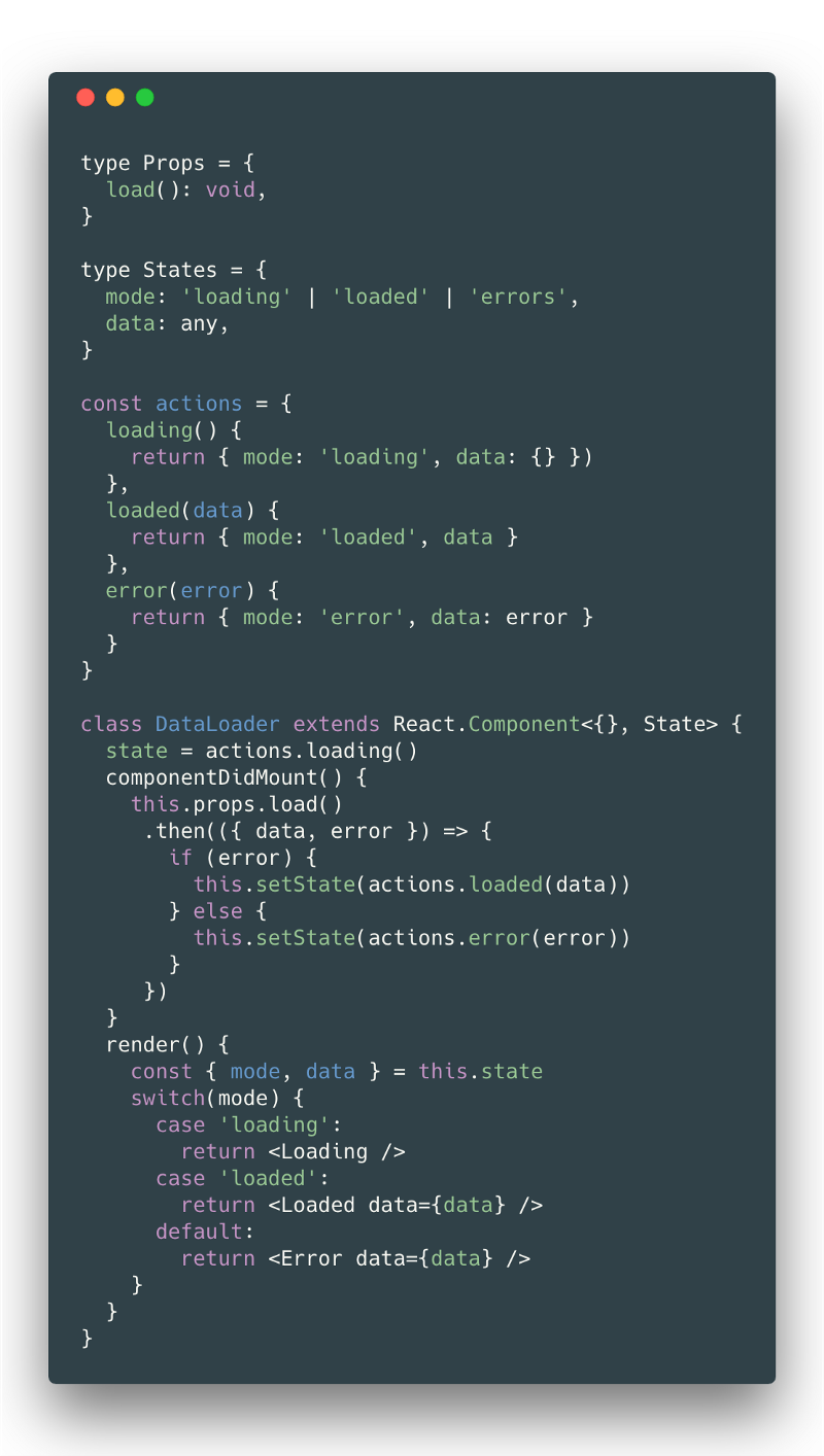
Whatever this DataLoader component below does, the state can only generate a limited set of views: “loading”, “loaded”, or “error”.
Separating state and data can lead to less confusion, and allows us to construct applications based on finite state machines.
2. State is Finite
Electronics developers have long known that a predictable interface is one with a limited and controlled number of states. Without a controlled number of states, systems become difficult to debug and impossible to thoroughly test.
In a finite state machine, states are explicitly defined. Transitions are the set of possible events you can trigger to move between states.
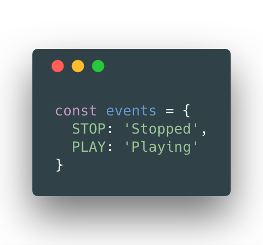
As an example, triggering a transition with the event “STOP” will move the state to “Stopped”.
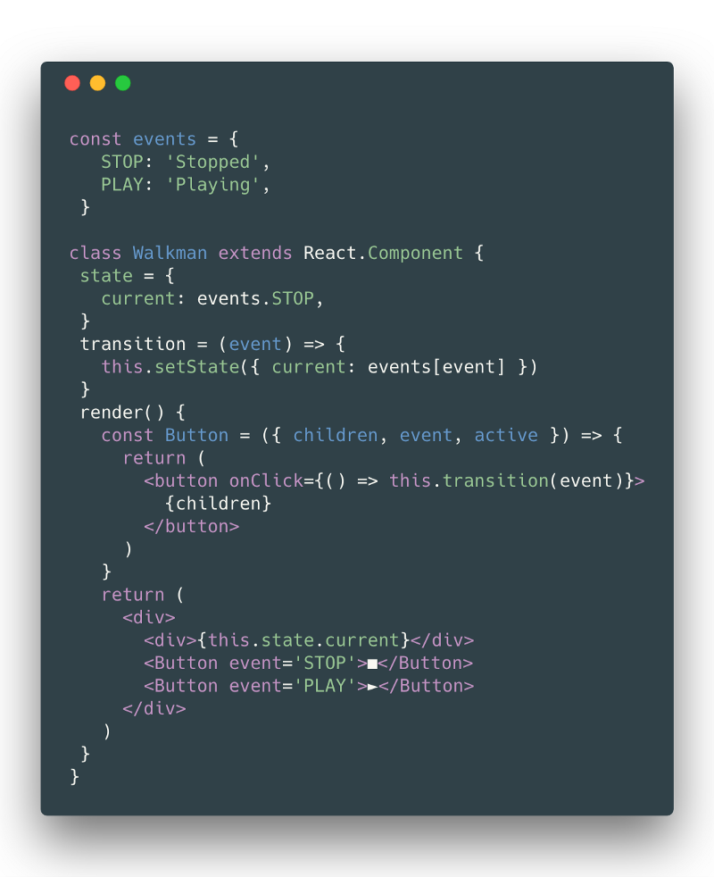
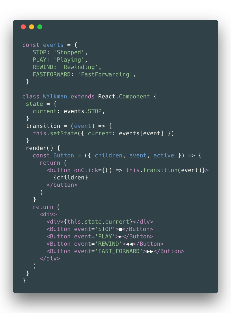
In React, we could define a basic Walkman as having at least two states: “Stopped” or “Playing”.
Check out this CodeSandbox.
In a finite state machine, the system is always in one of the possible configurations. The view has no possibility of being anything but “Playing” or “Stopped”. Testing both can give us confidence the system works the way it should.
3. Manage Complexity in State Machines
Let’s look at what happens when we start adding two new states to the state machine example: “Rewinding” & “FastForwarding”.
When states are equivalent, they are deceptively easy to add. Each state is like its module that can be developed and tested in isolation. But be careful, state transitions should not always be possible.
We should worry about uncontrolled transitions between states.
Maybe you caught it. We introduced a bug above. Take a minute and see if you can discover what went wrong.
4. Guard Transitions
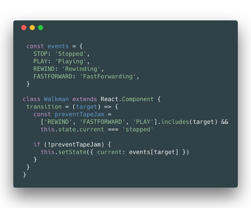
It seems the cassette tape is all tangled up as we’ve allowed users to jump between rewinding and fastForwarding without stopping the tape in between.
As a solution, we can add guards to our state transitions. Guards are conditions that must be met for a transition to occur. As an example, we can ensure that the events FASTFORWARD , REWIND , & PLAY can only trigger when the state is “Stopped”.
Unexpected state transitions are bound to happen unless we rethink the way we plan and design our state management.
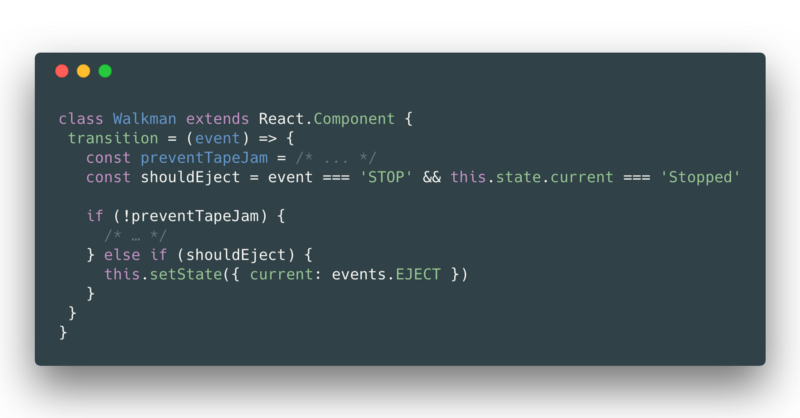
As we add additional states like ejected, we have to think through which state transitions can be allowed and under which conditions. With a Walkman, you can eject the tape by pressing stop while the tape is in the stop mode. To add this functionality, we have to add even more guards and determine which transitions are possible.
The likelihood of unhandled state combinations multiplies as additional states are added. This is not a scalable solution. Each additional state results in a check of all transition guards.
It starts to feel more like state is managing you.
The problem with managing guards stems from the way state is being represented: “Stopped”, “Playing”, “Rewinding”.
The ideal data structure for state is not a string or an object.
But then what is it?
5. State is a Graph
The ideal data structure to represent state is often a graph. State graphs, commonly known as state diagrams, provide an intuitive way to design, visualize, and control state transitions at each node.
This is not new news — electronic engineers have been using state diagrams to describe complex systems for decades.
Let’s look at an example on the web. AWS Step Functions provide a visual interface for graphing the workflow of an application. Each node controls a lambda — a remote function called in the cloud — with the output of each function triggering the input of the next.
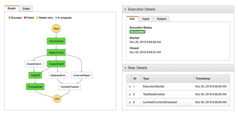
In the example above, it’s clear to see how a user’s actions move through each step, including possible errors and how to handle them. Adding additional steps doesn’t result in exponential increases in complexity.
An engineer might remark how much Step Functions have in common with PLC (Programmatic Logic Controller) Block Diagrams. A designer might remark how much they have in common with workflow diagrams. Shouldn’t the way we design state have more in common with the way we plan applications?
6. Scaffold on State Graphs
State graphs become the scaffolding for your application.
As an example, a state graph of our walkman could produce a more visually understandable and approachable representation.
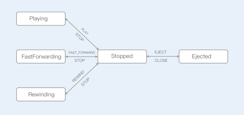
Without delving into code concerning guards, we can tell there should be no possibility to jump from “Rewinding” to any other state but “Stopped”. Rather than outlining all the transitions your interface shouldn’t do, you lay out what it can do. Development shifts from a defensive bottom-up coding approach to a top-down designing approach. This shift alone is 10x.
State graphs are more intuitive, more accessible to debug, and more able to absorb changes in requirements. Alongside state machines, changes in each state can be isolated from their neighboring states. Not to mention that much of the complex transition “guard” logic can be encompassed in a visually comprehensible format.
Unfortunately, state graphs can be a ticking time bomb.
Densely connected graphs don’t scale. Consider what would happen if we added another 4 states to the graph above. Readability reduces and repetition increases, with entangled arrows pointing in all directions competing for space. This spaghettification of a state graph is known as a state explosion.
Luckily, there is a way to reduce the visual complexity of designing complex state graphs using a formalized way of describing systems: let’s explore statecharts.
7. Master Statecharts
I first learned about statecharts from Luca Matteis’ presentation on How to model the behavior of Redux apps using statecharts at the Vancouver React Meetup. The next day at work, I brought up this “new” paradigm for state management, only to find many of my engineering co-workers were already familiar with the concept. I work at an IOT based company alongside many hardware and embedded developers. We’re hiring ;)
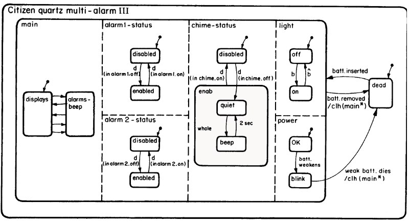
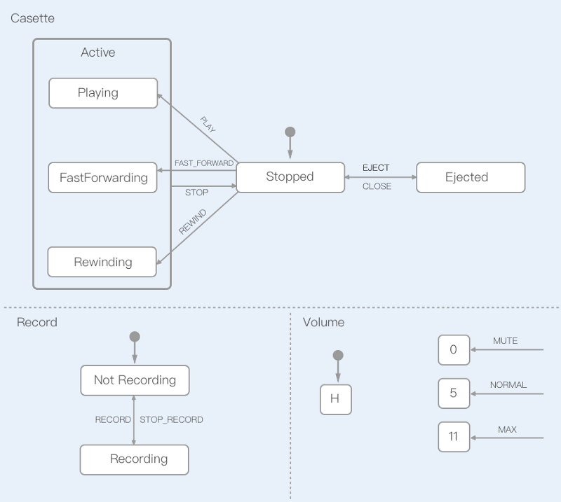
The concept of a statechart dates back to 1987 when mathematician David Harel published a paper on visually describing complex systems, such as the below example of a quartz watch.
Statecharts are both intuitive and easy to master once you understand the language.
Statecharts introduce a variety of new state types:
- initial state — the starting state marked by a dot with an arrow.
- nested states — states that have access to the transitions of their parent.
- parallel states — two non-touching states represented by dotted lines.
- history state — a state that remembers and can return to its previous value.
Besides, statecharts can encompass how and when transitions & actions are triggered:
- transition — a function that triggers a state change based on a named event. “Stopped” → transition(‘Play’) → “Playing”
- guard — a condition that must be met for a transition to occur. For example, “play” cannot be triggered if no tape is present, or if the tape is at its end. “Stopped” → transition(‘Play’) [hasTape] → “Playing”. Multiple transitions can be possible, given an order.
- action— triggers that occur based on a state change. For example, triggering a tape to start playing when the state enters “playing”. Actions may occur
onEntryand/oronExit.
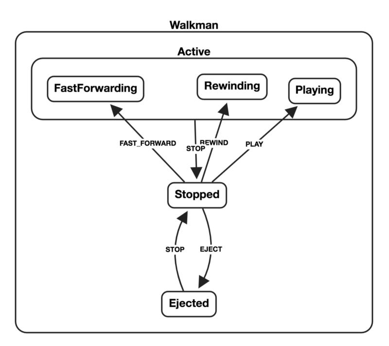
Rewriting the Walkman example as a statechart removes the redundancy found in the state graph. Notice how there is no longer a need for repetition with “STOP” events. Statecharts are scalable — it’s not hard to add additional parallel states such as “Recording” and “Volume”.
Statecharts are more than just a concept for visually describing applications.
Statecharts can generate the state machines that underly an application.
You can convert visuals to code, and vice versa. View your application logic as a chart, or draw it.
8. Statechart Tools
Statecharts offer a promising future for genuinely designing systems — and not just on paper. While tools have been around for other programming languages, JavaScript is just now starting to show a boom in statechart tooling.
C & Java developers have tooling available for coding with and alongside statecharts. As an example, Yakindu Statechart Tools brings together the worlds of visual design and code. I recently learned Yakindu also includes a Typescript code generator.
The same tooling is finally becoming available for JavaScript as well.
Sketch Systems provides a way of designing systems in markdown that can then be used to prototype in JavaScript. While Sketch Systems does not yet support actions or guards, I’ve found it very useful for prototyping and testing state charts.
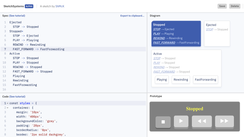
Sketch Systems allows you to export your charts to XState, a statechart-based JavaScript library with its visualization and clickable state prototyping tool.
Imagine more advanced tooling within your editor. Imagine your workflow as you toggle between visually designing and manually coding your application logic. It’s worth the work we’ll have to put in as a community to advance the tooling, libraries, and editor plugin’s we want to better support using statecharts.
Conclusion
Complexity snuck up on us in the JavaScript community. I don’t think we were ready for it. I’ll admit it took me a long time to get good at planning applications. I’d sketch out a component tree and some state shape. Watch prototypes iterate into production. But how could I be any good at planning applications without a formalized visual language to design state diagrams?
For a long time, I’ll confess that I approached state management more like a mystifying art. I was unaware that there was much to be learned from other areas of computer science with a long history of building and managing complex systems. I grew to understand that there’s value in looking to the past, as well as looking sideways at the fields of engineering around us.
We can learn from engineers who have pioneered and developed decades old solutions for creating complex — yet predictable — systems. We can build upon tools & libraries as an ecosystem to support the visual design of application logic. And we will do it because JavaScript needs all of this.
The future of designing applications in JavaScript is looking brighter than ever. This article has all been very high level and likely left more questions than answers. In part 2, I’d like to look more in-depth at patterns for using statecharts with components.
Subscribe to my newsletter
Read articles from freeCodeCamp directly inside your inbox. Subscribe to the newsletter, and don't miss out.
Written by

freeCodeCamp
freeCodeCamp
Learn to code. Build projects. Earn certifications—All for free.
