Learn Basic Data Visualization with D3.js
 freeCodeCamp
Our goal is to learn the basics of data
You'll learn the basics of data visualization using D3 through this project.

What is D3.js?
For those who are not familiar with D3, D3.js is a JavaScript library for manipulating documents based on data. D3 helps you bring data to life using HTML, SVG and CSS.
D3.js helps you attach your data to DOM (Document Object Model) elements. Then you can use CSS3, HTML, and/or SVG showcase this data. Finally, you can make the data interactive through the use of D3.js data-driven transformations and transitions.
Project Explanation:
Scenario:
There”s a class of Online students interacting with different topics of the subject and gives quiz on those topics.
There are 15 topics and on each topic, we have a numbers of student who have taken quiz and have scored in three categories: Low, Mid and High
For example (Given data ):
Topic: “1”, low: 4, mid:13, high: 18
Topic: “2”, low: 11, mid:12, high: 6
Topic: “3”, low: 12, mid:24, high: 6 and so on.
Note that Topic 1 has4 + 13 + 8 = 35 student has taken the quiz and Topic 2 has 11+12+6 = 29 student and topic 3 has 42 students and so on.
We want to make interactive Bar and Pie charts. For example, a mouse hover on one of the bars will change the pie chart accordingly and vice-versa.
With Interactive combination of bar chart and pie chart, where bar chart shows number of students who have interacted with particular topic(taken the quiz) and pie chart showing classification of that students performance in categories of “low, mid, high”, we can visualize our data and get more data analysis from it.
Hints and Resources:
Step by Step instructions:
D3 Introduction: where you can learn about Selections , Dynamic properties and Transitions in D3.js.
In the main javascript function, write a function to handle Histogram (Bar chart) - Histogram will show the total number of students who has taken the quiz (interacted with that topic) for 15 topics.
- (Here”s the Tutorial where you can learn how to make a bar chart using the D3 JavaScript library. The first tutorial teaches how to make a bare-bones version in HTML, then a more complete chart in Scalable Vector Graphics (SVG), and lastly animated transitions between views.)
- Create SVG for histogram
- Create function for x-axis mapping and add x-axis to histogram SVG
- Create function for y-axis mapping and Create bars for histogram to contain rectangles and topic labels.
- Create the rectangles and topic labels
- Create function to update the bars. This will be used by pie-chart
Write a function to handle pieChart. – pie chart will have three slices – Low , Mid and High to represent scores.
- Tutorial where you can learn how to make a pie chart, then transitions between views and how to create a legend.
- Create svg for pie chart.
- Create function to draw the arcs of the pie slices - pie slices will be Low , Mid and high
- Create a function to compute the pie slice angles.
- Draw the pie slices.
- Create function to update pie-chart. This will be used by histogram.
- Calculate total frequency by segment for all topic.
- Calculate total frequency by state for all segment.
Result of Data Analysis and what can we infer from Visualization:
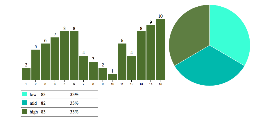
- Initial pie chart shows aggregate classification of all student score on all topic combined into three categories “low, mid ,high”
- Initial bar chart showing number of students who have interacted on that particular topic
- Any Selected category from pie chart will update bar chart, showing number of students who have interacted on various topics having score belonging to that particular category .
- Screenshots below shows the mouse hover on “Mid” slice and “High” slice of the pie chart respectively and for that particular slice , topic-wise bar charts and number of students.


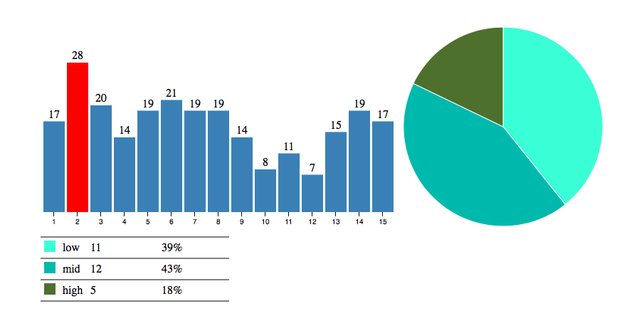
- Any selected bar chart”s bar will update pie chart showing classification of all students score on that particular topic into three categories Low , Mid and High. Screenshot below shows the mouse hover on Topic 2 and for that particular topic , how many student are in categories Low , Mid and High

Subscribe to my newsletter
Read articles from freeCodeCamp directly inside your inbox. Subscribe to the newsletter, and don't miss out.
Written by

freeCodeCamp
freeCodeCamp
Learn to code. Build projects. Earn certifications—All for free.