Global and local contrast in the 3C technique of design evaluation - Part II
 ICU Branding agency
Keeping with our developing questions approach, let's test our design options.
In the previous section, we examined two Cs: comprehending the context and the caliber of the project's content. Today's topic will be the last C, or (C)contrast, broken down into two sections: Local Contrast and Global Contrast.
Global Contrast identifies how the developed concept is unique for the creative industry, out of the ordinary for the client's domain, and creatively accomplished within the selected style.
Not every job exists in a vacuum. After submitting the design for review by friends, clients, or coworkers, it will unavoidably be compared to other projects. And it may be a breakthrough, a high-quality product, or none.

Nobody has to be taught how to perform poorly. It says how to do good everywhere. And you have to overcome some or all of the global contrast levels to win the festival (GC). Let's solve it together.
Effective global contrast questions:
1) Which styles are typical for the clients? How can I avoid using them?
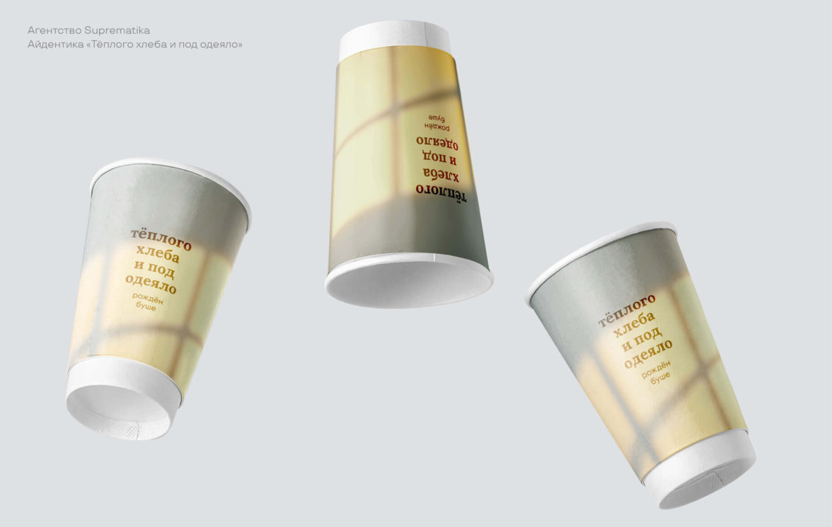
We track the category's information field and rivals. Remember the brief; we do the contrary as well. If, in a pro-skate, the party is dominated by graffiti and overkill of details, we then focus on ultra-minimalism. In the limousine rental service's design, we are bringing brutalism.
2) In the client's line of business, which cases have other agencies handled? Which ones deviate the most from these standards?
Design usually comes first in agencies. They have applied point 1 many times already. Thus, we consider the construction of tops and close another degree of their individuality. The issue is that there is no alternative approach to accomplish it. Let us first undertake reverse engineering and break down the case into components. However, why such challenges when the artists themselves discuss innovative work at events and lectures? We stroll, learn, copy the method.
3) Which colors are not typical for the customer area?
When all the major players have picked their primary colors, helping a client stand out at the color level is quite a feat. Regarding niche companies, however, developing a distinctive palette within the sector is feasible. Should fast food be defined by vivid, unsophisticated hues, we are aiming to bring pastel or black-white.
4) Which typefaces are not conventional for the client area?
A major design trend is typography, which lets you establish a distinctive brand signature. Moreover, he is not required to fit the categorization. Create grunge fonts for beauty items and display fonts for kindergarten ribbon antiques.
5) What graphic visuals are not usual for the client's sphere?
Still, a good metaphor might be the most vital component of a notion and yet make it unforgettable. If everyone around utilizes mountains as a sign of pure natural water, then the usage of an urban picture, like a water tower, might make your product unique.
6) With what non-standard instruments can I produce original elements?
Design is about the process of creating visual identity as much as about their appearances. Most of the time, current graphic choices are not surprising to anyone. But if mastering artwork or 3D for a project sounds like an unreal effort, then going beyond the reach of graphic editors and utilizing a log as a brush for letters may be organized at one time and enjoy the process.
Combining designer and creative talents starts with the Civil Code. Looking high above the project and its surroundings can help you produce a distinctive case for all points and astonish the world by creating your watchfulness, tracking current trends, and experimenting.
Local Variance
Determines the composition's level of organization inside the layout.
A designer must comprehend how viewers interpret visual content. We can read an object's form more quickly than its text because color is quicker than text. And that's only the very beginning of a well-composed piece. When working with local Contrast (LC), every solution ensures that the viewer spends the least time determining the most significant.

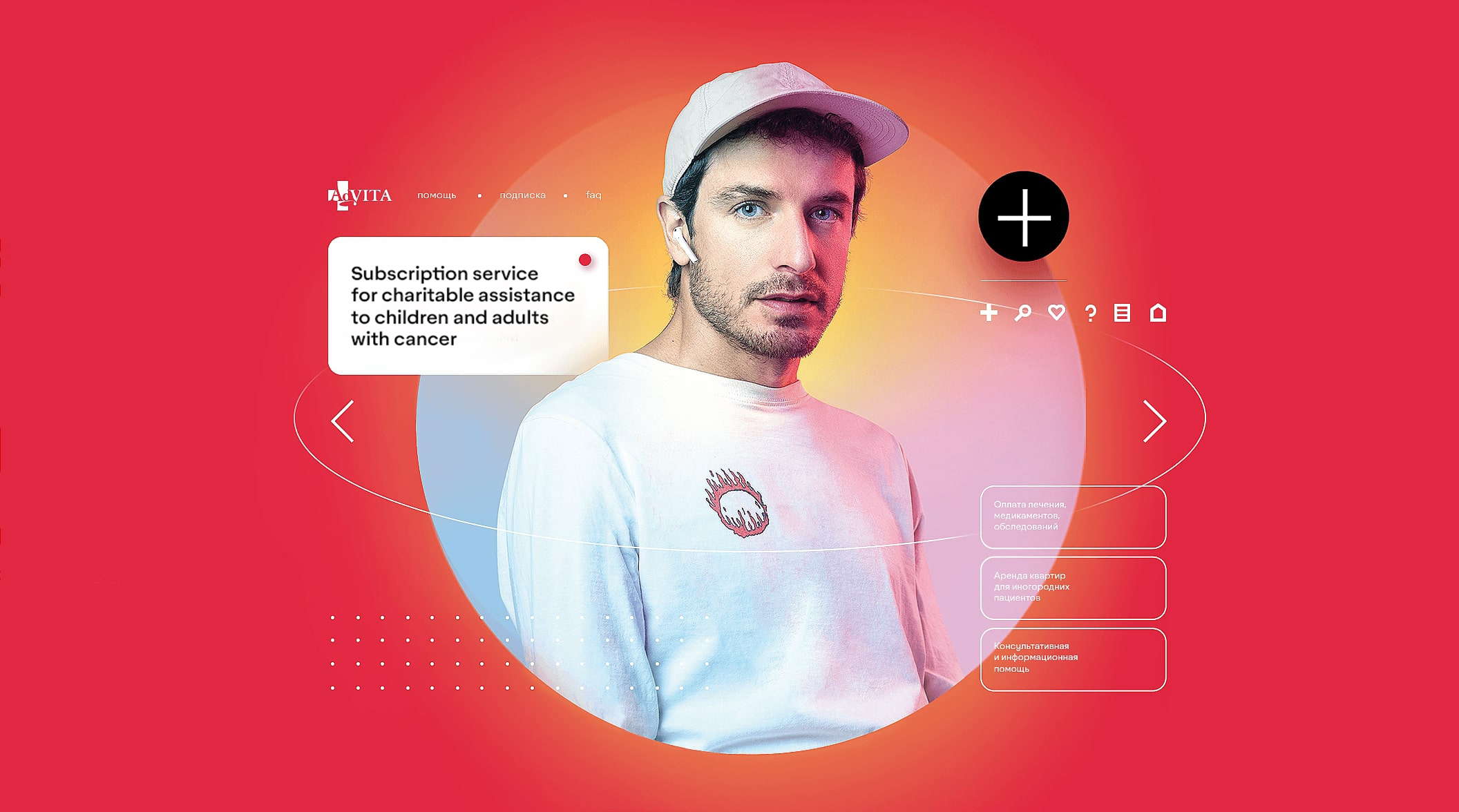
Take a look at the previous example. Although the composition is detailed, every part is clearly understood. These several factors include:
· Central location: everything draws attention to the center, which is the foundation
· Circle selection: A human figure's intricate silhouette ought to clash with an abundance of tiny features, but by enclosing it in a circle, we show where it belongs in the arrangement and reduce the outside silhouette to a level geometric shape.
· The scale difference: Although the guy is a large area and the surrounding details are thin, light lines, the white color of the figure and the little parts do not blend.
· The Contrast in color: the guy is white with warm and cold reactions, while the circle is pastel chilly. By using brightness and color temperature, we made it easier for the observer to focus on the main item.
The LK demonstrates the designer's talent at drawing the viewer's attention in certain directions.
Good local contrast test questions:
1) What is the arrangement's centerpiece, and how is it emphasized? How can the selection be stopped, and what stops it?
We follow the maxim "one layout, one message." We need to extract and visually represent the most essential information from this. You have already chosen the content for the layout and are aware of the context. Beeline highlights a key phrase in the message with a yellow stripe, and Avito inserts a product image within an application-generated digital frame. We examine the methods companies use, examine the work of visual artists, and learn strategies for emphasizing the key points.
2) What is the layout's hierarchy of items after the primary object?
While we can all draw attention to the essentials, most of the effort above the layout is done while arranging the data in a secondary plan. It is vital to decide what should be put in what order of priority for the billboard layout, but it is preferable to prescribe rather than to make the decision on its own. Provide the spectator with a path for his eyes to follow.
3) Which grid is used in the design? To what extent can it be scaled?
Of course, the grid is not a cure-all, but it may be useful when handling a lot of data in various forms. The density of the layout—the degree of information digestibility—is significantly influenced by the number of columns. Additionally, the grid might assist you in coming up with new ideas for expressive presentation if you venture outside of the Swiss school.
4) Is the proximity rule being followed?
The foundation of the fundamentals for organizing data in a layout. The unfavorable ratio of distances between pieces is frequently the cause when it appears intuitively that "something is wrong with the layout." Blocks are how one perceives a well-designed layout: here is a picture of the product, here is information about its merits, and here are the brand's contacts.
5) Is the spot contrast noticed?
Items and groupings of items make up a layout. These locations are them. They must fluctuate in size since uniformity makes a layout difficult to navigate and is often tedious to master. If you create an image product for half of a layout, the text block should be substantially smaller than the entire second half.
6) What visual methods are employed to divide up the composition's objects?
In compositions with a lot of parts, it becomes important to emphasize the main piece using more intricate techniques in addition to size and color. Separator lines, shadows, texture mapping, and highlighting are just a few techniques used to divide the layout into sections.
7) Does the layout contain subtle elements?
One way to characterize modern design is stark Contrast. Furthermore, a tiny object may always be added with a filigree touch. For instance, you might sketch a little emblem that represents the message's subject or put a brief tagline in the layout's empty area.
8) How much text do I need to apply accents and create layouts properly?
The designer must be able to divide the texts into logical sections and arrange them so that the most crucial information is highlighted after receiving the texts for the layout. We gave the copywriter the assignment to obtain the necessary font size; if it is absent, it appears that you will need to pick up a new ability for this job.
Composition abilities are intimately related to crafting a quality LC. It would help if you did your own independent, in-depth research on each of these eight questions. Finally, you may break down the composition into its constituent parts and work on refining it in a more organized manner.
Not yet a cure-all
This questioning approach is a useful tool for assessing your work, but it's mainly intended for people who are accustomed to answering inquiries with fresh insights. This is not a one-size-fits-all solution, and it won't instantly eliminate all black areas on your idea. Although you can't feel your layout right now, you can still grasp it in terms of its characteristics and specifics, which will help you identify your weak points and make progress.
Subscribe to my newsletter
Read articles from ICU Branding agency directly inside your inbox. Subscribe to the newsletter, and don't miss out.
Written by

ICU Branding agency
ICU Branding agency
Branding agency that creates a connection between business and audience through in-depth research and creative thinking.