I finished the course! Re-brainstorm?
 Subhrangsu Bose
So from the last ghosting on this blog, I wasn't sure I would get back to it. But I did. I was adamant about what I needed to do with my portfolio (idea: User controls a flight and lands it to different LZs representing experiences/projects). I finished the course, which was kinda comprehensive but unfortunately, it didn't give me the exact solutions that I needed. Disappointing but expected! When you're trying to solve a problem lesser known, it takes time to find or come up with the optimal solution. But I'm not ditching the idea just yet - well, at least the theory of it!
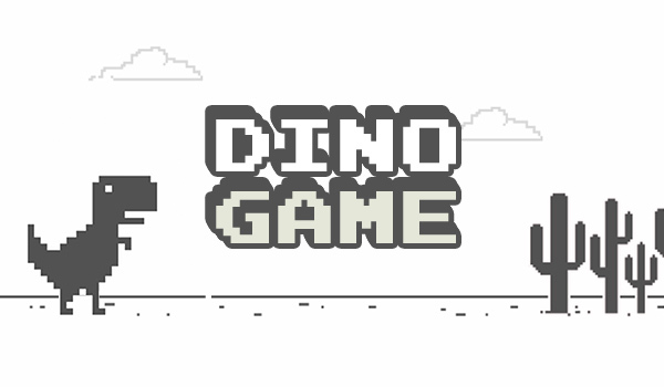
The Dino Game!

Who hasn't played the infamous Dino Doodle game, at least when their internet has been out or not responding? What's not to like about it - the controls are simple, the goal is simple, the graphics are apt and it caters to our low attention span selves extremely well. As simple as the game is, it is such a household thing right now. Everyone knows about it. Everyone can play it. This got me wondering - why not use this concept for our portfolio? Because truth be told the current idea of the portfolio sounds a bit complex. And as I'm sure everyone respects Occam's razor, the simpler we make our UI, we'd be one step closer to making it better, if not the best!
The Dino Game portfolio!
I'm brainstorming as I'm writing this so the write-up may not be snappy. But it's important I do it while sitting down and documenting it, as it will motivate me to execute it(just a me thing). So the subject - the dino. The controls would be the same. There would be obstacles (trees, and birds) that the user would have to avoid. At every "checkpoint" or after a certain number of obstacles, you'd encounter a section and its parts - for example, a sample section would be "Experiences", and its subparts would be the experiences I have had. Instead of the traditional scorekeeper on top, a neat little thing would be a progress bar, because we aren't looking for any high scores here. The experiences/projects would pop onto the screen upon reaching the checkpoint, and the user can check out more if they want.
Another feature I'd like to add is after the completion of a checkpoint, the user can go back to it by simply clicking on the progress bar (the previous checkpoints will be marked on it) so that he doesn't have to play it again and again if they don't want to. Something like this -
The reason for this idea is that it gives me a lot more control to show what's what, and in what order/chronology than before. And it's relatable AF. SIMPLE!
Challenges?
The fun part! It's going to have a LOT but let's note down the basics that I have thought of right now so that we know we're making some kinda progress -
The dino game is snappy! We need to make that happen? Can we do the OG 2D game into a 3D with the same entities? What would the character, obstacles and the scene look like?
Tech stack - are we still banking on threejs, or does this project need something else? Well with the course, I know a few aspects of it so that is going to be my starting point. Rest we can figure out as we make just a bit of progress
Snappy is also making it Dynamic! For instance the progress bar, it shouldn't be some static graphic - but well we're getting way ahead of ourselves!
Let's get right into it! Super excited to make it work!
Subscribe to my newsletter
Read articles from Subhrangsu Bose directly inside your inbox. Subscribe to the newsletter, and don't miss out.
Written by

Subhrangsu Bose
Subhrangsu Bose
Grad student, on my journey from a mechanical engineer to the highest paid dev in N-America