Mastering CSS Flexbox: A Comprehensive Guide to Modern Layouts
 Saurav Kumar
CSS Flexbox is a powerful layout module that has revolutionized the way developers design responsive and dynamic web layouts. Introduced as a solution to the limitations of traditional CSS layouts, Flexbox offers a flexible, efficient, and intuitive way to distribute space and align items within a container. In this blog post, we’ll explore the latest developments in Flexbox, delve into key concepts, and provide practical applications to help you master this essential tool in modern web design.
Want to PLAY & MASTER css flexbox..?? Visit here
The Essence of Flexbox
At its core, Flexbox is a one-dimensional layout method designed to arrange items in a row (horizontally) or a column (vertically). Unlike traditional layout models, which require complex and often brittle hacks to achieve fluid layouts, Flexbox provides a straightforward solution by allowing elements to automatically adjust their size, order, and alignment within a container.
Key Concepts in Flexbox
To fully harness the power of Flexbox, it’s essential to understand its key properties and how they work together to create flexible layouts.
1. Flex Container and Flex Items:
Flex Container:
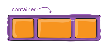
This defines a flex container; inline or block depending on the given value. It enables a flex context for all its direct children.
  .container {
    display: flex; /* or inline-flex */
  }
Flex Items:
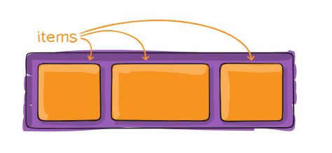
The direct children of the flex container. These items are the elements you want to arrange and align within the container.
By default, flex items are laid out in the source order. However, the
orderproperty controls the order in which they appear in the flex container.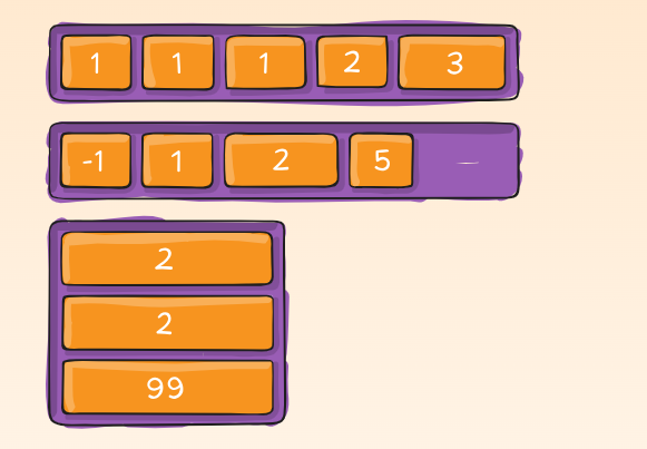
  .item {
    order: 5; /* default is 0 */
  }
2. Flex Direction: The flex-direction property defines the direction in which the flex items are placed in the flex container. It can be set to:
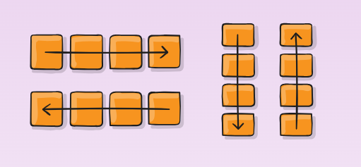
row(default): Aligns items horizontally, left to right.row-reverse: Aligns items horizontally, right to left.column: Aligns items vertically, top to bottom.column-reverse: Aligns items vertically, bottom to top..container { flex-direction: row | row-reverse | column | column-reverse; }
3. Flex Wrap: By default, flex items will try to fit into a single line within the container.
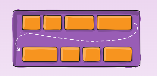
The flex-wrap property allows items to wrap onto multiple lines if necessary:
nowrap(default): All items fit in a single line.wrap: Items wrap onto multiple lines.wrap-reverse: Items wrap onto multiple lines in reverse order..container { flex-wrap: nowrap | wrap | wrap-reverse; }
4. Flex Grow, Shrink, and Basis: These three properties determine how flex items grow, shrink, and set their initial size:
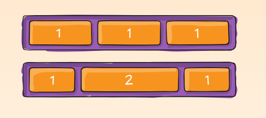
Flex Grow (
flex-grow): Dictates how much a flex item will grow relative to others. A value of1allows the item to take up available space proportionally.Flex Shrink (
flex-shrink): Controls how much a flex item will shrink relative to others when space is limited. A value of0prevents the item from shrinking.Flex Basis (
flex-basis): Sets the initial size of a flex item before any remaining space is distributed. It can be set in pixels, percentages, or auto.
5. Alignment Properties: Flexbox provides powerful alignment options to control the positioning of flex items within the container:
Justify Content (
justify-content): Aligns flex items along the main axis (horizontal or vertical depending onflex-direction). Options includeflex-start,flex-end,center,space-between,space-around, andspace-evenly.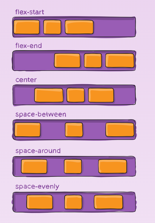
Align Items (
align-items): Aligns flex items along the cross axis (perpendicular to the main axis). Options includestretch(default),flex-start,flex-end,center, andbaseline.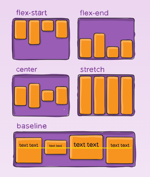
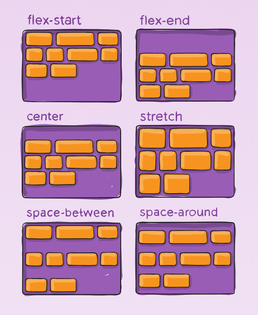
Align Content (
align-content): Aligns multiple lines of flex items within the container. This property is effective only when flex-wrap is enabled and there are multiple lines of items.
.container {
  align-content: flex-start | flex-end | center | space-between | space-around | space-evenly | stretch | start | end | baseline | first baseline | last baseline + ... safe | unsafe;
}
Note: This property only takes effect on multi-line flexible containers, where flex-wrap is set to either wrap or wrap-reverse). A single-line flexible container (i.e. where flex-wrap is set to its default value, no-wrap) will not reflect align-content.
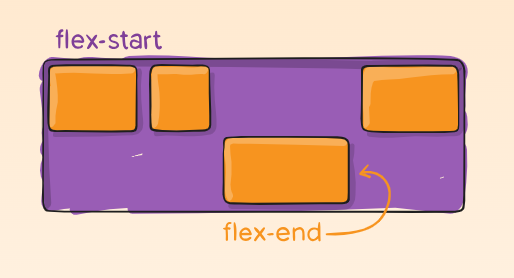
6. Align Self: The align-self property allows individual flex items to override the container’s align-items property, offering more control over the layout.
.item {
  align-self: auto | flex-start | flex-end | center | baseline | stretch;
}
6. Gap, row-gap, column-gap:
The
gapproperty explicitly controls the space between flex items. It applies that spacing only between items not on the outer edges.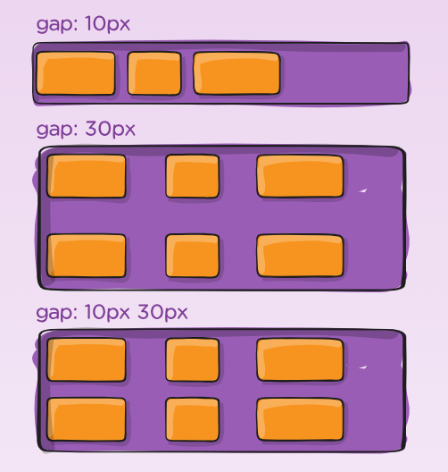
  .container {
    display: flex;
    ...
    gap: 10px;
    gap: 10px 20px; /* row-gap column gap */
    row-gap: 10px;
    column-gap: 20px;
  }
Practical Applications of Flexbox
Flexbox’s versatility makes it ideal for a variety of layout scenarios. Let’s explore some practical applications:
1. Creating Responsive Navigation Menus: Flexbox is perfect for building responsive navigation menus that adapt to different screen sizes. By setting display: flex on the navigation container and using justify-content: space-between, you can evenly distribute navigation links across the available space.
2. Building Dynamic Grids: While CSS Grid is often the go-to for complex grid layouts, Flexbox shines in simpler grid scenarios. By combining flex-wrap: wrap with flex-basis, you can create dynamic grids where items automatically wrap and adjust their size based on the available space.
3. Centering Elements: One of Flexbox’s most celebrated features is its ability to center elements both horizontally and vertically with minimal code. By setting display: flex, justify-content: center, and align-items: center on a container, you can easily center any content.
4. Creating Equal-Height Columns: Flexbox ensures that columns within a row have equal height, regardless of their content. This is achieved by setting align-items: stretch on the container, making all flex items expand to match the height of the tallest item.
The Importance of Flexbox in Modern Web Design
Flexbox’s ability to create responsive and flexible layouts with minimal effort has made it a cornerstone of modern web design. Its intuitive properties allow developers to build layouts that adapt seamlessly to different screen sizes and orientations, enhancing the user experience.
Moreover, Flexbox’s support across all major browsers ensures consistent rendering, making it a reliable choice for production websites. While CSS Grid offers more advanced capabilities for two-dimensional layouts, Flexbox remains the preferred tool for one-dimensional layouts due to its simplicity and efficiency.
Conclusion
CSS Flexbox is an essential tool for any web developer looking to create responsive, flexible, and visually appealing layouts. By mastering the key properties—such as flex direction, flex wrap, grow, shrink, and alignment—you can build layouts that adapt to any device or screen size. Flexbox’s versatility and ease of use make it a must-have skill in the ever-evolving landscape of web design.
As you continue to explore and experiment with Flexbox, you’ll discover its potential to simplify your CSS and create more maintainable, scalable layouts. Whether you’re building a simple navigation menu or a complex grid, Flexbox offers the tools you need to bring your design visions to life.
Subscribe to my newsletter
Read articles from Saurav Kumar directly inside your inbox. Subscribe to the newsletter, and don't miss out.
Written by

Saurav Kumar
Saurav Kumar
Build WebApps | Powered by Next.js, Node.js, Express.js, MongoDB & many more Styling, Auth, Db, Security, Deployment Tools & Techs