Building a Mobile Responsive Grid Layout in FileMaker Pro
 GreenFlux
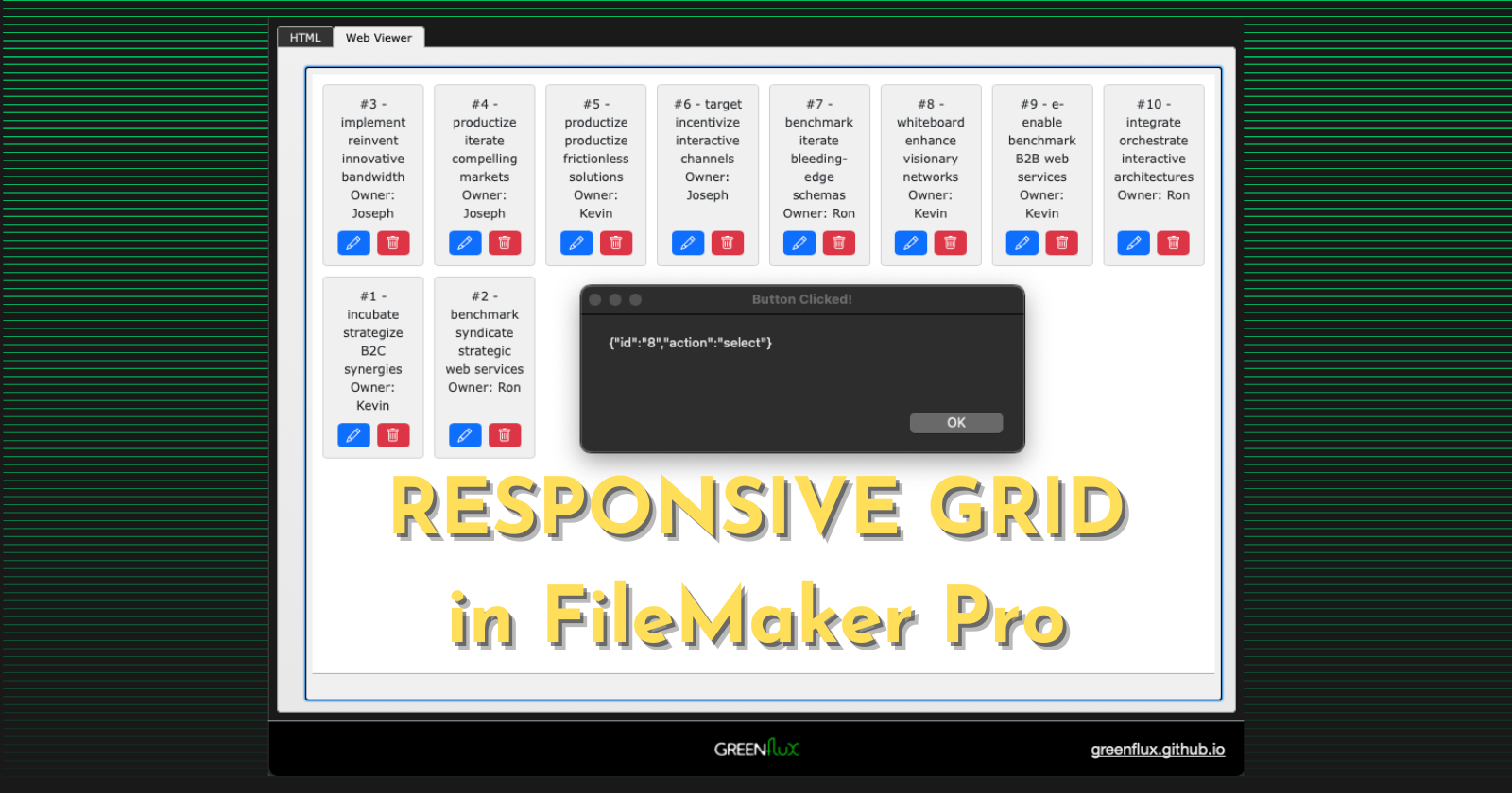
FileMaker Pro's layout design tools are top-notch. Between Form View, List View, Sub-Summary Parts, and Table View, you can build just about any type of UI you want... EXCEPT Grid Layouts! Yes, there are some workarounds you can do with multiple copies of the same layout objects, but the number of columns are fixed.
But what if you want a mobile responsive grid, with columns that adjust based on the screen width? Years ago I told a few clients this was not possible in FileMaker. But since then I've come to realize how powerful the Web Viewer can be in FileMaker.
In this guide, I'll show you how to:
Display a list of HTML elements in a Web Viewer
Add CSS to make it mobile responsive
Add JavaScript to merge in data from FileMaker
Trigger FileMaker scripts from within the Web Viewer
Let's get started!
Static List of Element in a Web Viewer
First, create a text field named HTML and add it to the layout, and then add a web viewer that displays the HTML field. You may want to put each one inside separate tabs of a Tab Control so they can be stacked, and each take the full screen width.
In the web viewer settings, enable Allow JavaScript to perform FileMaker scripts.
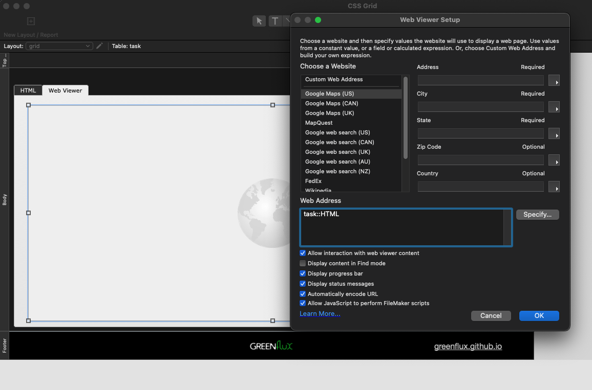
Next, go back to layout mode and enter this in the HTML field:
<html>
<head>
</head>
<body>
<div class='grid'>
  <div class='item'>Item #1</div>
  <div class='item'>Item #2</div>
  <div class='item'>Item #3</div>
  <div class='item'>Item #4</div>
  <div class='item'>Item #5</div>
  <div class='item'>Item #6</div>
  <div class='item'>Item #7</div>
  <div class='item'>Item #8</div>
  <div class='item'>Item #9</div>
  <div class='item'>Item #10</div>
</div>
</body>
</html>
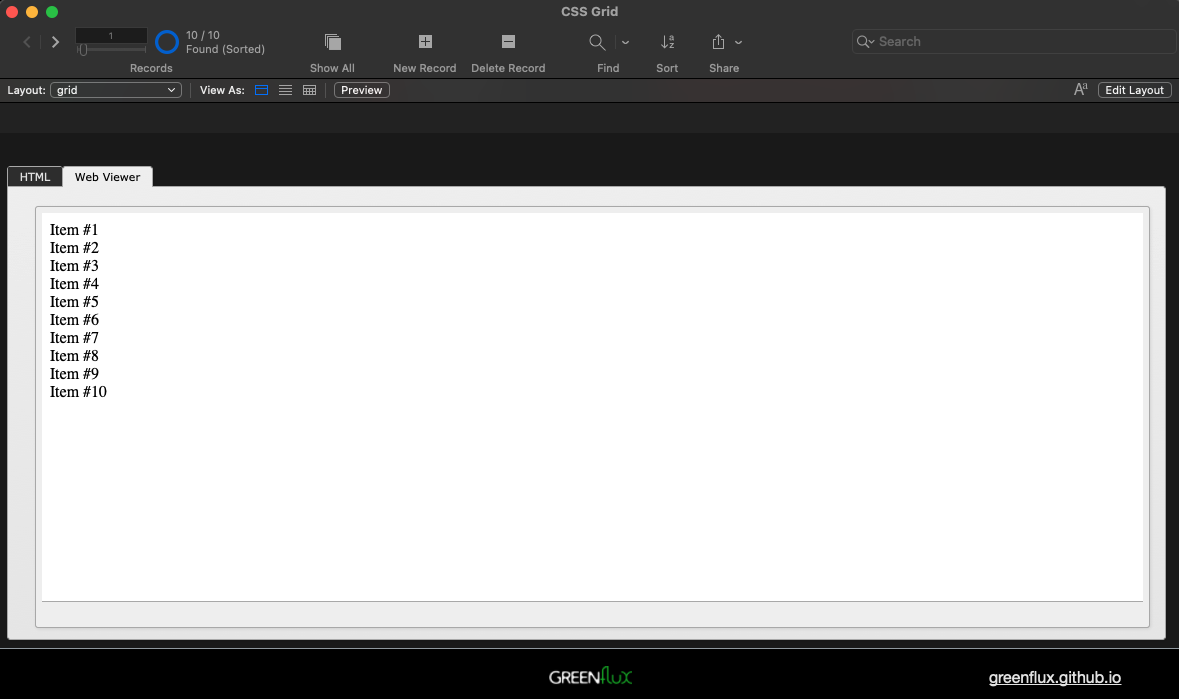
You should see a list in the web viewer like this:
Adding CSS to Make it Mobile Responsive
Now add some CSS to make each item look like a card, and to make the items display in a grid, by pasting this style tag in the <head> section:
    <style>
      body {
        margin: 10px;
        font-family: Verdana, Geneva, sans-serif;
        font-size: 12px;
      }
      .grid {
        display: grid;
        grid-template-columns: repeat(auto-fit, minmax(100px, 1fr));
        gap: 10px;
      }
      .item {
        border: solid 1px lightgrey;
        padding: 10px;
        border-radius: 4px;
        background-color: #f0f0f0;
        text-align: center;
        position: relative;
        height: 160px
      }
    </style>
Then anchor the right and bottom edges of the Tab Control, Web Viewer, and HTML field, so that they expand when the window is resized. You may also want to reduce the layout width, as this is will affect the minimum width of the grid.
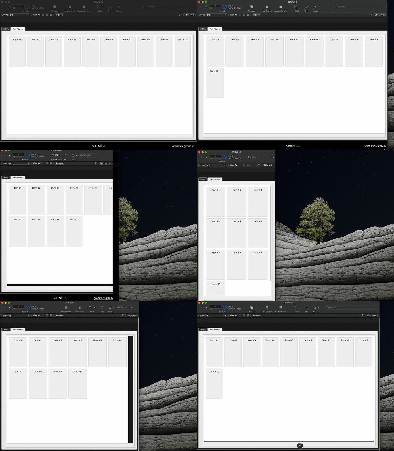
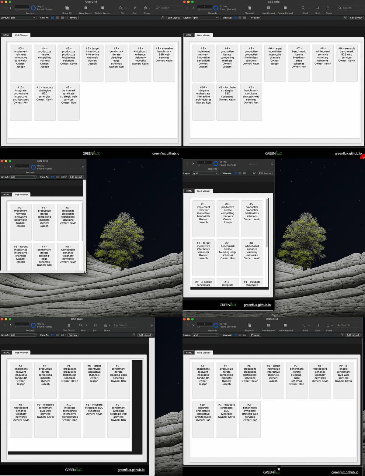
Resize the window, and you should see the grid columns adjust.
Adding JavaScript to Merge in FileMaker Data
Ok, the easy part is done. Now to insert data from FileMaker. But first, we need to figure out what data to merge in. For this example, I'm using a Tasks table, and displaying fields for the ID, Title and Owner.
Start out by using the Data Viewer to construct an ExecuteSQL query to get the fields you want to display in your grid. Be sure to use escape quotes on any table or field names that are SQL reserved words or that contain special characters or upper case letters. You have to use double-quotes on table and field names in SQL, and single quotes for strings.
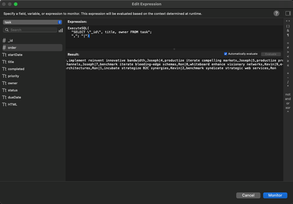
Note the use of | for the row separator instead of the default ¶. I had trouble parsing ¶ in JavaScript, so I chose the pipe character for the row separator. Click Monitor to save this expression to use in a few more steps.
Now go back to the HTML field and remove all the item divs. Then add a script tag to insert the raw SQL result into the grid div.
<body>
    <div class='grid'></div>
    <script>
      const data = 'SQL_RESULT';
      const grid = document.querySelector('.grid');
      grid.innerHTML = data;
    </script>
 </body>
Next, use Substitute in the web viewer to insert the SQL_RESULT, instead of displaying the HTML field directly.
Substitute ( task::HTML ;

  "SQL_RESULT" ; //search string

  //replace string
  ExecuteSQL(
  "SELECT \"_id\", title, owner FROM task";
  ","; "|")

)
You should now see the FileMaker SQL data in the web viewer, but the grid will now be broken.
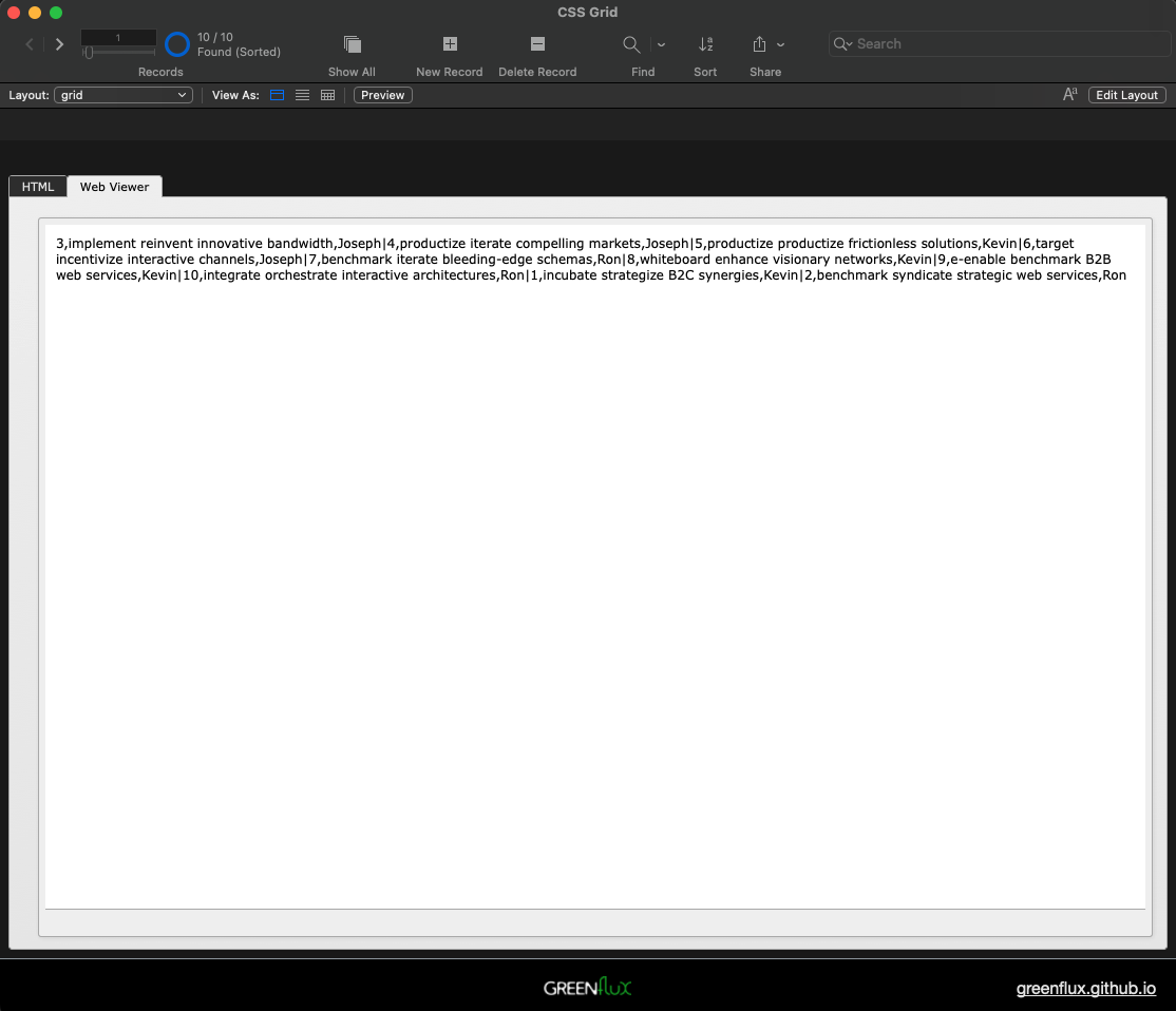
Now that the data is in the web viewer, you can loop over it to add new item divs to the grid. Update the script tag with:
    <script>
      const data = 'SQL_RESULT';
      const itemList = data.split('|');
      const grid = document.querySelector('.grid');
      itemList.forEach(row => {
        const [id, title, owner] = row.split(',');
        const item = document.createElement('div');
        item.setAttribute('class', 'item')
        item.innerHTML = `#${id} - ${title}\nOwner: ${owner}`;
        grid.appendChild(item)
      })
    </script>
You should now have a mobile responsive, data driven grid of your FileMaker data! In this example I'm keeping the card content simple by making it all a single string. You could add separate elements if you want to style them differently.
Triggering FileMaker Scripts From the Web Viewer
Ok, we have a mobile responsive grid in FileMaker, which is pretty cool on its own. But to make it truly useful, you need click events on each record to trigger FileMaker scripts. It also helps to have some buttons and icons on each card. So first we'll import Bootstrap and Bootstrap Icons, then add a few icons to each card.
<html>
  <head>
    <link href="https://cdn.jsdelivr.net/npm/bootstrap@5.3.0/dist/css/bootstrap.min.css" rel="stylesheet">
    <link href="https://cdn.jsdelivr.net/npm/bootstrap-icons/font/bootstrap-icons.css" rel="stylesheet">

    <style>
      body {
        margin: 10px;
        font-family: Verdana, Geneva, sans-serif;
        font-size: 12px;
      }
      .grid {
        display: grid;
        grid-template-columns: repeat(auto-fit, minmax(100px, 1fr));
        gap: 10px;
      }
      .item {
        border: solid 1px lightgrey;
        padding: 10px;
        border-radius: 4px;
        background-color: #f0f0f0;
        text-align: center;
        position: relative;
        height: 180px;
        display: flex;
        flex-direction: column;
        justify-content: space-between;
      }
      .btn-container {
        margin-top: auto;
        display: flex;
        justify-content: space-around;
      }
    </style>
  </head>
  <body>
    <div class='grid'></div>
    <script>
      const data = 'SQL_RESULT';
      const itemList = data.split('|');
      const grid = document.querySelector('.grid');
      itemList.forEach(row => {
        const [id, title, owner] = row.split(',');
        const item = document.createElement('div');
        item.setAttribute('class', 'item');
        item.innerHTML = `#${id} - ${title}<br>Owner: ${owner}`;

        const btnContainer = document.createElement('div');
        btnContainer.classList.add('btn-container');

        const editBtn = document.createElement('button');
        editBtn.setAttribute('class', 'btn btn-primary btn-sm');
        editBtn.innerHTML = '<i class="bi bi-pencil"></i>';

        const deleteBtn = document.createElement('button');
        deleteBtn.setAttribute('class', 'btn btn-danger btn-sm');
        deleteBtn.innerHTML = '<i class="bi bi-trash"></i>';

        btnContainer.appendChild(editBtn);
        btnContainer.appendChild(deleteBtn);

        item.appendChild(btnContainer);
        grid.appendChild(item);
      });
    </script>
    <script src="https://cdn.jsdelivr.net/npm/bootstrap@5.3.0/dist/js/bootstrap.bundle.min.js"></script>
  </body>
</html>
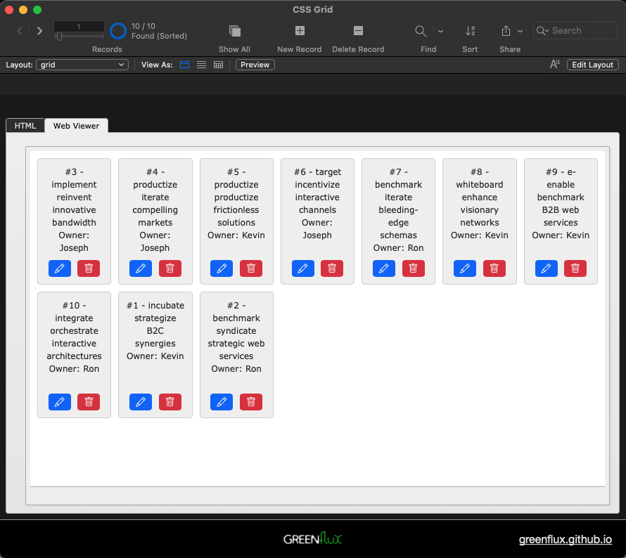
This should finish out the UI, aside from any CSS you want to add.
Next, create a new script called Handle Button Click. Add a Show custom dialog script step to display the script parameter, which we will be passing from the web viewer when a button is clicked.
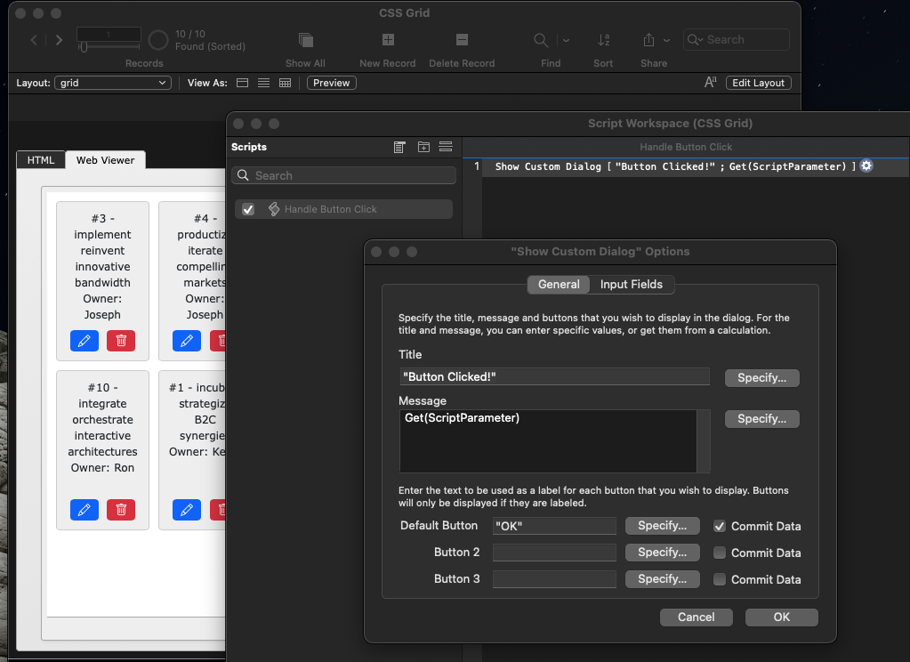
Then update the JavaScript to add event listeners to each button to set the onClick to execute this script, passing the task ID and the button that was clicked. You can also add an event for clicking anywhere on the card except for the buttons, and use that to navigate to the record in a detail view. But be sure to use the stopPropagation() method to avoid triggering the button and card click at the same time.
Here's the final HTML:
<html>
  <head>
    <link href="https://cdn.jsdelivr.net/npm/bootstrap@5.3.0/dist/css/bootstrap.min.css" rel="stylesheet">
    <link href="https://cdn.jsdelivr.net/npm/bootstrap-icons/font/bootstrap-icons.css" rel="stylesheet">

    <style>
      body {
        margin: 10px;
        font-family: Verdana, Geneva, sans-serif;
        font-size: 12px;
      }
      .grid {
        display: grid;
        grid-template-columns: repeat(auto-fit, minmax(100px, 1fr));
        gap: 10px;
      }
      .item {
        border: solid 1px lightgrey;
        padding: 10px;
        border-radius: 4px;
        background-color: #f0f0f0;
        text-align: center;
        position: relative;
        height: 180px;
        display: flex;
        flex-direction: column;
        justify-content: space-between;
        cursor: pointer;
      }
      .btn-container {
        margin-top: auto;
        display: flex;
        justify-content: space-around;
      }
    </style>
  </head>
  <body>
    <div class='grid'></div>
    <script>
      const data = 'SQL_RESULT';
      const itemList = data.split('|');
      const grid = document.querySelector('.grid');

      function callFileMakerScript(taskId, action) {
        const jsonPayload = JSON.stringify({ id: taskId, action: action });
        window.FileMaker.PerformScript('Handle Button Click', jsonPayload);
      }

      itemList.forEach(row => {
        const [id, title, owner] = row.split(',');
        const item = document.createElement('div');
        item.setAttribute('class', 'item');
        item.setAttribute('id', id);
        item.innerHTML = `#${id} - ${title}<br>Owner: ${owner}`;

        const btnContainer = document.createElement('div');
        btnContainer.classList.add('btn-container');

        const editBtn = document.createElement('button');
        editBtn.setAttribute('class', 'btn btn-primary btn-sm');
        editBtn.setAttribute('id', 'edit');
        editBtn.innerHTML = '<i class="bi bi-pencil"></i>';

        const deleteBtn = document.createElement('button');
        deleteBtn.setAttribute('class', 'btn btn-danger btn-sm');
        deleteBtn.setAttribute('id', 'delete');
        deleteBtn.innerHTML = '<i class="bi bi-trash"></i>';

        editBtn.addEventListener('click', function(event) {
          event.stopPropagation(); // Prevent triggering the card click event
          callFileMakerScript(id, 'edit');
        });

        deleteBtn.addEventListener('click', function(event) {
          event.stopPropagation();
          callFileMakerScript(id, 'delete');
        });

        btnContainer.appendChild(editBtn);
        btnContainer.appendChild(deleteBtn);

        item.appendChild(btnContainer);

        item.addEventListener('click', function() {
          callFileMakerScript(id, 'select');
        });

        grid.appendChild(item);
      });
    </script>
    <script src="https://cdn.jsdelivr.net/npm/bootstrap@5.3.0/dist/js/bootstrap.bundle.min.js"></script>
  </body>
</html>
And here's the final result:
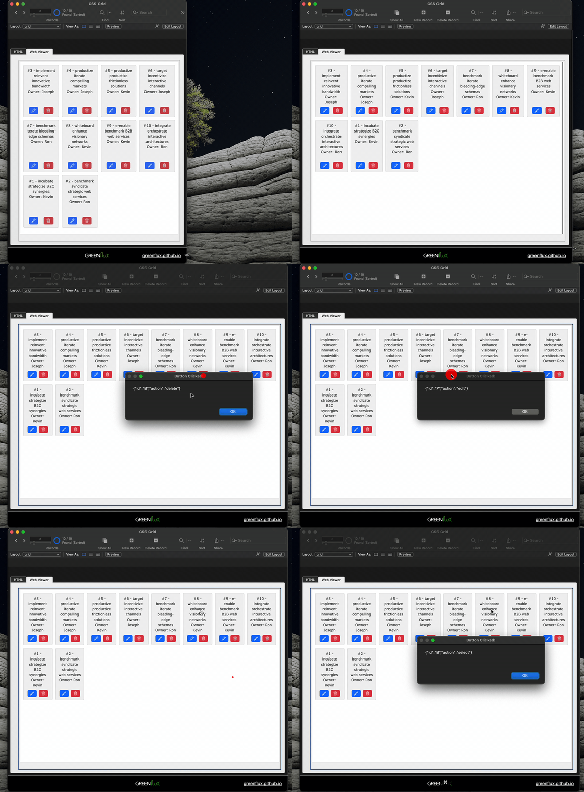
From here you can use JSONGetElement() to extract the ID and Action from the web viewer click, and run any other script steps you want, based on the script parameters.
What's next?
There's a lot more you could do with the card styling, like adding images, and making each data point its own element so you can target them separately with different CSS. You can also add separate fields for the HTML, CSS, and JS, then merge them all together using Substitute. You can even edit data from inside the web viewer, like in this SortableJS web viewer with draggable, reorderable rows!
About Me
Hi, I'm Joseph, founder at GreenFlux, LLC and a senior developer advocate at Appsmith. I enjoy pushing the limits of low-code, and I'm always up for a new challenge. If you have a difficult API integration or web viewer idea, post a comment below and I'll see what I can do!
Subscribe to my newsletter
Read articles from GreenFlux directly inside your inbox. Subscribe to the newsletter, and don't miss out.
Written by

GreenFlux
GreenFlux
NO LONGER ON HASHNODE: Follow at: https://news.greenflux.us/ Nuclear Plant Operator (US Navy), Turned Freelancer, Turned Developer Advocate. Head of Developer Relations @ Appsmith, Inc Founder/ Freelancer @ GreenFlux, LLC GREENFLUX, LLC WE'VE GOT YOUR APP COVERED. Veteran Owned & Operated Since 2016 - Tallahassee, FL