Creating Rounded Hover Effect for Tables with Styled Components
 Tomi
TomiPremise
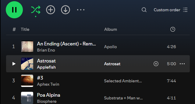
I looked to create the effect that Spotify's desktop client has when you hover over a row, similar to this:

My application is using a <table> element I figured it should be easy enough to just add border-radius on the tr element, but I ended with a slightly more complicated solution.
My gut feeling is that something a lot simpler should be possible, but this is what I ended up with for now. Simplification should follow later on.
The code
First the solution:
const MyTableRow = () => {
  {
    const [isHovered, setIsHovered] = useState<boolean>(false);

    const onHover = () => {
      setIsHovered(true);
    };

    const onMouseLeave = () => {
      setIsHovered(false);
    };

    return (
      <tr onMouseEnter={onHover} onMouseLeave={onMouseLeave}>
        <TrackNumberTd $hovered={isHovered}>
            1
        </TrackNumberTd>
        <TrackNameTd $hovered={isHovered}>
            track name
        </TrackNameTd>
        <HoverHighlightTd $hovered={isHovered}>
            album name
        </HoverHighlightTd>
        <HoverHighlightTd $hovered={isHovered}>
            0:00
        </HoverHighlightTd>
      </tr>
    );
  }
};

export const TracksList = () => {
  return (
    <MyContainer>
      <TracksTable>
        <tbody>
          <MyTableRow />
          <MyTableRow />
          <MyTableRow />
        </tbody>
      </TracksTable>
    </MyContainer>
  );
};


const HoverHighlightTd = styled.td<{ $hovered?: boolean }>`
  background-color: ${(props) =>
    props.$hovered
        ? "rgba(255, 255, 255, 0.1)"
        : "auto"
  };
`;

const TrackNumberTd = styled(HoverHighlightTd)`
  display: flex;
  flex-wrap: wrap;
  justify-content: center;
  align-content: center;
  min-height: 40px;
`;

const TrackNameTd = styled(HoverHighlightTd)`
  color: var(--text-on-main-bg);
`;

const TracksTable = styled.table`
  width: 100%;
  border-collapse: collapse;
  border-spacing: 0;
  table-layout: fixed;

  /* get rounded borders for the table */
  td:first-child {
    border-radius: 5px 0 0 5px;
  }
  td:last-child {
    border-radius: 0 5px 5px 0;
  }
`;

// Just table background styling
const MyContainer = styled.div`
  height: 100%;
  background-color: #ad3c34;
  padding: 20px;
`;
The explanation
HoverHighlightTd is a simple styled td element that sets a transparent background color when instructed to do so. All data cells in the table need to have that functionality to get the whole row highlighted.
In the MyTableRow component we manually keep track if mouse is hovered over the row and pass that info to the individual table cells.
I also learned that when extending styles with Styled Components, the extended components also automatically receive the props, as seen with TrackNumberTd and TrackNameTd without extra work needed. Nice!
Finally, the TracksTable component sets the first and last td childrens' border-radius to get the desired effect of rounding the borders. This is necessary since it's the those elements that get the transparent background color when hovering over the row.
End result

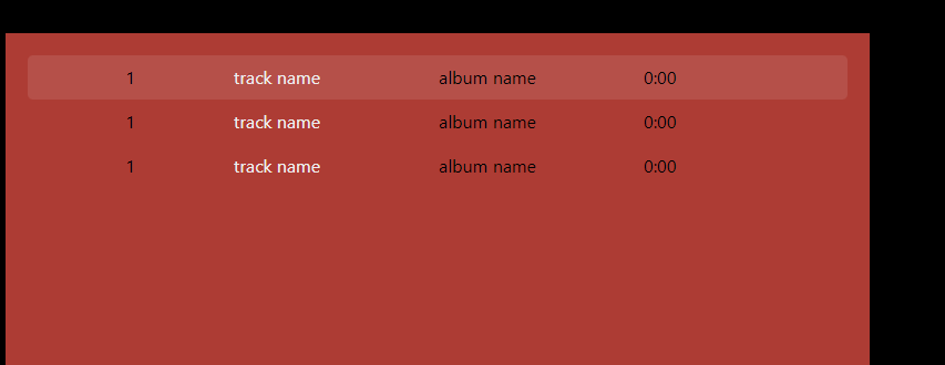
Hooray! One step closer to finishing my very own media player! Pretty ugly without any other styling I have attached, but it has the effect I was looking for.
Subscribe to my newsletter
Read articles from Tomi directly inside your inbox. Subscribe to the newsletter, and don't miss out.
Written by
