Creating a Google Sheets Sidebar with MermaidJS Charts
 GreenFlux
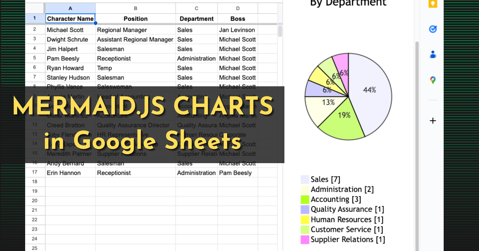
Google Sheets has a ton of different chart types built-in, but there are a few types missing like Class, Sequence and Sankey diagrams, to name a few. When it comes to these types of charts, you usually have to export your sheets data to another tool, or give it access to connect to your Google Account. That's not always an option with some organizations though, either due to cost or security restrictions. In cases like this, you have to get creative and use what's available, like the Sidebar in Google Apps Script.
That's only half of the solution though. Apps Script can serve a web page based on sheet data, but what about creating charts? That's where Mermaid.js comes in. Mermaid is a markdown-inspired charting library, that uses a plain-text syntax to generate charts without coding.
In this guide, I'll show you how to:
Create a Sheets Sidebar with Apps Script
Import Mermaid.js and insert a static chart
Add JavaScript to read sheet data and update the chart
Make it dynamic with UI options to select columns to chart
Let's get started!
Creating a Sidebar
First, open up the sheet you want to chart, then open up Apps Script from the Extensions menu.
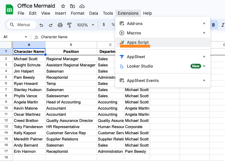
Start out by clicking the + to create a new File and choose HTML for the type. Name it Index, then paste this in the file and click SAVE.
<!DOCTYPE html>
<html>
<head>
</head>
<body>
<div>
Web app test
</div>
</body>
</html>
Then, paste this in the Code.gs file and SAVE.
function showSidebar() {
  const htmlOutput = HtmlService.createHtmlOutputFromFile('Index')
    .setTitle('Mermaid Chart');
  SpreadsheetApp.getUi().showSidebar(htmlOutput);
}

function onOpen() {
  const ui = SpreadsheetApp.getUi();
  ui.createMenu('Custom Menu')
    .addItem('Open Mermaid Chart', 'showSidebar')
    .addToUi();
}
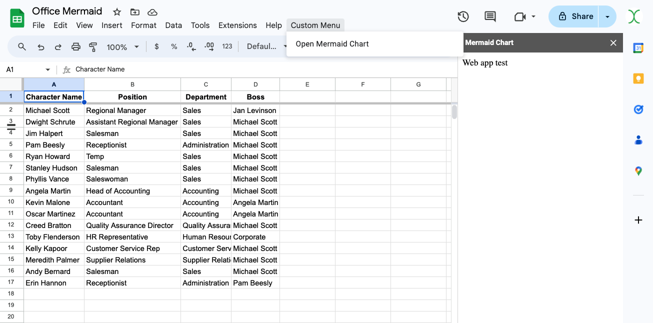
Refresh the sheet, and you should now see the Custom Menu in the toolbar. Open it and run the showSidebar function to open the new sidebar.
Adding a Mermaid Chart
Next, update the HTML to import the Mermaid library and display a pie chart.
<!DOCTYPE html>
<html>
<head>
  <script src="https://cdnjs.cloudflare.com/ajax/libs/mermaid/9.1.7/mermaid.min.js"></script>
</head>
<body>
<div class="mermaid" id="mermaidChart">
pie title Mermaid Test
    "Sales" : 3
    "Receptionist" : 2
    "Temp" : 1
</div>
</body>
</html>
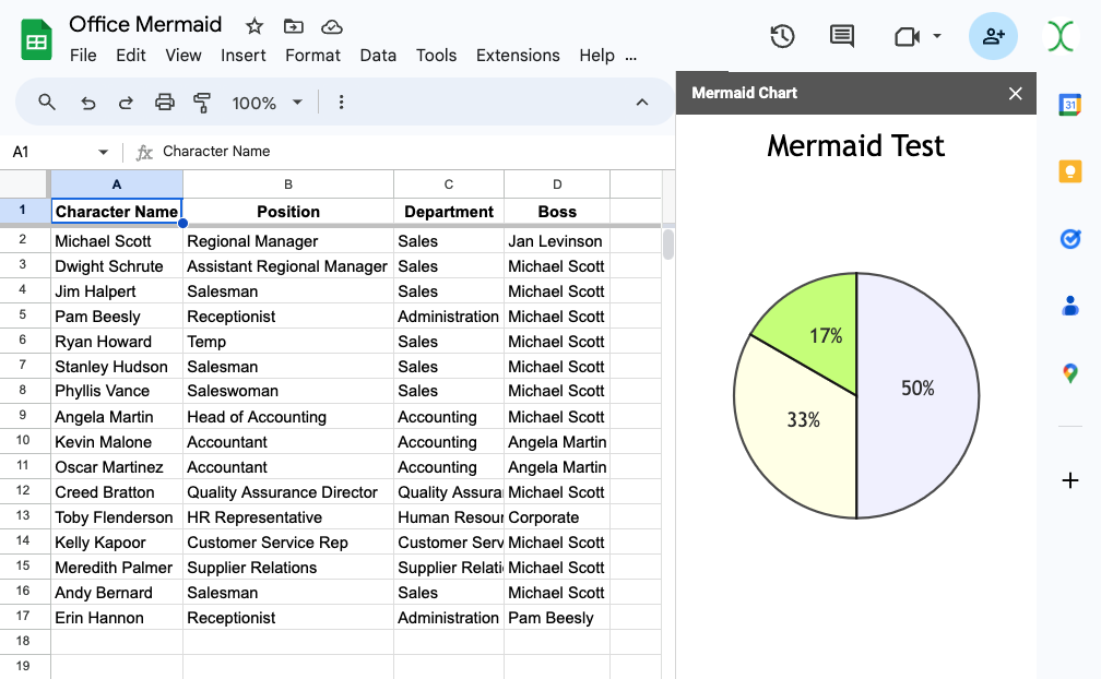
Re-run the script from the Custom Menu, and you should see a pie chart in the sidebar.
Inserting Sheet Data
Next, we need a JavaScript function to return the Mermaid Pie Chart config, using numbers from the sheet data. This can be done by looping over the rows and accumulating a count of repeat values, then looping over those totals to create the chart config.
Update the Code.gs with:
function pieChart(groupBy = 'Department') {
  const ss = SpreadsheetApp.getActiveSpreadsheet();
  const sh = ss.getActiveSheet();
  const table = sh.getDataRange().getValues();
  const headers = table[0];
  const data = table.slice(1); // Get all rows except the header
  const groupByCol = headers.findIndex(h => h === groupBy);

  let chart = `pie showData\ntitle By ${groupBy}\n`;
  const totals = {};

  data.forEach(row => {
    totals[row[groupByCol]] = (totals[row[groupByCol]] || 0) + 1;
  });

  Object.entries(totals).forEach(entryArr => {
    chart += `  "${entryArr[0]}" : ${entryArr[1]}\n`;
  });

  Logger.log(chart);
  return chart;
}
This will return a chart config based on your sheet data.
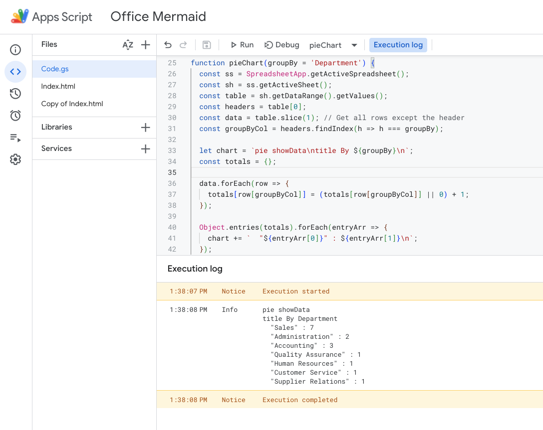
Next, add script tags to the HTML doc, and write a function to update the Mermaid div with this config, then re-initialize Mermaid:
        function renderMermaidChart(mermaidSyntax) {
        const mermaidDiv = document.getElementById('mermaidChart');

        // Clear placeholder chart and create a new one
        mermaidDiv.innerHTML = '';

        const newDiv = document.createElement('div');
        newDiv.className = 'mermaid';
        newDiv.textContent = mermaidSyntax;
        mermaidDiv.appendChild(newDiv);
        mermaid.init(undefined, newDiv);
      }
NOTE: Mermaid won't re-render the chart when the config is updated. Instead, you can clear the placeholder chart and create a new one with the real data.
Then add an sync function to call the pieChart function from the client side, get the chart config, and then run this renderMermaidChart function with the config. You can use the jquery library to wrap the function with $(function(){}) so that it will evaluate and run on the client side.
Here's the updated HTML doc:
<!DOCTYPE html>
<html>
<head>
  <script src="https://cdnjs.cloudflare.com/ajax/libs/mermaid/9.1.7/mermaid.min.js"></script>
  <script src="//ajax.googleapis.com/ajax/libs/jquery/1.9.1/jquery.min.js"></script>
  <script>
        function renderMermaidChart(mermaidSyntax) {
        const mermaidDiv = document.getElementById('mermaidChart');

        // Clear placeholder chart and create a new one
        mermaidDiv.innerHTML = '';

        const newDiv = document.createElement('div');
        newDiv.className = 'mermaid';
        newDiv.textContent = mermaidSyntax;
        mermaidDiv.appendChild(newDiv);
        mermaid.init(undefined, newDiv);
      }
      $(function() {
        google.script.run.withSuccessHandler(renderMermaidChart)
          .pieChart('Department');
      })
  </script>
</head>
<body>
<div class="mermaid" id="mermaidChart">
pie title Mermaid Test
    "Sales" : 3
    "Receptionist" : 2
    "Temp" : 1
</div>
</body>
</html>
Re-run the script from the sheet menu, and you should see the placeholder pie chart, followed by a real chart from your data.
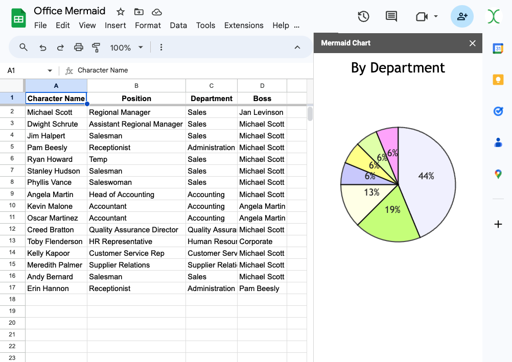
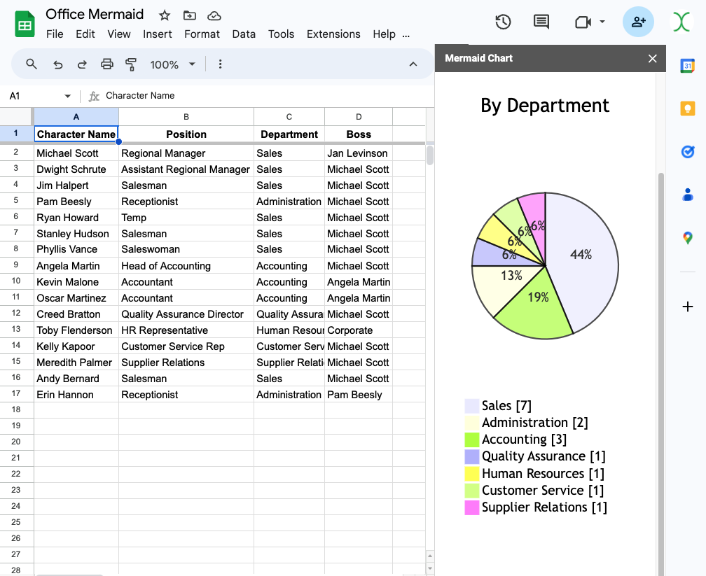
You may notice that there is no legend data, even though the examples in Mermaid show one. Unfortunately, Google Sidebars are always a fixed 300px, and in this case Mermaid is rendering the legend outside the viewable area. This can be fixed by adding some CSS to reposition the legend.
<style>
  rect,
  rect + text {
    transform: translate(-320px, 250px);
  }

svg {
    height: 800px
  }
</style>
This moves the rectangle and text label below the pie chart, and adds some extra room at the bottom for them.
Making It Dynamic
Lastly, we can add in a select input with a list of the column headers, so you can choose which column to chart.
Update the HTML with a select input. I put mine in a container so I could fix it to the top when the sidebar is scrolled.
    <!-- Container for the select element, acting as a navbar -->
    <div id="selectContainer">
      <label for="groupBySelect">Group by:</label>
      <select id="groupBySelect">
        <!-- Options will be populated here -->
      </select>
    </div>
Then add a function to the Code.gs file to get the headers.
function getHeaders() {
  const ss = SpreadsheetApp.getActiveSpreadsheet();
  const sh = ss.getActiveSheet();
  const headers = sh.getDataRange().getValues()[0];
  return headers;
}
Next, add a function to the HTML doc that uses this output to update the select options.
      function populateSelect(headers) {
        const selectElement = document.getElementById('groupBySelect');
        headers.forEach(header => {
          const option = document.createElement('option');
          option.value = header;
          option.text = header;
          selectElement.appendChild(option);
        });

        // Add event listener to update chart on selection change
        selectElement.addEventListener('change', function() {
          const selectedGroupBy = selectElement.value;
          google.script.run.withSuccessHandler(renderMermaidChart)
            .pieChart(selectedGroupBy);
        });
      }
And update the client side function to call this function after the page loads.
      $(function() {
        // Populate the select input with the headers
        google.script.run.withSuccessHandler(populateSelect)
          .getHeaders();

        // Initial chart rendering
        google.script.run.withSuccessHandler(renderMermaidChart)
          .pieChart('Department');
      });
Lastly, add the CSS to make the select stay at the top when scrolling:
#selectContainer {
        position: sticky;
        top: 0;
        background-color: #f9f9f9;
        z-index: 1000;
        padding: 10px;
        border-bottom: 1px solid #ccc;
}
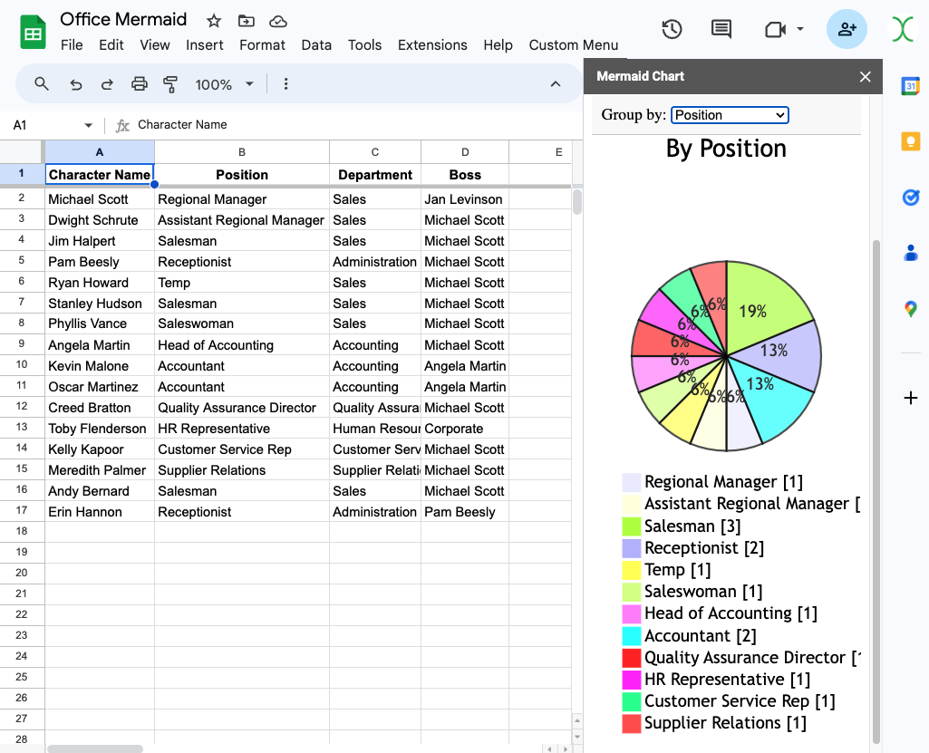
And that's it! You can now select any column to generate a Pie chart based on the repeating values in that column.
What's Next?
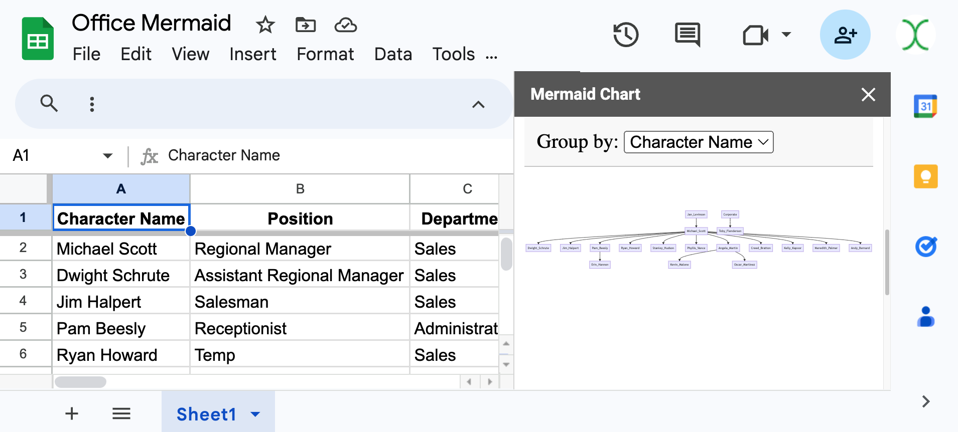
Now that the basics are working, you can replace the pieChart function with any other function to return other chart types.
Here's a function to generate an Organizational Flow Chart:
function orgFlowchart() {
  const ss = SpreadsheetApp.getActiveSpreadsheet();
  const sh = ss.getActiveSheet();
  const data = sh.getDataRange().getValues();
  const headers = data[0];
  const bossColIndex = headers.indexOf('Boss');
  const nameColIndex = headers.indexOf('Character Name');

  if (bossColIndex === -1 || nameColIndex === -1) {
    throw new Error("The sheet must have 'Boss' and 'Name' columns.");
  }

  const orgStructure = {};

  // Build the org structure from the data
  data.slice(1).forEach(row => {
    const boss = row[bossColIndex];
    const employee = row[nameColIndex];

    if (!orgStructure[boss]) {
      orgStructure[boss] = [];
    }
    orgStructure[boss].push(employee);
  });

  // Build the Mermaid syntax for the flowchart
  let mermaidSyntax = 'graph TD\n';

  Object.keys(orgStructure).forEach(boss => {
    orgStructure[boss].forEach(employee => {
      mermaidSyntax += `  ${sanitizeName(boss)} --> ${sanitizeName(employee)}\n`;
    });
  });

  Logger.log(mermaidSyntax); // Log the generated Mermaid syntax
  return mermaidSyntax;
}

// Helper function to sanitize names for Mermaid syntax
function sanitizeName(name) {
  if (!name) {
    return 'undefined';
  }
  return name.replace(/\s+/g, '_').replace(/[^a-zA-Z0-9_]/g, '');
}
Just swap out the .withSuccessHandler functions to pass this functions return value to the renderMermaidChart function, and you'll get a completely different chart type.
About Me
Hi, I'm Joseph, founder at GreenFlux, LLC and a senior developer advocate at Appsmith. I enjoy pushing the limits of low-code, and I'm always up for a new challenge. If you have an idea for an Apps Script tutorial, feel free to drop a comment below and I'll see what I can do!
Subscribe to my newsletter
Read articles from GreenFlux directly inside your inbox. Subscribe to the newsletter, and don't miss out.
Written by

GreenFlux
GreenFlux
NO LONGER ON HASHNODE: Follow at: https://news.greenflux.us/ Nuclear Plant Operator (US Navy), Turned Freelancer, Turned Developer Advocate. Head of Developer Relations @ Appsmith, Inc Founder/ Freelancer @ GreenFlux, LLC GREENFLUX, LLC WE'VE GOT YOUR APP COVERED. Veteran Owned & Operated Since 2016 - Tallahassee, FL