The Journey of Creating a Farmland Listing Website
 Karthik Deshmukh
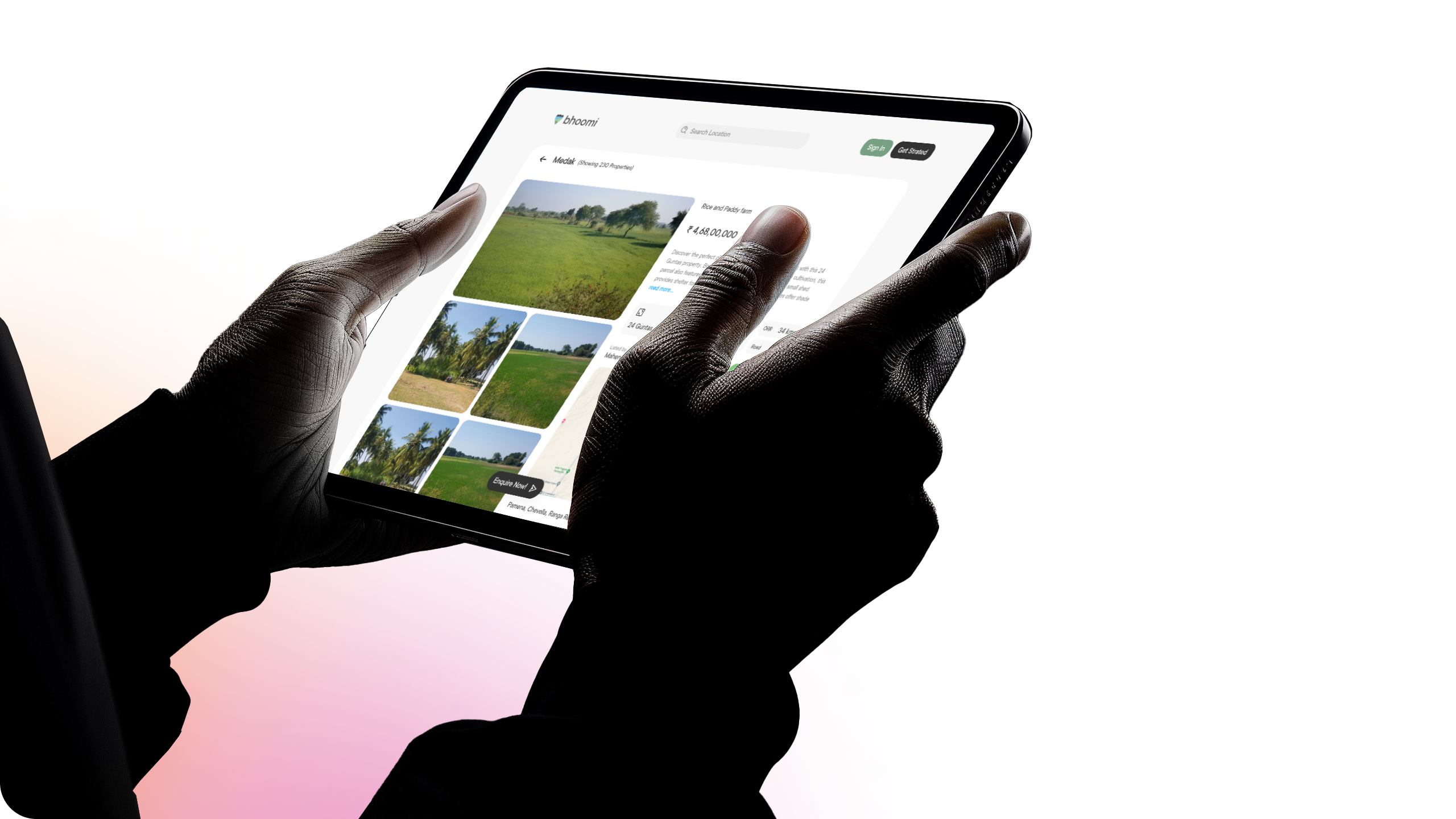
Bhoomi, a platform for farmland listings in Telangana, was the brainchild of Nani Goud. The idea was simple: connect landowners with potential buyers, kind of like Airbnb but with more tractors and fewer throw pillows.
From Concept to Creation: The Logo
Before diving into the website, I started with the logo design. Nani wanted something that captured the essence of Bhoomi—land, growth, and opportunity. After three iterations, I could nail it! The final logo was versatile enough to be used across various platforms: as an app icon, on the website, and for print materials. I even threw in dark mode versions, because let’s face it, who doesn’t love a good night mode?

Building the Website: Not Your Average Field of Dreams
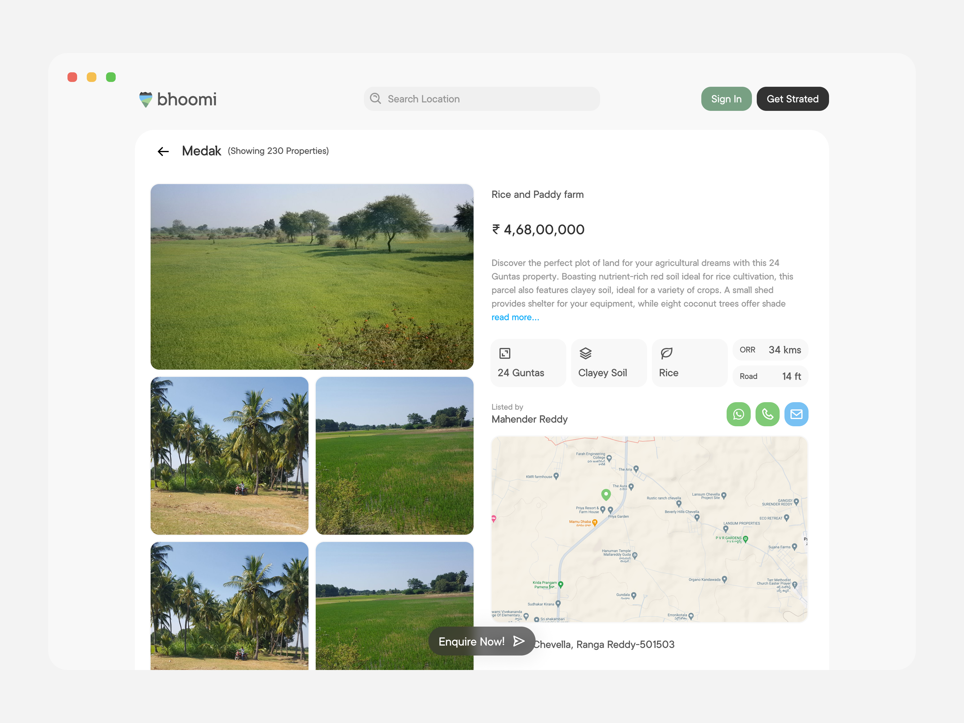
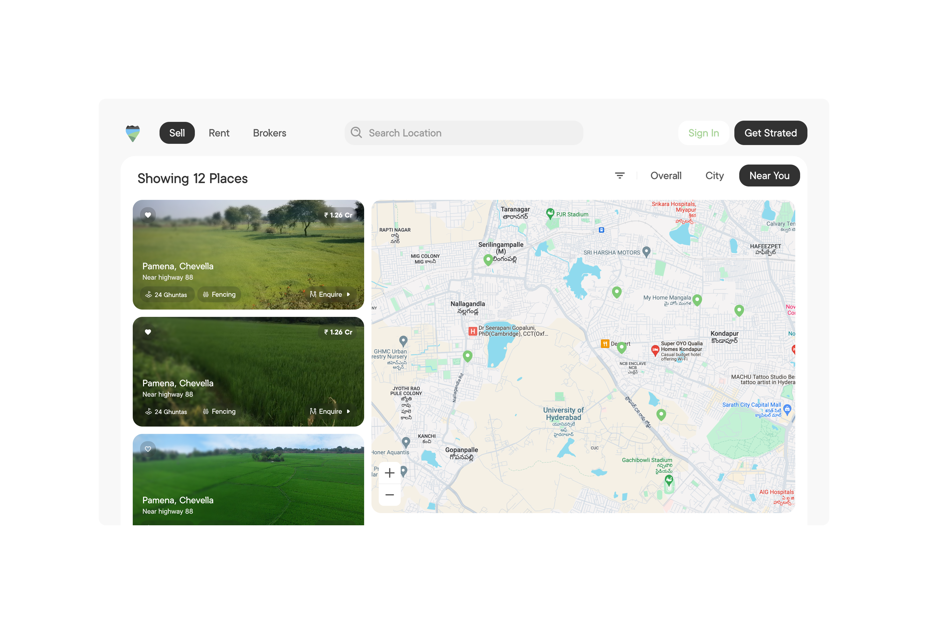
The next step was building the Bhoomi website. The goal was to make it as user-friendly as possible, while still packing in all the essential information. Think soil types, plantation details, and how close your potential piece of paradise is to the nearest highway. All this, wrapped up with a map integration that would make even Google Maps jealous.
One of the coolest features we added was the ability to contact sellers directly through WhatsApp or phone. No need to send an email and wait for a response—just a quick tap, and you’re one step closer to owning your own slice of Telangana’s rich farmland.
Making a Strong First Impression
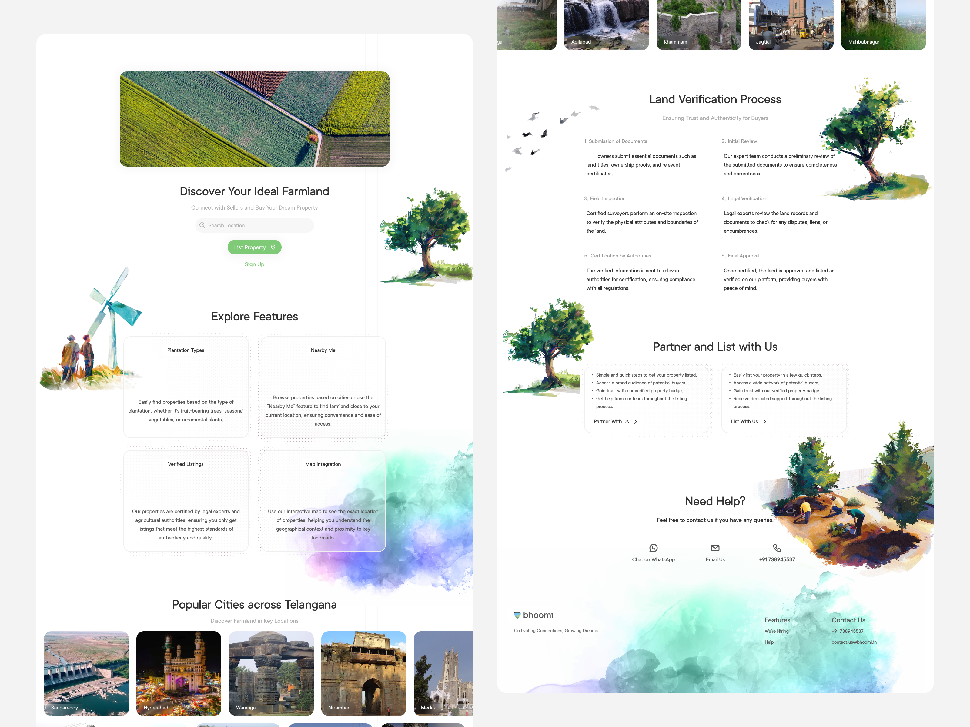
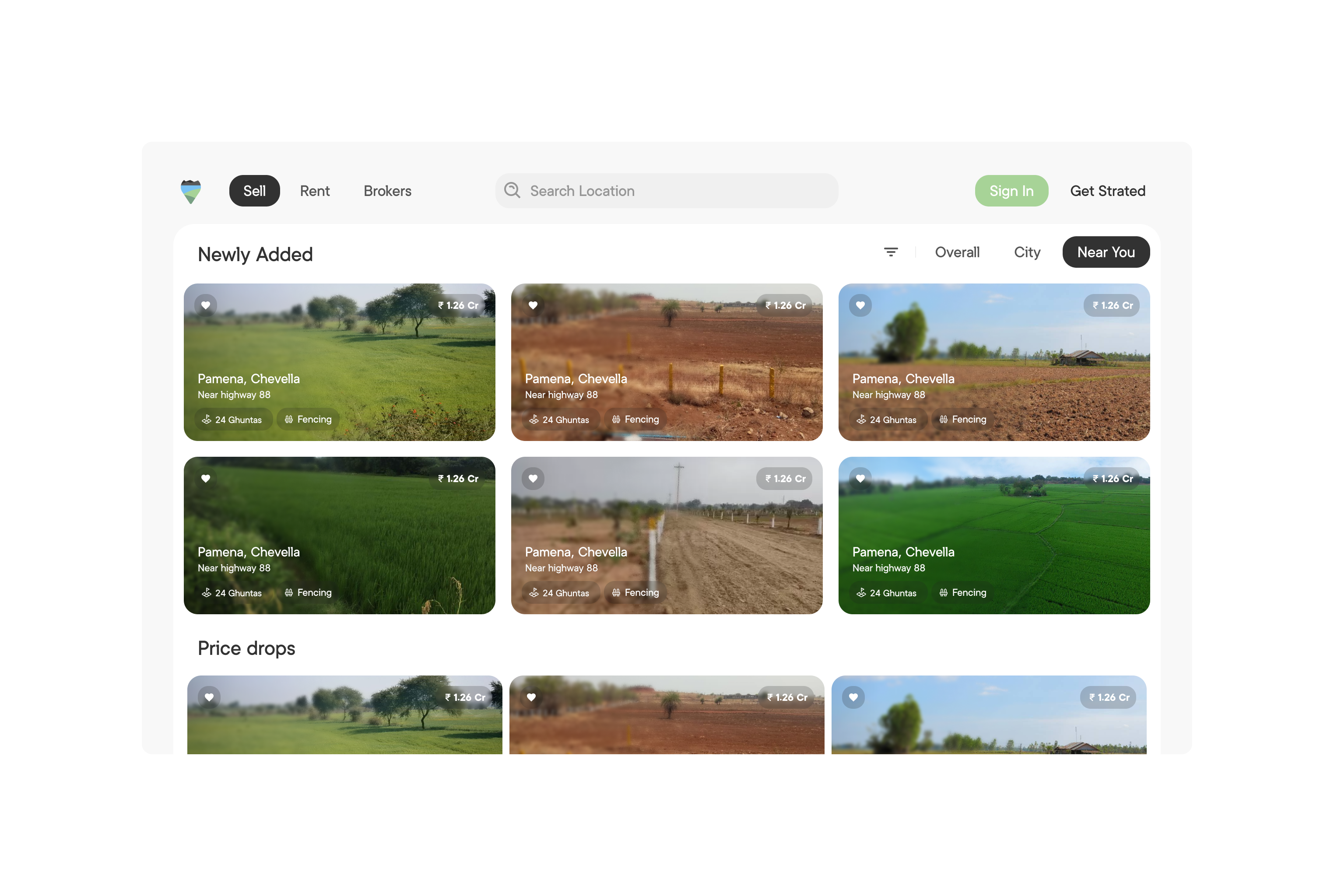
The landing page needed to make an immediate impact—after all, first impressions count, even in the world of farmland. We designed it to be welcoming and informative, with a clean layout that guides visitors effortlessly through Bhoomi’s offerings. The page prominently features a search function, making it easy for users to start exploring available properties right away. With eye-catching visuals and concise information, it’s designed to engage users and encourage them to dig deeper into the platform.
Keeping Users Engaged
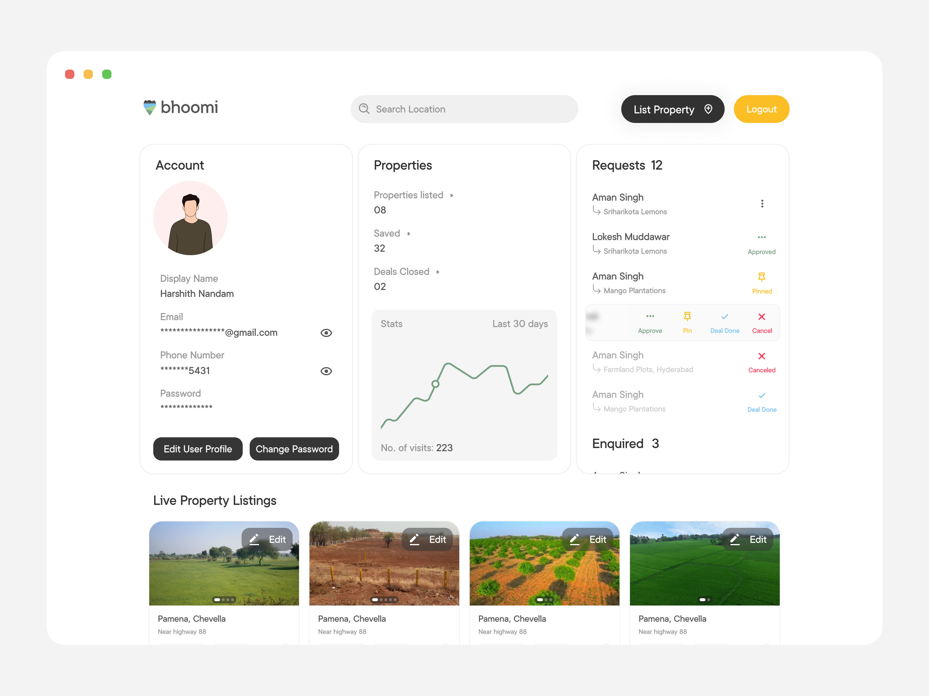
The feed is where the magic happens. It’s the heart of Bhoomi’s platform, showcasing available farmland listings with all the juicy details. From soil type and plantation specifics to highway proximity, users can get a comprehensive view of each property. We integrated interactive maps for a visual twist, helping users pinpoint exactly where their future farmland could be. The feed is designed to be as user-friendly as it is informative, ensuring that finding and exploring properties is a breeze.
Research & Development: Planting the Seeds for Future Growth
Our research revealed that Bhoomi had more potential than just a website. We identified opportunities for app development to enhance accessibility and engagement. We also explored revenue-generating features to ensure the platform’s sustainability. The goal was to make Bhoomi not just a website, but a thriving digital ecosystem for farmland listings.
A Bountiful Result
By the end of the project, Bhoomi was more than just a website—it was a comprehensive platform ready to grow and evolve. Nani (our client) was thrilled with the outcome, and I gained a deeper appreciation for the intersection of agriculture and technology.
Curious about the results? Check out the mockups, videos, and designs above to see how everything came together. And don’t forget to browse my other projects on Dribbble and my portfolio. Who knows? You might just find the inspiration you need for your next big idea—whether it’s for a logo, a website, or your own digital farmland!
I promise it’s worth a click—no muddy boots required!
Subscribe to my newsletter
Read articles from Karthik Deshmukh directly inside your inbox. Subscribe to the newsletter, and don't miss out.
Written by

Karthik Deshmukh
Karthik Deshmukh
Well, let me paint you a picture. I’m a mechanical engineer by academics who decided to swap wrenches for pixels.