Streamlining User Experience: A Pop-Up Design Makeover
 Karthik Deshmukh
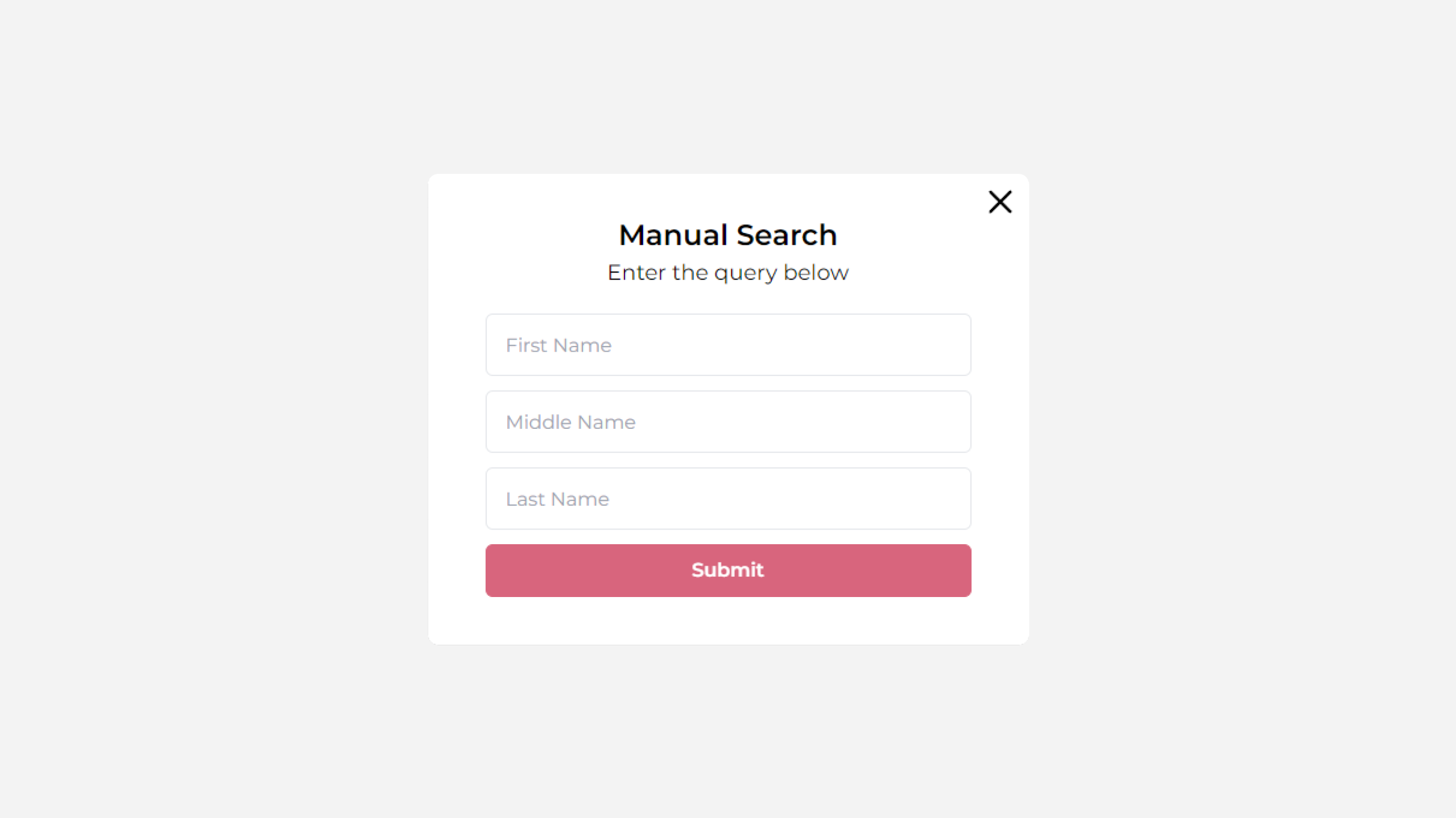
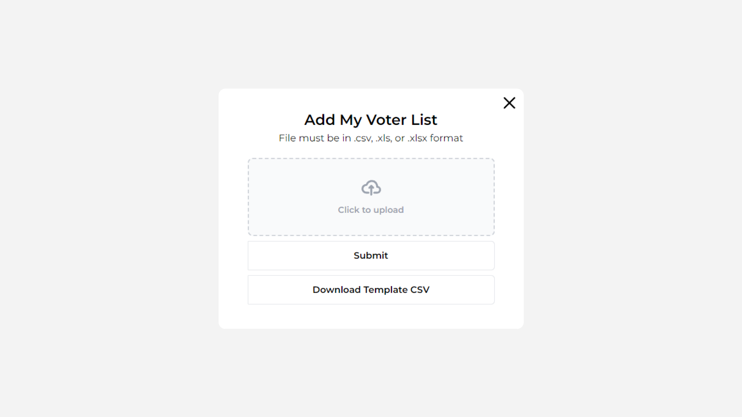
Recently, a developer friend of mine reached out with a classic problem: his website had two separate pop-ups that just weren't cutting it. One pop-up required users to manually enter their first, middle, and last names, offering a list of names in return. The second pop-up allowed users to upload a file (.csv, .xls, etc.) and search the database for matching names. While both pop-ups got the job done, the overall user experience felt clunky and disjointed.
Two Pop-Ups, Two Problems
Let’s be honest—having two separate pop-ups isn’t exactly the most elegant solution. Users had to switch between them depending on what they wanted to do, which felt a bit like making them choose between apples and oranges when they really just wanted a fruit salad. The design also lacked clear instructions, making the whole process a bit more confusing than it needed to be.
Enter: the design makeover
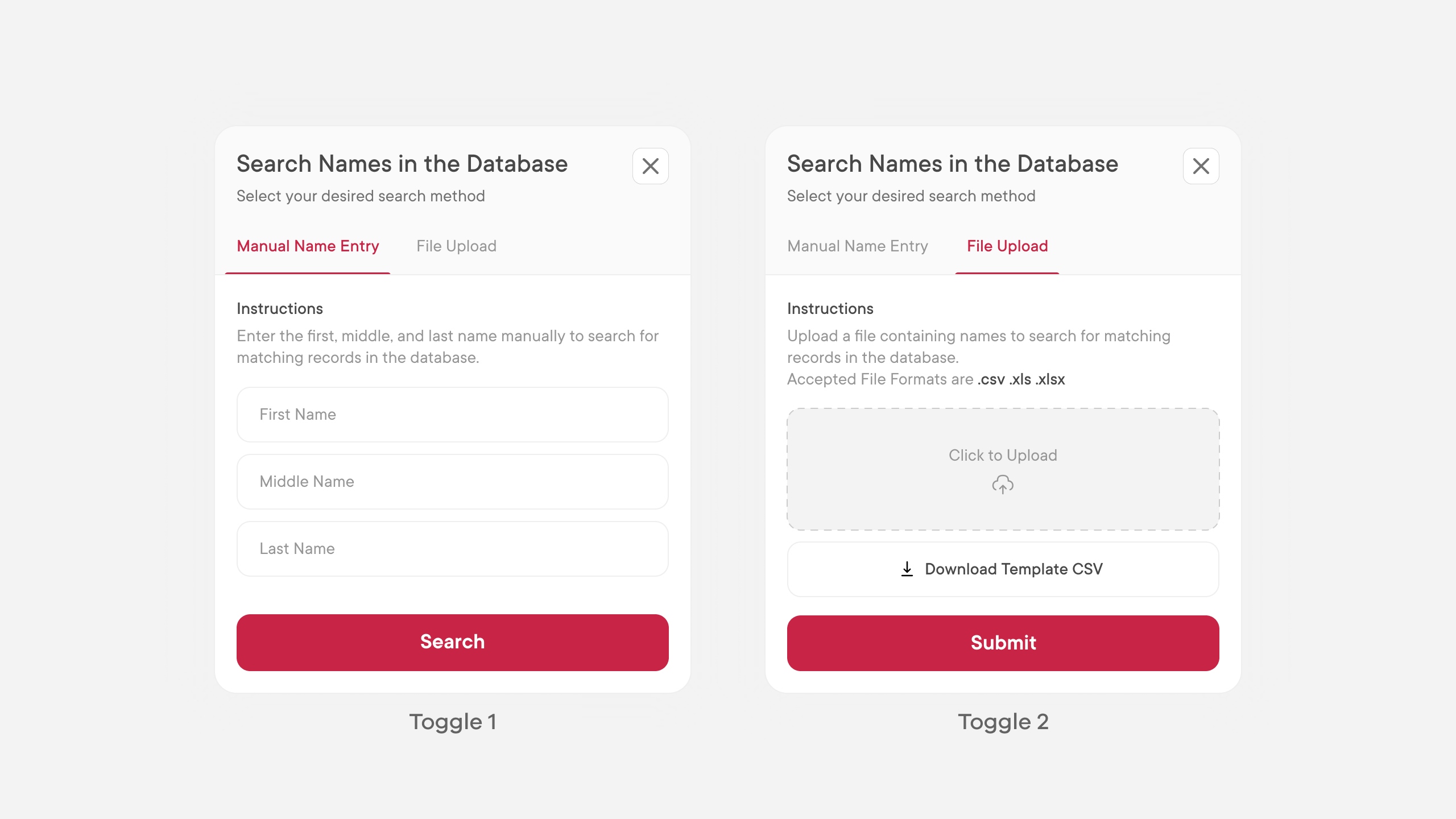
Instead of sticking with two separate pop-ups, I combined them into a single, streamlined pop-up with a simple toggle option. Users can now easily switch between entering names manually or uploading a file, all from the same interface. I also added clear instructions, titles, and subtitles to guide users through the process. The result? A much smoother, more intuitive user experience that feels cohesive and user-friendly.
See the Transformation
Below, you’ll find a side-by-side comparison of the original and redesigned pop-ups. The difference is clear: the new design not only looks better, but it also functions more efficiently, cutting down on user frustration and improving overall satisfaction.


The Takeaway
Sometimes, the best design solutions are the simplest ones. By merging two pop-ups into one and adding clear, helpful instructions, we were able to enhance the user experience in a big way. It’s a great reminder that a little design love can go a long way.
Curious to see more of my work? Check out my portfolio and Dribbble page for more design transformations like this one. Who knows, your next project might just be one pop-up away from perfection!
I promise it’s worth a click—no muddy boots required!
Subscribe to my newsletter
Read articles from Karthik Deshmukh directly inside your inbox. Subscribe to the newsletter, and don't miss out.
Written by

Karthik Deshmukh
Karthik Deshmukh
Well, let me paint you a picture. I’m a mechanical engineer by academics who decided to swap wrenches for pixels.