How Wireframing Boosts Product Design and Development Efficiency
 Suresh Sapkota
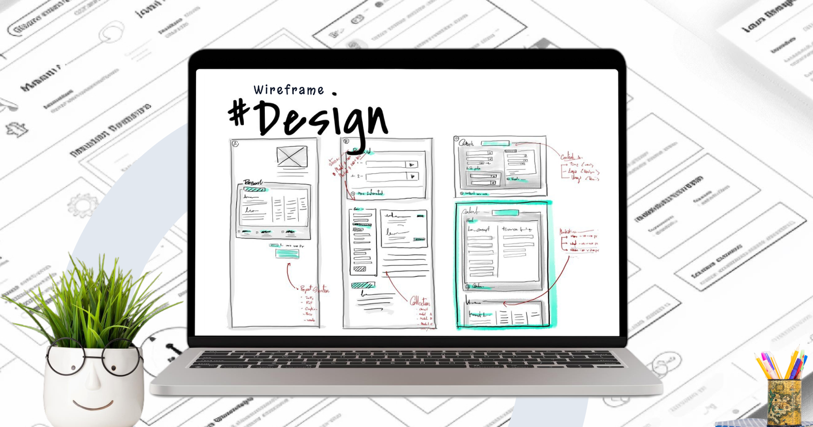
Wireframe represent a skeleton structure or an initial concept of any future website, system, app or any other digital product. It focuses mainly on crucial aspects like page structure, layout, information architecture, user flow, functionality, and intended behaviors and other active parts neglecting details related to color, typography or graphics.
Typically used during initial periods of development; these blueprints are a way for designing teams, software engineers and economic stakeholders to interactively reach agreement concerning user interface (UI) design before advancing to finer design stages.
Types of wireframe
Wireframes vary in detail and complexity, and they are classified into three varieties based on fidelity: low-fidelity, mid-fidelity, and high-fidelity. Each kind has a different function in the design process.
1. Low-Fidelity Wireframes:
Overview:
These are basic sketches that are often done by hand and which focus on the general structure and layout without much detail. They usually have one color and contain simple shapes like boxes or placeholders that represent the different components.

Purpose:
- Used in the initial phases of design to swiftly visualize and convey ideas.
- Suitable for brainstorming sessions, early conceptualization, and early-stage feedback.
Features:
- Minimal detail, often just outlines and basic shapes.
- No attention to scale, spacing, or specific design elements.
- Focuses on overall layout, placement of contents and navigation flow.
Tools:
Pen and paper, whiteboards or basic digital tools such as Balsamiq.
2. Mid-Fidelity Wireframes:
Overview
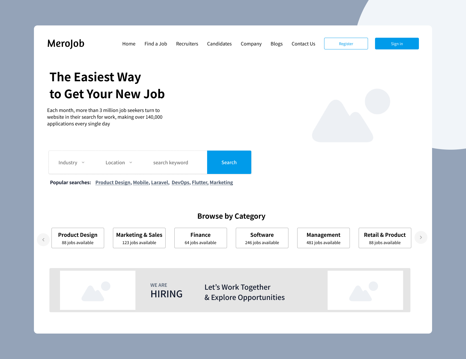
These wireframes provide more detail than low-fidelity wireframes. They often show more accurately how the layout will be, clearly labeling elements and more properly structured; therefore, they focus on their functionalities.
Purpose
- Helps in refining design concepts as well as get feedback that is more specific about structures and functionalities.
- Aids in identifying possible issues with the design before advancing to high-fidelity wireframes or prototypes.
Features
- They represent elements, headings, text blocks, buttons or forms in greater detail than low-fidelity wireframes.
- The aspect of spacing and alignment is given some attention.
May contain simple interactive components like dropdown lists, sliders and navigation menus.
Tools
Digital tools like Sketch, Figma or Adobe XD are usually used for this purpose.
3. High-Fidelity Wireframes:
Overview:
These are wireframe designs which have high detailing and look alike to the final design in all aspects except for the full visual styling (colors, fonts, images). They contain specific content, comprehensive annotations and frequently simulate how interactions should flow.

Purpose:
- They are used during the later stages of design in order to finalize both structure and interaction before embarking on complete design as well as development.
- A blueprint for developers is what this serves as because it offers a clear guide for building this product.
Features:
- They have a minute plan with accurate spacing, alignment and proportions.
- They have in-depth explanations about functionalities, interactions and how elements behave.
- There might be some basic forms of styling included like grayscale variants of the ultimate design.
Tools:
Advanced design tools such as Figma Sketch Adobe XD or Axure.
Benefits of Wireframe
Wireframes act as a blueprint for your digital product, outlining the primary structure and functionality ideas and placements prior to thorough design and development. This promotes seamless collaboration and improved communication because all product stakeholders, designers, and developers have a clear grasp of the project's direction. Below are the key benefits of wireframe:
1. Clarifies Project Requirements:
- Early Visualization
The wireframes show clearly the general structure of the project, enabling stakeholders to see how the final product will look and function. Especially when you are trying out ideas and seeking someone’s opinion early on, it comes in handy.
- Scope Definition
In defining the project scope, they outline the pages, features and elements that are required, hence preventing scope creep.
2.Facilitates Collaboration:
- Communication Tool
Wireframes serve as a means of communication among designers, developers, and clients. They help to verify that everyone is on the same page about design and functionality before more comprehensive design work begins.
- Feedback Gathering
Wireframes make it easy to gather early feedbacks and make modifications before investing considerable time and resources. Since, they are more focused on structure and information
3. Save Time & Resources
- Efficient Iteration
A wireframe can be adjusted much more easily and quickly than a high-fidelity design or final product. Early iterations enable for the refinement of the user experience (UX) without the expense of rewriting code or redesigning detailed parts.
- Prevents Misunderstandings
Wireframes help to avoid misconceptions by clearly displaying the intended functionality, layout, and flow, lowering the likelihood of significant adjustments later in the project.
4. Focuses on User Experience (UX):
- User-Centered Design
Wireframes urge designers to prioritize usability and user experience. They enable designers to consider how users will browse and interact with the interface, ensuring that the layout is both intuitive and efficient.
- Identifying Potential Issues
By visualizing the flow and structure early on, possible usability concerns can be detected and solved before going on to the more complex design and production stages.
5. Guides the Design Process:
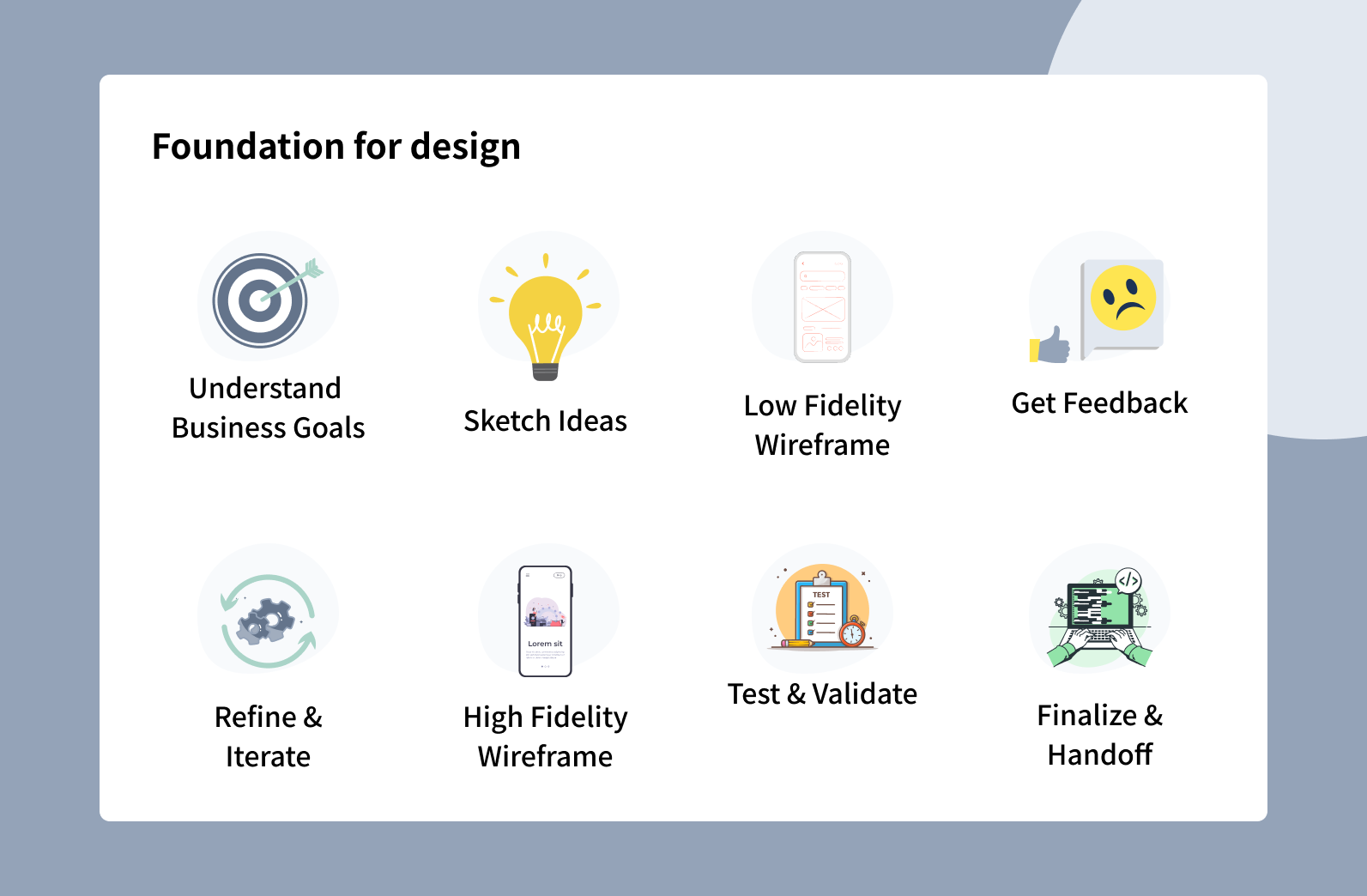
- Foundation for Design
Wireframes serve as a foundation for visual design. They specify where material, graphics, and functional aspects should be put, leading the design team to produce a unified, visually appealing end result.

- Content Prioritization
Through reducing interface to basics, wireframes give importance to content and functions as they make sure that most crucial aspects are exposed.
6. Enhances Development Efficiency:
- Blueprint for Development
Wireframes provide an outline for developers, which indicates the specific items that require construction. This minimizes the possibility of misunderstanding between parties involved and confirms that the development team comprehends what functions were expected from it.
- Early Testing
Early usability testing can be conducted using basic wireframes so that user feedback is obtained by teams before development starts which leads to more user-friendly final outputs.
Different Approach For Desktop/web & Mobile App Wireframes
When building wireframes for mobile and desktop apps, there are several best practices and methodologies to follow to guarantee that the wireframes are effective and meet the unique requirements of each platform.
📌 Screen Size & Orientation:
Mobile Apps
Humans use smaller mobile screens, most of them are vertically oriented. Thus, the layout designs must consider vertical scrolling and it should be made possible to get important data without doing too much of scrolling.
Desktop/Web Apps
Desktop wireframes can use more screen space, enabling for more sophisticated layouts with many columns and larger content sections.
📌 Interaction:
Mobile Apps
Because mobile devices rely on touch, wireframes should take into account touch targets, such as gestures like tap or pinch (swipe).
Desktop/Web Apps
Desktops use mouse and keyboard inputs, therefore wireframes can feature smaller clickable objects and more sophisticated interactions (hover states, right-click menus).
📌 Context & Usage:
Mobile Apps
Being that mobile users tend to move around, wireframes targeting this group should focus on providing instant access to important activities while making navigation easier. Consider where and how users will use mobile apps, such as on the go or in short bursts.
Desktop/Web Apps
Consider longer session and maybe more challenging activities while using desktop programs.
📌 Hierarchy of Information:
Mobile Apps
For mobile apps, this often means simplifying navigation and reducing content to essentials by ensuring clear and most critical content with quick access.
Desktop/Web Apps
For mobile apps, this often means simplifying navigation and reducing content to essentials.

Img src: imgflip.com, tsh.io
📌 Navigation & User Flow:
Mobile Apps
Consider mobile-specific navigation patterns, such as bottom navigation bars, hamburger menus, and tabs. Ensure that the navigation is easy and intuitive.
Desktop/Web Apps
Desktop wireframes should include more standard navigation features such as sidebars, top navigation bars, and dropdown menus. Desktop apps can also support more complicated navigational structures.
Summary
Wireframes are important tools in UX design because they serve as blueprints for the layout, structure, and functionality of digital products. They come in three levels of detail: low-fidelity for early idea exploration, mid-fidelity for fine-tuning structure and functionality, and high-fidelity for extensive design and development assistance.
Wireframes are used to explain project requirements, simplify collaboration, and improve user experience by mapping out content layout, navigation, and interactions. They are especially useful in the early stages of design, allowing for quick iterations and feedback before moving on to more complex phases.
🙏 Thanks for reading my post, you are welcome to comment & leave feedback 🙂🙂🙂
References
Subscribe to my newsletter
Read articles from Suresh Sapkota directly inside your inbox. Subscribe to the newsletter, and don't miss out.
Written by

Suresh Sapkota
Suresh Sapkota
Hi, I am a Nepal based product designer. Currently working in JoBins as a Designer. Having experience of working with enterprise clients around the world since 2021. Love to read books, writing blogs & travel in free time. 🇳🇵🙂🎨