Activity #7: Creating a Low-Fidelity Prototype of Your Personal Portfolio
 froilan
Introduction:
Low-fidelity prototypes aim to provide UI composition at a low level. This fidelity effectively abstracts away the other UI elements, giving a high-level overview of what UI elements are expected to see in the high-fidelity layout.
List a few advantages, like how it’s quick and easy to make and helps get feedback early:
Spin up ideas within a matter of time: This is beneficial in the early development where the low-fidelity prototype is being created. Iterative adjustment can be done quickly as UI elements are being abstracted away. This is also beneficial in a feedback-loop environment wherein every modification is subject to feedback, be it changes or removal of something.
Cost effective: Since the low fidelity requires fewer resources to create it also being considered a cost-effective option to spin up UI composition ideas. Juxtapose with the high-fidelity counterparts which requires effort to make as well. However, low-fidelity is only for initial brainstorming of UI ideas.
Focus on core functionality: Focusing on core functionality, effectively abstracting away some of the non-core functionality i.e, aestethics. This abstraction helps minimize distraction on the development of the low-fidelity UI. Effectively prioritizing underlying core logic.
Accessibility and User Testing: This stage of development will ensure that the UI is accessible for everyone. Providing early feedback in the User acceptance stage, wherein changes can be done quickly to the abstracted design.
Open feeback: By having open feedback to the early design of the UI they can easily integrate those propose feedback to the design.
Low-fidelity prototype of personal website:


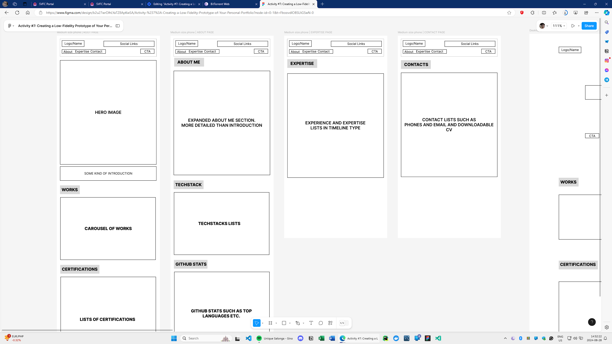
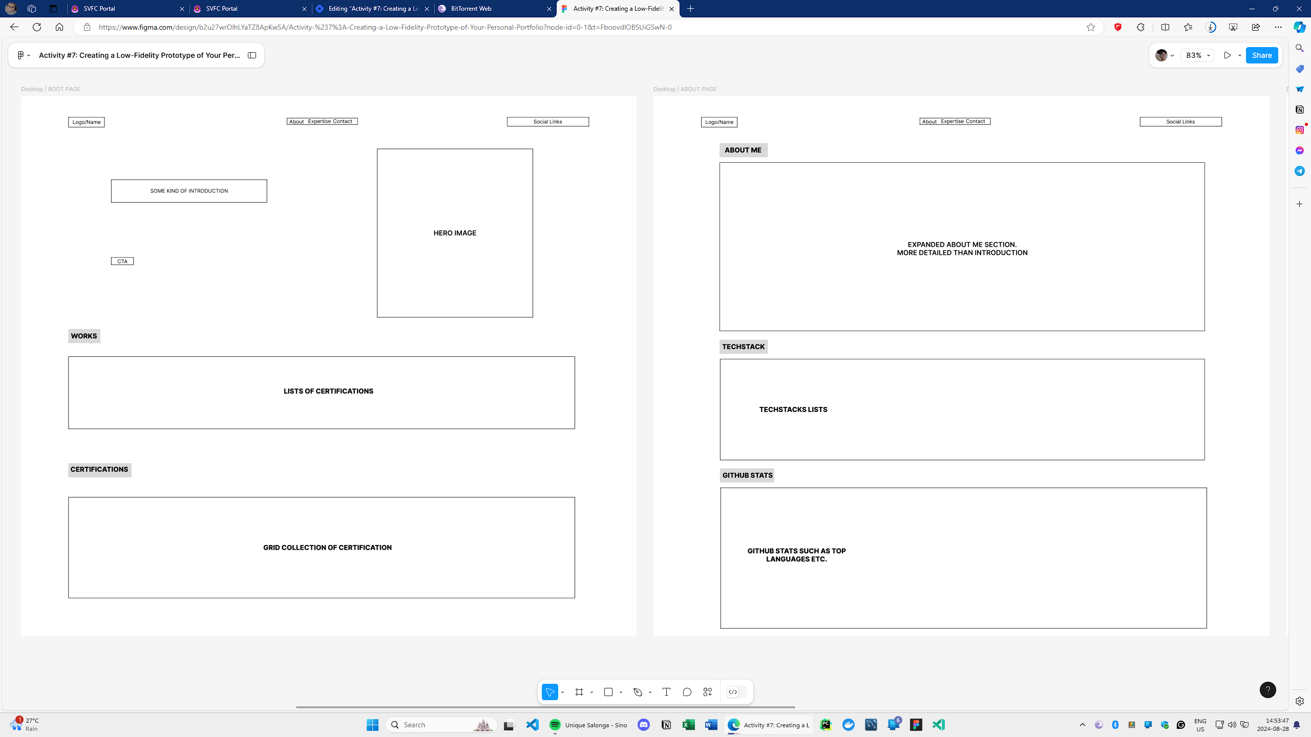
In this low-fidelity design, at first glance, we see two sizes of screen. As possible, I tried to make the website responsive. The mobile and the desktop layout are nearly identical the only difference is the layout of them. The mobile layout comprises of navigation bar on top, as well as social links, CTA, and logo. After the Navigation Bar, the Hero section is there which is where my picture will be placed as well as a short introduction. The succeding sections are Work and Certification which are self-explanatory.
The about me section has the same navbar on the mobile layout the only difference is the about me section which is longer than the introduction on the latter page. The techstack is there as well as the statistics of the GitHub account.
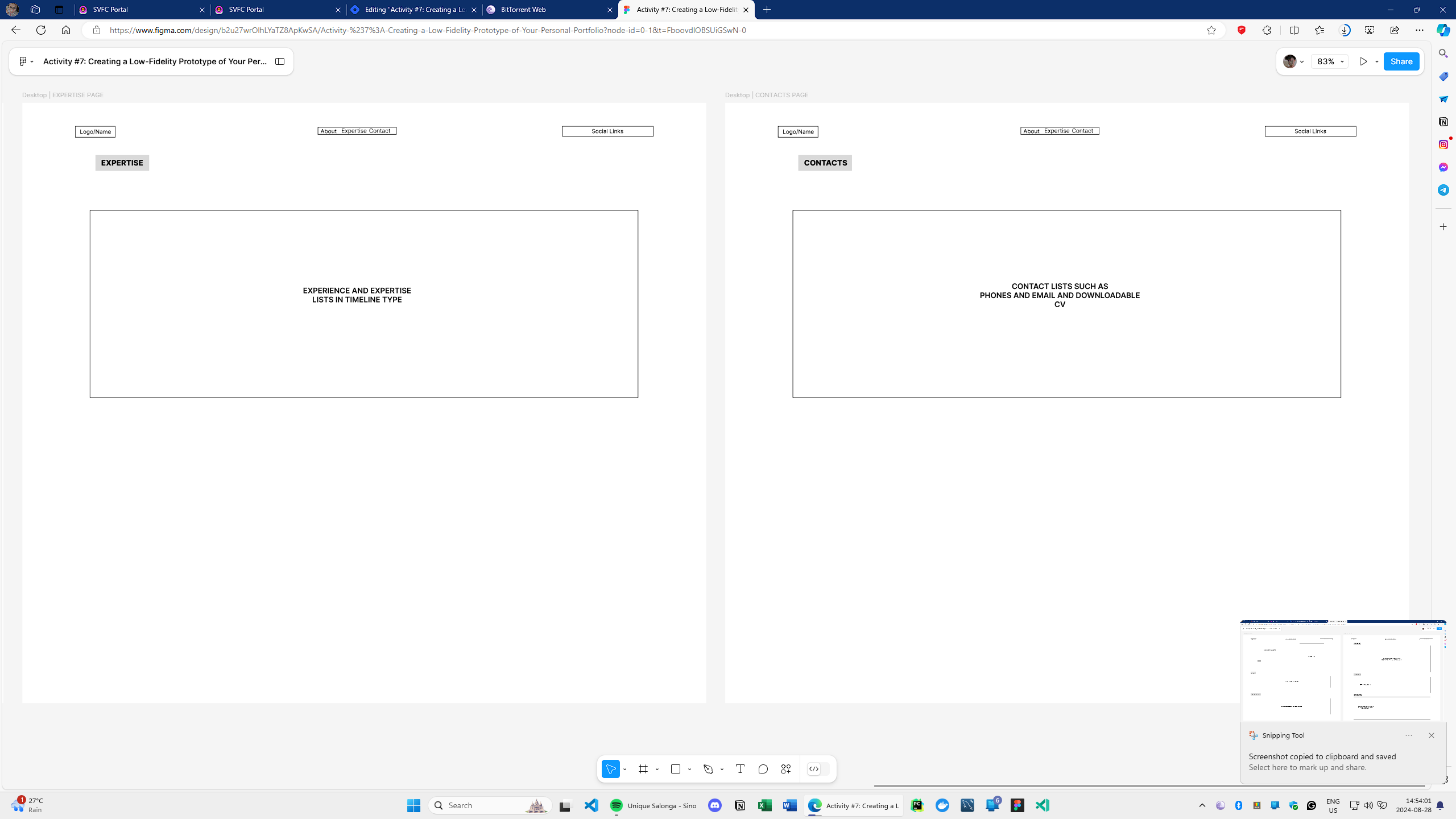
The expertise will be dedicated to the experience summary.
The contacts page is for the contact channel.
Figma Link:
Subscribe to my newsletter
Read articles from froilan directly inside your inbox. Subscribe to the newsletter, and don't miss out.
Written by
