DESIGनीति: The Designer's Way !
 Apexia
Apexia kicked off its journey into the world of design by hosting DESIGनीति on August 21, 2024.
The main agenda of the event was to introduce the audience to design principles, UI/UX, graphic design, and efficient design.
So, let’s dive into DESIGनीति —the designer’s way!
A Kalakaar’s POV to design:
Let’s start with a question: What comes to mind when you hear the word “design”? Design is a broad term. Everything around you, whether it’s your room, desktop setup, favourite place, or app, is designed.
Consider visiting your favourite café. What makes it your favourite? Maybe it’s the food or the service, but would you still like it if the place was bland with no thoughtful arrangements? Probably not, right?
Thus, this example highlights why design is so important—the ambience and aesthetics play a crucial role!
Since design is such a broad term, we focused on Digital Design.
Digital Design
Thanks to the internet, designs can now be created digitally, making it one of the most popular fields today.
The three main aspects of digital design are:
Aesthetics
The appearance of anything— whether it’s a poster, an app interface, or a greeting card—is critical.
Thus, the three major factors to consider for a design's aesthetics are:
Colour
Typography
Composition
Function
No one likes complicated things. What makes you continue using an app? It’s the functionality. The most important thing users want is simplicity and efficiency.
Key factors to consider for the function of a design are:
Usability
Efficiency
Problem-solving capability
Experience
What makes you like or dislike something? It’s your experience with it.
Always design from the audience's perspective to ensure their experience is memorable, not frustrating.
Key factors for user experience are:
Intuitive design
Memorable experience
Delightfulness
This was all about the fundamentals of design. Now, let us dive into the principles of design.
Principles of Design
Let’s say you want wooden furniture—a chair, a sofa, or anything similar. Regardless of the type, the first step is to obtain the wood and have it cut, carved, and polished.
The same goes for design; certain principles remain constant no matter what you’re designing.
Some of the major principles of design are:
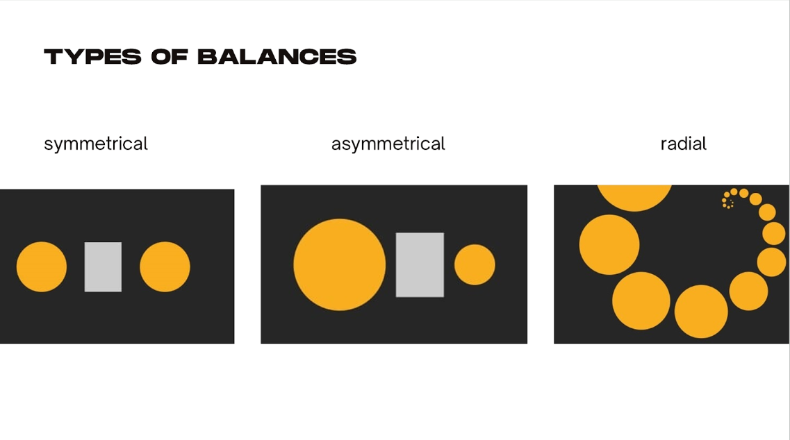
Balance
Balance is the distribution of visual weight, creating a sense of equilibrium in the design.
As the saying goes,
“Balance isn’t something you find; it’s something you create” (just like in life 😶).
Contrast
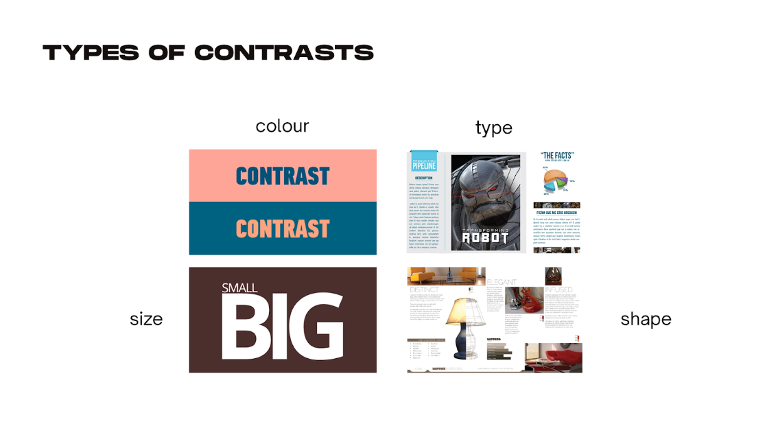
Contrast is the difference between design elements, like light and dark, thick and thin, or colour and neutral.
Imagine reading this blog with both the background and text in the same colour—you wouldn’t be able to.
Contrast helps capture attention, highlight important information, and add drama to the design.
Emphasis
Emphasis is the focal point in a design, directing the viewer’s attention and highlighting key information.
Designers frequently emphasize calls to action (CTAs) on landing pages, such as sign-up or subscribe buttons, to draw the user's attention first.
It helps to reduce distractions and allows the user to focus on what is most important.
Hierarchy
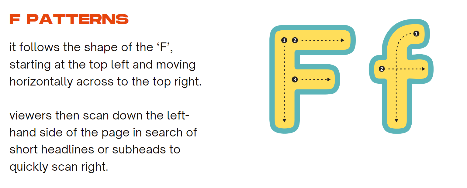
Hierarchy is the organization and prioritization of information, establishing a clear visual flow for the viewer to follow.
For example, most people read from top to bottom and left to right, which is why footers are placed at the bottom of landing pages—they provide additional information and reinforce calls to action without interfering with the main content.

Graphic Design
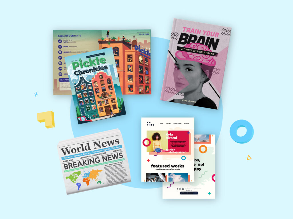
Graphic design is the art of effectively communicating information or a message using visual elements like typography, images, colours, and shapes.
In essence, if you’re creating visual content, you’re practising some form of graphic design. Ever created a digital birthday card, invitation letter, or college poster using tools like Canva or Adobe? If so, you’ve already dipped your toes into the world of graphic design!
What about Jobs?
If you’re a graphic designer, there are numerous sectors where you can work!
Some of the most popular fields include marketing and advertising, textile and surface design, posters and infographics, editorial or publication design, motion design, and user interface design.
But wait, There's More to Design!
Graphic design is just the beginning!
Ever wondered what makes your favourite apps so easy to use or why certain websites just feel so cool to use? That’s where UI/UX design comes into play. So, let us dive into the world of user interfaces and experiences and see how design influences how we interact with digital products.
UI/UX Design
UI, or User Interface, refers to the design or look of screens, pages, and visual elements that enable users to engage with a digital product.
Whereas, user experience, or UX, refers to a user's overall experience with the product or website.
There’s no need to get confused between the two—UI is a specialised subset of UX.
UI includes the screens, buttons, toggles, icons, and other visual elements that you interact with while using a website, app, or other electronic device.
UX encompasses your overall interaction with the product or website, including how you feel about it.
Example: When you open WhatsApp, all your chats are displayed first.

The design ensures that the most important part of the app—your chats—is immediately accessible without needing to click anything extra.
This simple and efficient layout is an example of UI design, while your overall satisfaction and ease of use reflect UX.
Design System
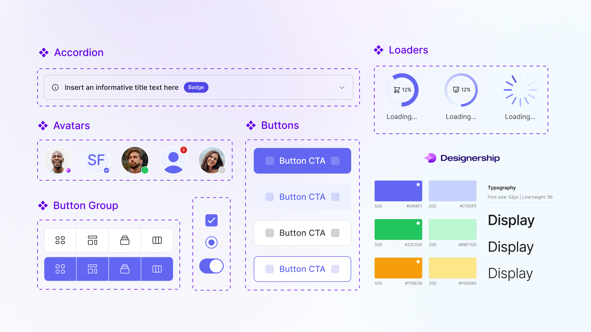
A design system is a complete set of standards intended to manage design at scale using reusable components and patterns.
It is like a toolbox having a collection of reusable components, guidelines, and standards that help ensure everything looks and works the same way across a website or app.
Imagine you’re building a house. You wouldn’t want each room to have completely different materials and styles—it would feel disjointed. Instead, you’d choose matching tiles, paint, and fixtures to create a unified look.
Similarly, in a design system, if you’re designing buttons, text styles, or colour schemes, you create them once and use them everywhere.
For instance, if a button on the homepage is blue and rounded, buttons across the entire site will follow the same design.
So, a design system helps keep everything uniform and consistent, saving time and improving the user experience.
Design that sticks to your memory
Apple.
What comes to mind when you hear this name?
Music.
Now, what comes to mind?
If even 10% of you thought about the Apple logo when I mentioned "Apple" and Spotify when I mentioned "music," then you've experienced a perfect example of memorable design.
Memorable design goes beyond just aesthetics—it creates a strong association in your mind. Apple’s sleek design and iconic logo are so powerful that they instantly bring the brand to mind. Similarly, Spotify’s design and user experience are so well-crafted that when you think of music, you might automatically think of Spotify.
This is what makes a design truly effective: it leaves a lasting impression, making it easy to recall and associate with a particular brand or product.
Design that delivers
"Design that delivers" is an approach to creating solutions that not only look good but also meet the end-user's needs and achieve the desired results.
Have you ever wondered why people worldwide are obsessed with iPhones and Apple products? It's because of their sleek, minimalist UI, their functionality, and how effectively they achieve their intended results.
This approach prioritises functionality, usability, and impact over aesthetics alone.
Example: Compare the camera quality of an Oppo phone with an iPhone, and you'll see what we mean. (The rest you'll understand 😂)
Successful design goes beyond visual appeal; it drives user satisfaction, business growth, and positive change.
Example: Medium, Duolingo
Ps: (Instead of focusing on streaks on Snapchat, try building them on Duolingo and see the difference.)

See how easy any field becomes when explained the right way?
DESIGनीति just opened the door to the world of design for you. What Apexia provided was just an introduction—a starting point to ignite your creativity. We’ve taught you how to use the pedals; now it’s your time to cycle and explore the vast world of design!
As the saying goes,
“No one can stop your imagination and creativity except you.”
Subscribe to my newsletter
Read articles from Apexia directly inside your inbox. Subscribe to the newsletter, and don't miss out.
Written by
