How to add blurred background to your image with CSS?
 Peng
PengI am building notenote.cc, it's a Instagram style note taking app. I want to show photos that users pick from their device in a square frame. Something like this:

After some perplexity and Google, I have a solution.
First try: use css.glass directly
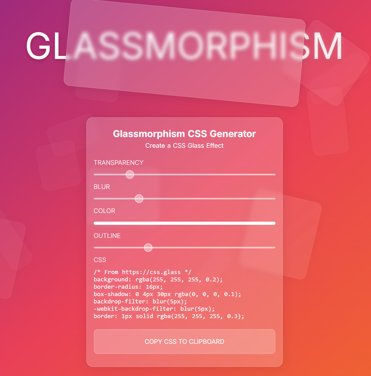
I found this website, it has very good blurred glass effect:

I dragged the sliders, and got this css:
.image-container {
  width: 600px;
  height: 600px;

  display: flex;
  justify-content: center;
  align-items: center;

  background: rgba(139, 137, 137, 0.52);
  box-shadow: 0 4px 30px rgba(0, 0, 0, 0.1);
  backdrop-filter: blur(20px);
  -webkit-backdrop-filter: blur(20px);
}

.image-container img {
  max-width: 100%;
  max-height: 100%;
  object-fit: contain;
}
Use it for an image and its wrapper:
<div class="image-container">
  <img src="image.webp" alt="Your image" />
</div>
But the background is just plain grey, no blur at all, the effect is not good:

Second try: add a background image behind the blur CSS
The blur effect looks nice at the css.glass website, because there is something (orange color and text) behind. So let's show the image behind the blur.
Now the html looks like this:
<div class="image-container">
  <div class="image-blur">
    <img src="image.webp" alt="Your image" />
  </div>
</div>
image-container will have the image as background, image-blur will have the blur effect, and img show the full image.
CSS:
.image-container {
  width: 600px;
  height: 600px;

  background-image: url('image.webp');
  background-size: cover;
}

.image-container .image-blur {
  width: 100%;
  height: 100%;

  display: flex;
  justify-content: center;
  align-items: center;

  background: rgba(139, 137, 137, 0.52);
  box-shadow: 0 4px 30px rgba(0, 0, 0, 0.1);
  backdrop-filter: blur(20px);
  -webkit-backdrop-filter: blur(20px);
}

.image-container img {
  max-width: 100%;
  max-height: 100%;
  object-fit: contain;
}
background-size: cover makes sure that the image covers the whole container, which means only part of the image is the background, but it's fine.
Now the effect is very nice:

Thanks for reading and give notenote.cc a try.
Subscribe to my newsletter
Read articles from Peng directly inside your inbox. Subscribe to the newsletter, and don't miss out.
Written by
