7 Essential Chart Features for Effective Reporting
 Bold Reports Team
Charts are essential tools for transforming data into insights. They simplify complex information, making it accessible and actionable. By converting raw data into easily comprehensible visual formats, charts pave the way to informed decision-making.
In this blog, we’ll explore some of the key features of Bold Reports charts that can help you maximize the usefulness of your data.
7 key features of Bold Reports charts
Bold Reports provides a robust charting component for creating a wide range of visually appealing and informative charts to represent your data effectively. Here are some of its key features:
1. Dynamic filtering
With dynamic filtering, you can examine data subsets by adding filters as needed. This feature makes it possible to analyze data more narrowly, letting you focus on the information that is most important to your query.

2. Customization options
Effective data visualization requires flexibility to adapt charts to specific analytical needs and datasets. Bold Reports offers nearly endless customization opportunities, including:
Chart types
The wide range of chart types in Bold Reports ensures you have the right visualization for any kind of data. Supported types include bar, line, pie, and polar. Each chart type can be tailored to precisely meet your data visualization requirements, ensuring that your charts are impactful and communicate the story within the data.
Use case: A financial analyst might use a column chart to compare quarterly revenue growth across different regions, while a project manager might use a bar chart to illustrate project timelines.

Color palettes
Color palettes align a chart’s appearance with your branding or make data distinctions more apparent. You can select from predefined color palettes or create your own to maintain consistency with your organization’s visual identity.
Use case: A marketing team could use color-coded pie charts to represent market share distribution, applying their company’s brand colors to make the report visually cohesive.

Data labels
Data labels enhance clarity and ensure that your charts effectively communicate the intended message. Adding and customizing data labels can help highlight key figures and provide additional context.
Use case: In a sales report, a line chart showing monthly sales trends might include data labels that specify exact sales figures for each data point, providing a clearer picture of performance fluctuations.

Tooltips
Tooltips provide detailed, context-sensitive information when users hover over data points. You can customize them to display additional metrics or explanations of the data.
Use case: Imagine you’re a meteorologist studying temperature variations. You’ve created a chart to compare the temperature trends in two countries throughout the year and two tooltips: one that provides the corresponding country’s name and another that provides the precise data values for the data series.

3. Trendlines
Trendlines in Bold Reports help you visualize long-term trends and patterns within your data. By adding a trendline to a chart, you can identify whether data points are moving upward, downward, or remaining stable over time.
Use case: Imagine you’re the financial analyst for a growing e-commerce company. You’re tasked with understanding the company’s revenue and profitability over the past year. After plotting the data in a chart, you apply a trendline to the data to assess the general direction of the company’s revenue.

4. Forecasting
The forecasting features in Bold Reports enable you to predict future values by analyzing historical data. This is useful for making data-driven projections about upcoming trends and planning accordingly.
Use case: A retail business can use its quarterly performance over previous years to forecast the next quarter’s sales. This helps in inventory planning, budget allocation, and setting sales targets.

5. Drillthrough actions
Drillthrough actions allow users to click on data points to access more detailed information. This feature is ideal for exploring hierarchical data.
Use case: Imagine a sales report where users can click on a product category to drill down into detailed sales data. This functionality allows users to analyze data at a granular level.
The following figures show a pie chart that breaks down sales by product category and a subreport that breaks down the Bikes category of the pie chart into its component data.


6. Interactive legends
Interactive legends let users click on legend items to highlight the corresponding data series in the chart. This feature makes it easy for users to focus on specific data without being overwhelmed with all the chart’s information at once.
Use case: In a multiseries line chart plotting sales and visitor data, users can click on legend items to isolate and view specific series relevant to their analysis.

7. Nested data regions
Nested data regions empower you to visualize hierarchical data, making complex data easier to understand and analyze.
Use case: A company can use nested data regions to display sales data organized by product category and subcategory. One data region can show sales for a product category, and another can show the sales for each subcategory within a product category.

How to create effective charts in Bold Reports

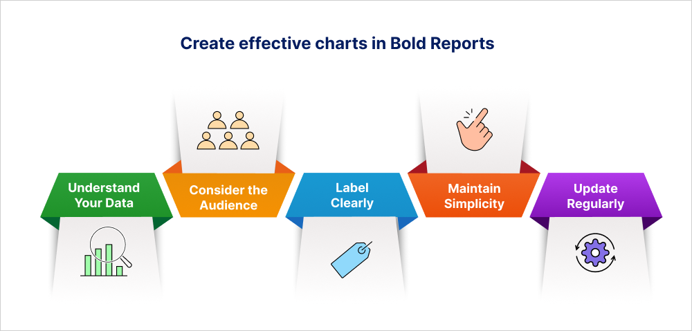
Creating effective charts in Bold Reports requires a little more than just selecting a chart type and binding data to it. To make your visualizations effective, follow these best practices to ensure they are clear, accurate, and engaging:
Understand your data: Before choosing a chart, analyze the nature of your data. Is it categorical, continuous, or time-based?
Consider the audience: Tailor your chart choice to your audience’s familiarity with different types of visualizations. How are they accustomed to seeing this type of data visualized?
Label clearly: Label axes, data points, and legends clearly and concisely so that viewers can easily understand what each element represents.
Maintain simplicity: Aim for simplicity in design. Avoid unnecessary enhancements and focus on the data.
Update regularly: If your data changes frequently, ensure your charts are updated accordingly.
Conclusion
Bold Reports charts offer a powerful suite of features that transform how you visualize and interpret data. From customizable settings to advanced interactive elements, these tools enable users to present their data in compelling and insightful ways. By leveraging Bold Reports charts, organizations can drive more informed decision-making, uncover hidden trends, and ultimately unlock the full potential of their data.
Subscribe to my newsletter
Read articles from Bold Reports Team directly inside your inbox. Subscribe to the newsletter, and don't miss out.
Written by
