Customer Segmentation Using Machine Learning
 Gayathri Selvaganapathi
Table of Contents
Introduction
Understanding the Dataset
Data Wrangling and Cleaning
Exploratory Data Analysis (EDA)
Unsupervised Learning Techniques
K-Means Clustering
Principal Component Analysis (PCA)
Autoencoders
6. Visualizing Customer Segments
7. Conclusion and Insights
8. References
1. Introduction
Customer segmentation is a crucial technique in marketing analytics, where customers are divided into groups based on similar characteristics or behaviors. Understanding these segments allows companies to tailor their marketing strategies, optimize product offerings, and improve customer engagement.
In this blog, we’ll take you step by step through a customer segmentation process using a real-world credit card dataset, implementing advanced machine learning techniques. We’ll apply unsupervised learning algorithms such as K-Means clustering, Principal Component Analysis (PCA), and Autoencoders to uncover hidden patterns in customer behavior.
By the end of this article, you’ll have a deeper understanding of customer segmentation and how machine learning can unlock valuable insights from your data.
2. Understanding the Dataset
The dataset used in this project consists of around 9,000 credit card customers, containing detailed information about their spending habits and payment behaviors. Key features include:
Balance: Total amount of credit card balance.
Cash Advance: Total amount of cash advances taken on the card.
Purchase Frequency: Frequency of purchases made by the customer.
Payment Behavior: Whether the customer pays off their balance in full or just the minimum payment.
Credit Limit: Maximum amount of credit extended to the customer.
Each row in the dataset corresponds to one customer, and the various features describe their interaction with their credit card. This rich set of features makes the dataset ideal for machine learning-driven segmentation.
import pandas as pd

# Load the dataset
data = pd.read_csv('Marketing_data.csv')

# Display the first few rows of the dataset
data.head()
The dataset includes various numerical and categorical variables, which need to be handled properly for our machine learning models to perform well.
3. Data Wrangling and Cleaning
Raw data often requires pre-processing before it’s suitable for analysis. In this step, we handle missing values, remove irrelevant columns, and standardize our features. Data wrangling ensures that our dataset is ready for accurate machine learning modeling.
Handling Missing Values: Any missing data can bias our model’s performance. In this case, we fill missing values using the mean of the corresponding column.
Feature Selection: We drop irrelevant columns such as customer IDs, which do not contribute to customer behavior.
Standardization: We standardize numerical features to have a mean of 0 and a standard deviation of 1 to ensure that the clustering algorithm treats all features equally.
Code Snippet: Data Cleaning
# Check for missing values
data.isnull().sum()

# Fill missing values with the mean of the column
data.fillna(data.mean(), inplace=True)

# Drop irrelevant features like Customer ID
data.drop(['CUST_ID'], axis=1, inplace=True)

# Standardize numerical features for K-Means
from sklearn.preprocessing import StandardScaler
scaler = StandardScaler()
data_scaled = scaler.fit_transform(data)
At the end of this step, we have a clean and standardized dataset, ready for the machine learning process.
4. Exploratory Data Analysis (EDA)
Exploratory Data Analysis (EDA) allows us to explore the data visually and identify patterns and relationships between different variables. This is a crucial step before applying any machine learning algorithms, as it helps us understand the data’s structure and identify potential challenges such as outliers or multicollinearity.
Visualizing Feature Distributions
We start by visualizing key features such as balance, purchase frequency, and credit limit to understand their distribution across the customer base.

import matplotlib.pyplot as plt
import seaborn as sns

# Visualize the distribution of balance across customers
plt.figure(figsize=(10, 6))
sns.histplot(data['Balance'], kde=True)
plt.title('Distribution of Customer Balances')
plt.show()

# Visualize the distribution of purchase frequency
plt.figure(figsize=(10, 6))
sns.histplot(data['Purchase_Frequency'], kde=True)
plt.title('Distribution of Purchase Frequency')
plt.show()
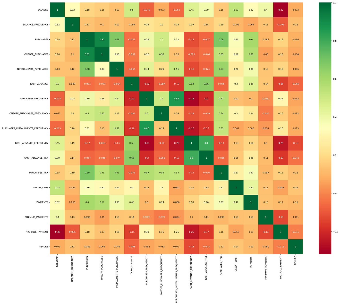
Correlation Matrix
Next, we generate a correlation matrix to examine the relationships between different features. Features that are highly correlated can indicate redundant information, which may need to be addressed through dimensionality reduction.

# Plotting the correlation matrix
plt.figure(figsize=(12, 8))
sns.heatmap(data.corr(), annot=True, cmap='coolwarm')
plt.title('Correlation Matrix')
plt.show()
EDA provides us with a good sense of the data’s structure and its relationships, setting the stage for more advanced machine learning techniques.
5. Unsupervised Learning Techniques
Unsupervised learning is a type of machine learning that deals with data that doesn’t have predefined labels. In customer segmentation, unsupervised learning is ideal because we don’t know beforehand how many segments exist or what defines each segment.
We’ll explore three unsupervised learning methods:
K-Means Clustering
Principal Component Analysis (PCA)
Autoencoders
K-Means Clustering
K-Means is a popular algorithm that partitions data into distinct clusters based on similarity. In this case, we want to group customers who have similar credit card usage patterns.
Determining the Optimal Number of Clusters
We use the Elbow Method to determine the optimal number of clusters. The idea is to plot the Sum of Squared Errors (SSE) for different numbers of clusters and identify the “elbow point” where the SSE starts to decrease at a slower rate.
from sklearn.cluster import KMeans
import numpy as np

# Finding the optimal number of clusters using the Elbow method
sse = []
for k in range(1, 11):
    kmeans = KMeans(n_clusters=k, random_state=42)
    kmeans.fit(data_scaled)
    sse.append(kmeans.inertia_)

# Plotting the Elbow curve
plt.figure(figsize=(10, 6))
plt.plot(range(1, 11), sse, marker='o')
plt.title('Elbow Method for Optimal Clusters')
plt.xlabel('Number of Clusters')
plt.ylabel('SSE')
plt.show()
Applying K-Means
After determining the optimal number of clusters (let’s assume 5 clusters in this case), we apply K-Means to group the customers.
# Applying K-Means with 5 clusters
kmeans = KMeans(n_clusters=5, random_state=42)
data['Cluster'] = kmeans.fit_predict(data_scaled)

# Visualize the number of customers in each cluster
data['Cluster'].value_counts()
Principal Component Analysis (PCA)
PCA is a powerful technique for dimensionality reduction. It transforms a large number of correlated features into a smaller set of uncorrelated components, making it easier to visualize and analyze the data.
Applying PCA for Dimensionality Reduction
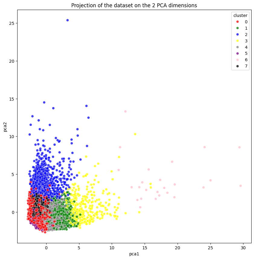
We apply PCA to reduce the dimensionality of the dataset while retaining as much variance as possible. This also makes it easier to visualize the clusters in a 2D or 3D space.
from sklearn.decomposition import PCA

# Applying PCA to reduce dimensions to 2 components
pca = PCA(n_components=2)
data_pca = pca.fit_transform(data_scaled)

# Visualizing the PCA result
plt.figure(figsize=(10, 6))
plt.scatter(data_pca[:, 0], data_pca[:, 1], c=data['Cluster'], cmap='viridis')
plt.title('PCA: Visualizing Customer Segments')
plt.xlabel('Principal Component 1')
plt.ylabel('Principal Component 2')
plt.show()
Autoencoders
Autoencoders are a type of neural network designed for unsupervised learning tasks, particularly for dimensionality reduction. Unlike PCA, which is a linear transformation, autoencoders can model complex, non-linear relationships in the data.
Building and Training the Autoencoder
We build a simple autoencoder to reduce the dataset’s dimensions and visualize the customer segments in a 2D space.
from keras.models import Model
from keras.layers import Input, Dense

# Define the Autoencoder model
input_dim = data_scaled.shape[1]
encoding_dim = 2

input_layer = Input(shape=(input_dim,))
encoded = Dense(encoding_dim, activation='relu')(input_layer)
decoded = Dense(input_dim, activation='sigmoid')(encoded)

autoencoder = Model(input_layer, decoded)
autoencoder.compile(optimizer='adam', loss='mse')

# Train the autoencoder
autoencoder.fit(data_scaled, data_scaled, epochs=50, batch_size=256, shuffle=True
Extracting and Visualizing Encoded Features
After training the autoencoder, we can extract the encoded features representing each customer in a reduced 2D space. This allows us to visualize the clusters created by the autoencoder.
# Extracting the encoder part of the autoencoder
encoder = Model(inputs=input_layer, outputs=encoded)
# Encoding the data to the reduced dimensions
data_encoded = encoder.predict(data_scaled)
# Visualizing the encoded results
plt.figure(figsize=(10, 6))
plt.scatter(data_encoded[:, 0], data_encoded[:, 1], c=data['Cluster'], cmap='viridis')
plt.title('Autoencoder: 2D Projection of Customer Segments')
plt.xlabel('Encoded Dimension 1')
plt.ylabel('Encoded Dimension 2')
plt.show()
This visualization allows us to see how the autoencoder has grouped similar customers together, potentially uncovering different patterns than the ones observed with PCA.
6. Visualizing Customer Segments
Visualization plays a critical role in interpreting the results of our clustering efforts. By visualizing customer segments in a reduced dimension space (such as 2D), we can better understand the characteristics of each cluster and how they differ from one another.

Comparing PCA and Autoencoder Clusters
Both PCA and Autoencoders reduce the dimensionality of our data, but they approach the problem differently. Comparing the clusters produced by these two techniques can provide insights into the underlying structure of the data.
# Visualizing the clusters using PCA
plt.figure(figsize=(10, 6))
plt.scatter(data_pca[:, 0], data_pca[:, 1], c=data['Cluster'], cmap='viridis')
plt.title('PCA: Visualizing Customer Clusters')
plt.xlabel('Principal Component 1')
plt.ylabel('Principal Component 2')
plt.show()

# Visualizing the clusters using Autoencoders
plt.figure(figsize=(10, 6))
plt.scatter(data_encoded[:, 0], data_encoded[:, 1], c=data['Cluster'], cmap='viridis')
plt.title('Autoencoder: Visualizing Customer Clusters')
plt.xlabel('Encoded Dimension 1')
plt.ylabel('Encoded Dimension 2')
plt.show()
Insights from Visualizations
By looking at these visualizations, we can derive the following insights:
Cluster Separation: How well-separated are the clusters? Better separation generally means more distinct customer groups.
Cluster Size: Are some clusters significantly larger than others? This could indicate a broad customer segment or an over-representation of certain behaviors.
Cluster Overlap: Overlapping clusters might suggest customers with mixed or transitional behaviors, where segmentation is less clear.
These visualizations can guide the interpretation and application of customer segmentation strategies.
7. Conclusion and Insights
The journey through customer segmentation using machine learning has revealed the power of unsupervised learning techniques in extracting meaningful patterns from complex datasets. Here’s a summary of what we’ve achieved:
Key Techniques Applied:
K-Means Clustering: Grouped customers into distinct segments based on similar behaviors.
Principal Component Analysis (PCA): Reduced the dataset’s dimensionality, facilitating visualization and analysis.
Autoencoders: Leveraged deep learning to uncover non-linear relationships in the data, providing a different perspective on customer segmentation.
Key Insights:
Revolvers: Customers with high balances and frequent cash advances, representing a lucrative segment for credit card companies.
Credit Purchasers: Customers who frequently purchase on credit and use installment payment facilities, possibly preferring deferred payments.
VIP/Prime: High credit limit customers who pay their balance in full, an attractive segment for upselling premium services.
Low Tenure Users: New customers with lower balances, which may represent an opportunity for targeted marketing to increase engagement.
Low Activity Users: Customers with minimal card usage, who may require incentivization to increase their activity.
Application in Business:
The insights derived from this analysis can be directly applied to create targeted marketing strategies. For instance:
Marketing Campaigns: Tailor campaigns to the specific needs of each segment, such as offering balance transfer promotions to Revolvers or loyalty programs to VIP customers.
Product Customization: Develop new financial products or services that cater specifically to the unique behaviors of each customer segment.
Customer Retention: Identify at-risk customers, such as Low Activity Users, and create personalized offers to increase their engagement.
8.References
Subscribe to my newsletter
Read articles from Gayathri Selvaganapathi directly inside your inbox. Subscribe to the newsletter, and don't miss out.
Written by

Gayathri Selvaganapathi
Gayathri Selvaganapathi
AI enthusiast ,working across the data spectrum. I blog about data science machine learning, and related topics. I'm passionate about building machine learning and computer vision technologies that have an impact on the "real world".