The Totally Not Sarcastic at All Guide to How to Design for the Web
 freeCodeCamp
By Casper Beyer
I’ve written about how to design for the modern web before, way back in 2018. But the web moves forward quickly so those guidelines are already obsolete and outdated, as more modern conventions have become mainstream.
Let's break down and go through the most important design principles of designing for the modern web in 2019.
Let Users Know You Have A Mobile Application
This one remains the most important principle and it’s not without reason. Well paid focus groups have shown that the very first thing a user wants to do when visiting your web site in their web browser is to install a mobile application.
The best way to achieve this is to show a modal dialog that prompts them to install it.
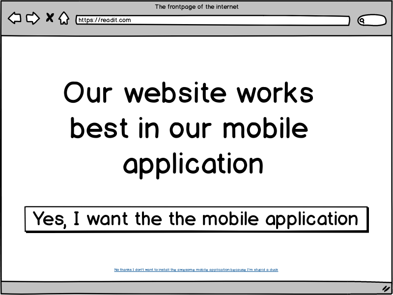
As an optional step, you may add a button or hyperlink to close said dialog. But it's important to use some cryptic text, preferably worded to shame the user to comply.
Tip: If you don’t have an actual mobile application, you can just get an intern to package your website in a webview with security disabled and ship that!
Implement a Do Not Track Policy
Many modern browsers these days support a HTTP header called DNT which stands for Do Not Track. This header is meant to signal that a user does not want to be tracked. Unfortunately this is enabled by default in some browsers like Brave (An open source ad-blocking browser made by the creator of JavaScript Brendan Eich).
However, don’t worry as all is not lost! We’ve found that most users will remove this header when prompted to do so so. In order to handle this, we recommend that you serve a guide on how to disable it when the header is present.
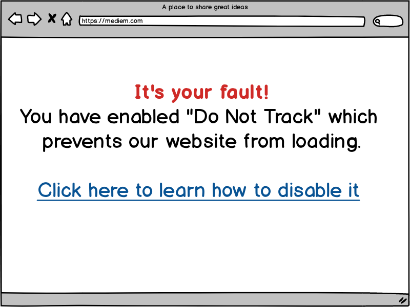
Tip: Don’t serve the prompt to disable DNT on the guide that shows the users how to disable it, as the conversion rate ends up being rather poor.
Implement a Cookie Policy
Cookie consent is confusing. While it's not required in most cases, with reasonable cookie use it’s better to prompt the user for consent so we can track everything without fear of repercussions.
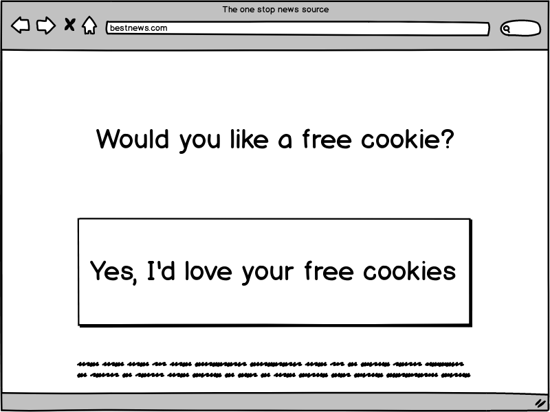
Tip: Don’t serve pages without cookies enabled even when we don’t need them. It means we can track less personal information, thus we have less user information to sell.
Blocking Ad-Blockers
Ad-blockers are everywhere and can really hurt your margins, so the obvious precaution to take is to block ad-blockers.
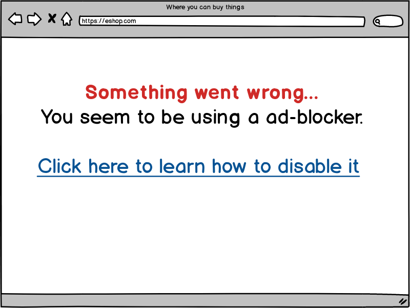
Chrome is moving to block ad-blockers, so if the user is using a browser like Brave we’ll be able to just claim the user’s browser isn’t modern enough.
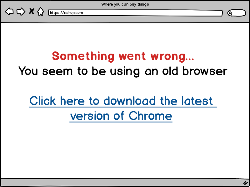
Tip: Don’t tell anyone about Brave, the open source Chromium based browser with built-in ad-blocking.
Blocking Non U.S Countries and Devices
Between Cupcake nations, GDPR, link taxes and the Huwaei ban which we haven’t been able to figure out at all, the best approach is just to block them all to avoid any and all liability.
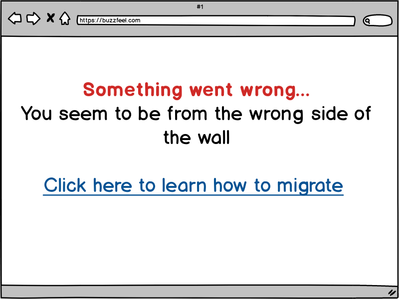
Tip: You can …
Maximizing Your Layout
The days of 800 pixels wide layouts are gone. Modern displays tend to be widescreen so make sure to take advantage of the entire width in the layout.
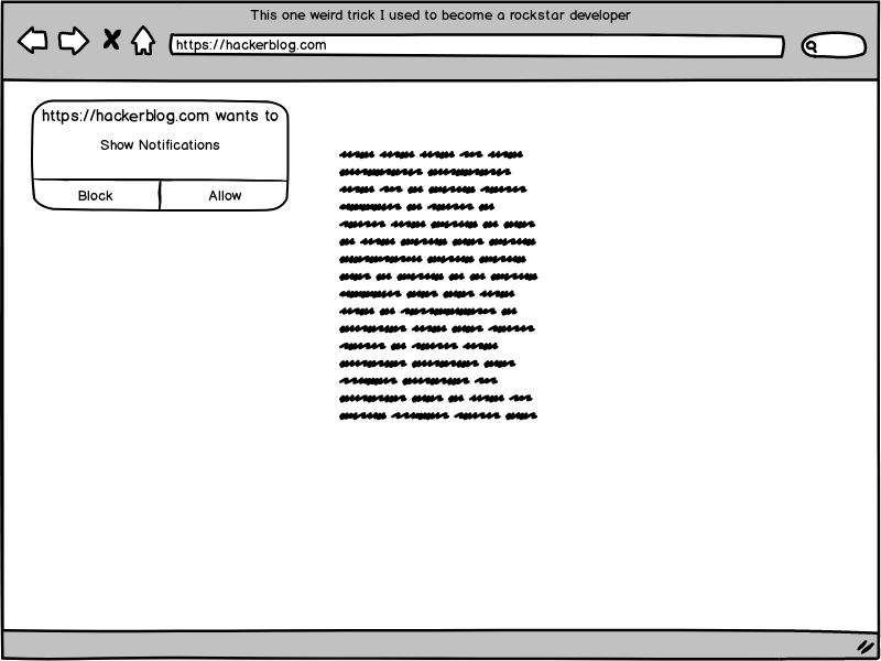
Tip: Research has shown that modal dialogs that cannot be closed perform better.
Use Notifications
Modern browsers support notifications so enabling them is a must. But as a fallback, also automatically subscribe the user to to a newsletter, sms notifications and/or email notifications.

Tip: Use these notifications to tell users when you have a new version of the mobile application available.
Prompt The User
Sometimes users forget they can sign up. Be sure to prompt them regularly and feature a prominent sign up link or button.
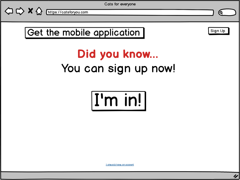
Tip: Also prompt the user when they’re about to leave the website or their mouse cursor leaves the website.
Allow The User To Opt-Out
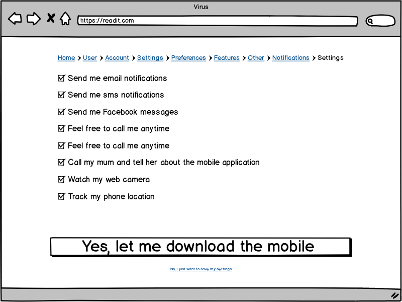
It’s very important that we are user friendly and aren’t intrusive. This means we have to let users opt out of our constant prompts and modal dialogs.
The best practice here is to put the opt-out settings in a place where the user will easily spot it — typically this is inside one of the “account preferences” pages.
Use JavaScript
It’s a known fact, all websites require JavaScript.
While you might think, “Oh it’s only plain text and a couple of modals.” But in the future? By then, it’ll be many many more modals, and I’ll promise you right now.
When that happens, you’ll regret not making your website an isomorphic application using the latest framework running on a serverless cloud.
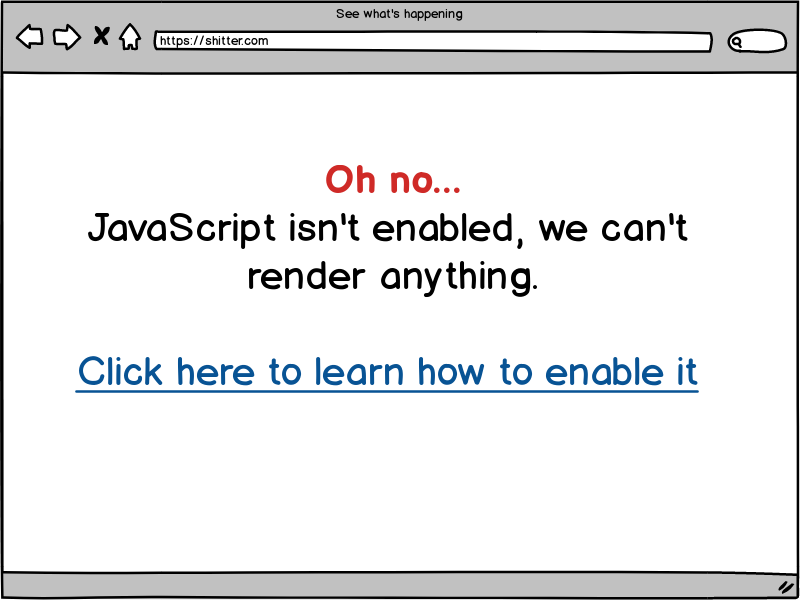
Tip: Don’t render this page with JavaScript.
Not a web developer yet? Don’t worry about it - you're already qualified from reading this post.
Already a web developer? buy the C programming language book here and get out while you still can!
Subscribe to my newsletter
Read articles from freeCodeCamp directly inside your inbox. Subscribe to the newsletter, and don't miss out.
Written by

freeCodeCamp
freeCodeCamp
Learn to code. Build projects. Earn certifications—All for free.