A Visual Reference For D3
 freeCodeCamp
By Zaid Humayun
I’ve been using D3 quite a bit recently to build an analytics dashboard. The main reason I went with D3 was because I got tired of dealing with the limitations of the various charting libraries and trying to understand their documentation.
I found myself in a situation where I was spending more time trying to figure out whether the library I was using could do what I wanted rather than actually trying to figure out how to do what I wanted.
With D3, there is almost never a case of whether you can do something. It’s always about how you can do something.
Granted, getting to grips with D3’s API is a mammoth challenge but it’s worth the hassle.
In this article, I’m going to try to give you a visual representation of my understanding of D3 after working with it for a while now.
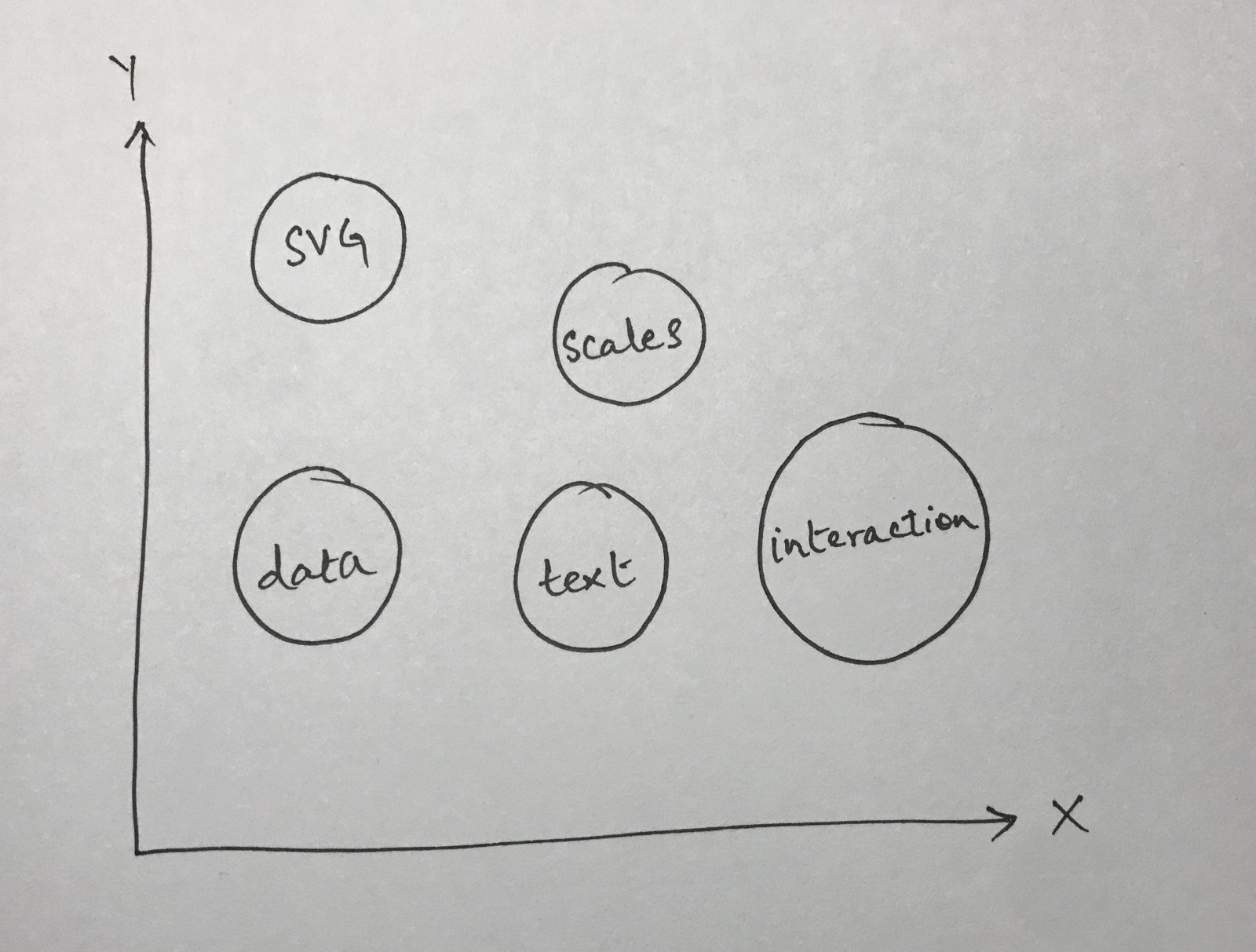 Main Ideas Behind D3
The Ups And Downs Of D3
The thing I love about D3 is that its built on top of the smallest primitives, and you have access to all of those primitives.
If you were to use a typical charting library for React, you’d probably do something like this
import { BarChart } from 'generic-charting-library'

export default class Chart() {
  render() {
    return (
      <BarChart data={data} /
    )
  }
}
The above is perfectly fine for most use cases. However, the moment you want to do anything slightly more complicated like interacting with the bar chart in unique ways (think beyond just displaying a tool tip), my personal experience has been that it turns into a war with the documentation of the library.
First, you have to figure out if it is even possible to do this with the library, and then you have to figure out how to do it.
The first part, in my experience, is the hard bit. It is quite frustrating to look for something that you’re not sure exists. However, with D3, that isn’t the case. Pretty much anything you want to do can be done with D3. It is simply a matter of figuring out how to do it.
The downside of course is that D3’s API and documentation is so vast and expansive, that you end up having disparate pieces of knowledge of how things work. This is also a consequence of how I chose to learn D3, that is by building something with it. When you choose to build something with a technology, you only look up the pieces relevant to what you’re currently building.
Say, for instance, you wanted to build a bar chart. Well, you’re probably to going look up something like how to define and place axes on a web page. Then, you’ll probably look up how to define the actual bars of the chart themselves. These are well defined problems and have straightforward solutions.
I took pretty much the same route and ended up in a frustrating place where I could get things to work but I couldn’t quite understand how it was all coming together.
I’m going to explain my thought process of how I put together all the different pieces.
The Big Picture
The following image is that of a simplistic bar chart (something we’ll try to recreate for this post)
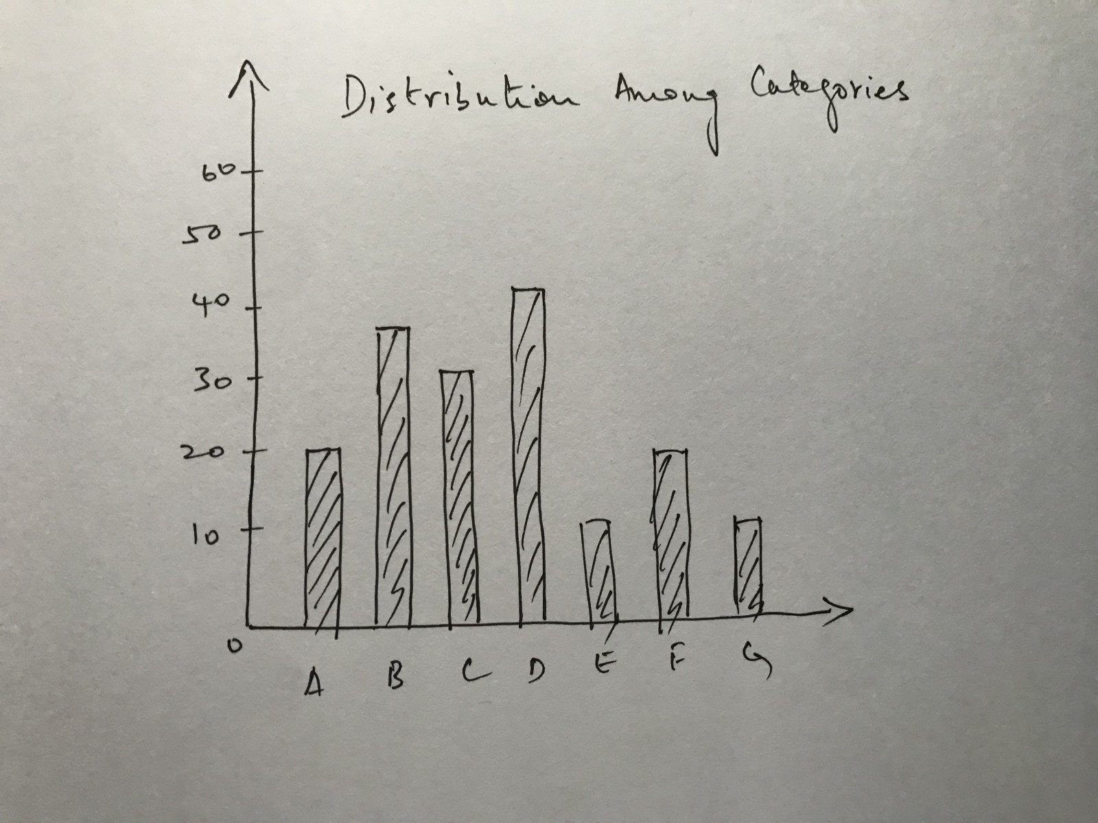 Typical Bar Chart
Now, here’s the same bar chart with the different components being marked out. By components, I mean the different things we will need to worry about when creating the bar chart using D3.
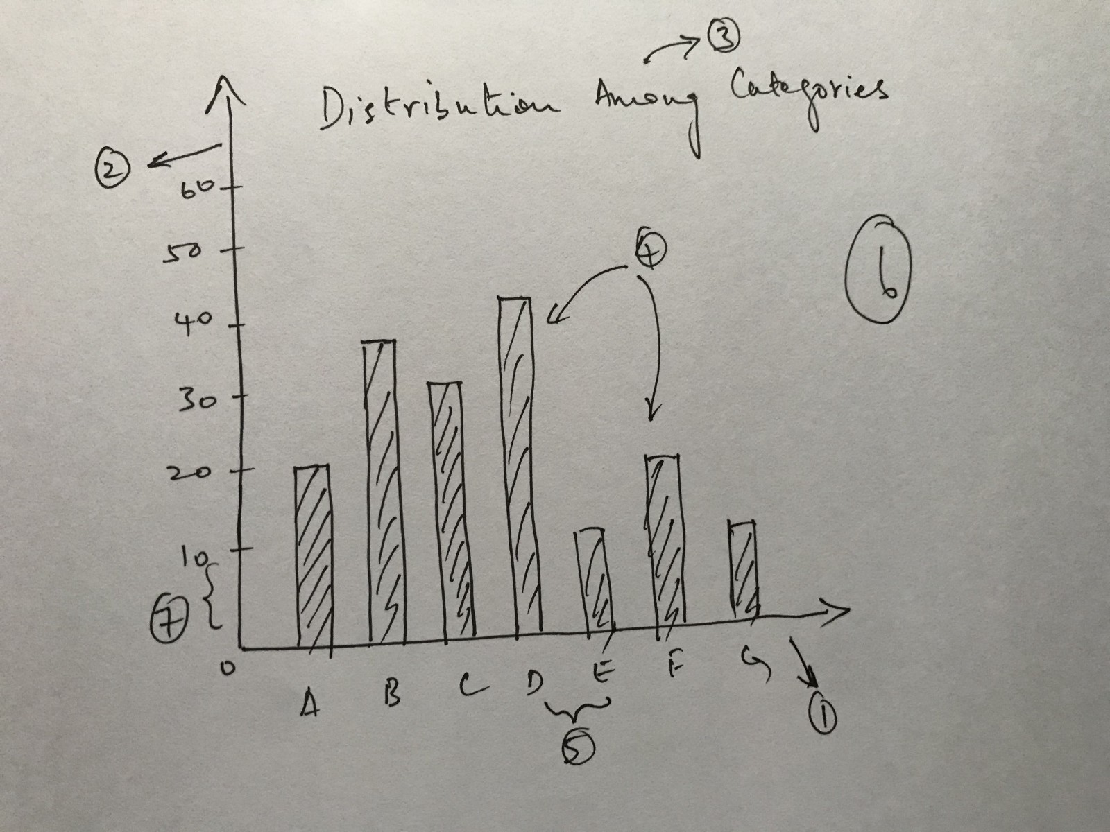 Labelled Bar Chart
- The X-axis
- The Y-axis
- The title
- The bars (I’m counting all of them as one)
- The spacing between the ticks on the X axis
- The actual chart area itself
- The spacing between the ticks on the Y axis
We’ll explore everything except the spacing between ticks in detail. The spacing between ticks will take care of itself when figure out how to construct the axes.
The Small Things That Make Up The Big Picture
Before we can even start with composing the small pieces that make up the big picture, we need to understand the one element that is a part of every component in the chart above: the SVG element.
The SVG Element
A D3 chart is primarily composed of SVG elements. In the bar chart above, the x-axis, the y-axis, each individual bar are all instances of SVG elements.
I recommend reading this page to get a better understanding of what an SVG is. SVG’s are essentially how you describe 2D graphics on a web page.
The most basic example of an SVG element is the circle element.
See the Pen qGMxzO by Zaid Humayun (@redixhumayun) on CodePen.
Take a look at the codepen above and you should see the definition for the circle SVG inside the HTML file.
I’d advise going through the SVG documentation on MDN (linked above), and familiarizing yourself with it. D3 makes extensive use of SVG’s.
The G in SVG
There is a specific kind of SVG element called a G element. Similar to the way we defined the circle element above, we define this with
<svg viewBox="0 0 100 100" xmlns="http://www.w3.org/2000/svg">
  <!-- Using g to inherit presentation attributes -->
  <g fill="white" stroke="green" stroke-width="5">
    <circle cx="40" cy="40" r="25" />
    <circle cx="60" cy="60" r="25" /> </g>
</svg>
Think of a g element as similar to a div element that is used as a container in HTML. They are both used to group certain elements.
Read the MDN documentation for g here
If you want to understand why people make use of the g element, read this
The Data We Need
Before we continue any further, let’s quickly create the data we’ll be using. Here is a sample JSON file we can use to create a bar chart.
[
  {
    "key": "A",
    "value": 20
  },
  {
    "key": "B",
    "value": 40
  },
  {
    "key": "C",
    "value": 80
  },
  {
    "key": "D",
    "value": 55
  },
  {
    "key": "E",
    "value": 70
  }
]
The Chart Area
Let’s start off with creating a simple chart area first. The way to create a chart area is to set up a basic SVG element and then assign a viewBox attribute to it.
Just ignore what the viewBox attribute is for now. It isn’t relevant to the discussion of this post.
<svg class="chart" viewBox="0 0 800 600">
You won’t see anything on the screen yet because the chart is transparent at this point. If you use the browser inspector, however, you will see the SVG element.
We’ll also define some dimensions for our chart area like the height, width and margins.
const height = 600
const width = 800
const margin = { top: 15, right: 30, bottom: 15, left: 30 }
Now that we’ve defined the dimensions we need to actually create the area for our chart in the DOM. To do that, we need to use something called d3.select
Think of this as exactly the same as the set of document.getElementBy[X]commands the DOM offers natively.
When you use something like d3.select('.chart'), you are asking D3 to select an element with a class named chart.
Note that we’re saving the selection inside of a variable. This will be important later.
When you select something with d3.select, D3 allows you to use method chaining to alter attributes like width and height, like I've done here.
const chart = d3.select(".chart")
                .attr("width", width)
                .attr("height", height)
What we’ll end up with is something like the following image
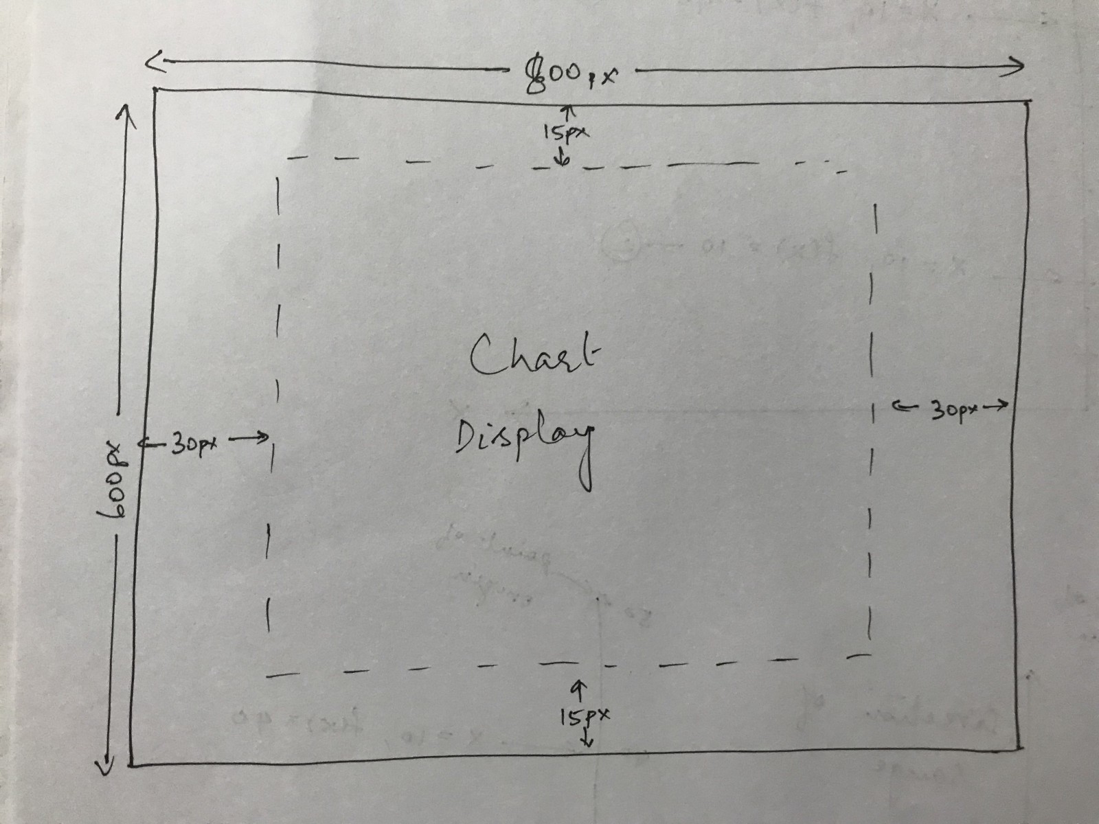 Chart Display With Margins
Don’t worry about the margins for now. We’ll take care of that later.
Defining The Axes
Now, we start with the meaty part of D3: creating and placing our axes.
Before we can start, we need to understand something fundamental about the way D3 axes work: they are essentially a mapping from one set of values to another set of values.
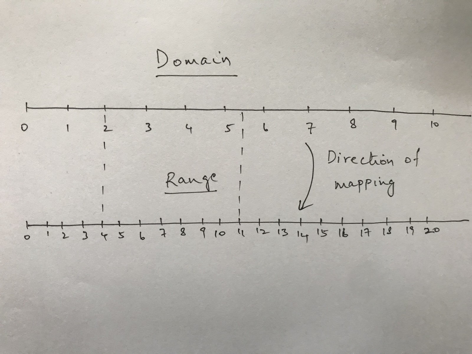
The two sets of values are called domain and range. D3’s mapping works from the domain onto the range.
I have defined two really simple number lines to illustrate the domain and range. The range is the exact same as the domain with double the number of markings.
In this example its really easy to see how the domain can be mapped to the range. You just need to multiply the value by 2 since the range has double the number of ticks and has the same starting tick value of 0.
I’ve drawn two dashed lines to show the following mappings
2 -> 4
5.5 -> 11
Now, D3 is not limited only to having real numbers (or even just numbers) to define scales. You can even use characters to define your scales.
The Y Scale
We’ll start with the Y scale.
D3 has different kinds of scales but the one we’ll be using is called the linear scale.
To define the scale we need two things: the domain and the range.
We’ll use a simple, stupid rule to define our domain. We’ll assume that the minimum value we can have for one of our categories is 0 and the max value is 100. No negative numbers. The domain then becomes [0, 100]
const y = d3.scaleLinear()
            .domain([0, 100])
            .range([height - margin.bottom, margin.top])
One thing we need to examine here is the range. It took me a little while to understand why the range seems to be in “reverse”. My initial thought was that the range should be [margin.top, height - margin.bottom]. But, we want our Y axis for the chart to start at the bottom and moves vertically upwards.
We’ll consider the following two scenarios in a subsequent diagram to examine this.
1. .range([height - margin.bottom, margin.top])
2. .range([margin.top, height - margin.bottom])
The important difference between the two scenarios is that in the first scenario we are treating the value of height as our ‘zero’ value. In the second scenario, we are treating the margin.top value as our 'zero' value.
One thing to remember before we proceed further: the point of origin of every SVG coordinate system is at the top left corner.
Interpreted another way, the bottom of the Y-axis is our ‘zero’ value in the first scenario and the top of the Y-axis is our ‘zero’ value in the second scenario.
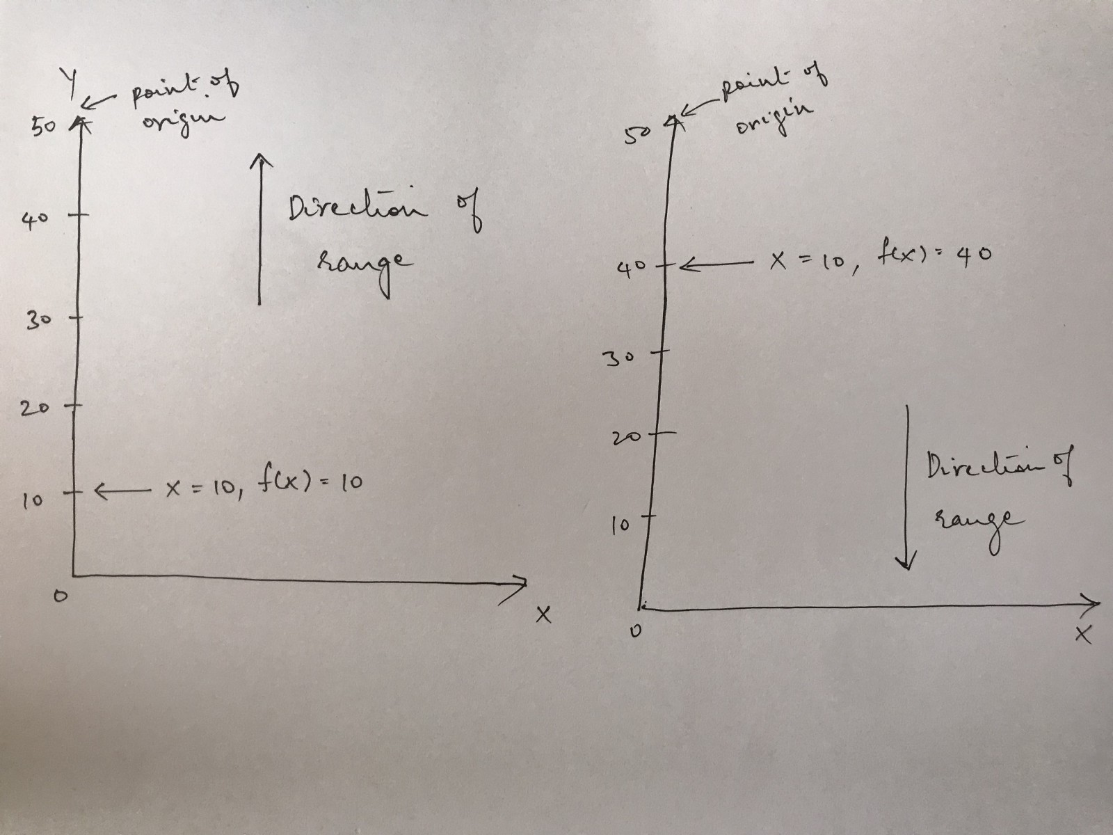 The Two Scenarios Represented Visually
In the image above, scenario 1 is on the left and scenario 2 is on the right. You can see the direction of movement for the domain in each image.
In scenario 1, the domain grows upwards from the bottom, which is what we want. In scenario 2, the domain grows downwards from the top, which is what we don’t want.
I appreciate that I might have made things more confusing for those of you who managed to grab the above intuitively but this is something that took me a while to figure out. If you understand intuitively, don’t worry about the above. If you still don’t get it, you will by the end of this post.
The X Scale
The X scale is a little easier to figure out. We need the X scale to grow from left to right keeping in mind the width of our chart area and also the margins on the left and right.
The domain on this scale is a little more confusing though because we aren’t dealing with numbers anymore. We are dealing with the letters of our categories instead.
To figure out how to construct this scale, we first need to understand something called the ordinal scale. The quickest way to understand the ordinal scale is to consider the differences between the linear and ordinal scales.
 The Linear And Ordinal Scale
In the image above, you can see a poor drawing of the two scales. The important difference to note is that the linear scale is a continuous scale and the ordinal scale is a discrete scale.
In the example of the linear scale, if you were to provide a value of 5.5, it would be mapped to the midway point between 5 and 6. However, if you were to provide a value of a letter somewhere between C and D (which doesn’t exist), D3 would have no idea how to map it. As far as D3 is concerned, there is no way to map that value because you have stated that all those values are discrete. That is, there are no connecting values in between.
Now, let’s construct the X axis.
function getKeys(array) {
  return array.map(arrObj = {
    return arrObj.category;
  });
}
const keys = getKeys(data)

const x = d3.scaleOrdinal()
            .domain([...keys])
            .range([margin.left, width - margin.right])
If you’re wondering about the function in there and the variable keys, that is to extract all the categories present in our data and provide it to the domain function as an array.
I could just as easily have written .domain(['A', 'B', 'C', 'D', 'E']) but then I would have had to manually update that every time my data changed.
The range, as I have already mentioned, needs to grow from left to right. So, we leave out the margin on the left, move the length of the width and leave out the margin on the right.
Creating The Actual Axes
Now, we have the chart area and the scales defined, we need to set up the axes themselves. Here is how we do that.
const xAxis = d3.axisBottom(x)
Here, we are creating a function called xAxis which uses the d3.axisBottomfunction with our x scale provided as a parameter.
To actually display the X-axis on our chart, we need to do the following
chart.append('g')
      .attr('transform', `translate(0, ${height})`)
      .call(xAxis)
Two things to examine here.
We’re appending a g element to our chart. We discussed the g element in an earlier section. We then apply a transform to our g element. This transform is something that comes up in D3 all the time.
SVG’s have what are called transform functions. There are multiple kinds of transform functions, but the one we care about here is translate. Translateaccepts two parameters an x and y co-ordinate. This signifies how many units of pixels to move the g element either in the X or the Y direction.
You can read more about transforms here.
The two parameters we provide to the translate function are 0 and height. Remember that the point of origin of our SVG chart is at the top left corner. Since, we already know this is a horizontal axis that begins at the point of origin, we need to move it vertically down by height number of units.
If you didn’t provide the transform attribute, the X-axis would be situated at the top of your chart.
The last part of the method chain is a call function where the xAxis is provided as a parameter. This is probably the most confusing aspect so far because of the poor choice of terminology.
We’ll examine just these two lines first.
.append('g')
.attr('transform', `translate(0, ${height})`)
What you need to understand is that when you do something like chart.append('g'), this appends a g element onto the chart element, selects the g element and then returns it. You can test this by doing the following
const test = chart.append('g')
            .attr('transform', `translate(0, ${height})`)
            .call(xAxis)console.log(test)
When the result of the log shows up, you’ll see a g element under a Selection object. This is actually what enables us to do method chaining on the append method. Since it returns the g element, we can transform as part of the same method chain.
Let’s go to the last line now
.call(xAxis)
Here’s what D3’s documentation says about call
Invokes the specified function exactly once, passing in this selection along with any optional arguments. Returns this selection.
So, we know we utilize call as a function and we have to pass it a function as a parameter. We know this because the documentation says, it invokes the specific function exactly once. Now, the other thing to realize is that xAxis is also a function. You can verify this again by logging xAxis.
But, if xAxis is also a function then that needs a parameter passed to it as well. Read the documentation for call again and you'll notice it says "passes in this selection...". This means that the xAxis function is being implicitly called with the g selection returned from calling chart.append('g')
Having to explain how call works is precisely why I don't like it. There's too much implicitly happening that just seems like black magic.
If you’re still confused about how call works hopefully the following graphic clears it up for you.
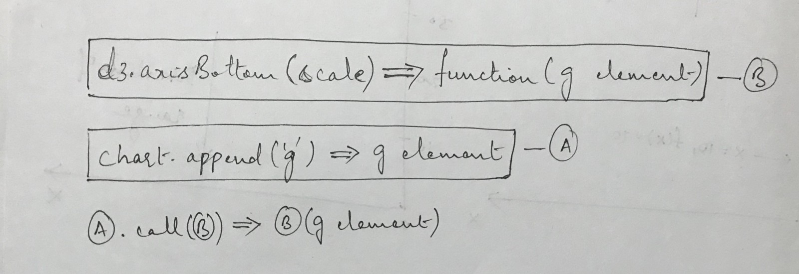 How Call Works
Creating the Y axis now that we know how the X axis works is far simpler. We use the same principles but swap out axisBottom for axisLeft and change the translate function slightly.
const yAxis = d3.axisLeft(y);

chart
  .append("g")
  .attr("transform", `translate(${margin.left}, ${margin.bottom})`)
  .call(yAxis);
You’ll notice that the transform attribute has a translate function where the y attribute is set to margin.bottom. If you go back to the range we set for the y scale, you'll notice we set it to height - margin.bottom.
When we call D3’s axisBottom function, D3 will place this at height - margin.bottom, but the bottom of the chart is actually at height, so we add the margin.bottom offset.
Placing The Bars
This is the most visually important part of the chart because this is where the user actually gets to see the data.
First, let me just show you the code that will create the bars for us and then step through it.
chart.selectAll('rect')
    .data(data)
    .join('rect')
    .attr('x', d => x(d.category))
    .attr('y', d => y(d.value))
    .attr('width', x.bandwidth())
    .attr('height', height - y(d.value))
    .style('fill', 'steelblue')
The first two lines are straightforward. selectAll works the same as selectexcept it returns all possible selections of a specific elemenet.
Calling .data allows you to define the data you want to associate with the DOM elements.
Now, the .join is where the crux of D3 comes in. This is what makes D3 unbelievably powerful to create visualizations with.
If you want to read what Mike Bostock (the creator of D3) has to say on data joins, you can find that here.
What follows is my attempt at explaining what the .join function does in the context of a bar chart.
So, if you go back and look at the data we defined earlier in this post, you’ll notice that it is an array. The reason is because this is the data structure D3 expects.
The .join function then takes every element of the array and constructs a corresponding DOM element with this data point attached.
Note: The _.join_ function used to earlier be separate functions called _.enter_and _.append_. However this syntax is a lot cleaner. Here is the GitHub issue where Mike Bostock first suggested it.
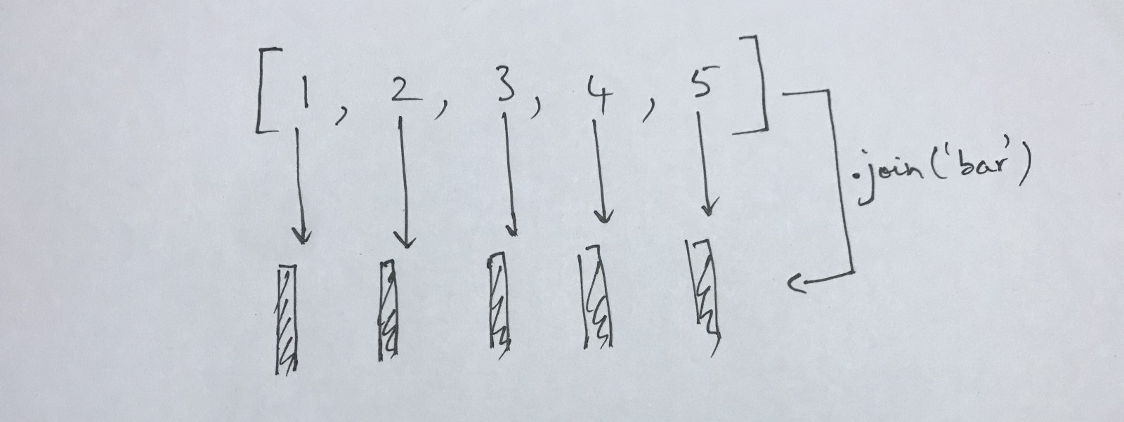 How .join() works visually
Note: In the graphic above, it should read _.join('rect')_ not _.join('bar')_
The graphic above illustrates what is going on when you do a data join. If you take an array of 5 elements and perform a .join('rect') on it, what D3 will do is create a rect SVG element for each of those elements.
Another thing D3 will do is associate each data point from your array to its respective rect element.
const data = [1, 2, 3, 4, 5]

const selection = d3.selectAll('rect')
                    .data(data)
                    .join('rect)

selection.each(function(d, i) {
  console.log(d)
})

//1, 2, 3, 4, 5
The above code snippet shows you how to do the logging of each individual data point to satisfy your own curiosity.
You could, of course, replace the rect above with any other SVG element and you would have the same result.
Great, now we know how to create our bars but we still need to figure out how to place them. Before continuing, I recommend you read this MDN articleabout rects.
One thing that tripped me up a lot about working with D3 intially was trying to figure out how the SVG coordinate system works.
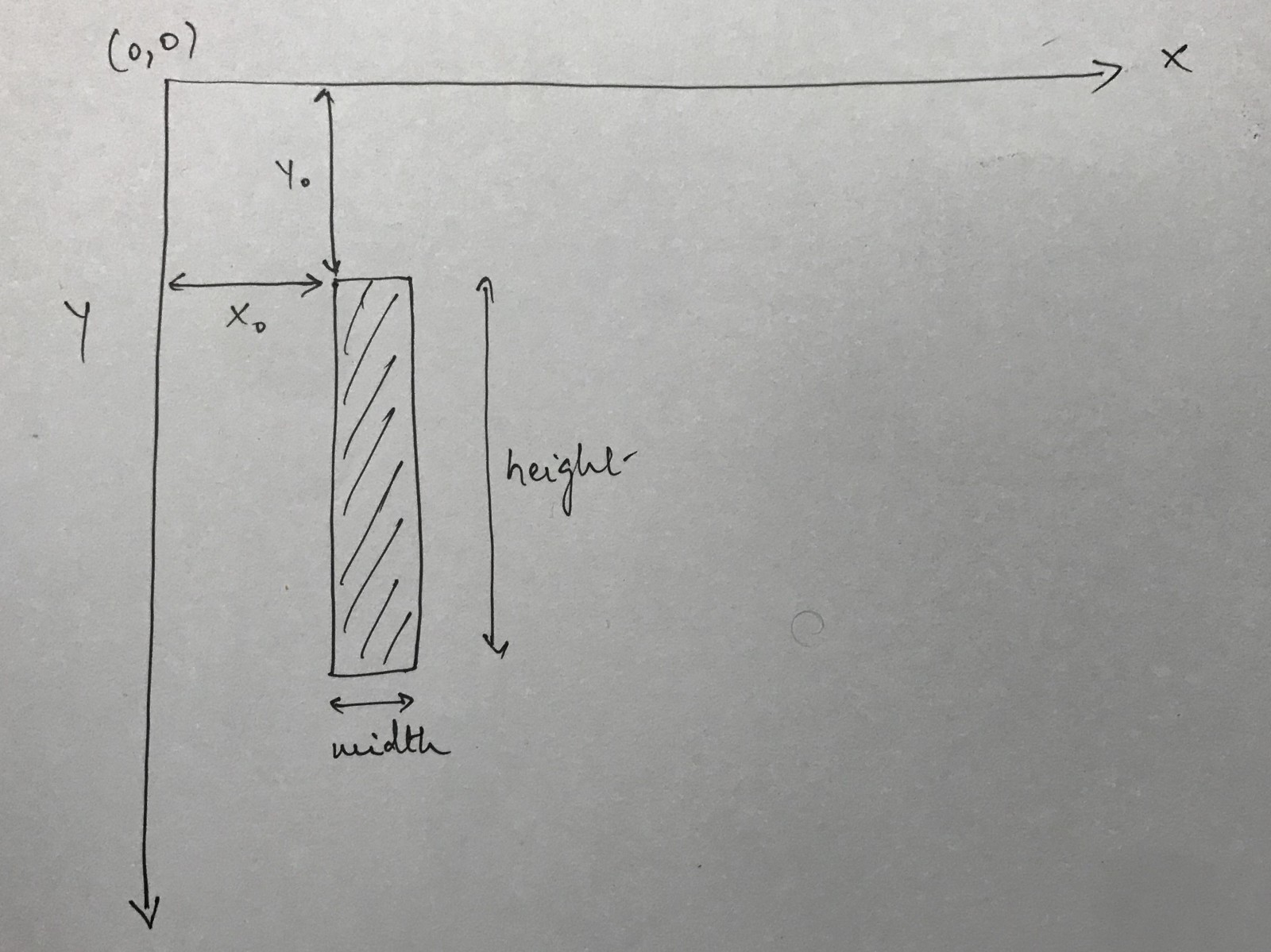
If you want a deeper understanding of how SVG coordinate systems work, check out this article
The graphic above shows you how different measurements would impact the placement of a rect in the SVG coordinate space.
A rect SVG element has four main attributes we’ll be concerned with: x, y, width and height.
You can see how each of them relate to the SVG coordinate space in the image.
Let’s translate the above into code.
chart
  .selectAll("rect")
  .data(data)
  .join("rect")
  .attr("x", d => return x(d.category))
  .attr("y", d => return y(d.value))
  .attr("width", x.bandwidth())
  .attr("height", d => height - y(d.value))
  .style("fill", "steelblue");
Let’s step through the bits of the code after the .join call.
When we set the x and y attributes, we make a call to the respective scales we defined earlier. Remember when we defined the scales, we said that each of them would be functions that could be called with a value to map it from the domain to the range. That's precisely what we're doing here.
Now, to understand the width attribute, we first need to go back to the ordinalScale we defined. D3 has a function associated with each scale called the bandwidth function. This returns the width of each band defined. D3 internally does this by dividing the range equally among each element of the domain.
So, we provided an array of 5 characters as the domain of the x axis and we set the range to [margin.left, width - margin.right], where width = 800and margin = { left: 60, right: 60 }
So, we have
(800 - 60 - 60) / 5 = 136
All units are in pixels.
Now, the height attribute is another thing that tripped me up for a long time because I couldn’t quite figure out why we were doing height - y(d.value)to represent the height of the rect. Surely, it should have just been y(d.value)?
This is answered again by remembering that the SVG coordinate has its point of origin in the top left corner and the +ve Y-axis goes downwards.
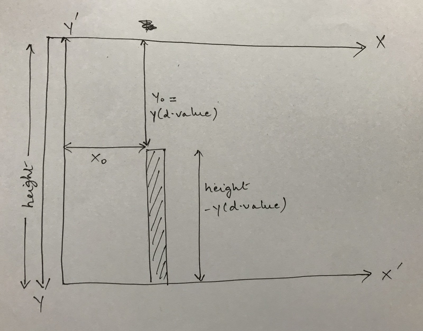 Measurements For A Bar in SVG Coordinate System
In the graphic above, I’ve presented my understanding of how the height of the bar is calculated. Again, if the calculation for the height of the bar makes intuitive sense for you, feel free to skip this.
The main thing to notice in the visual is that there is a difference between the axes of the SVG coordinate system and the axes of our chart. The Y axis for the SVG coordinate system is positive downwards but the Y axis for our chart is positive upwards.
This is the reason I’ve drawn two separate sets of axes for both X and Y. Technically, the two Y axes should be superimposed on top of one another but that would make it hard to visually see it. But, you can assume that they are overlayed on top of each other.
When we call the y scale function with y(d.value), we get a value that counts down the +ve Y-axis of the SVG coordinate system starting from the top. The height is shown on the side which is the entire length of the Y axis and then what remains is height - y(d.value), which is the height we are assigning to the bar.
Adding Titles And Labels
Now, we get to the easy bit. It’s only easy because of everything we’ve covered so far!
Similar to how we’ve appended rects to our SVG so far, we can also append text as an SVG element like below:
chart.append('text')
      .attr('x', width / 2)
      .attr('y', margin.top)
      .style('font-size', 32px)
      .style('text-anchor', 'middle')
      .text('Distribution Among Categories')
The text SVG element also has an x and y attribute that work very similarly to how the x and y attributes of the rect work.
You can set different style attributes to the text element and you set the text itself using the .text attribute.
Now, let’s place the Y-axis label
chart
  .append("text")
  .attr("transform", "rotate(-90)")
  .attr("x", -height / 2)
  .attr("y", margin.left / 4)
  .text("Values")
Okay, this one is a little confusing, so let’s step through it.
First, we apply a transform to the element and set that value to rotate(-90). What this does is rotate the SVG coordinate system itself by -90 degrees.
Note: Everything that follows is my attempt to reverse engineer how the rotate function works. If I turn out to be wrong, please excuse me.
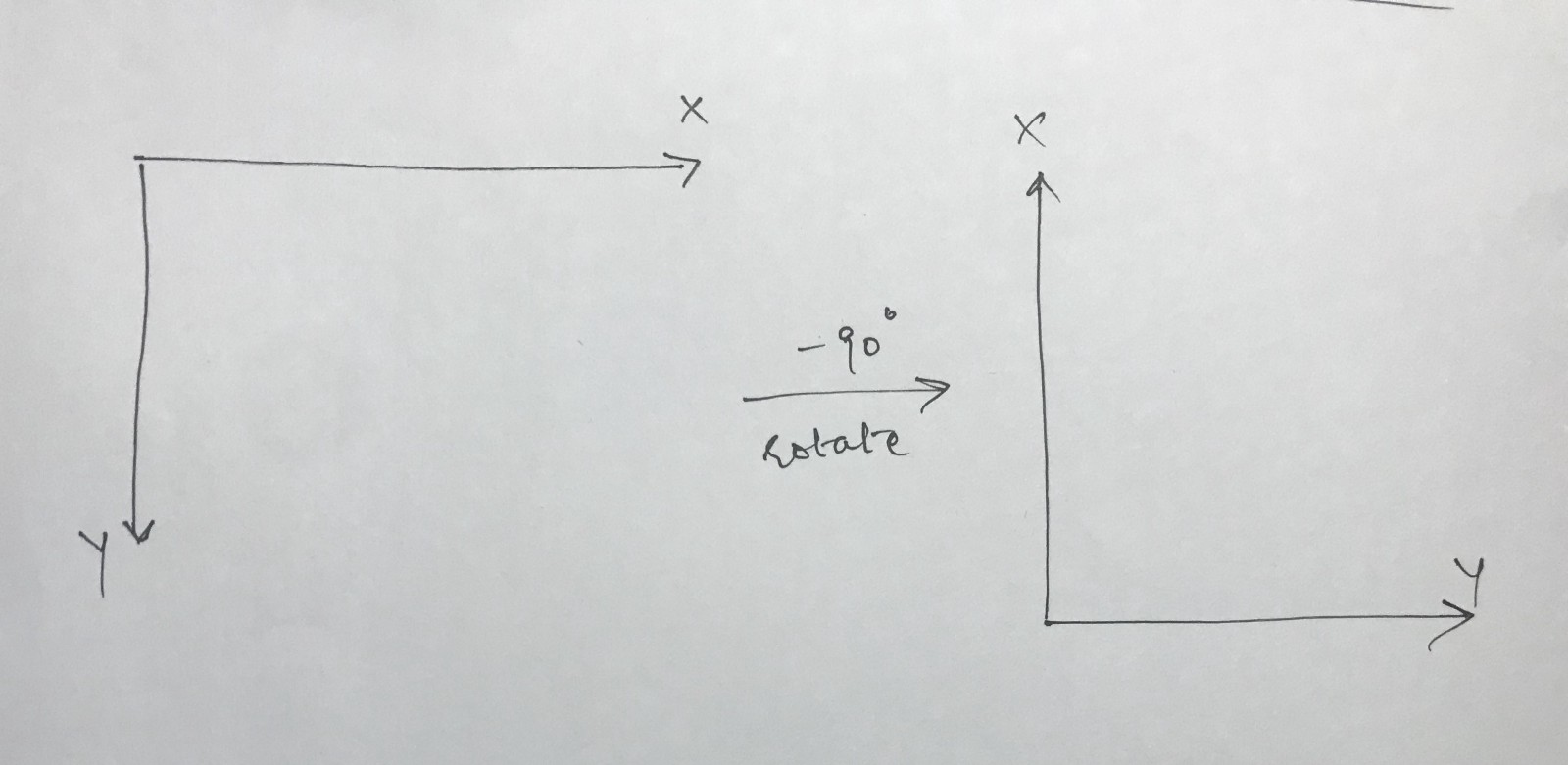 Axis Rotation
The graphic above shows what happens to the coordinate system on applying rotate(-90). Now, you're probably even more confused because a negative rotation typically means a clockwise rotation. Yet, it looks like I've rotated anti-clockwise here.
Well, remember that a typical coordinate system has the Y-axis pointing positively upwards. We have it pointing positively downwards. Therefore, our rotations are reversed.
Now, our new X axis points in the opposite direction of the old Y axis and our new Y axis points in the direction of the old X axis.
Now, in the context of this new information, looking at the values of the xand y attributes makes more sense. Since our new X points opposite to the direction of the old Y, we set a negative value to the x attribute.
Conclusion
Okay, that was quite the post. I wasn’t envisioning it becoming quite so massive but we did cover a lot in detail. I hope you enjoyed going through this post and more than anything, I hope you have a better grasp of how D3 works. This is a truly wonderful library that provides you with a set of very powerful tools.
I’ve created a Code Sanbox here with a working version of the code from this post. Feel free to fork it and play around with it!
If you want to follow me, you can do so on GitHub or Twitter. If you have any questions, please don’t hesitate to ask.
Subscribe to my newsletter
Read articles from freeCodeCamp directly inside your inbox. Subscribe to the newsletter, and don't miss out.
Written by

freeCodeCamp
freeCodeCamp
Learn to code. Build projects. Earn certifications—All for free.